![[object Object],[object Object],[object Object]](data:image/gif;base64,R0lGODlhAQABAIAAAAAAAP///yH5BAEAAAAALAAAAAABAAEAAAIBRAA7)
Recomendados
Mais conteúdo relacionado
Mais procurados
Mais procurados (19)
Destaque
Destaque (20)
Semelhante a Evaluating my magazine
Semelhante a Evaluating my magazine (20)
Evaluating my magazine
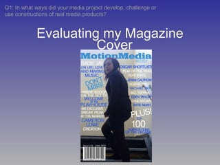
- 1. Evaluating my Magazine Q1: In what ways did your media project develop, challenge or use constructions of real media products? Cover
- 3. How I used, challenged and developed conventionsc In my magazine cover, the girl is the most prominent element. She is in the centre of the picture, and she is clearly contrasted against the pale background as she is wearing dark clothing. I followed the conventional arrangement of the text, as many of the article titles were arranged around the girl’s figure (so the titles do not overlap onto her). However I created a copy of the girl’s head and shoulders in another layer, to allow me to place that in front of the title of the magazine (‘MotionMedia Weekly’). This followed the convention of making sure the text did not overlap onto the picture, but subverted it somewhat as the girl overlapped onto the text (the other way around). The picture is positioned in the middle of the cover, and is the main focus. Text is arranged around the picture accordingly. How I used/developed/challenged it Convention
- 4. How I used, challenged and developed conventions The majority of the text follows a colour pattern of white and dark blue. However, the magazine title differentiates from this, making it stand out from the rest of the text. However, as it is still blue it doesn’t clash. Text follows a colour scheme, used both to separate text that is about different articles, and to separate different names (e.g. in the ‘Oscar Shortlist’ section on my cover) Although purely practical, these conventions are essential in the authenticity of the magazine cover. However, as they are just practical elements (and do not help sell the magazine) the barcode is small and placed in the lower corner, in a dark space that I could not fill with text. Furthermore the issue details are next to the barcode are in a small, unobtrusive font. A barcode, issue number/details are included.