Making Effective Figures
•
0 likes•184 views

Professional development series for CSU's Department of Atmospheric Science REU program in 2021

Recommended
Recommended
More Related Content
What's hot
What's hot (20)
Similar to Making Effective Figures
Similar to Making Effective Figures (20)
More from Zachary Labe
More from Zachary Labe (20)
Recently uploaded
Recently uploaded (20)
Making Effective Figures
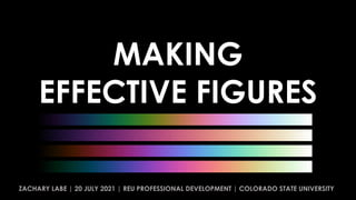
- 1. MAKING EFFECTIVE FIGURES ZACHARY LABE | 20 JULY 2021 | REU PROFESSIONAL DEVELOPMENT | COLORADO STATE UNIVERSITY
- 3. Polar Amplification: acceleration of warming in high latitudes relative to the rest of the globe
- 7. Polar Amplification: acceleration of warming in high latitudes relative to the rest of the globe
- 9. DON’T BE SUCH A SCIENTIST WE ARE DATA SCIENTISTS ART BY JILL PELTO
- 10. Landscape of Change uses data about sea level rise, glacier volume decline, increasing global temperatures, and the increasing use of fossil fuels. These data lines compose a landscape shaped by the changing climate, a world in which we are now living. Jill Pelto|http://www.jillpelto.com/landscape-of-change “ ”
- 19. :)
- 23. MAP PLOTS
- 24. YIKES!
- 25. YIKES – FONT IS BLEH!
- 26. YIKES – COLOR!
- 27. MAP PROJECTION!
- 28. :)
- 29. HAVE FUN!
- 37. Senator Sheldon Whitehouse (D-CT) - Time to Wake Up: Climate Progress Speech (3/21/2018)
- 52. Adapted from Ed Hawkins at betterfigures.org
- 53. Crameri, F. (2018). Scientific colour maps. Zenodo. http://doi.org/10.5281/zenodo.1243862 Crameri, F. (2018), Geodynamic diagnostics, scientific visualisation and StagLab 3.0, Geosci. Model Dev., 11, 2541- 2562, doi:1 0.5194/gmd-11-2541-2018 Crameri, F., G.E. Shephard, and P.J. Heron (2020), The misuse of colour in science communication, Nature Communications, 11, 5444. doi:10.1038/s41467-020-19160-7 Palettable: Color palettes for Python
- 54. Crameri, F. (2018). Scientific colour maps. Zenodo. http://doi.org/10.5281/zenodo.1243862 Crameri, F. (2018), Geodynamic diagnostics, scientific visualisation and StagLab 3.0, Geosci. Model Dev., 11, 2541- 2562, doi:1 0.5194/gmd-11-2541-2018 Crameri, F., G.E. Shephard, and P.J. Heron (2020), The misuse of colour in science communication, Nature Communications, 11, 5444. doi:10.1038/s41467-020-19160-7
- 55. OTHER OPTIONS THYNG ET AL. 2016; OCEANOGRAPHY
- 56. CMOCEAN
- 57. CMASHER “Scientific colormaps for making accessible, informative and cmashing plots”
- 61. 1. Seaborn. 2. Plotly. 3. ggplot. 4. Matplotlib v3. ALTERNATIVES
- 62. 1. https://betterfigures.org/ 2. https://www.climate-lab-book.ac.uk/ 3. http://colorbrewer2.org/ RESOURCES
- 63. Future minus Pre-Industrial PEINGS ET AL. 2021, JCLI Bring drama to your data story
- 64. 2-m TEMPERATURE Future minus Pre-Industrial PEINGS ET AL. 2021, JCLI
- 65. 2-m TEMPERATURE Future minus Pre-Industrial PEINGS ET AL. 2021, JCLI
- 66. 2-m TEMPERATURE Future minus Pre-Industrial PEINGS ET AL. 2021, JCLI
- 67. 2-m TEMPERATURE Future minus Pre-Industrial PEINGS ET AL. 2021, JCLI
- 68. 2-m TEMPERATURE Future minus Pre-Industrial PEINGS ET AL. 2021, JCLI
- 69. 2-m TEMPERATURE Future minus Pre-Industrial PEINGS ET AL. 2021, JCLI
- 70. 2-m TEMPERATURE Future minus Pre-Industrial PEINGS ET AL. 2021, JCLI
- 72. ACCESSIBILITY
- 73. ACCESSIBILITY
- 74. ACCESSIBILITY
- 80. ACCESSIBILITY No jargon Tell a story Alternative text Color contrast ratio Label data directly Avoid flashing GIFs Include figure titles Avoid data overlays Provide data references
- 83. PLOT BY ED HAWKINS
- 84. 2016 RIO OLYMPICS OPENING CEREMONY
- 87. PLOT BY ED HAWKINS DON’T BE SUCH A SCIENTIST WE ARE DATA SCIENTISTS
- 89. https://showyourstripes.info/ PLOT BY ED HAWKINS
- 90. CHECK: Simple. Bold. Stories. @ZLabe Questions! ZACHARY LABE | 20 JULY 2021 | REU PROFESSIONAL DEVELOPMENT | COLORADO STATE UNIVERSITY