1. {CentreStage} Unwind
Artàlaarte A cafe where every moveable object is a piece of art on sale and walls are
adorned with carefully-crafted retail products. The talented team from
Workshop Inc create a canvas with an identity for the contemporary, The
Project Cafe, in Ahmedabad.
Text: Vishankha Gandhi; Photographs: Kunal Bhatia; Courtesy Workshop Inc
{CentreStage} Unwind{CentreStage} Unwind
Designed as an amorphous cave, multi-
disciplinary firm Workshop Inc transforms the
existing structured grid layout into a fluid and
interconnected space. Strategically carved out
openings at the corners opens up the space,
which now reads as a whole. Retail being a chief
aspect of the brief, niches are carved to match the
lintel height, providing ample room for display.
August 2015 BETTER INTERIORS 109108 BETTER INTERIORS August 2015
2. 110 BETTER INTERIORS August 2015
{CentreStage} Unwind
A
n art gallery is as much about
the quality of art as it is
about curating the display.
The Project Cafe located in
the perceptive city of
Ahmedabad is one such
space. Architects Keta Shah and Harsha
Mistry, and interior designer Varun Shah who
make the three arms of the multi-disciplinary
Ahmedabad-based, Workshop Inc, has created
a three-dimensional canvas for a cafe that
allows the patrons to effortlessly interact with
the art. Each section of the establishment is a
purposeful exhibition of programmatic
functions ranging from relaxing on lounge
chairs to collaborating on community tables
and even simply sitting in isolation on an
outdoor bench staring at the yellow flowers on
the tree at the entrance. What seals the
exhibition-quality at the cafe is the ‘usable art’
model that permeates every movable object
that occupies the space.
“For an adaptive reuse project, such as this,
we did not want to do away with its previous
identity altogether,” says Keta in reference to
the five-decade-old bungalow that houses the
cafe. And it starts right from the entrance
where without changing the exterior facade
and simply soaking it in a turmeric yellow hue,
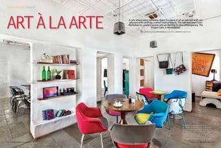
The white POP wall serves as a
perfect backdrop for displaying
eccentric art and products across
different genres. A variety of pop-
coloured furniture can be seen
throughout the cafe, making for a
vibrant and engaging experience.
This unconventional seating option
invites patrons to have ‘favourite’
places and encourages them to
choose different furniture every
time they visit.
Unwind
they visibly put the otherwise trite structure
on the map. Inside, there existed a grid of
small rooms; a major challenge as the brief
required people to freely meander around.
“We required more visual and physical
connectivity to break the notion of a house,
but being a load-bearing structure, there were
certain limitations,” explains Keta. In response
to that, the team carves out openings at the
corners. This eases circulation, provides
unobstructed surfaces for retail and
art display and the much desired
spatial unification.
The old bungalow has been transformed using
many sagacious elements. One such feature is
the use of metal framework on the ceiling that
simultaneously makes the expansive space
more intimate as well as provides the
scaffolding for suspended art. In some places,
the existing has been retained and replicated.
For instance, the old wooden switchboards
can be seen at the lower half of the wall
throughout the cafe; a wistful reminder of
what this place was. Likewise, the archaic
windows were replicated to maintain
continuity and authenticity of the extant
character. But a true demonstration of
transforming the fossil into a modern piece of
art is the blue entrance door. A high parapet
Architects and
interiordesigner
Keta Shah, Varun Shah
and Harsha Mistry
A plethora of furniture typologies adds layers of character
to the cafe. The ‘feel’ of each space was executed via
the medium of furniture. The room on the left houses the
community table ideal for brainstorming and collaborating
while the one on the right provides a more intimate setting for
friends to catch-up over ambrosial food. Once these pieces
are sold out, "a similar layout and feel would be maintained
with future designs,” says Keta.
Cafe + Art + Retail being the overarching brief, each space is
an astutely balanced palette of visually enticing picture frames,
quirky yet ergonomically bang-on upholstered chairs and retail
products with kaarigari work embellishing the bare walls.
August 2015 BETTER INTERIORS 111
Unwind
3. 112 BETTER INTERIORS August 2015
{CentreStage} Unwind
CONCEPT: The Project Cafe has been conceptualized as a fresh, dynamic space merging three aspects — food, art and retail —
where food acts as a catalyst for widening the reach of artists and designers among the masses. The idea was to create a design language
that serves as a neutral canvas for the numerous artworks, such that the shell continues to retain its identity amongst the changing display.
February 2015 BETTER INTERIORS 112
Materials
Wall POP Plaster, Flooring Kotah Stone
(interior) and China mosaic (semi- open
spaces), Display Systems
Reinforcement bars
prominent industrial side table and light
standing nonchalantly next to the window. A
square space with four openings connecting
to the adjacent orthogonal spaces, functional
art displayed in all its two-dimensional and
three-dimensional forms, low lounge chairs
and a settee with un-identically upholstered
cushions for backrest and quirky pieces like a
spider light on the ceiling; this room
exemplifies the core principle of the project.
Workshop Inc in collaboration with the artists
poetically uses art to enhance the spatial
qualities. A fleet of brass birds, the genius of
artist Ashka Shah, with a wave-like motion,
disappear into the next room, visually adding
depth. In this space too the core philosophy
remains the same, but what is different is the
character. The furniture layout is now two
round tables with four chairs each, lit by
Unwind
Above The walls of the shell are painstakingly rendered to achieve the right kind of white POP finish.
Below At the far end of the cafe is the Dali Room, a rectangular room with an L-shaped balcony
running around it. This is home to a centrally spaced community table, an abode for creative
collaboration. On the opposite wall are two symmetrically placed Salvador Dali art works, the result of
collaboration with a Chennai-based artist, Karthik.
wall on one side (traces of the old bungalow)
transforms into a blue entrance replete with a
threshold, bringing back visuals of the
entrance to the traditional desert homes of
Gujarat and Rajasthan.
The white parapet wall, beyond the entrance
gate, dramatically drops to form an
approximately 1½ feet high planter, suddenly
opening up the porch to the street. Step over
the threshold and the floor-scape changes
from flat, hard concrete to textured pebbles.
Robust benches give a relaxed character.
Metal frames above the outdoor seating and
an external staircase that wraps around the
structure visually and physically take one to
the cafe above.
“The Project Cafe offers patrons a chance to
relax and enjoy art over a cup of coffee. Space
design is evolving to reflect this need to create
environments, which are more engaging and
facilitate a dialogue between the art and its
audience, making art more than just a pretty
backdrop,” asserts Harsha, outlining the
design principle guiding this project. As one
walks across the room that houses the
confection and billing counter, you will see the
TOP The recessed window sill is retained as a reminder of the extant character as well as to serve as
a display space. A fleet of brass birds are amongst the permanent art works that lyrically fly from one
window to the next. Adding colour to the neutral canvas is the range of bright retail products hung
from reinforced metal rods.
Above White painted reinforcement bars, fixed on walls and within niches are the primary retail
display elements. This camouflages with the white walls easily putting the spotlight on the products.
August 2015 BETTER INTERIORS 113
Unwind
4. August 2015 BETTER INTERIORS 115
{CentreStage} Unwind
February 2015 BETTER INTERIORS 114
Project Name The Project Cafe
Location Ambavadi, Ahmedabad Area
900 sq ft (first floor) + 900 sq ft
(outdoor cafe) Principal architects
Varun Shah, Harsha Mistry, Keta Shah
Contractors Bella Decor (Woodwork,
Fabrication and Wall texture) and
Kamleshbhai (Electrician) Lighting
Salvaged, Flea Markets and Concrete
Lamps from Grey
just house, but interact with the relevant art
and retail products. It is cave-like
predominantly because of the scale and
proximity of the rooms, or the lack of corridor
space thereof. Sitting in one room, you can see
the differently coloured soft furnishings from
the adjacent room and the one beyond that.
This element of mystery and depth too adds to
the cave-like quality of the space. Eliminating
the wall skirting completely further augments
this feature where a simple groove
demarcates the wall from the flooring. Finally,
it is cocooning in nature for one can get lost
and discover new things in its many layers,
serving as a ground for the flourishing of old
art and the inception of the new.
above left The Project Cafe
is well curated with diverse
elements put together to hit the
right notes. These elements are
triggered by and respond to what
the space offers and in the process
completely transform the space.
A metal framework on the ceiling
makes the volume more intimate
besides holding suspended art. In
this case, industrial concrete lights
designed by a brand called Grey are
suspended from the framework and
complement the solid wooden table
and hand-sculpted silver chairs.
above Right Located off a busy
road, the bright blue entrance doors
lead first to the outdoor area, and
then to the pebbled path that leads
to the cafe staircase. This space
serves the dual purpose of being
a casual seating where one can let
thoughts wander aimlessly as well
as allow for outdoor workshops and
creative discussions.
salvaged ‘ship lights’ and pendant concrete
lamps by a brand called Grey. While the
previous room is ideal for an informal meeting,
this one is conducive for friends catching up
over good food in a vibrant surrounding.
“Initially, the artists had a lot of apprehensions
for experimenting with different mediums,”
informs Varun. “There were a lot of
discussions and exchange of ideas amongst all
of us that has led to the final outcome. We had
marked out walls and areas as retail or art,
keeping in mind not to clutter up the space. It
is an organic process that still continues as the
cafe keeps on changing day by day.”
The design team was conscious of the fact
that products would change overtime. This
resulted in a flexible design solution for the
shelving and display systems. Omnipresent
reinforcement bars were fixed within niches
and on walls turning and ending at the centre
of the wall thickness. The bars were painted
white to camouflage with the white POP
finished walls and to let the products
stand-out.
The Project Cafe is simultaneously amorphous,
cave-like and cocooning in character. It is
amorphous owing to its sculptural feel, where
the massing has been tactfully moulded to not
Every space in the cafe is a
picturesque collage of art, with
most acting as a temporary display.
Workshop Inc confirms that the
antique wall clocks and the salvaged
ship-lights fixed to the ceiling are
more or less permanent but the rest
is set to change.
114 BETTER INTERIORS August 2015
Unwind