Data Design: Where Math and Art Collide
•
923 gostaram•90,803 visualizações

Slides from SXSW 2015 session on the intersection of data and design: http://schedule.sxsw.com/2015/events/event_IAP41090 By Trina Chiasson from https://infoactive.co

Recomendados
Mais conteúdo relacionado
Mais procurados
Mais procurados (20)
Semelhante a Data Design: Where Math and Art Collide
Semelhante a Data Design: Where Math and Art Collide (20)
Último
Último (20)
Data Design: Where Math and Art Collide
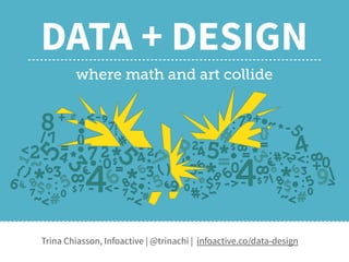
- 1. DATA + DESIGN where math and art collide Trina Chiasson, Infoactive | @trinachi | infoactive.co/data-design
- 2. This year, I did something new. I worked with 80+ volunteer contributors to write a 300-page ebook.
- 4. How do you write an open source ebook? It started with a message…
- 5. Hi Trina! Stats dork from Chicago here… Do you have any plans to include tutorials for basic data cleaning and data selection techniques for users who may not have any statistics background? — Dyanna Gregory
- 6. This is what most statistics textbooks look like. Most designers say…
- 8. HAVE YOU EVER SEEN A BAD INFOGRAPHIC? 24.5%NO 84.5% YES
- 9. Why do so many infographics suck?
- 10. THEORY #1 Graphic Designers are evil. They sacrifice truthful data representation for aesthetic gain.
- 11. THEORY #2 Marketers are evil. They sacrifice truthful data representation for more clicks.
- 12. THEORY #3 Most people aren’t evil. Good data visualization is really hard to do.
- 13. Who has skills in programming, design, and data analysis?
- 14. Not everyone is blessed with the innate ability to make brilliant data visualizations.
- 15. What data collection looked like, not too long ago
- 16. What data storage looked like, not too long ago
- 17. What data collection looks like today
- 18. 1985: The birth of Excel
- 19. But what do we do with all of this data?
- 20. The price of light is less than the cost of darkness. — Arthur C. Nielsen, Market Researcher & Founder of ACNielsen
- 21. Let’s send our data to a designer who can make it look pretty.
- 22. But most designers are not trained in stats
- 23. How about a friendly introduction to data?
- 24. But how do you write an open source ebook?
- 26. There’s no open source book on how to write an open source book.
- 29. Don’t underestimate the awesomeness of strangers on the internet.* * Especially strangers who volunteer to write books about data in their free time.
- 30. In six months, we wrote and released the English version. Data + Design is now being translated in Chinese, Russian, Spanish, and French.
- 34. Is it true that dataviz people hate pie charts?
- 35. That’s a complex question. Arguments against pie charts:
- 40. 13% 100%
- 41. 13%
- 43. A table is nearly always better than a dumb pie chart; the only worse design than a pie chart is several of them, for then the viewer is asked to compare quantities located in spatial disarray both within and between charts […] Given their low density and failure to order numbers along a visual dimension, pie charts should never be used. Edward Tufte, "The Visual Display of Quantitative Information”
- 46. Graphical perception: Theory, Experimentation, and Application to the Development of Graphical Models
- 49. Meat Pies & Color Theory
- 50. What Color Is This Chart? #TheChart
- 51. Hot Pie Cold Pie
- 52. Hot PieCold Pie
- 54. Men who cannot read this chart Men who can read this chart
- 55. So you should use monochromatic color scales, right?
- 56. Monochromatic scales are better for continuous data
- 58. Be careful with multicolor scales
- 60. Red tends to stand out against other colors
- 61. Can you find the red circle?
- 62. How about now?
- 63. Which is easier?
- 64. Finding boundaries in color vs. shapes Adapted from: Healey, Christopher G., Kellogg S. Booth, and James T. Ennis. “High-Speed Visual Estimation Using Preattentive Processing.” ACM Transactions on Computer-Human Interaction 3.2 (1996): 4.
- 65. So what colors should I use?
- 66. It depends, but…
- 67. BLUE & ORANGE
- 70. Our brains look for baselines to compare distances
- 71. But the dark blue line is measured on a vertical scale.
- 72. Tricky, indeed.
- 73. Another example…
- 74. At first glance, you might think that the dark blue line decreased in value.
- 79. Same data, different story.
- 80. How do we make data more human?
- 81. US unemployment rate from 2007-2009
- 85. In 2008, the Sichuan Earthquake killed over 60,000 people in China.
- 88. “For seven years she lived happily on this earth” - Mother of an earthquake victim
- 89. How will you share your data?
- 90. DATA + DESIGN where math and art collide Trina Chiasson, Infoactive | @trinachi | infoactive.co/data-design