SlideShare uma empresa Scribd logo
1 de 23
How do I make my brochure stand out and increase sales?
Top Tips for Brochure Design
Christchurch i-SITE – a “sea” of brochures
South Island/
Dunedin
brochures at
Christchurch i-
SITE
BROCHURE EXERCISE:
← Christchurch i-Site Brochure
Display
• Which brochure would you pick up?
• Why do you think it leaps out at you?
• Can you tell what each brochure is
selling?
• What one do you think is the best &
why?
• Why not visit our i-Site and do this
test with the brochures there (and your
own?)
New Plymouth i-SITE
Lots of brochure competition
Anything leap out of the ‘sea’?
The Top Third – what catches your eye?
1. Business name in the top third of the front cover (and location i.e. Dunedin).
2. Use high quality images; ensure your hero image is large.
3. Have a very clear message about your Key Selling Point(s).
4. List key benefits to reader e.g. “view 7 species wildlife, money back guarantee”…
5. Show Awards, Quality marks or other “stamps of approval”. Ensure industry
recognised and current
6. Have ALL your contact details, incl website
7. Include details of times and lengths of tours.
8. Map of NZ/Dunedin and your location.
9. Don‟t clutter your brochure layout.
10. Prices and expiry dates
(decide the life of your brochure before you include prices).
Top Ten Tips
1. Make it easy for customers to buy – have a “call to action”.
2. Put a PDF of your brochure on your website
3. Ensure your brochure fits your brand (as does all your material)
4. Go to printer when they print your brochure – check it as it comes off the press.
5. Less is more – use large readable printing
6. Go to the i-Site; look at brochures on display. What works? What leaps out at you?
7. Add in services: café, toilets, money exchange, gift shop etc
8. Include special conditions (take walking boots, lunch, camera..) fitness levels etc
9. Distribution is key! Ensure you carefully think about where your brochure will be on
display – i-Sites, etc. Have a budget for this.
10.DLE is industry standard size. Odd sizes incur extra display costs etc. Consider
deviation carefully!
*Don’t forget to use the Dunedin brand, find logos at
http://www.dunedinbrand.co.nz/Photos/Logos.aspx
Ten More Tips
Our one sentence
“Key Selling Message” is
...................................
LEARNING
Upon reading our brochure
the majority of visitors will:
e.g. be able to find us
1...
2...
3...
EMOTIONAL
Visitors will feel: e.g. I’m excited, I
can’t miss this
1. -“...”
2. -“...”
3. -“...”
BEHAVIOURAL
Key Objectives . Visitors will:
e.g. buy, share, visit, eat.
1. .
2. .
3. .
Brochure
objectives
Are your target markets?:
 Families on holiday with young children
 Families on holiday with older children and teens
 Families from the local community (high return visits)
 Overseas visitors
 Older visitors (retired or with no children in the household)
 Retired individuals coming to your site by bus (coach tours)
 General tourists/Cruise coming to your site by coach tour
 School groups
 Visitors with special hobbies or interests (wildlife watching,
hiking, skiing, visiting historic homes, etc.
 Special groups or tours – VIPs, Conferences, Weddings…
Who is your target Market?
Think about
What photos to use in the
brochure (you should have photos of
the kinds of market groups that you are
trying to attract E.g. wealthy middle
aged)
Photos we should use:
How you distribute your brochures
Good to have a separate plan for this
Places to have our brochures:
What kinds of services, events, or
activities these market groups may
be looking for? E.g. fine wine and
food
Brainstorm list of events/activities/ Services:
e.g. wheelchair route, high tea, ....
Understanding your market mix
Helps you to identify:
First Impressions - The Cover :
 Can you tell within 5-10 seconds what the subject of this
brochure (attraction/experience) is?
 Can you tell within 5-10 seconds who the intended
market group(s) is?
 Can you tell within 5-10 seconds what the site "offers"
the visitor or market group?
 Does the brochure header/design provoke attention or
interest?
 Does the leaflet give you a general „this looks
interesting!‟ feeling?
 Does there appear to be "benefits" to the market group -
reasons to pick up and look at the brochure in more
detail (open it up)?
First impressions
Can you tell within 5-10
seconds for these brochures
 Subject?
 Market Group?
 Offers?
 Attention?
 Is it interesting?
 Benefits?
Which
wins?
Checklist:
 Are the objectives of the brochure clear (to you and the audience)?
 What information do you want your market groups to learn?
 How do you want them to feel about your site or attraction?
 What do you want the market group to do as a result of reading your
brochure?
 Does the publication have a clear theme or central marketing message?
 Is your target audience clearly defined (who is in the pictures you are using)?
 How will you distribute your publication (this affects design, paperweight, etc.)?
 Distribution via brochure rack?
Remember that in most cases only the top 1/3 of the brochure will show
 Distributed by a third party?
Planning
 Pre-test draft brochures with test groups (some of your current visitors)
 Do response evaluation of your current brochures
-is it working – are people visiting and spending?
 Do audience observations at dispersal points
 Analysis by an expert
 Other evaluation methods… surveys etc
 Line up your brochure with your competitor‟s brochures
- does your brochure „leap‟ from the sea??
How to evaluate success of your brochure?
(know that your stated objectives are being accomplished)
Point Size: the size of type you are using for your brochure.
General rule = use as large a point size as you can. Edit your copy to get it to fit with a larger
type. Get examples of brochures to learn from
 What point size are you using - can you easily read the copy? (Without your reading glasses!!)
 Is the point size used for your brochure appropriate for the target audience (i.e. if it is too
small, older visitors may have trouble reading it)?
Font: the way the text letters look. E.g. this text is "Times New Roman". This is Algerian. This
is Vivaldi You want to select the right font to go with the correct message illustration.
 Is the font easy to read?
 Would you want the total text in your chosen font?
 Does it support the theme(old fonts -historic brochures, modern fonts -science museums)?
 Are a variety of fonts used (and why)?
 What colour should the font be printed in - do I need to have text in colours?
Brochure Folds: How you want your brochure folded.
Consider:
Is the design best suited for open (no folds) or multiple folds (like a road map)?
For larger publications, can the user easily re-fold the publication?
Is the fold part of the overall "design" - help define topic areas?
Design considerations
 Does the paper type used support the message/theme of the brochure?
 What colour paper should you use?
 What paper weight will you use? This has an impact if your brochure will be used
in a brochure rack NB light/cheaper paper can lead to “bendy brochures” which won‟t
display well.
 Does your type of paper support your brochures intended use?
 Non glare for most outdoor use
 Heavier weight paper for outdoor use (won't bend or blow easily in the wind)
 Lighter papers for mail outs or bulk mailings
 Does the brochure use unique or interesting die cuts to attract or focus the
potential visitor‟s attention? Die cuts are an expensive brochure treatment, but
can add to the "attraction power" of the piece.
What kind of paper should you use?
Consider:
 Is the copy written in short - provocative paragraphs?
 Does the copy address information that the visitors will need to or want to know?
 Can the visitors easily find the key information points?
 Is the copy written in an "interpretive" manner (provoke, relate, and reveal information)?
 Is the copy written using active - colourful language?
 Does it properly prepare the potential visitor for the "promised" experiences (are
there restrooms, children's play areas, food services, etc.)?
 the copy "get to the point"?
 Does the copy use colour text appropriately?
 Is the copy written in a simple - non-technical language? about 10-12-year-old level
 If technical terms are used, are they illustrated or defined?
 Are larger/bolder paragraph or topic headers used to help reader find key points?
 Does the copy have "white space" around it?
 Is it written in an "editorial" or "speaking" style?
 Does it "leave the reader asking for more"?
Text/Copy Use
Check your spelling!
Photo Composition - important things to consider include:
 Who is in the photo (market groups)?
 What are the people in the photo doing? (Having fun in a safe and stewardship-like manner?)
 How do "non-visitor" composition photos help you accomplish your objectives (why do you
have photos with no people in them?) Sometimes "no people in the photos" might work. When
trying to control "numbers" of visitors, or market is "getting away from people" experience
 Will you need colour photos, or will black & white do?
 Will the photos you selected "date you" if they are not updated regularly?
 Do the photos clearly illustrate the strengths of the site or facility?
 Do the photos clearly identify the site or facility?
People remember:
10% of what they hear; 30% of what they read;
50% of what they see; 90% of what they do.
• A picture is worth a 1,000 words. Pre-test pictures for brochures,
...... it could be the WRONG 1,000 words!
• One really good - large photo is better than lots of small ones.
Photos
Things to consider when using graphics:
 Do support graphics clearly illustrate the
theme, story or concepts?
 Are graphics simple and easy to understand?
 Is the use of a graphic here better than the
use of a photograph?
 What size graphics should be used (look at
objectives)?
 Is the graphic "visual information" market
appropriate (will the user understand and
correctly interpret what they are seeing)?
Sometimes a graphic works better than a photo, and can give a better
"interpretation" of the site or facility.
Getting Graphic
Does the brochure...
 have attraction power and holding power?
 layout clean, simple, but yet powerful?
 clear as to the intent of the publication?
 Can user easily FIND needed information?
 Have the BEST photos or graphics selected (and pre-tested)?
 Do photos clearly illustrate the strengths of the site or attraction?
 Will the user be "inspired and motivated" to visit the site or attraction?
 Do photos clearly illustrate the intended market group(s) you want to attract?
 Can the user get the message mostly through visuals without having to read too much copy?
 Does layout support the theme and objectives of the brochure?
 Has draft layout been pre-tested to see if "visitors like it" as much as the person who designed it?
 Is there "white space" to give the user visual breathing space?
 Has the best type size and font, best paper size, colour, texture, and weight been considered?
 Has the right design been used for the intended distribution and presentation method?
 What shows on the top 1/3 of your brochure?
Checklist:
 Have you given me, the potential visitor, a reason to pick the brochure up?
 Is your site or attraction "for me"? Can I clearly identify the target market group(s) your
site is intended for?
 Can I list three benefits I (my family) will gain by visiting the attraction (three reasons I
should visit you)?
 Are there photos with "people in them" that I can relate to?
 Do the photos illustrate the benefits I will gain by visiting the site/attraction?
 Are there clear directions as to how to find the site?
 Is there a usable map with landmarks I can look for (most visitors can't read typical road
maps)?
 Have you given me an overview of customer services available?
 I don't like to read - is the text short, provocative, interesting?
 I can't read text printed over graphics! You try it!
 I can't read text that is too small and don't like to look at "little" photos
 Is there a creative design to get my attention?
 In general, have you taken the "risk" out of the visit to your site or facility (I feel certain
that I will get my money and time's worth from visiting you)?
Checklist from your customer‟s view
Questions, business advice, support or feedback ?
We are here to help you:
Sophie Barker, Visitor Industry Advisor, DCC, 474 3457
sbarker@dcc.govt.nz (business support, advocacy and destination management).
http://www.dunedin.govt.nz/services/business-support/support-for-industries-and-across-otago/tourism
Louise Van de Vlierd, i-Site, 474 3300
lvandevl@dcc.govt.nz (Brochure display, i-Site support and sales)
Tourism Dunedin info@tourismdunedin.co.nz (Marketing Dunedin support)

Mais conteúdo relacionado

Destaque

New Year 2011 Around The World
New Year 2011 Around The WorldNew Year 2011 Around The World
New Year 2011 Around The WorldEmerito Razon
 
Beowulf: The Battle with Grendel
Beowulf: The Battle with GrendelBeowulf: The Battle with Grendel
Beowulf: The Battle with GrendelKay Jenkins
 
Analysis of If by Rudyard Kipling
Analysis of If by Rudyard KiplingAnalysis of If by Rudyard Kipling
Analysis of If by Rudyard Kiplingsarahaliceparker
 
Langston hughes
Langston hughesLangston hughes
Langston hughesakasuna91
 
Punctuation
PunctuationPunctuation
PunctuationOKate321
 
Business Ethics an Introduction
Business Ethics an IntroductionBusiness Ethics an Introduction
Business Ethics an IntroductionSairam Moturi
 
Business Ethics
Business EthicsBusiness Ethics
Business Ethicstutor2u
 
Business ethics, powerpoint
Business ethics, powerpointBusiness ethics, powerpoint
Business ethics, powerpointCSU Chico
 
Importance of-business-ethics
Importance of-business-ethicsImportance of-business-ethics
Importance of-business-ethicsSyed Arslan
 

Destaque (14)

New Year 2011 Around The World
New Year 2011 Around The WorldNew Year 2011 Around The World
New Year 2011 Around The World
 
English (kennings)
English (kennings) English (kennings)
English (kennings)
 
Using a hyphen
Using a hyphenUsing a hyphen
Using a hyphen
 
English2.2(kennings)
English2.2(kennings)English2.2(kennings)
English2.2(kennings)
 
Epic Powerpoint
Epic PowerpointEpic Powerpoint
Epic Powerpoint
 
Beowulf: The Battle with Grendel
Beowulf: The Battle with GrendelBeowulf: The Battle with Grendel
Beowulf: The Battle with Grendel
 
Ellipsis in english
Ellipsis in englishEllipsis in english
Ellipsis in english
 
Analysis of If by Rudyard Kipling
Analysis of If by Rudyard KiplingAnalysis of If by Rudyard Kipling
Analysis of If by Rudyard Kipling
 
Langston hughes
Langston hughesLangston hughes
Langston hughes
 
Punctuation
PunctuationPunctuation
Punctuation
 
Business Ethics an Introduction
Business Ethics an IntroductionBusiness Ethics an Introduction
Business Ethics an Introduction
 
Business Ethics
Business EthicsBusiness Ethics
Business Ethics
 
Business ethics, powerpoint
Business ethics, powerpointBusiness ethics, powerpoint
Business ethics, powerpoint
 
Importance of-business-ethics
Importance of-business-ethicsImportance of-business-ethics
Importance of-business-ethics
 

Último

FW25-26 Knit Cut & Sew Trend Book Peclers Paris
FW25-26 Knit Cut & Sew Trend Book Peclers ParisFW25-26 Knit Cut & Sew Trend Book Peclers Paris
FW25-26 Knit Cut & Sew Trend Book Peclers ParisPeclers Paris
 
Interior Design for Office a cura di RMG Project Studio
Interior Design for Office a cura di RMG Project StudioInterior Design for Office a cura di RMG Project Studio
Interior Design for Office a cura di RMG Project StudioRMG Project Studio
 
10 must-have Chrome extensions for designers
10 must-have Chrome extensions for designers10 must-have Chrome extensions for designers
10 must-have Chrome extensions for designersPixeldarts
 
Niintendo Wii Presentation Template.pptx
Niintendo Wii Presentation Template.pptxNiintendo Wii Presentation Template.pptx
Niintendo Wii Presentation Template.pptxKevinYaelJimnezSanti
 
simpson-lee_house_dt20ajshsjsjsjsjj15.pdf
simpson-lee_house_dt20ajshsjsjsjsjj15.pdfsimpson-lee_house_dt20ajshsjsjsjsjj15.pdf
simpson-lee_house_dt20ajshsjsjsjsjj15.pdfLucyBonelli
 
guest bathroom white and blue ssssssssss
guest bathroom white and blue ssssssssssguest bathroom white and blue ssssssssss
guest bathroom white and blue ssssssssssNadaMohammed714321
 
Piece by Piece Magazine
Piece by Piece Magazine                      Piece by Piece Magazine
Piece by Piece Magazine CharlottePulte
 
Map of St. Louis Parks
Map of St. Louis Parks                              Map of St. Louis Parks
Map of St. Louis Parks CharlottePulte
 
DAKSHIN BIHAR GRAMIN BANK: REDEFINING THE DIGITAL BANKING EXPERIENCE WITH A U...
DAKSHIN BIHAR GRAMIN BANK: REDEFINING THE DIGITAL BANKING EXPERIENCE WITH A U...DAKSHIN BIHAR GRAMIN BANK: REDEFINING THE DIGITAL BANKING EXPERIENCE WITH A U...
DAKSHIN BIHAR GRAMIN BANK: REDEFINING THE DIGITAL BANKING EXPERIENCE WITH A U...Rishabh Aryan
 
怎么办理英国Newcastle毕业证纽卡斯尔大学学位证书一手渠道
怎么办理英国Newcastle毕业证纽卡斯尔大学学位证书一手渠道怎么办理英国Newcastle毕业证纽卡斯尔大学学位证书一手渠道
怎么办理英国Newcastle毕业证纽卡斯尔大学学位证书一手渠道yrolcks
 
NBA power point presentation final copy y
NBA power point presentation final copy yNBA power point presentation final copy y
NBA power point presentation final copy ysrajece
 
Karim apartment ideas 02 ppppppppppppppp
Karim apartment ideas 02 pppppppppppppppKarim apartment ideas 02 ppppppppppppppp
Karim apartment ideas 02 pppppppppppppppNadaMohammed714321
 
CAPITAL GATE CASE STUDY -regional case study.pdf
CAPITAL GATE CASE STUDY -regional case study.pdfCAPITAL GATE CASE STUDY -regional case study.pdf
CAPITAL GATE CASE STUDY -regional case study.pdfAlasAlthaher
 
AI and Design Vol. 2: Navigating the New Frontier - Morgenbooster
AI and Design Vol. 2: Navigating the New Frontier - MorgenboosterAI and Design Vol. 2: Navigating the New Frontier - Morgenbooster
AI and Design Vol. 2: Navigating the New Frontier - Morgenbooster1508 A/S
 
Unit1_Syllbwbnwnwneneneneneneentation_Sem2.pptx
Unit1_Syllbwbnwnwneneneneneneentation_Sem2.pptxUnit1_Syllbwbnwnwneneneneneneentation_Sem2.pptx
Unit1_Syllbwbnwnwneneneneneneentation_Sem2.pptxNitish292041
 
Giulio Michelon, Founder di @Belka – “Oltre le Stime: Sviluppare una Mentalit...
Giulio Michelon, Founder di @Belka – “Oltre le Stime: Sviluppare una Mentalit...Giulio Michelon, Founder di @Belka – “Oltre le Stime: Sviluppare una Mentalit...
Giulio Michelon, Founder di @Belka – “Oltre le Stime: Sviluppare una Mentalit...Associazione Digital Days
 
Top 10 Modern Web Design Trends for 2025
Top 10 Modern Web Design Trends for 2025Top 10 Modern Web Design Trends for 2025
Top 10 Modern Web Design Trends for 2025Rndexperts
 
Sharif's 9-BOX Monitoring Model for Adaptive Programme Management
Sharif's 9-BOX Monitoring Model for Adaptive Programme ManagementSharif's 9-BOX Monitoring Model for Adaptive Programme Management
Sharif's 9-BOX Monitoring Model for Adaptive Programme ManagementMd. Shariful Hoque
 
10 Best WordPress Plugins to make the website effective in 2024
10 Best WordPress Plugins to make the website effective in 202410 Best WordPress Plugins to make the website effective in 2024
10 Best WordPress Plugins to make the website effective in 2024digital learning point
 
General Simple Guide About AI in Design By: A.L. Samar Hossam ElDin
General Simple Guide About AI in Design By: A.L. Samar Hossam ElDinGeneral Simple Guide About AI in Design By: A.L. Samar Hossam ElDin
General Simple Guide About AI in Design By: A.L. Samar Hossam ElDinSamar Hossam ElDin Ahmed
 

Último (20)

FW25-26 Knit Cut & Sew Trend Book Peclers Paris
FW25-26 Knit Cut & Sew Trend Book Peclers ParisFW25-26 Knit Cut & Sew Trend Book Peclers Paris
FW25-26 Knit Cut & Sew Trend Book Peclers Paris
 
Interior Design for Office a cura di RMG Project Studio
Interior Design for Office a cura di RMG Project StudioInterior Design for Office a cura di RMG Project Studio
Interior Design for Office a cura di RMG Project Studio
 
10 must-have Chrome extensions for designers
10 must-have Chrome extensions for designers10 must-have Chrome extensions for designers
10 must-have Chrome extensions for designers
 
Niintendo Wii Presentation Template.pptx
Niintendo Wii Presentation Template.pptxNiintendo Wii Presentation Template.pptx
Niintendo Wii Presentation Template.pptx
 
simpson-lee_house_dt20ajshsjsjsjsjj15.pdf
simpson-lee_house_dt20ajshsjsjsjsjj15.pdfsimpson-lee_house_dt20ajshsjsjsjsjj15.pdf
simpson-lee_house_dt20ajshsjsjsjsjj15.pdf
 
guest bathroom white and blue ssssssssss
guest bathroom white and blue ssssssssssguest bathroom white and blue ssssssssss
guest bathroom white and blue ssssssssss
 
Piece by Piece Magazine
Piece by Piece Magazine                      Piece by Piece Magazine
Piece by Piece Magazine
 
Map of St. Louis Parks
Map of St. Louis Parks                              Map of St. Louis Parks
Map of St. Louis Parks
 
DAKSHIN BIHAR GRAMIN BANK: REDEFINING THE DIGITAL BANKING EXPERIENCE WITH A U...
DAKSHIN BIHAR GRAMIN BANK: REDEFINING THE DIGITAL BANKING EXPERIENCE WITH A U...DAKSHIN BIHAR GRAMIN BANK: REDEFINING THE DIGITAL BANKING EXPERIENCE WITH A U...
DAKSHIN BIHAR GRAMIN BANK: REDEFINING THE DIGITAL BANKING EXPERIENCE WITH A U...
 
怎么办理英国Newcastle毕业证纽卡斯尔大学学位证书一手渠道
怎么办理英国Newcastle毕业证纽卡斯尔大学学位证书一手渠道怎么办理英国Newcastle毕业证纽卡斯尔大学学位证书一手渠道
怎么办理英国Newcastle毕业证纽卡斯尔大学学位证书一手渠道
 
NBA power point presentation final copy y
NBA power point presentation final copy yNBA power point presentation final copy y
NBA power point presentation final copy y
 
Karim apartment ideas 02 ppppppppppppppp
Karim apartment ideas 02 pppppppppppppppKarim apartment ideas 02 ppppppppppppppp
Karim apartment ideas 02 ppppppppppppppp
 
CAPITAL GATE CASE STUDY -regional case study.pdf
CAPITAL GATE CASE STUDY -regional case study.pdfCAPITAL GATE CASE STUDY -regional case study.pdf
CAPITAL GATE CASE STUDY -regional case study.pdf
 
AI and Design Vol. 2: Navigating the New Frontier - Morgenbooster
AI and Design Vol. 2: Navigating the New Frontier - MorgenboosterAI and Design Vol. 2: Navigating the New Frontier - Morgenbooster
AI and Design Vol. 2: Navigating the New Frontier - Morgenbooster
 
Unit1_Syllbwbnwnwneneneneneneentation_Sem2.pptx
Unit1_Syllbwbnwnwneneneneneneentation_Sem2.pptxUnit1_Syllbwbnwnwneneneneneneentation_Sem2.pptx
Unit1_Syllbwbnwnwneneneneneneentation_Sem2.pptx
 
Giulio Michelon, Founder di @Belka – “Oltre le Stime: Sviluppare una Mentalit...
Giulio Michelon, Founder di @Belka – “Oltre le Stime: Sviluppare una Mentalit...Giulio Michelon, Founder di @Belka – “Oltre le Stime: Sviluppare una Mentalit...
Giulio Michelon, Founder di @Belka – “Oltre le Stime: Sviluppare una Mentalit...
 
Top 10 Modern Web Design Trends for 2025
Top 10 Modern Web Design Trends for 2025Top 10 Modern Web Design Trends for 2025
Top 10 Modern Web Design Trends for 2025
 
Sharif's 9-BOX Monitoring Model for Adaptive Programme Management
Sharif's 9-BOX Monitoring Model for Adaptive Programme ManagementSharif's 9-BOX Monitoring Model for Adaptive Programme Management
Sharif's 9-BOX Monitoring Model for Adaptive Programme Management
 
10 Best WordPress Plugins to make the website effective in 2024
10 Best WordPress Plugins to make the website effective in 202410 Best WordPress Plugins to make the website effective in 2024
10 Best WordPress Plugins to make the website effective in 2024
 
General Simple Guide About AI in Design By: A.L. Samar Hossam ElDin
General Simple Guide About AI in Design By: A.L. Samar Hossam ElDinGeneral Simple Guide About AI in Design By: A.L. Samar Hossam ElDin
General Simple Guide About AI in Design By: A.L. Samar Hossam ElDin
 

Top tips for brochure design

  • 1. How do I make my brochure stand out and increase sales? Top Tips for Brochure Design
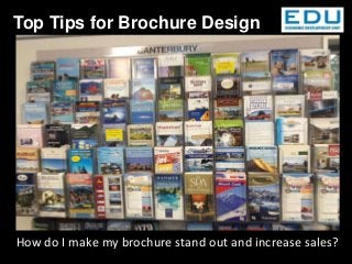
  • 2. Christchurch i-SITE – a “sea” of brochures
  • 3. South Island/ Dunedin brochures at Christchurch i- SITE BROCHURE EXERCISE: ← Christchurch i-Site Brochure Display • Which brochure would you pick up? • Why do you think it leaps out at you? • Can you tell what each brochure is selling? • What one do you think is the best & why? • Why not visit our i-Site and do this test with the brochures there (and your own?)
  • 4. New Plymouth i-SITE Lots of brochure competition Anything leap out of the ‘sea’?
  • 5. The Top Third – what catches your eye?
  • 6. 1. Business name in the top third of the front cover (and location i.e. Dunedin). 2. Use high quality images; ensure your hero image is large. 3. Have a very clear message about your Key Selling Point(s). 4. List key benefits to reader e.g. “view 7 species wildlife, money back guarantee”… 5. Show Awards, Quality marks or other “stamps of approval”. Ensure industry recognised and current 6. Have ALL your contact details, incl website 7. Include details of times and lengths of tours. 8. Map of NZ/Dunedin and your location. 9. Don‟t clutter your brochure layout. 10. Prices and expiry dates (decide the life of your brochure before you include prices). Top Ten Tips
  • 7. 1. Make it easy for customers to buy – have a “call to action”. 2. Put a PDF of your brochure on your website 3. Ensure your brochure fits your brand (as does all your material) 4. Go to printer when they print your brochure – check it as it comes off the press. 5. Less is more – use large readable printing 6. Go to the i-Site; look at brochures on display. What works? What leaps out at you? 7. Add in services: café, toilets, money exchange, gift shop etc 8. Include special conditions (take walking boots, lunch, camera..) fitness levels etc 9. Distribution is key! Ensure you carefully think about where your brochure will be on display – i-Sites, etc. Have a budget for this. 10.DLE is industry standard size. Odd sizes incur extra display costs etc. Consider deviation carefully! *Don’t forget to use the Dunedin brand, find logos at http://www.dunedinbrand.co.nz/Photos/Logos.aspx Ten More Tips
  • 8. Our one sentence “Key Selling Message” is ................................... LEARNING Upon reading our brochure the majority of visitors will: e.g. be able to find us 1... 2... 3... EMOTIONAL Visitors will feel: e.g. I’m excited, I can’t miss this 1. -“...” 2. -“...” 3. -“...” BEHAVIOURAL Key Objectives . Visitors will: e.g. buy, share, visit, eat. 1. . 2. . 3. . Brochure objectives
  • 9. Are your target markets?:  Families on holiday with young children  Families on holiday with older children and teens  Families from the local community (high return visits)  Overseas visitors  Older visitors (retired or with no children in the household)  Retired individuals coming to your site by bus (coach tours)  General tourists/Cruise coming to your site by coach tour  School groups  Visitors with special hobbies or interests (wildlife watching, hiking, skiing, visiting historic homes, etc.  Special groups or tours – VIPs, Conferences, Weddings… Who is your target Market?
  • 10. Think about What photos to use in the brochure (you should have photos of the kinds of market groups that you are trying to attract E.g. wealthy middle aged) Photos we should use: How you distribute your brochures Good to have a separate plan for this Places to have our brochures: What kinds of services, events, or activities these market groups may be looking for? E.g. fine wine and food Brainstorm list of events/activities/ Services: e.g. wheelchair route, high tea, .... Understanding your market mix Helps you to identify:
  • 11. First Impressions - The Cover :  Can you tell within 5-10 seconds what the subject of this brochure (attraction/experience) is?  Can you tell within 5-10 seconds who the intended market group(s) is?  Can you tell within 5-10 seconds what the site "offers" the visitor or market group?  Does the brochure header/design provoke attention or interest?  Does the leaflet give you a general „this looks interesting!‟ feeling?  Does there appear to be "benefits" to the market group - reasons to pick up and look at the brochure in more detail (open it up)?
  • 12. First impressions Can you tell within 5-10 seconds for these brochures  Subject?  Market Group?  Offers?  Attention?  Is it interesting?  Benefits?
  • 14. Checklist:  Are the objectives of the brochure clear (to you and the audience)?  What information do you want your market groups to learn?  How do you want them to feel about your site or attraction?  What do you want the market group to do as a result of reading your brochure?  Does the publication have a clear theme or central marketing message?  Is your target audience clearly defined (who is in the pictures you are using)?  How will you distribute your publication (this affects design, paperweight, etc.)?  Distribution via brochure rack? Remember that in most cases only the top 1/3 of the brochure will show  Distributed by a third party? Planning
  • 15.  Pre-test draft brochures with test groups (some of your current visitors)  Do response evaluation of your current brochures -is it working – are people visiting and spending?  Do audience observations at dispersal points  Analysis by an expert  Other evaluation methods… surveys etc  Line up your brochure with your competitor‟s brochures - does your brochure „leap‟ from the sea?? How to evaluate success of your brochure? (know that your stated objectives are being accomplished)
  • 16. Point Size: the size of type you are using for your brochure. General rule = use as large a point size as you can. Edit your copy to get it to fit with a larger type. Get examples of brochures to learn from  What point size are you using - can you easily read the copy? (Without your reading glasses!!)  Is the point size used for your brochure appropriate for the target audience (i.e. if it is too small, older visitors may have trouble reading it)? Font: the way the text letters look. E.g. this text is "Times New Roman". This is Algerian. This is Vivaldi You want to select the right font to go with the correct message illustration.  Is the font easy to read?  Would you want the total text in your chosen font?  Does it support the theme(old fonts -historic brochures, modern fonts -science museums)?  Are a variety of fonts used (and why)?  What colour should the font be printed in - do I need to have text in colours? Brochure Folds: How you want your brochure folded. Consider: Is the design best suited for open (no folds) or multiple folds (like a road map)? For larger publications, can the user easily re-fold the publication? Is the fold part of the overall "design" - help define topic areas? Design considerations
  • 17.  Does the paper type used support the message/theme of the brochure?  What colour paper should you use?  What paper weight will you use? This has an impact if your brochure will be used in a brochure rack NB light/cheaper paper can lead to “bendy brochures” which won‟t display well.  Does your type of paper support your brochures intended use?  Non glare for most outdoor use  Heavier weight paper for outdoor use (won't bend or blow easily in the wind)  Lighter papers for mail outs or bulk mailings  Does the brochure use unique or interesting die cuts to attract or focus the potential visitor‟s attention? Die cuts are an expensive brochure treatment, but can add to the "attraction power" of the piece. What kind of paper should you use? Consider:
  • 18.  Is the copy written in short - provocative paragraphs?  Does the copy address information that the visitors will need to or want to know?  Can the visitors easily find the key information points?  Is the copy written in an "interpretive" manner (provoke, relate, and reveal information)?  Is the copy written using active - colourful language?  Does it properly prepare the potential visitor for the "promised" experiences (are there restrooms, children's play areas, food services, etc.)?  the copy "get to the point"?  Does the copy use colour text appropriately?  Is the copy written in a simple - non-technical language? about 10-12-year-old level  If technical terms are used, are they illustrated or defined?  Are larger/bolder paragraph or topic headers used to help reader find key points?  Does the copy have "white space" around it?  Is it written in an "editorial" or "speaking" style?  Does it "leave the reader asking for more"? Text/Copy Use Check your spelling!
  • 19. Photo Composition - important things to consider include:  Who is in the photo (market groups)?  What are the people in the photo doing? (Having fun in a safe and stewardship-like manner?)  How do "non-visitor" composition photos help you accomplish your objectives (why do you have photos with no people in them?) Sometimes "no people in the photos" might work. When trying to control "numbers" of visitors, or market is "getting away from people" experience  Will you need colour photos, or will black & white do?  Will the photos you selected "date you" if they are not updated regularly?  Do the photos clearly illustrate the strengths of the site or facility?  Do the photos clearly identify the site or facility? People remember: 10% of what they hear; 30% of what they read; 50% of what they see; 90% of what they do. • A picture is worth a 1,000 words. Pre-test pictures for brochures, ...... it could be the WRONG 1,000 words! • One really good - large photo is better than lots of small ones. Photos
  • 20. Things to consider when using graphics:  Do support graphics clearly illustrate the theme, story or concepts?  Are graphics simple and easy to understand?  Is the use of a graphic here better than the use of a photograph?  What size graphics should be used (look at objectives)?  Is the graphic "visual information" market appropriate (will the user understand and correctly interpret what they are seeing)? Sometimes a graphic works better than a photo, and can give a better "interpretation" of the site or facility. Getting Graphic
  • 21. Does the brochure...  have attraction power and holding power?  layout clean, simple, but yet powerful?  clear as to the intent of the publication?  Can user easily FIND needed information?  Have the BEST photos or graphics selected (and pre-tested)?  Do photos clearly illustrate the strengths of the site or attraction?  Will the user be "inspired and motivated" to visit the site or attraction?  Do photos clearly illustrate the intended market group(s) you want to attract?  Can the user get the message mostly through visuals without having to read too much copy?  Does layout support the theme and objectives of the brochure?  Has draft layout been pre-tested to see if "visitors like it" as much as the person who designed it?  Is there "white space" to give the user visual breathing space?  Has the best type size and font, best paper size, colour, texture, and weight been considered?  Has the right design been used for the intended distribution and presentation method?  What shows on the top 1/3 of your brochure? Checklist:
  • 22.  Have you given me, the potential visitor, a reason to pick the brochure up?  Is your site or attraction "for me"? Can I clearly identify the target market group(s) your site is intended for?  Can I list three benefits I (my family) will gain by visiting the attraction (three reasons I should visit you)?  Are there photos with "people in them" that I can relate to?  Do the photos illustrate the benefits I will gain by visiting the site/attraction?  Are there clear directions as to how to find the site?  Is there a usable map with landmarks I can look for (most visitors can't read typical road maps)?  Have you given me an overview of customer services available?  I don't like to read - is the text short, provocative, interesting?  I can't read text printed over graphics! You try it!  I can't read text that is too small and don't like to look at "little" photos  Is there a creative design to get my attention?  In general, have you taken the "risk" out of the visit to your site or facility (I feel certain that I will get my money and time's worth from visiting you)? Checklist from your customer‟s view
  • 23. Questions, business advice, support or feedback ? We are here to help you: Sophie Barker, Visitor Industry Advisor, DCC, 474 3457 sbarker@dcc.govt.nz (business support, advocacy and destination management). http://www.dunedin.govt.nz/services/business-support/support-for-industries-and-across-otago/tourism Louise Van de Vlierd, i-Site, 474 3300 lvandevl@dcc.govt.nz (Brochure display, i-Site support and sales) Tourism Dunedin info@tourismdunedin.co.nz (Marketing Dunedin support)