Unconventional wisdom: Putting the WHY Before the WHAT of Presentation Design

This is my second slide deck on presentation design and is designed to complement (and overlap a bit) my first: Data Visualization and Information Design: One Learner's Perspective. This one is in answer to the many questions I've been getting: How do you know this stuff and where did you learn it, and WHY are there all these new rules? Enjoy! Since I can't embed fonts on my Mac, I had to convert to pdf. Here are the links that are no longer live in the presentation: Slide 23: http://sethgodin.typepad.com/seths_blog/2011/10/the-atomic-powerpoint-method-of-creating-a-presentation.html Slide 71: http://www.perceptualedge.com http://www.perceptualedge.com/files/GraphDesignIQ.html http://www.perceptualedge.com/examples.php Slide 72: http://www.garrreynolds.com http://www.garrreynolds.com/preso-tips/design/ http://www.garrreynolds.com/resources/ Slide 73: http://p2i.eval.org http://p2i.eval.org/index.php/slide-design-guidelines/ Slide 74: http://stephanieevergreen.com http://emeryevaluation.com http://www.storytellingwithdata.com

Recomendados
Recomendados
Mais conteúdo relacionado
Mais procurados
Mais procurados (20)
Destaque
Semelhante a Unconventional wisdom: Putting the WHY Before the WHAT of Presentation Design
Semelhante a Unconventional wisdom: Putting the WHY Before the WHAT of Presentation Design (20)
Último
Último (20)
Unconventional wisdom: Putting the WHY Before the WHAT of Presentation Design
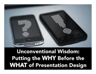
- 1. Unconventional Wisdom: Putting the WHY Before the WHAT of Presentation Design
- 2. It doesn't matter what you do, it matters WHY you do it. Simon Sinek
- 3. This is a presentation for educators by an educator.
- 4. What I have to share about presentation design isn’t NEW, …but it IS new to many educators.
- 5. WHY And educators like to know the WHY WHY these strategies work we should change too the “rules” have changed WHY
- 6. (Drum roll please…) It’s based on what we know informs good teaching!
- 7. Here is some of what I’ve learned, along with insights from those who taught me to think differently about presentations.
- 8. Designing by the “new rules” is a culture-changer for educators.
- 9. WHY? • Because teachers (not unlike other people) like to TEACH. • We like to EXPLAIN, to SUMMARIZE, and to PARAPHRASE. • We like using a lot of WORDS, we like to READ, and we like our audiences to READ. • We like people to LISTEN to us, and we’re used to having a captive audience for a limited TIME, so we tend to try to get in as much information as possible. • We also like to be CREATIVE, and use PICTURES and COLOR to illustrate our key points. • It’s no wonder our slides look like this!
- 10. Here’s the thing… …It just doesn’t work.
- 11. WHY?
- 12. READING UNDERSTANDING INTERPRETING LISTENING SEEING IT’S “BATTLE OF THE SUBSKILLS!” PROCESSING
- 13. And most of us just can’t do it all at once!
- 14. WHY the big disconnect?
- 15. People speak about 110-160 words per minute
- 16. But we can read about 200-300 words per minute
- 17. Education… revolve[s] around non- sales selling: the ability to influence, to persuade, and to change behavior while striking a balance between what others want and what you can provide them. Daniel Pink, To Sell is Human Daniel Pink
- 18. So, education involves influencing, persuading, and changing behavior…
- 20. So, presenting is educating! That’s a syllogism! (I knew that junior high English class would come in handy someday!)
- 21. And what do we know from good teaching that makes sense in presentation design?
- 22. “Chunking” = breaking complex information into manageable pieces
- 23. Hence, just 1 idea per slide! For more info, see Seth Godin’s “Atomic Powerpoint Method”
- 24. And with just 1 idea per slide, who needs these?
- 25. No matter where we work or learn, we must endure the blatherings of people who anesthetize us with bullet points and then, in the dark of the conference room, steal our souls and bake them into 3-D pie charts. Daniel Pink
- 26. OUCH!
- 27. People need engaging visuals with time built in to process information chunks.
- 28. WHY?
- 29. The audience will either read your slides or listen to you. They will not do both.
- 30. So, ask yourself this: is it more important that they listen, or more effective if they read? Nancy Duarte
- 31. Our short-term and working memory are limited.
- 32. We can hold only 4-7 bits of information at a time.
- 33. Too much information at once and our brains get confused.
- 34. WHY?
- 36. We learn better when we can build on what we already understand – our existing “schemas” or prior knowledge.
- 37. Education, or helping others to learn, is built on a foundation of good communication.
- 38. Communication is about getting others to adopt your point of view, to help them understand why you’re excited (or sad, or optimistic, or whatever else you are).
- 39. If all you want to do is create a file of facts and figures, then cancel the meeting and send in a report. Seth Godin
- 40. WORDS belong in memos. Powerpoint is for ideas. I’m just dying to add “Silly Rabbit…” on top of this quote! Seth Godin
- 41. Slides are slides. Documents are documents. They aren’t the same thing. Attempts to merge them result in what I call …
- 43. Beware the SLIDEUMENT! • This is a slideument. A slideument features too much text, and too many bullet points. It may also include graphs and pictures. • If a presenter has this slide on the screen, and reads it to the audience, most people will finish reading before the presenter finishes, and then tune out. • If the presenter doesn’t read the slide, but just talks about the topic, the audience will likely read the slide and not listen to the presenter. • Go ahead (you know you want to) – experiment! • Time yourself! Read this slide silently at your normal reading speed. • Then, go back and time yourself reading it out loud at a normal ”presentation” pace. It’s OK if your family laughs while you do this. • You read faster than you speak, don’t you? • I tried this and found I read almost twice as fast as I speak. • Oh, and this font is now way too small for a slide.
- 44. Slides ≠ Handouts
- 45. Create these… 1
- 46. Create these… …then these! 1 2
- 47. Create these… …then these! Show these! 1 2 3
- 48. Create these… …then these! Show these! Hand out these! 1 2 3 4
- 49. Like this: And pleeeeease…. no printing Your slides will be full of images with very little text, so no need for these, right?
- 50. Like this: And pleeeeease…. no printing Or this: Your slides will be full of images with very little text, so no need for these, right? And if you need to distribute reading material, you’ve created separate handouts.
- 51. Make slides that reinforce your words, not repeat them. Godin wrote this in 2003! TWO…THOU…SAND…THREE!!! Seth Godin
- 52. What if your slides include graphs? By the way, this is an “image quilt” aka the absolute coolest new thing! Check outhttp://imagedataquilts.com/
- 53. To visualize data effectively, we must follow design principles that are derived from an understanding of human perception. Stephen Few
- 54. So, it’s not just about slides or graphs looking pretty.
- 56. The interior decoration of graphics generates a lot of ink that does not tell the viewer anything new…
- 57. …The purpose of decoration varies — to make the graphic appear more scientific and precise, to enliven the display, to give the designer an opportunity to exercise artistic skills.
- 58. …Regardless of its cause, it is all non-data-ink or redundant data-ink, and it is often chartjunk. Edward Tufte
- 59. And there’s a whole lotta chartjunk goin’ on here! Same or different values? Can you tell? Same or differentvalues? Can you tell? What’s the value of this bar? (Your fingers are on the screen tracing the gridline right now, aren’t they?) Ticky-tacky tick marks. How do they help us here?
- 60. Here’s how I share a graph with multiple elements. It’s one step at a time using “the slow reveal”
- 61. 4.20 4.60 4.40 5.00 3.92 4.46 4.38 4.50 4.33 4.64 4.52 4.59 3.50 3.67 3.67 3.67 Time Application Quality Facilitation Scores by Subgroup Here’s the whole graph. Of course, there is some contextual info missing. If I show this to the audience just like this, they’ll spend their mental energy processing the information and not listening to me!
- 62. 4.20 4.60 4.40 5.00 3.92 4.46 4.38 4.50 4.33 4.64 4.52 4.59 3.50 3.67 3.67 3.67 Time Application Quality Facilitation Scores by Subgroup Here’s the slide I show first. My low-tech secret? There’s a white box hiding the rest of the graph!
- 63. 4.20 4.60 DO 4.40 DO 5.00 3.92 4.46 TL 4.38 TL 4.50 4.33 4.64 SB 4.52 SB 4.59 3.50 3.67 Blank 3.67 Blank 3.67 Time Application Quality Facilitation Scores by Subgroup Here’s the next part. I just shrink the white box to reveal the next segment of the graph.
- 64. 4.20 4.60 4.40 DO 5.00 3.92 4.46 4.38 TL 4.50 4.33 4.64 4.52 SB 4.59 3.50 3.67 3.67 Blank 3.67 Time Application Quality Facilitation Scores by Subgroup Here we go again!
- 65. 4.20 4.60 4.40 5.00 3.92 4.46 4.38 4.50 4.33 4.64 4.52 4.59 3.50 3.67 3.67 3.67 Time Application Quality Facilitation Scores by Subgroup Finally, here’s the whole graph! The audience has now had a chance to read and process each bit, and as the presenter, I was able to talk about each segment one at a time.
- 66. So, where did I learn all this? And WHY? Well, there’s really not much good stuff on TV these days… {sigh}
- 67. As emerging disciplines [information graphics and visualization]…are a hodge-podge of concepts, methods, and procedures borrowed from many areas: the principles of map design…guidelines on how to better display data on a chart… rules on best practices for the use of type, layout, and color palettes…principles of writing style…and more… Alberto Cairo
- 68. It’s all thanks to some great thinkers and leaders whose work I’ve read and studied.
- 69. And many, many articles and blog posts, along with online and face-to- face courses. Tools of the trade Water Supplies Books
- 70. More importantly… …where can YOU learn it?
- 71. Visit perceptual edge 1.) take the Graph Design I.Q. Quiz 2.) Click on Examples to see poorly constructed charts, Few’s analysis, and solutions. Stephen Few
- 72. Visit Garr Reynolds 1.) Study his Top Ten Slide Tips 2.) Check out Resources for recommended books. Garr Reynolds
- 73. Check out the American Evaluation Association’s Potent Presentations 1.) Download and read Slide Design Guidelines AEA
- 74. For even more on Data Visualization & Information Design Visit & read blogs at: Evergreen Data Emery Evaluation Storytelling with Data Stephanie Evergreen Ann Emery Cole Nussbaumer
- 75. WHY So, now you know the WHY WHY these strategies work we should change too the “rules” have changed WHY
- 76. WHY And should YOU take the time to learn more?
- 77. LEARNING never exhausts the mind. -Leonardo da Vinci
- 78. Image credits: Via Flickr: Opensourceway Cea carlaarena Suss Wanslink Dena Flows Dewitahs Send me adrift DaveonFlickr HJ Media Studios yewenli mrdarkroom jc-pics seng1011 caniswolfie Rich Renomeron Retrogasm Soy of the North Kris Krug Davide Restivo cubicgarden epSos.de ziagazou76 DoodleDeMoon verbeeldingskr8 paul bica pasukaru76 CC Chapman TEDxKyoto wasabicube kharied Mirka23 Mr. Nightshade Matthew T Rader Andreas_MB Maryam (one bored chica) seanbonner Lachian Hardy mrsdohpaz Medialab Prado Mark Brannan cogdoglbog Anirudh Koul Other images via: Wikimedia commons