Social Media: Tracking your reach and measuring against objectives
2016 FWM Analytics Poster
1. A Case Study on Clean Energy Outreach
Using Analytics to Improve your Market
Moses Ifamose
NC Clean Energy Technology
Center
Results
• So far, we have used analytics to update our contacts list. We have removed dead
email addresses and have updated old ones. This has given us a higher open rate
with our newsletters and emails meaning that more people now have access to our
outreach.
• With Twitter being our most successful social media outlet, we have focused more
on Twitter outreach to get the word out to as many people as people. We are also
considering doing more Twitter events for future campaigns.
• The Fuel What Matters campaign will soon get a reboot and when this happens, we
will know exactly where to concentrate our efforts and where to make
improvements.
Fuel What Matters
• I have decided to focus on a case study to demonstrate the various features that
analytics offer. For the case study, I will discuss the Fuel What Matters campaign,
launched by the NC Clean Energy Technology Center in the summer of 2015.
• Fuel What Matters is a statewide public education media campaign that aims to
connect North Carolina residents and fleets with resources and information to make
informed choices about how they use transportation.
• Several media outlets were used to market the Fuel What Matters campaign. These
include radio and television spots, Twitter, Facebook, Instagram, Newsletters and
public events.
• We used different analytics to keep track of how people were responding to the
campaign on different sites. Google analytics was used to monitor the behavior of
viewers on our website, Twitter analytics was used to keep track of our hashtags
and Twitter posts and we used the analytics function on iContacts to monitor the
reach of our newsletters and emails.
Google Analytics
• Google analytics provides you with very important and interesting information about
your website that can help you develop a marketing strategy that will work for you.
• Google analytics allows you to know what social media websites are working better
for you. Whether it’s Facebook, Twitter, Instagram or another website, Google
analytics keeps track of how people find you and this allows you to determine which
websites work best for your type of business.
• Image 1 shows the analytics of our Fuel What Matters website. It shows which part
of the website received the most views. This lets you know which page is the most
popular and which page needs more work.
Newsletter Analytics
• The newsletter is an important part of an organization and it can help other
organizations recognize who you are.
• Websites like Constant Contact, iContact and MailChimp allow you to create
newsletters, contacts lists and boiler plate emails.
• iContacts was used for the Fuel What Matters campaign. It allows you to keep
track of the open and bounce rates of your emails and newsletters. This allows you
to know which contact groups are the most responsive.
• Image 2 is the analytics for a newsletter that we sent out. It shows how many
people received the newsletter and what percentage of those people actually
opened it. It shows how many emails bounced and what percentage of people
clicked on links in the newsletter.
Social Media Analytics
• Twitter, Facebook, Wordpress and even Youtube are great ways to connect with
fans and interested people and they also provide analytics that allow you to see
which social media outlet works best for your organization.
• Twitter and Instagram were the two major social media outlets that we used for this
campaign. The Twitter analytics showed us how effective our hashtags and posts
were and this allowed us to know what was working and what needed
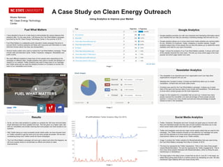
improvement. Below is an image of our Twitter analytic.
• Image 3 contains the Twitter analytics for #fuelwhatmatters that was used during
the Fuel What Matters campaign from May to October of 2015.
• The blue line represents the Twitter impressions. That is how many times people
viewed #fuelwhatmatters. The red line represents the Twitter engagements. That is
how many times people interacted with #fuelwhatmatters, either by liking the post,
mentioning it or retweeting it.
• The large spike in the data is from a tweet that we did on June 29. In the tweet, we
talked about giving away $100 to a random person for retweeting our post. We also
mentioned Cape Hatteras NPS and Great Smoky NPS.
Image 3
Image 2
Image 1