SlideShare uma empresa Scribd logo
1 de 11
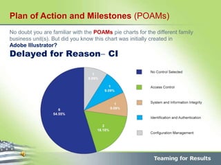
No doubt you are familiar with the POAMs pie charts for the different family
business unit(s). But did you know this chart was initially created in
Adobe Illustrator?
Delayed for Reason CI
Plan of Action and Milestones (POAMs)
• WHY copy data created in an Excel
file into an Adobe Illustrator
format?
• WHY not create your pie charts
in PowerPoint or even Excel?
 Because, IF YOU LIKE THE clean lines, color, etc., this is simply not always
possible when creating pie charts in EXCEL or PowerPoint.
CRISP, to the point, but not…
This was created in Adobe Illustrator
Graphs let you communicate statistical information in a visual way.
In Adobe Illustrator, you can create
nine different types of graphs and customize them to suit your needs.
This is a basic Adobe Illustrator pie chart, but how was it created?
Please follow along…
Where do we start in Adobe Illustrator
1 Copy your EXCEL DATA into an Adobe Illustrator file
Security Control Family CI
Certification & Accreditation 2 1.72%
Media Protection 2 1.72%
System and Information Integrity 3 2.59%
System and Communication Protection 4 3.45%
Identification & Authentication 5 4.31%
Contingency Planning 6 5.17%
Audit & Accountability 8 6.90%
Access Control 10 8.62%
Configuration Management 12 10.34%
No Control Selected 64 55.17%
116
Where do we start in Adobe Illustrator
2 BUT HOW? Open a new Adobe Illustrator file then:
SELECT A GRAPH TOOL.
The tool you use initially determines the type
of graph Illustrator generates;
Define the dimensions of the graph in any of
the following ways:
 Drag diagonally from the corner
where you want the graph to begin to
the opposite corner. Alt-drag
(Windows) to draw the graph from its
center. Hold down Shift to constrain
the graph to a square.
Where do we start in Adobe Illustrator
3 Select a graph tool (continued)
Click where you want to create the graph. Enter
a width and height for the graph, and click OK.
 Note: The dimensions you define are for
the main body of the graph and do not
encompass the graph’s labels and legend.
Where do we start in Adobe Illustrator
4
Select a graph tool (continued)
Enter data for your EXCEL data and paste into the
GRAPH DATA WINDOW.
Click the Apply button, or press the Enter key on
the numeric keypad to create the graph.
The Graph Data window stays open until you close
it. This allows you to easily switch between editing
graph data and working on the artboard.
Graph data window
A. Entry text box B. Import data C. Transpose row/column D. Switch x/y E. Cell style F. Revert G. Apply
Where do we start in Adobe Illustrator
5
Select a graph tool (continued)
Your Excel Data is now part of Adobe Illustrator
Click the Apply button or
press the Enter key on the
numeric keypad to regenerate
the graph.
You now have a Adobe Illustrator pie chart
6 Note: Once your Adobe Illustrator pie chart with labels have been
created, please save the file as a .jpeg, .png, and insert into
PowerPoint.
Delayed for ReasonCI, etc.
Of course there is no need to reinvent the
wheel… Once you’ve created a pie chart in
Adobe Illustrator, just simply copy your new
data from your Excel document and hit apply!

Mais conteúdo relacionado

Mais procurados

Creating a graph in excel
Creating a graph in excelCreating a graph in excel
Creating a graph in excelorthms
 
Figure 1.8
Figure 1.8Figure 1.8
Figure 1.8L H
 
Making a Chart Using Excel
Making a Chart Using ExcelMaking a Chart Using Excel
Making a Chart Using Excelrebelbrindley
 
Lesson 16 Working With Charts
Lesson 16   Working With ChartsLesson 16   Working With Charts
Lesson 16 Working With Chartsguevarra_2000
 
KPI Dashboard For HR Recruitment Process
KPI Dashboard For HR Recruitment ProcessKPI Dashboard For HR Recruitment Process
KPI Dashboard For HR Recruitment ProcessSlideTeam
 
Graphing Using Excel Part Ii 2008 Finished
Graphing Using Excel Part Ii 2008 FinishedGraphing Using Excel Part Ii 2008 Finished
Graphing Using Excel Part Ii 2008 FinishedStephanie
 
Quality Control KPI Dashboard Showing Defects And Downtime
Quality Control KPI Dashboard Showing Defects And DowntimeQuality Control KPI Dashboard Showing Defects And Downtime
Quality Control KPI Dashboard Showing Defects And DowntimeSlideTeam
 
Hr Dashboard Number Of Employees Employee Structure
Hr Dashboard Number Of Employees Employee StructureHr Dashboard Number Of Employees Employee Structure
Hr Dashboard Number Of Employees Employee StructureSlideTeam
 
Calculating a correlation coefficient and scatter plot using excel
Calculating a correlation coefficient and scatter plot using excelCalculating a correlation coefficient and scatter plot using excel
Calculating a correlation coefficient and scatter plot using excelSandra Nicks
 
Financial Performance KPI Dashboard Showing Gross Profit Margin Sales Growth ...
Financial Performance KPI Dashboard Showing Gross Profit Margin Sales Growth ...Financial Performance KPI Dashboard Showing Gross Profit Margin Sales Growth ...
Financial Performance KPI Dashboard Showing Gross Profit Margin Sales Growth ...SlideTeam
 
Hr Dashboard Recruitment Performance Key Metrics
Hr Dashboard Recruitment Performance Key MetricsHr Dashboard Recruitment Performance Key Metrics
Hr Dashboard Recruitment Performance Key MetricsSlideTeam
 
Digital Analytics Bar Graph Line Chart
Digital Analytics Bar Graph Line ChartDigital Analytics Bar Graph Line Chart
Digital Analytics Bar Graph Line ChartSlideTeam
 
How to use pivot table
How to use pivot tableHow to use pivot table
How to use pivot tableDennis Saren
 
How to Insert a Graph into Microsoft Excel 2007
How to Insert a Graph into Microsoft Excel 2007How to Insert a Graph into Microsoft Excel 2007
How to Insert a Graph into Microsoft Excel 2007nfasano
 
Creating graphs in excel
Creating graphs in excelCreating graphs in excel
Creating graphs in excelclynnc
 
Making an xy scatter plot
Making an xy scatter plotMaking an xy scatter plot
Making an xy scatter plotilanasaxe
 
Making Charts in Excel
Making Charts in ExcelMaking Charts in Excel
Making Charts in Excelcronegeek
 

Mais procurados (20)

Creating a graph in excel
Creating a graph in excelCreating a graph in excel
Creating a graph in excel
 
Figure 1.8
Figure 1.8Figure 1.8
Figure 1.8
 
Making a Chart Using Excel
Making a Chart Using ExcelMaking a Chart Using Excel
Making a Chart Using Excel
 
Lesson 16 Working With Charts
Lesson 16   Working With ChartsLesson 16   Working With Charts
Lesson 16 Working With Charts
 
KPI Dashboard For HR Recruitment Process
KPI Dashboard For HR Recruitment ProcessKPI Dashboard For HR Recruitment Process
KPI Dashboard For HR Recruitment Process
 
Graphing Using Excel Part Ii 2008 Finished
Graphing Using Excel Part Ii 2008 FinishedGraphing Using Excel Part Ii 2008 Finished
Graphing Using Excel Part Ii 2008 Finished
 
Quality Control KPI Dashboard Showing Defects And Downtime
Quality Control KPI Dashboard Showing Defects And DowntimeQuality Control KPI Dashboard Showing Defects And Downtime
Quality Control KPI Dashboard Showing Defects And Downtime
 
Hr Dashboard Number Of Employees Employee Structure
Hr Dashboard Number Of Employees Employee StructureHr Dashboard Number Of Employees Employee Structure
Hr Dashboard Number Of Employees Employee Structure
 
Calculating a correlation coefficient and scatter plot using excel
Calculating a correlation coefficient and scatter plot using excelCalculating a correlation coefficient and scatter plot using excel
Calculating a correlation coefficient and scatter plot using excel
 
Karan Goyal
Karan GoyalKaran Goyal
Karan Goyal
 
Financial Performance KPI Dashboard Showing Gross Profit Margin Sales Growth ...
Financial Performance KPI Dashboard Showing Gross Profit Margin Sales Growth ...Financial Performance KPI Dashboard Showing Gross Profit Margin Sales Growth ...
Financial Performance KPI Dashboard Showing Gross Profit Margin Sales Growth ...
 
Hr Dashboard Recruitment Performance Key Metrics
Hr Dashboard Recruitment Performance Key MetricsHr Dashboard Recruitment Performance Key Metrics
Hr Dashboard Recruitment Performance Key Metrics
 
Digital Analytics Bar Graph Line Chart
Digital Analytics Bar Graph Line ChartDigital Analytics Bar Graph Line Chart
Digital Analytics Bar Graph Line Chart
 
How to use pivot table
How to use pivot tableHow to use pivot table
How to use pivot table
 
How to Insert a Graph into Microsoft Excel 2007
How to Insert a Graph into Microsoft Excel 2007How to Insert a Graph into Microsoft Excel 2007
How to Insert a Graph into Microsoft Excel 2007
 
Creating graphs in excel
Creating graphs in excelCreating graphs in excel
Creating graphs in excel
 
Print16
Print16Print16
Print16
 
Creating a chart in Excel
Creating a chart in Excel Creating a chart in Excel
Creating a chart in Excel
 
Making an xy scatter plot
Making an xy scatter plotMaking an xy scatter plot
Making an xy scatter plot
 
Making Charts in Excel
Making Charts in ExcelMaking Charts in Excel
Making Charts in Excel
 

Semelhante a Create Pie Charts in Adobe Illustrator

Creating and editing spreadsheets
Creating and editing spreadsheetsCreating and editing spreadsheets
Creating and editing spreadsheetscrystalpullen
 
Creating and Editing Spreadsheets.pdf
Creating and Editing Spreadsheets.pdfCreating and Editing Spreadsheets.pdf
Creating and Editing Spreadsheets.pdfyogeshkute7
 
Basics-of-microsoft-office-and-nudi-presentation-at-ATI-Mysore-by-Mohan-Kumar-G
Basics-of-microsoft-office-and-nudi-presentation-at-ATI-Mysore-by-Mohan-Kumar-GBasics-of-microsoft-office-and-nudi-presentation-at-ATI-Mysore-by-Mohan-Kumar-G
Basics-of-microsoft-office-and-nudi-presentation-at-ATI-Mysore-by-Mohan-Kumar-GMohan Kumar G
 
READING ASSIGNMENTEach element of your project must be submitted.docx
READING ASSIGNMENTEach element of your project must be submitted.docxREADING ASSIGNMENTEach element of your project must be submitted.docx
READING ASSIGNMENTEach element of your project must be submitted.docxsedgar5
 
5 Hacks to create awesome Presentations
5 Hacks to create awesome Presentations5 Hacks to create awesome Presentations
5 Hacks to create awesome Presentations3sharad
 
THE DATA GEEKHere’s the perfect infographic template.docx
THE DATA GEEKHere’s the perfect infographic template.docxTHE DATA GEEKHere’s the perfect infographic template.docx
THE DATA GEEKHere’s the perfect infographic template.docxarnoldmeredith47041
 
$5 COUPON LINK - Excel Udemy Course: Excel with Excel Dynamic Graphs, Dashboa...
$5 COUPON LINK - Excel Udemy Course: Excel with Excel Dynamic Graphs, Dashboa...$5 COUPON LINK - Excel Udemy Course: Excel with Excel Dynamic Graphs, Dashboa...
$5 COUPON LINK - Excel Udemy Course: Excel with Excel Dynamic Graphs, Dashboa...mellontraining
 
InDesign CS5 Tutorial
InDesign CS5 TutorialInDesign CS5 Tutorial
InDesign CS5 TutorialZaxapias
 
Creating & Editing Charts In Microsoft Excel 2003
Creating & Editing Charts In Microsoft Excel 2003Creating & Editing Charts In Microsoft Excel 2003
Creating & Editing Charts In Microsoft Excel 2003bud_00
 
How to-create-5-fabulous-infographics-final
How to-create-5-fabulous-infographics-finalHow to-create-5-fabulous-infographics-final
How to-create-5-fabulous-infographics-finalVanitha Pillay
 
Microsoft office power_point_2007_tutorial
Microsoft office power_point_2007_tutorialMicrosoft office power_point_2007_tutorial
Microsoft office power_point_2007_tutorialMizuhashi Yuki
 
Smart view instructions_2_7_14
Smart view instructions_2_7_14Smart view instructions_2_7_14
Smart view instructions_2_7_14Sabyasachi Srimany
 
Tableau online training || Tableau Server
Tableau online training || Tableau ServerTableau online training || Tableau Server
Tableau online training || Tableau ServerUnited Trainings
 

Semelhante a Create Pie Charts in Adobe Illustrator (20)

Creating and editing spreadsheets
Creating and editing spreadsheetsCreating and editing spreadsheets
Creating and editing spreadsheets
 
Creating and Editing Spreadsheets.pdf
Creating and Editing Spreadsheets.pdfCreating and Editing Spreadsheets.pdf
Creating and Editing Spreadsheets.pdf
 
Group 3 how to create tables, figures and equations
Group 3   how to create tables, figures and equationsGroup 3   how to create tables, figures and equations
Group 3 how to create tables, figures and equations
 
Basics-of-microsoft-office-and-nudi-presentation-at-ATI-Mysore-by-Mohan-Kumar-G
Basics-of-microsoft-office-and-nudi-presentation-at-ATI-Mysore-by-Mohan-Kumar-GBasics-of-microsoft-office-and-nudi-presentation-at-ATI-Mysore-by-Mohan-Kumar-G
Basics-of-microsoft-office-and-nudi-presentation-at-ATI-Mysore-by-Mohan-Kumar-G
 
READING ASSIGNMENTEach element of your project must be submitted.docx
READING ASSIGNMENTEach element of your project must be submitted.docxREADING ASSIGNMENTEach element of your project must be submitted.docx
READING ASSIGNMENTEach element of your project must be submitted.docx
 
5 Hacks to create awesome Presentations
5 Hacks to create awesome Presentations5 Hacks to create awesome Presentations
5 Hacks to create awesome Presentations
 
Microsoft Excel 101
Microsoft Excel 101Microsoft Excel 101
Microsoft Excel 101
 
THE DATA GEEKHere’s the perfect infographic template.docx
THE DATA GEEKHere’s the perfect infographic template.docxTHE DATA GEEKHere’s the perfect infographic template.docx
THE DATA GEEKHere’s the perfect infographic template.docx
 
Office session7
Office session7Office session7
Office session7
 
$5 COUPON LINK - Excel Udemy Course: Excel with Excel Dynamic Graphs, Dashboa...
$5 COUPON LINK - Excel Udemy Course: Excel with Excel Dynamic Graphs, Dashboa...$5 COUPON LINK - Excel Udemy Course: Excel with Excel Dynamic Graphs, Dashboa...
$5 COUPON LINK - Excel Udemy Course: Excel with Excel Dynamic Graphs, Dashboa...
 
InDesign CS5 Tutorial
InDesign CS5 TutorialInDesign CS5 Tutorial
InDesign CS5 Tutorial
 
Creating & Editing Charts In Microsoft Excel 2003
Creating & Editing Charts In Microsoft Excel 2003Creating & Editing Charts In Microsoft Excel 2003
Creating & Editing Charts In Microsoft Excel 2003
 
Lecture eight
Lecture eightLecture eight
Lecture eight
 
Microsoft excel
Microsoft excelMicrosoft excel
Microsoft excel
 
MS Excel 2010 tutorial 6
MS Excel 2010 tutorial 6MS Excel 2010 tutorial 6
MS Excel 2010 tutorial 6
 
How to-create-5-fabulous-infographics-final
How to-create-5-fabulous-infographics-finalHow to-create-5-fabulous-infographics-final
How to-create-5-fabulous-infographics-final
 
Microsoft office power_point_2007_tutorial
Microsoft office power_point_2007_tutorialMicrosoft office power_point_2007_tutorial
Microsoft office power_point_2007_tutorial
 
Smart view instructions_2_7_14
Smart view instructions_2_7_14Smart view instructions_2_7_14
Smart view instructions_2_7_14
 
Connect With Customers: and Office 2013 Tips and Tricks
Connect With Customers: and Office 2013 Tips and TricksConnect With Customers: and Office 2013 Tips and Tricks
Connect With Customers: and Office 2013 Tips and Tricks
 
Tableau online training || Tableau Server
Tableau online training || Tableau ServerTableau online training || Tableau Server
Tableau online training || Tableau Server
 

Create Pie Charts in Adobe Illustrator

  • 1. No doubt you are familiar with the POAMs pie charts for the different family business unit(s). But did you know this chart was initially created in Adobe Illustrator? Delayed for Reason CI Plan of Action and Milestones (POAMs)
  • 2. • WHY copy data created in an Excel file into an Adobe Illustrator format? • WHY not create your pie charts in PowerPoint or even Excel?
  • 3.  Because, IF YOU LIKE THE clean lines, color, etc., this is simply not always possible when creating pie charts in EXCEL or PowerPoint. CRISP, to the point, but not…
  • 4. This was created in Adobe Illustrator Graphs let you communicate statistical information in a visual way. In Adobe Illustrator, you can create nine different types of graphs and customize them to suit your needs. This is a basic Adobe Illustrator pie chart, but how was it created? Please follow along…
  • 5. Where do we start in Adobe Illustrator 1 Copy your EXCEL DATA into an Adobe Illustrator file Security Control Family CI Certification & Accreditation 2 1.72% Media Protection 2 1.72% System and Information Integrity 3 2.59% System and Communication Protection 4 3.45% Identification & Authentication 5 4.31% Contingency Planning 6 5.17% Audit & Accountability 8 6.90% Access Control 10 8.62% Configuration Management 12 10.34% No Control Selected 64 55.17% 116
  • 6. Where do we start in Adobe Illustrator 2 BUT HOW? Open a new Adobe Illustrator file then: SELECT A GRAPH TOOL. The tool you use initially determines the type of graph Illustrator generates; Define the dimensions of the graph in any of the following ways:  Drag diagonally from the corner where you want the graph to begin to the opposite corner. Alt-drag (Windows) to draw the graph from its center. Hold down Shift to constrain the graph to a square.
  • 7. Where do we start in Adobe Illustrator 3 Select a graph tool (continued) Click where you want to create the graph. Enter a width and height for the graph, and click OK.  Note: The dimensions you define are for the main body of the graph and do not encompass the graph’s labels and legend.
  • 8. Where do we start in Adobe Illustrator 4 Select a graph tool (continued) Enter data for your EXCEL data and paste into the GRAPH DATA WINDOW. Click the Apply button, or press the Enter key on the numeric keypad to create the graph. The Graph Data window stays open until you close it. This allows you to easily switch between editing graph data and working on the artboard. Graph data window A. Entry text box B. Import data C. Transpose row/column D. Switch x/y E. Cell style F. Revert G. Apply
  • 9. Where do we start in Adobe Illustrator 5 Select a graph tool (continued) Your Excel Data is now part of Adobe Illustrator Click the Apply button or press the Enter key on the numeric keypad to regenerate the graph.
  • 10. You now have a Adobe Illustrator pie chart 6 Note: Once your Adobe Illustrator pie chart with labels have been created, please save the file as a .jpeg, .png, and insert into PowerPoint.
  • 11. Delayed for ReasonCI, etc. Of course there is no need to reinvent the wheel… Once you’ve created a pie chart in Adobe Illustrator, just simply copy your new data from your Excel document and hit apply!

Notas do Editor

  1. Since POAMs data has already been compiled in an Excel sheet from information received via TAF(s) documents, there is no need to create data in Adobe Illustrator