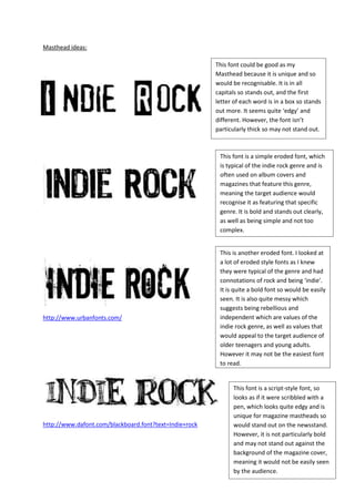
SlideShare a Scribd company logo
1 of 2
Masthead ideas:

                                                        This font could be good as my
                                                        Masthead because it is unique and so
                                                        would be recognisable. It is in all
                                                        capitals so stands out, and the first
                                                        letter of each word is in a box so stands
                                                        out more. It seems quite ‘edgy’ and
                                                        different. However, the font isn’t
                                                        particularly thick so may not stand out.


                                                         This font is a simple eroded font, which
                                                         is typical of the indie rock genre and is
                                                         often used on album covers and
                                                         magazines that feature this genre,
                                                         meaning the target audience would
                                                         recognise it as featuring that specific
                                                         genre. It is bold and stands out clearly,
                                                         as well as being simple and not too
                                                         complex.


                                                         This is another eroded font. I looked at
                                                         a lot of eroded style fonts as I knew
                                                         they were typical of the genre and had
                                                         connotations of rock and being ‘indie’.
                                                         It is quite a bold font so would be easily
                                                         seen. It is also quite messy which
                                                         suggests being rebellious and
http://www.urbanfonts.com/                               independent which are values of the
                                                         indie rock genre, as well as values that
                                                         would appeal to the target audience of
                                                         older teenagers and young adults.
                                                         However it may not be the easiest font
                                                         to read.


                                                              This font is a script-style font, so
                                                              looks as if it were scribbled with a
                                                              pen, which looks quite edgy and is
                                                              unique for magazine mastheads so
http://www.dafont.com/blackboard.font?text=Indie+rock         would stand out on the newsstand.
                                                              However, it is not particularly bold
                                                              and may not stand out against the
                                                              background of the magazine cover,
                                                              meaning it would not be easily seen
                                                              by the audience.
This is another font that looks as if
                                                         it were written with a pen. It is like
                                                         a doodle, or a scribble which
                                                         suggests it’s laid back, informal
                                                         mode of address and would appeal
                                                         to the predominantly teenaged
http://www.dafont.com/riot.font?text=Indie+rock
                                                         target audience.


                                                         This font is also eroded and very
                                                         bold, so would stand out and have
                                                         an impact. It’s also simple so would
                                                         easily be spotted and recognised by
                                                         the magazine’s target audience,
http://www.dafont.com/harris-wear.font?text=Indie+rock   whilst easily being seen amongst the
                                                         other magazines on the stands.


                                                                The lines around this font made
                                                                it seem different and unique, as
                                                                well as highlighting the
                                                                masthead which I think is
                                                                important as the masthead also
http://www.dafont.com/-top-secret.font?text=Indie_rock          clearly displays the genre of the
                                                                magazine and so will draw the
                                                                target audience to it.

More Related Content

What's hot

Macabees nme dps analysis
Macabees nme dps analysisMacabees nme dps analysis
Macabees nme dps analysisjessiekeegan
 
Ancillary stages (better2)
Ancillary stages (better2)Ancillary stages (better2)
Ancillary stages (better2)laurencelees94
 
Macabees nme dps analysis
Macabees nme dps analysisMacabees nme dps analysis
Macabees nme dps analysisjessiekeegan
 
Fonts and Book Cover Research and Designs
Fonts and Book Cover Research and DesignsFonts and Book Cover Research and Designs
Fonts and Book Cover Research and DesignsDanielle Hulmes
 
Contents page analysis
Contents page analysisContents page analysis
Contents page analysisshackeliadavis
 
Artist logos/ typeface
Artist logos/ typefaceArtist logos/ typeface
Artist logos/ typefacebavickery
 
Robin hood cartoon strips 1
Robin hood cartoon strips 1Robin hood cartoon strips 1
Robin hood cartoon strips 1year5thepines
 
Production log for fmp
Production log for fmpProduction log for fmp
Production log for fmpcassie_coyne
 
Production log for fmp
Production log for fmpProduction log for fmp
Production log for fmpcassie_coyne
 
Double page spread analysis
Double page spread analysisDouble page spread analysis
Double page spread analysisemilystott_
 
Digipak and Album cover analysis
Digipak and Album cover analysisDigipak and Album cover analysis
Digipak and Album cover analysisbavickery
 
Magazine Planning
Magazine PlanningMagazine Planning
Magazine PlanningEllie Marsh
 
Magazine contents page2
Magazine contents page2Magazine contents page2
Magazine contents page2UmaiyaKhawaja
 
Guitar World DPS
Guitar World DPSGuitar World DPS
Guitar World DPSErosV
 

What's hot (20)

Macabees nme dps analysis
Macabees nme dps analysisMacabees nme dps analysis
Macabees nme dps analysis
 
Drafts front cover
Drafts  front coverDrafts  front cover
Drafts front cover
 
Ancillary stages (better2)
Ancillary stages (better2)Ancillary stages (better2)
Ancillary stages (better2)
 
Macabees nme dps analysis
Macabees nme dps analysisMacabees nme dps analysis
Macabees nme dps analysis
 
Fonts and Book Cover Research and Designs
Fonts and Book Cover Research and DesignsFonts and Book Cover Research and Designs
Fonts and Book Cover Research and Designs
 
Med18
Med18Med18
Med18
 
Contents page analysis
Contents page analysisContents page analysis
Contents page analysis
 
Artist logos/ typeface
Artist logos/ typefaceArtist logos/ typeface
Artist logos/ typeface
 
Robin hood cartoon strips 1
Robin hood cartoon strips 1Robin hood cartoon strips 1
Robin hood cartoon strips 1
 
Fonts
Fonts Fonts
Fonts
 
Production log for fmp
Production log for fmpProduction log for fmp
Production log for fmp
 
Production log for fmp
Production log for fmpProduction log for fmp
Production log for fmp
 
Double page spread analysis
Double page spread analysisDouble page spread analysis
Double page spread analysis
 
Digipak and Album cover analysis
Digipak and Album cover analysisDigipak and Album cover analysis
Digipak and Album cover analysis
 
Ancillary stages
Ancillary stages Ancillary stages
Ancillary stages
 
Eval 1
Eval 1Eval 1
Eval 1
 
Magazine Planning
Magazine PlanningMagazine Planning
Magazine Planning
 
Magazine contents page2
Magazine contents page2Magazine contents page2
Magazine contents page2
 
Conventions
ConventionsConventions
Conventions
 
Guitar World DPS
Guitar World DPSGuitar World DPS
Guitar World DPS
 

Viewers also liked

Shaw school hall 0802-06B
Shaw school hall 0802-06BShaw school hall 0802-06B
Shaw school hall 0802-06Bpaul yerbury
 
Интеграция разработки и продвижения. Как не ошибиться там, где ошибается 95% ...
Интеграция разработки и продвижения. Как не ошибиться там, где ошибается 95% ...Интеграция разработки и продвижения. Как не ошибиться там, где ошибается 95% ...
Интеграция разработки и продвижения. Как не ошибиться там, где ошибается 95% ...borovoystudio
 
English ii presentation
English ii presentationEnglish ii presentation
English ii presentationHarwinder Girn
 
Dreamwaver2222222222222
Dreamwaver2222222222222Dreamwaver2222222222222
Dreamwaver2222222222222Jose David
 
ACERCAMIENTO TEÓRICO A LOS PROCESOS DE ADQUISICIÓN DEL LENGUAJE DE UNA NIÑA E...
ACERCAMIENTO TEÓRICO A LOS PROCESOS DE ADQUISICIÓN DEL LENGUAJE DE UNA NIÑA E...ACERCAMIENTO TEÓRICO A LOS PROCESOS DE ADQUISICIÓN DEL LENGUAJE DE UNA NIÑA E...
ACERCAMIENTO TEÓRICO A LOS PROCESOS DE ADQUISICIÓN DEL LENGUAJE DE UNA NIÑA E...Cristián Ele
 
people who i admire....
people who i admire....people who i admire....
people who i admire....Kelita Chagua
 
Entrepreneurship.
Entrepreneurship.Entrepreneurship.
Entrepreneurship.Nada Nasr
 
Road construction equipment.pptx 2
Road construction equipment.pptx 2Road construction equipment.pptx 2
Road construction equipment.pptx 2AhmedZL
 
Tuem
TuemTuem
TuemTUEM
 
Humber College Post Cert
Humber College Post CertHumber College Post Cert
Humber College Post CertLiza Karimzad
 

Viewers also liked (20)

Homework
HomeworkHomework
Homework
 
Aulas de madrugada
Aulas de madrugadaAulas de madrugada
Aulas de madrugada
 
Shaw school hall 0802-06B
Shaw school hall 0802-06BShaw school hall 0802-06B
Shaw school hall 0802-06B
 
Final project summary
Final project summaryFinal project summary
Final project summary
 
Интеграция разработки и продвижения. Как не ошибиться там, где ошибается 95% ...
Интеграция разработки и продвижения. Как не ошибиться там, где ошибается 95% ...Интеграция разработки и продвижения. Как не ошибиться там, где ошибается 95% ...
Интеграция разработки и продвижения. Как не ошибиться там, где ошибается 95% ...
 
Catalogo hinode
Catalogo hinodeCatalogo hinode
Catalogo hinode
 
English ii presentation
English ii presentationEnglish ii presentation
English ii presentation
 
Dreamwaver2222222222222
Dreamwaver2222222222222Dreamwaver2222222222222
Dreamwaver2222222222222
 
Bhagavad gita according to gandhi chapter 11
Bhagavad gita according to gandhi chapter 11Bhagavad gita according to gandhi chapter 11
Bhagavad gita according to gandhi chapter 11
 
ACERCAMIENTO TEÓRICO A LOS PROCESOS DE ADQUISICIÓN DEL LENGUAJE DE UNA NIÑA E...
ACERCAMIENTO TEÓRICO A LOS PROCESOS DE ADQUISICIÓN DEL LENGUAJE DE UNA NIÑA E...ACERCAMIENTO TEÓRICO A LOS PROCESOS DE ADQUISICIÓN DEL LENGUAJE DE UNA NIÑA E...
ACERCAMIENTO TEÓRICO A LOS PROCESOS DE ADQUISICIÓN DEL LENGUAJE DE UNA NIÑA E...
 
Sesion 05 analisis interno
Sesion 05 analisis internoSesion 05 analisis interno
Sesion 05 analisis interno
 
people who i admire....
people who i admire....people who i admire....
people who i admire....
 
Entrepreneurship.
Entrepreneurship.Entrepreneurship.
Entrepreneurship.
 
UDHR Article 16
UDHR  Article 16UDHR  Article 16
UDHR Article 16
 
Tarea power point
Tarea power pointTarea power point
Tarea power point
 
V D - ZG - VECSP 16
V D - ZG - VECSP 16V D - ZG - VECSP 16
V D - ZG - VECSP 16
 
Caligrafia
CaligrafiaCaligrafia
Caligrafia
 
Road construction equipment.pptx 2
Road construction equipment.pptx 2Road construction equipment.pptx 2
Road construction equipment.pptx 2
 
Tuem
TuemTuem
Tuem
 
Humber College Post Cert
Humber College Post CertHumber College Post Cert
Humber College Post Cert
 

Similar to Masthead planning

Lady gaga rollingstone analysis
Lady gaga rollingstone analysisLady gaga rollingstone analysis
Lady gaga rollingstone analysisSianLynes
 
Magazine cover analysis_adele
Magazine cover analysis_adeleMagazine cover analysis_adele
Magazine cover analysis_adeleRyanDenner
 
Front Cover Analysis
Front Cover AnalysisFront Cover Analysis
Front Cover Analysisasmediac12
 
My front cover analysis
My front cover analysisMy front cover analysis
My front cover analysismacblakey
 
Logo Experimentation
Logo ExperimentationLogo Experimentation
Logo ExperimentationWS200017
 
Lady gaga rollingstone analysis
Lady gaga rollingstone analysisLady gaga rollingstone analysis
Lady gaga rollingstone analysisSianLynes
 
Magazine cover analysis_adele
Magazine cover analysis_adeleMagazine cover analysis_adele
Magazine cover analysis_adeleRyanDenner
 
Macabees nme dps analysis
Macabees nme dps analysisMacabees nme dps analysis
Macabees nme dps analysisjessiekeegan
 
As media coursework evaluation
As media coursework evaluationAs media coursework evaluation
As media coursework evaluation06esmith
 
As media coursework evaluation
As media coursework evaluationAs media coursework evaluation
As media coursework evaluation06esmith
 
Magazine cover analysis kerrang!
Magazine cover analysis   kerrang!Magazine cover analysis   kerrang!
Magazine cover analysis kerrang!cherellelouise
 

Similar to Masthead planning (20)

Font Analysis
Font AnalysisFont Analysis
Font Analysis
 
Lady gaga rollingstone analysis
Lady gaga rollingstone analysisLady gaga rollingstone analysis
Lady gaga rollingstone analysis
 
Magazine cover analysis_adele
Magazine cover analysis_adeleMagazine cover analysis_adele
Magazine cover analysis_adele
 
Double page sprea1
Double page sprea1Double page sprea1
Double page sprea1
 
Magaine analysis2 q
Magaine analysis2 qMagaine analysis2 q
Magaine analysis2 q
 
Front Cover Analysis
Front Cover AnalysisFront Cover Analysis
Front Cover Analysis
 
My front cover analysis
My front cover analysisMy front cover analysis
My front cover analysis
 
Logo Experimentation
Logo ExperimentationLogo Experimentation
Logo Experimentation
 
Media Question 5
Media Question 5 Media Question 5
Media Question 5
 
Lady gaga rollingstone analysis
Lady gaga rollingstone analysisLady gaga rollingstone analysis
Lady gaga rollingstone analysis
 
Magazine cover analysis_adele
Magazine cover analysis_adeleMagazine cover analysis_adele
Magazine cover analysis_adele
 
Evaluation Q5
Evaluation Q5Evaluation Q5
Evaluation Q5
 
Magazine Analysis
Magazine AnalysisMagazine Analysis
Magazine Analysis
 
Magazine Analysis
Magazine AnalysisMagazine Analysis
Magazine Analysis
 
Coursewrok (analysis)
Coursewrok (analysis)Coursewrok (analysis)
Coursewrok (analysis)
 
Macabees nme dps analysis
Macabees nme dps analysisMacabees nme dps analysis
Macabees nme dps analysis
 
As media coursework evaluation
As media coursework evaluationAs media coursework evaluation
As media coursework evaluation
 
As media coursework evaluation
As media coursework evaluationAs media coursework evaluation
As media coursework evaluation
 
Magazine cover analysis kerrang!
Magazine cover analysis   kerrang!Magazine cover analysis   kerrang!
Magazine cover analysis kerrang!
 
Usher vibe
Usher vibeUsher vibe
Usher vibe
 

More from Katieee17

Dps screenshots
Dps screenshotsDps screenshots
Dps screenshotsKatieee17
 
Front cover screenshots
Front cover screenshotsFront cover screenshots
Front cover screenshotsKatieee17
 
Own magaine flat plan
Own magaine flat planOwn magaine flat plan
Own magaine flat planKatieee17
 
Readership profile
Readership profileReadership profile
Readership profileKatieee17
 
Final masthead ideas
Final masthead ideasFinal masthead ideas
Final masthead ideasKatieee17
 
Analysis of audience questionnaire results
Analysis of audience questionnaire resultsAnalysis of audience questionnaire results
Analysis of audience questionnaire resultsKatieee17
 
College magazine questionnaire
College magazine questionnaireCollege magazine questionnaire
College magazine questionnaireKatieee17
 
Evaluation of college magazine
Evaluation of college magazineEvaluation of college magazine
Evaluation of college magazineKatieee17
 

More from Katieee17 (8)

Dps screenshots
Dps screenshotsDps screenshots
Dps screenshots
 
Front cover screenshots
Front cover screenshotsFront cover screenshots
Front cover screenshots
 
Own magaine flat plan
Own magaine flat planOwn magaine flat plan
Own magaine flat plan
 
Readership profile
Readership profileReadership profile
Readership profile
 
Final masthead ideas
Final masthead ideasFinal masthead ideas
Final masthead ideas
 
Analysis of audience questionnaire results
Analysis of audience questionnaire resultsAnalysis of audience questionnaire results
Analysis of audience questionnaire results
 
College magazine questionnaire
College magazine questionnaireCollege magazine questionnaire
College magazine questionnaire
 
Evaluation of college magazine
Evaluation of college magazineEvaluation of college magazine
Evaluation of college magazine
 

Masthead planning

  • 1. Masthead ideas: This font could be good as my Masthead because it is unique and so would be recognisable. It is in all capitals so stands out, and the first letter of each word is in a box so stands out more. It seems quite ‘edgy’ and different. However, the font isn’t particularly thick so may not stand out. This font is a simple eroded font, which is typical of the indie rock genre and is often used on album covers and magazines that feature this genre, meaning the target audience would recognise it as featuring that specific genre. It is bold and stands out clearly, as well as being simple and not too complex. This is another eroded font. I looked at a lot of eroded style fonts as I knew they were typical of the genre and had connotations of rock and being ‘indie’. It is quite a bold font so would be easily seen. It is also quite messy which suggests being rebellious and http://www.urbanfonts.com/ independent which are values of the indie rock genre, as well as values that would appeal to the target audience of older teenagers and young adults. However it may not be the easiest font to read. This font is a script-style font, so looks as if it were scribbled with a pen, which looks quite edgy and is unique for magazine mastheads so http://www.dafont.com/blackboard.font?text=Indie+rock would stand out on the newsstand. However, it is not particularly bold and may not stand out against the background of the magazine cover, meaning it would not be easily seen by the audience.
  • 2. This is another font that looks as if it were written with a pen. It is like a doodle, or a scribble which suggests it’s laid back, informal mode of address and would appeal to the predominantly teenaged http://www.dafont.com/riot.font?text=Indie+rock target audience. This font is also eroded and very bold, so would stand out and have an impact. It’s also simple so would easily be spotted and recognised by the magazine’s target audience, http://www.dafont.com/harris-wear.font?text=Indie+rock whilst easily being seen amongst the other magazines on the stands. The lines around this font made it seem different and unique, as well as highlighting the masthead which I think is important as the masthead also http://www.dafont.com/-top-secret.font?text=Indie_rock clearly displays the genre of the magazine and so will draw the target audience to it.