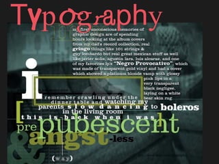
Typography
•Download as PPT, PDF•
5 likes•1,822 views

Everything a designer ought to know about type, its anatomy, and its history.

Recommended
More Related Content
What's hot
What's hot (20)
Similar to Typography
Similar to Typography (20)
More from Kaitlin Hanger, Ph.D.
More from Kaitlin Hanger, Ph.D. (20)
Recently uploaded
Recently uploaded (20)
Typography
- 2. Typography The art of selecting or arranging type; using type in graphic design to obtain bang-up effects . . .
- 4. Other issues to think about when using type… How much text is there to read? Is the project to be skimmed or really be read(Are you designing for a poster, a book, a report? What is more important – readability or aesthetics?) What is the stylistic purpose of the text? (A serious look, a casual look, a decorative look?) How much space do you need to fill? Or leave unfilled? (Different typefaces take up different amounts of space, even at the same point size.) Think about integral unity with the rest of your design. (Imagine the body copy as blocks of gray, not just words.)
- 5. Typography • Typography is concerned with the style of type or font used for the text in print media • Different fonts suggest different contexts and ideas • Good graphic design matches style to meaning or message
- 6. Before Gutenberg, various civilizations had developed a variety of alphabets and methods for writing which influenced moveable type. . . Typography has a history…
- 7. . The first letterpress fonts imitated the illuminated manuscripts of monks. . Typographers have ever since been developing new typefaces for improved elegance & readability. Printing Press (not an electric chair) . Johannes Gutenburg developed movable type c. 1440 making books available to the masses.
- 8. Pre-pre-digital technology was ultra- manual. Typemakers poured their own lead to make type that would be set by hand. A compositor set each letter of each word of each
- 10. TYPEFACES We describe the size of type in points and picas, not inches. There are approximately 12 points to a pica and 6 picas to an inch. 10 12 16 20 24 32 36 48 60 80
- 12. Points and Picas While fonts are measured in points, PAGES are measured in picas (column width). 12 points = 1 pica 6 picas = 1 inch Type Traits Kerning: space between characters Leading: space between lines of type Tracking: space between words+characters (how a line of text is spaced out at the PARAGRAPH level)
- 13. Type Terms
- 14. KerningKerning The designer’s most neglected attribute of type: the space between letters. Typefaces are optimally designed for print uses and readability, but different uses, such as display text (headlines, subheadings, logos, call-outs, etc.) call for fine-tuning the kerning. Lower-end (unpurchased) typefaces not from a foundry have fewer rules built into the font file to correct the kerning as point size increases or decreases.
- 15. The way some letters fit together adds more or less negative space. Your eye is the best judge as to what looks best, and each typeface has different kerning needs. Paying attention to these small details is a quick and easy way to add that extra bit of professionalism to your presentation. Kerning…Kerning
- 19. • Complementary colors are dynamic and full of movement – good for logos, interior design • Contrasting colors give emphasis & have high impact • Harmonious colors [also called ‘analogous’] can create a serene, warm, peaceful or romantic mood Fonts & ColorFonts & Color
- 20. Preparation: Layout tips • Keep it simple • Create a hierarchy of information from most to least important • Make sure the type is readable • Generally, don’t use more than 2-3 fonts • Align text carefully • Keep text in blocks and balance it with graphics: see the text as simple gray shapes
- 21. Readability •Your eye takes in comfortably 40 characters in a single line of type. •Colors are made up of screen or half-tone combinations. Colors can become “pixelated” and hard to read. •Avoid use of TOO many fonts (style clutter). •Serif fonts are easier to read than sans serif in body copy, but work well in headlines. •Roman (normal) is easier to read than italic or bold. •Upper and lower case is easier to read than all caps. Reserve all caps for SHORT headings or emphasis. •Eye path and economy of images/styles enhances readability.
- 22. Typography LINKS: Check it Out * About Illustrator Type Tools * Getting Started * Text Warping in Illustrator * Step-by-Step Illustrator Type Tutorials * Photoshop and Illustrator Type Tutorials * Distressing Type in Photoshop Looking for an interesting font to download? Try DaFont.com (Thanks to Danny Barry in section FH for suggesting this resource.)