SlideShare uma empresa Scribd logo
1 de 27
Baixar para ler offline
Creating a Comic Book
From Conception to Completion
John Patrick Garcia
John Patrick Garcia
ID#@0025778
MART 697 Field Project
Creating a Comic Book
From Conception to Completion
Commitee
Chairperson Kerry Loewen
Discipline Member Conor Peterson
Outside Member David Lobdell
Oral Defense Date 12/11/2014
Table of Contents
Conceptualization 04
A Goal-Based Approach 04
The essentials 05
Hardware/Software 05
before the panels 06
celtx program 06
concept art 07
set design 08
character development 09
thumbnail layouts 11
page layout 13
inking/black levels 15
grayscale 16
painting with transparency 16
Textures and overlays 17
color correction 19
formatting 20
printing 21
influences 22
presentation 26
Creating a comic book
has been a project that I
have been considering for
many years. I have spent
much of my academic
and professional career
developing the skills and
work ethic necessary to
complete such a time-
consuming endeavor. All of
the aspects of my media arts
background have in some
way prepared me for my first
attempt at creating a full
color comic book.
From the fundamentals
of drawing, to the
camera angles found in
cinematography, from
storyboarding
The entire process, despite
requiring a relatively small
number of resources, is
much more involved than
a few casual evenings of
doodling in a sketchbook.
The purpose of this paper is
to describe the steps I took in
my personal approach.
A Goal-Based
approach
layouts and screenwriting,
to graphic design and
typography, this project
has tested all of my
accumulated design skills.
Of course, a comic author
could spend as much
money as desired on
computers, printing, drawing
tablets, and art supplies. But
in the end, the bare material
necessities for creating a
comic book are a box of
pencils, a stack of paper,
and basic graphics editing
software.
This paper will discuss both
the content of my book, as
well as the method behind
its creation
CoNCEPTUALIZATION
Besides the obvious goal of
‘completing a comic book’,
it is a good idea to establish
a set of timely goals and
reasons for creating a book in
the first place.
My decision to create a
comic book came from a
desire to tell an ongoing
story that would continue
to evolve with myself as
an artist. Having complete
creative control over my story
was an appealing idea. With
very little need for access to
expensive equipment and
resources, I would be able to
create my book in any vision
that I could manage to put
down on paper.
Money and commercial
success are never
guaranteed in the comics
and graphic novel field.
However, no one is sucessful
in writing comic books
who didn’t first write an
actual comic book. Thus,
a lateral goal of mine is to
produce a book that can
be commercially viable, or
to at least begin the journey
towards creating books that
will sell.
the essentials
Here is a description of the
materials that I used to
create my book.
Throughout the course of my
project I have used over 50
#2 HB pencils. I bought very
inexpensive school grade
pencils. I did not need the
wide variety of drawing
pencils used in other forms
of pencil art. I did not need
the subtle hardness and
shades that I have used in
life-drawing and fine-art
settings.
I utilized white plastic
erasers. They were perfect
for removing marks from
a smooth surface, without
damaging the paper like
pink erasers.
For ruling pages, I used a
common T-square, and also
a 90 degree metal L-ruler.
Other straight lines were
created with a common
school ruler. A compass was
used for perfect arcs and
circles.
The paper I used was a 100lb
cold press paper. I procured
this paper from a thrift store.
What would have cost me
$200 in an art store, I was
lucky enough to obtain for
under $20.
Other accessories included
electric and manual pencil
sharpeners, a brush to
remove eraser and pencil
shavings, razor blades, and
other standard drawing and
graphic design tools.
hardware and software
I made use of common graphics processing software during
the entire process. Desktop applications have made it
possible to complete the work of multiple artists in a fraction of
the time.
I utilized a 14 megapixel snapshot camera to digitize my
drawings. Natural sunlight, and a careful angle proved to
be somewhat quicker than using a flatbed scanner. The
difference in quality is negligible for my purposes. I would be
surprised if anyone could tell which pages I scanned and
which I photographed.
I used Photoshop to import, format, ink, and paint the images.
I also utilized the text funtions for my lettering. I downloaded a
copyright/royalty-free font called “Evil Genius” in .TTF format
(This font is also used in the section headers of this paper).
I used Indesign’s booklet printing capablilties to format and
prepare double-sided layouts of my comic book. I hope to
make professionally printed copies of my book in the near
future.
I wrote the script for my book in a free version of Celtx.
My personal laptop, with built-in screen stylus sensitivity proved
extremely convenient when it came time to ink and paint
the pages. When stationed at a powerful desktop, I made
extensive use of a basic Wacom tablet and stylus.
before the
Comic Panels
I worked from a screenplay
that I had written prior to this
project. It quickly became
apparent that each page
of my screenplay equated
to roughly one page in my
comic book.
My screeplay was over 100
pages long. I decided to
create the opening scene
of my screenplay as a ‘first
issue’ of my comic book
version.
This particular scene works as
a short story which would be
enough material for a comic
book between 32 and 40
pages.
I made revisions in dialogue,
pacing, and other aspects as
I converted the screenplay
to a comic book script.
From here, I was able to
begin the preliminary work.
This involved creating
conceptual designs. I made
early drawings for characters
and settings involved in my
story. This was the stage
where I experimented with
different drawings and
designs.
Using my conceptual
drawings as models, I
attempted to keep a
continuity in the appearance
of characters, objects and
settings.
Celtx utilized in a comic
Not specifically designed with comic books in mind, the free
screenwriting software,Celtx, proved to be a useful tool in
the production of Fiddik. The standard screenwriting format
is very easy to follow, and it lends itself to being interpreted
into a graphic novel/comicbook format.
There are modules in Celtx which allow an author to create
character and setting biography profiles. I used this function
to keep track of important information regarding characters,
settings, and other plot information. There is even an option
for uploading image files to character profiles. I found Celtx
to be a helpful way to keep track of key elements in my
story.
Perhaps there are software suites that may be specifically
tailored for comic books, and I am interested in researching
them. However, these sort of softwares are simply
organizational tools, not necessary to the overall process.
Many authors have no need to keep such detailed notes,
or if they do keep notes, a paper filing system is more than
adequate.
It is recommended that authors keep some sort of reference
file in relation to their own stories. It can be difficult to keep
numerous story elements consistent, especially in longer,
serial comic books.
Concept art
Perhaps one of the most
enjoyable stages of creating
a comic book is the
conceptual design phase.
Here is where the artist is free
to sketch ideas without too
many restrictions.
Of course, I worked from
notes I had written prior,
and from the screenplay
itself. Character treatments
in text form gave me all of
the information necessary to
visualize and draw my major
subjects.
Settings and locations are
also sketched out at this
point.
I had envisioned my story
taking place in a science
fiction setting. I wanted it to
be a stylized cartoon, set in a
very colorful world.
My characters would mostly
be anthropomorphized
animals and robots.
Many of the characters
would be bipedal Reptilians.
Jimador, the protagonist,
like all Reptilians in the
Fiddik setting, is born into
a life of servitude.
The story takes place in
a Reptilian egg hatchery
located on a small planet
called Ophidia 3.
Here is where thousands
of worker reptiles are
born, raised, and
indoctrinated in the ways
of the Order of Draco, a
fictional cult..
Each Hachery is home to
a ‘Mother Reptile’ who
is attended by dozens of
lesser Reptilians. These
bipedal workers make
sure to nourish, sedate,
and protect the Mother.
She is enslaved, with the
sole task of producing
more and more Reptilian
offspring.
In designing these
characters, I studied
many examples of
sauropod, lizards and
reptiles. I decided on a
simple design, which I
could easily draw dozens
of times in a small amount
of time.
Other influences included
descriptions of extra
terrestrial Reptilians as
found in David Icke’s
conspiracy theory
books “The Perception
Deception” and “Children
of the Matrix”.
Egyptian motifs and styles
reinforce the “Ancient
Astronaut” themes while
contrasting with the
cartoon style of drawings.
As for the architecture in the reptilian
facilities, I have gone with a mix of
biomechanical shapes and egyptian
motifs. I wanted a fantasy/sci-fi style of
architecture that might appear as if it
were a living entity itself.
In a later section of this paper, I will
describe the methods of texture
mapping that I used to create certain
visual cues that reinforce the ‘reptilian’
theme throughtout the comic book.
One concept that plays a central theme
is the mechanism which facilitates
the whole Reptilian birthing process.
The ‘Birthing Machine’ is a network
of automated chutes, tubes, and
escalators that deliver nutrients, sperm,
and mind control serum to various parts
of the Hatchery.
Biomechanical and steampunk elements
can be found peppered throughout the
book. Influences range from the works of
surrealist H.R. Giger to Sci-Fi painter Ralph
McQuarry.
Pneumatic Tubes, assembly lines,
catwalks, incinerators, force-feeding
machines, sedation devices, and
artificial inseminators all paint the picture
of a regimented, oppresive Reptilian
society.
This is all in contrast with the presentation
of mamallian characters, who are
portrayed as warm, simple, honest family
folk.
The colors of the settings were chosen in
a classic expressionist manner, to convey
the emotion present in the current
scene. Blues, purples, and greens were
used to convey mystery and otherworldy
feelings. Reds and bowns
were used in moments of violence or
death. Greens were used in moments of
calm, safety.
Set Design
Character Development
The characters behave as
if in a fable, but with more
anthropomorphic overtones.
My story involves a theme
which pits cold-blooded
creatures against warm-
blooded creatures. In this
story a family of mole-people
have been enslaved by
the reptilians a forced into
servitude.
The story begins with the
birth of a newborn Reptilian.
Unlucky circumstances brings
the young reptile, Jimador to
be cast out of the reptilian
brood. A chance encounter
with the kind Father Mole
takes Jimador beyond
the walls of the reptilian
Hatchery.
The story serves as
introduction to a few main
characters, sets the stage,
and opens the story up to
further episodic material.
The Reptilians are depicted
as cold, single-minded,
and ruthless subjects. They
are fanatically driven to
reproduce their collective
and create dominon over
the warmblooded animals,
who they use as slaves and a
food supply.
Jimador was somehow
different than his reptile
siblings. He was born with a
softer, kinder, more curious
nature than his mindless
brothers.
Although helpless through the
entire story, circumstances
take Jimador to the homes of
the mammalian Mole Family.
This sets the stage for
future events which will pit
Jimador’s Reptilian instincts
against the vallues he learns
from his warm-blooded
friends.
I consulted the books of
Joseph Campbell and
Christopher Vogler while
I created characters and
settings. “The Hero With
a Thousand Faces”, and
“The Writer’s Journey” are
excellent reference books for
mythical adventure stories.
Both are consulted in top
Hollywood Blockbusters
ranging from Star Wars to The
Lion King.
I created a simple plot
structure for my story. The
intent was to introduce
my character, Jimador T.
Reptile, in a very intimate
way. Rather than focusing on
a grander plot, I decided to
create a detailed prologue
that would be used as a
starting point for broader
story arcs.
This entire project
was exploration and
experimentation for further
Fiddik stories.
Indeed, Jimador’s birth takes
place over the course of half
the pages in the issue.
A helpless, imobile
protagonist can be a tricky
subject to work with. In order
to progress the story I used
a series of coincidental
and circumstantial events
to force calamity upon
newborn baby Jimador. Of
course, using gravity, a series
of coveyor belts, chutes, and
tubes helped to propel my
character forward, against
his own will.
Strangely enough, Jimador is
born with a fairly developed 	
			
sense of being. While
unable to communicate
with others, he is somehow
able to form fully
articulated thoughts from
within his soft, transparent
eggshell.
There is a less discussed
protagonist archetype in
many new fictional works.
“Hero Type” characters
are as old as society
itself. There is no need to
describe the vast pantheon
of heroes in historic
literature.
More recently, Anti-heroes
have become popular
in literature. For these
archetypes, the lines
between good and evil are
blurred. One man’s hero
could be another man’s
villian. Popular examples
include George Lucas’
work in Star Wars (Anakin/
Vader) or Vince Gilligan’s
Breaking Bad (Walter
White/Heisenberg).
Even more uncommon in
pop culture are examples
of Hero-less stories.
Many cultures are not so
enthusiastic about the Hero
Figure. A deep mistrust has
been seeded towards those
that are labeld as heroes.
Historically, there are many
people, originally touted
as social saviors who
ultimately become tyranical
sociopaths. It is not so hard
to find a disdain for the Hero
Figure in many of today’s
social issues. I intend to
explore that in my Fiddik
stories. Jimador is not a hero,
but plays the role of the well-
meaning fool.
Major antagonists in my
book include the hungry
Blood-Wasps, hell-bent on
infesting Jimador with their
parasitic larvae.
The Reptilans themselve
might seem like a malicious,
heartless presence in the
book. But for the larger part
of this issue, they remain
a mostly neutral force.
They barely acknowledge
Jimador’s precence at all.
In fact, the only time they
interact with Jimador is
to treat him as a piece of
infectious garbage. Not a
hero, Jimador is a character
who learns to take things as
they come.
“This entire project was exploration and
experimentation for further Fiddik stories.”
thumbnail
layouts
One of the most important
steps in creating my graphic
novel was the process of
creating thumbnail sketches.
Comic Books tend to have
more than a passing similarity
to storyboards. Many movies
have been made using
comic books as an initial
storyboard. And yet comics
have their own form of
‘storyboard’. These crude
sketches are often called
thumbnails.
Many of the visual and
logistical issues can be
worked out at this stage.
Camera angles, movement,
story pacing, lighting,
dialogue placement, and
other design problems can
be solved at this stage.
It might seem that foregoing
this process might seem to
save time. In fact, it can be
bypassed by an experienced
artist, in certain cases. But in
most situations, dropping this
step will cause more time-
consuming headaches down
the line. As an example, I
chose to drop the thumbnails
in what I thought was a very
simple dialgue between
Jimador and Pappa Mole.
I didn’t realize until I had
rendered the panels, that I
had broken the 180 degree
camera rule, creating a
major continuity error. I
was forced to spend time
in photoshop, mirroring the
images until the orientation
was correct.
Many artists choose to use
a lightbox or projector to
transfer a thumbnail sketch
to a larger, rendered comic
panel. In my case, I decided
to redraw the panel from
scratch. In many other cases,
I cut up the thumbnails and
rearranged them in different
configurations.
I would say that this is one of
the most important lessons
that I learned during this
project. As I continue to
author comic books, I will
place heavy priority on
creating thumbnails.
This is not to suggest that I
drew all of the thumbnails
before I began the next
phase. For the majority of
the project, I would draw a
few pages of thumbnails and
then I would render those
pages in clean pencil.
Once I had a handful of
pages rendered, I would
refer back to my script
and produce 4 or 5 more
thumbnails. In this way, I was
able to break up the tedium
that can occur in certain
phases of the writing process.
In fact, breaking up a
repetitive process (at least
for me) was something that
I became very adept at
throught my project.
A certain fatigue can creep
up on an artist after they
have been working on a
specific task for numerous
hours.
While it is important to vary
the tasks to avoid fatigue, it is
important that an artist builds
a ‘drawing stamina’ in order
to complete a specific work
goal.
This reminds me that each
stage in the comic book
process can be broken down
into sub-stages.
For example, the scripting
process might be broken
up into a plot outline stage
before fleshing out the
details. Lettering the pages
might be the 3rd step in the
writing process.
The drawing stage is broken
down into preparation
phases. Concept drawings
precede thumbnail layouts,
precede
rendered panels.
The same is true of the
coloring process. In my case,
establishing grayscale values
precedes the selection
of a color palette, which
precedes the final painting
process.
Page Layouts
With thumbnails in hand, I was ready to proceed with the process of penciling my page
panels. Using 100 lb cold press paper, I began this step by ruling my paper. Of course, it is
possible to purchase pre-ruled comic book paper from Dlick Blick, or other such art suppliers,
but those cost nearly twice as much money. Using a T-square, I ruled out my pages to 13” x
19”, with 1” safety gutters.
Using my thumbnails as guides, I render clean, finished drawings to the art paper. This step is
the most time consuming part of the process, but it is arguably the most important. A cleaner
line-drawing is much easier to paint .
An alternate possibility at the layout stage is to forego actual paper and pencil altogether.
I have created certain panels in my blook directly as digital drawings. With a bit of practice
it is easy to become comfortable using a Wacom or touch screen/stylus to create incredibly
detailed drawings. While missing some of the traditional qualities or good old fashioned
drawing media, digital drawings offer a different set of advantages. For example drawing
directly in the computer saves the time required to digitize physical drawings. Also, using
a laptop or tablet to draw is much more portable than lugging a large box of drawings
around. As well, using CTRL-Z will erase a mistake in a fraction of a second.
After accumulating a pile of pencil drawings, it comes
close to the time for digitizing. The most common method is
to utilize a flatbed scanner to capture all of the subtle line
work. But even before this, it is a good idea to clean up the
artwork. Pencil smudges, fingerprints, eraser scraps all leave
behind artifacts which will reproduce on the digitized version.
It is possible, and ultimately necessary to correct these sort
of imperfections in photoshop, but it is prudent to address
as many of these issues before proceeding. In my case,
white plastic erasers, white-out, or other masking techniques
worked best.
A large, modern flatbed scanner is the most accurate
method for capturing line work. Using hardware and
software settings, it is possible to capture and convert
physical drawings to digital formats such as .jpg, .tiff, and
.png. In my case 13”x 19” is slightly larger than common
flatbed scanners.
While using scanners when possible, I have found that using
digital cameras are acceptable alternatives. In fact, using a
simple snapshot camera has certain advantages.
Utilizing a 14 megapixel Kodak Easy Share, I am able to
digitize dozens of drawings in a couple minutes. I found that
natural sunlight works best for this method. Taking care to
have a perpendicular angle is important, or skewed images
might occur. Photoshop can take care of any issues like this,
but it is best to prevent problems like this before they occur.
This method is not unlike the old method of using photos to
capture slide prints for viewing art pieces on projectors.
Near the end of the project,
I became comfortable with
the practice of drawing
directly into the computer,
without using paper or pencil.
There are considerable
differences between using a
pencil and paper, and using
stylus and tablet. However,
there are advantages to
both. I recommend spending
the time to learn digital
painting and drawing. The
learning curve may seem
daunting, but is ultimately
very rewarding. Such
online resources as Feng
Zhu Design, Gnomon, Stan
Winston Creature Design,
and others provide excellent
tutorials (often free to the
public) regarding digital
design using stylus and tablet
techniques.
For my project, I attempted
to blend traditional and
digital techniques to create
the images that I imagined in
my head.
Pseudo-Inking and the
art of black levels
Inked pages have long been a staple of
comic book art. But working alone, time is
never on the side of a comic book author. (At
least if you don’t want to take 5 years to write
a book).
Being that I had already made clean pencil
drawings, it seemed a bit redundant to ink
all of my work again. This was a creative
decision, and the vast majority of modern
comics are still inked in some way or another.
I made a compromise. Instead of inking over
my pencils, I decided to employ a technique
I learned a few years ago as an undergrad .
A type of pseudo-ink can be applied to clean
pencil drawings.
The first step was to reduce a scanned or
photographed panel to a grayscale file. From
there, it is a matter of using Photoshop to
adjust the black, white, and gray levels.
As you can see in the photographs, I began
with a clean pencil drawing. By adjusting the
levels, I was able to accentuate the blacks
and whites, while nearly removing gray values
all together.
While this method may not capture the
distinct effect of black ink, it preserved the
delicate subtleties of pencil lines. In any case,
the process takes mere moments, saving
hours of time.
establishing
gray-scale
values
The next step in my process
involves airbrush or other
digital painting techniques,
Using multiple layers of
transparent gray tones,
blacks and highlights, I bring
volume and depth, light and
shadow to a line drawing.
Photoshop is convenient,
as its airbrush tool has a
very even, mechanical,
and adustable flow rate.
Corel Painter has a number
of sophisticated, natural
painting tools, including
blendable oils, watercolors,
and inks.
While it is quite possible to
proceed straight to painting
in color, there are a few
advantages to building a
grayscale layer first.
In a sense, I don’t really skip
the inking phase at all, but
implemented a modern,
digital reincarnation of the
process.
Painting on
Transparency
LaYers.
Using transparency
combinations within
Photoshop or Corel, I am
able to paint color hues
over the gray scale without
compromising the value I
established in the previous
step.
Without going into a lengthy
explanations of transparency
modes, I will say that
parameters in Adobe Photoshop and Corel Painter provided
unexpected and surprising results that I employed in my
final work. It is like working with unlimited amounts of clear
celluloid sheets, endless inkwells, and paint tubes. Being able
to digitally save countless itterations, rework mistakes, and
edit in a non-destructive manner are some of the greatest
advantages that a lone artist can exploit from modern
technology. While many of these digital advances are
already over a decade old, it is interesting to see how they
are being employed in subtle ways that do not appear to be
digital. I have tried to use the digital technologies as a way
to showcase my skills in more traditiional styles.
TExtures and
overlays
Finishing touches to
the panels can be
as complicated or as
simple as necessary to
communicate what is
happening or to create
a sense of atmosphere,
or texture. For example, I
made use of photographs
of dust particles, and other
‘noisy’ textures to create air
partical effects, and other
atmoshepherics.
Sometimes it is effective
and economical to use
photgraphic textures to
describe actual rocks or
bricks, or metal, etc.
Using photoshop, it is possible
to skew and warp textures
over pencil drawings
I have found that subtle
and reserved use of texture
overlays works best. It is easy
to overuse this. Often times a
texture used out of context
can create interesting effect.
Of course, more layers
means more memory
demands, so I tended to be
frugal with my use.
In some instances I employed
the look of traditional comic
halftones. There area wide
variety of tones available for
free useage on the internet.
Effects range from straight
gradients, radial gradients,
or hatchwork and other
patterns. These give certain
cartoon-like style.
Here are a few examples of photo textures used to describe a rough, rocky floor. The metal
door and the ribbed texture of the walls are also described using photo textures. In other
panels, I have used photos of organic textures to suggest the surfaces of unrelated objects.
The microscopic texture of insect chitin looks completely alien when it is used as the texture
of a wall or a floor. This is another example of when experimentation works great when
designing Sci-Fi settings.
Using photos in combination with drawings and illustration has been utilized before the
advent of digital imaging techniques. Using razors and a steady hand, it was possible to cut
out relief patterns and paste them to the drawing. In my case, I was able to utilize the digital
equivalent of a razorblade and glue to composite drawings and photo images together.
It is interesting to use a program like Photoshop, which was designed for photography
manimpulation to discover techniques that were not intended specifically for comicbook
art. Many magazine publications such as Fantasy Illustrator, Digital Artist, and countless
instructional books detail new ways that illustrators can take advantage of unorthodox
methods to create exciting styles.
Artists such as David Mckeen and My Pet Skeleton, have been major pioneers in using digital
illustration and compositing in the last decade. I will provide some example of their work later
in this paper, along with other artists that continue to infulence my work.
Color
Correction
Laying out pages in an
array is a good idea. In
this way it is easier to see if
there are continuity issues
or color consistency issues. I
wanted color shifts between
individual pages to be subtle
or sudden as necessary.
My goal was to look at my
panels at this point and
see if I could discern the
progression of the story
without using text.
I went back through my
pages adding last details or
making corrections. I made
2 versions of my book. Each
version was color corrected
in a different way. One
version was optimized for
viewing on screens and
monitors. The other was color
corrected for print. Monitors
can display a wider color
gamut than printed media.
Video screens display
brilliant deep blues and
reds, which are difficult to
reproduce on paper.
The printed versions have
a darker appearance. To
counter this, I adjusted values
to create a brighter image.
I consulted Photoshop’s
histogram monitor window in
order to get a better range
of colors for printing. The final
result was a printed version
that compares to the screen
version in a satisfactory
manner. Both versions have
their advantages and
disadvantages.
Formatting The
book
When I was satisfied with my progress,
it was time to add black borders, add
word balloons where needed, and
other compositional elements. I created
a template to overlay all of my pages.
This template was as simple as a black
rectangular border with a 1” thickness.
I used this black border as a safety-
zone when printing. Any inconsistencies
or misaligned prints were allowed a
little room to breathe by creating a
black bleed around the entire page.
This is also helpful when printing to
different aspect ratios or length/width
proportions. Also, a black border helps
to keep titles, text, and important
artwork within a safe viewing zone.
This is especially important for visual
elements which may come close to
the spine of the book. Words or art may
become lost if they are too close to the
inside of the book.
In future issues, or even in future prints
of my 1st issue, I may forego the use
of black borders. A full-bleed, with
art printed up to the very edge of
the page, might look nice. But for this
endeavor I have used the border as
a way to become familiar with the
formatting and printing process.
While not used prevalently in this
project, I have experimented with the
concept of breaking the border, or the
edge of the page. In certain instances,
breaking the borders and grid structures can
be very effective in story telling.
This entire project has been an educational
experience. Employing established design rules
was important in keeping a sense of coherent
visual flow. But there were many times when I
was tempted to see what broken rules would
produce visually.
There is no replacement for experience in
projects like this. I have found all my time
spent on this book was well worth the effort. It
is somewhat easy to visualize a story concept,
characters, settings, and even to form a clear
picture of the finished project.
However, it is much more dificult to actualize
the concept in a finished piece. I consider this
book as an absolutely neccessary step in
ACtion
and Title
Safe Zone
creating future work. There
are many great books
detailing the process (such
as Gertler and Lieber’s
“Creating a Graphic Novel”).
There are even more books
detailing the techniques in
drawing. But the truth is that
application and repetition
are abolutely neccessary.
Sequential art and story
telling are a complete
language of their own. The
act of drawing the same
character and location must
be learned through practice.
For beginners, the tedium of
repetition can be offputting.
It is hard to draw something
over and over, from multiple
angles. For me, it was hard
to focus on one moment
in a story, when I wanted
to move ahead to the next
jump to more exciting parts.
There is a concept in
art and drawing which
involves a work stamina,
not unlike a marathon
runner’s stamina. These
creative processes require
long hours of uninterrupted
work (especially lengthy,
ongoing series work). There
is probably a lot of advice
and techniques towards
maintaining artist stamina.
But in any case, once
the process begins, time
becomes irrelevant. With the
exclusion of deadlines, the
uninterrupted process takes
as long as it requires.
printing
The final, and for me, the
least artistic phase was the
printing process. After the
artwork was complete, the
last thing I wanted to do was
to force my brain into the
role of troubleshooter.
However, I forced myself
to embrace this aspect of
creating a comic book. I
quickly learned to enjoy
the new techniques and
subtleties of printing.
I quickly accepted that
almost all of my artwork looks
more luminous when viewed
on a screen, monitor, or
tablet.
There is a quality to the
illuminated pixels which
causes colorful artwork to
glow in an almost magical
way. This radiance is
somewhat diminished when
it is translated to the printed
page.
There are pros and cons in
both versions of media. For
this reason I formatted my
work to both platforms.
The online, screen version is
optimized for a wider range
of colors. There is simply no
way to capture the intensity
of certain blues and reds in
another medium than video.
Even so, the color range
between devices varies
greatly. Art work will look
different when viewed on
different platforms. Knowing
this, I worked on different
devices, noting that I would
have a different appearance
on each, but coming to
an averaged compromise
overall.
The biggest differences
came during printing
time. It is well known that
converting RGB color
(video) to CMYK color
(print) is a tricky process.
I worked in a somewhat
limited, older video color
range (RGB 1998). I tried
to select as many colors
as possible that would
reproduce faithfully in
printing color ranges. There
are many tools within
Photoshop that can help
with this process.
In the end, I still found
that my colors printed at
a darker value than was
apparent on my screen.
This required me to create
a separate set of files
optimized for printing.
Fortunately the process
was not too difficult or time
consuming. It was a matter
of using basic photoshop
tools to lighten the color
values and/or adjust
contrast.
The histogram window
in Photoshop provided a
good guide to determining
the spectrum of levels of
black, gray, and white in a
given image.
Influences
Here are some of the artists that have influenced or inspired my work.
I will discuss some of the projects and techniques which have served as reference as I
worked on Fiddik.
Tony Diterlizzi
Known for his work as an illustrator, and more recently as an author and screen writer, Tony
DiTerlizzi combines a mixture of art and word to bring his fantasy worlds to life.
Initially known for his work in the fantasy roleplaying franchise Dungeons & Dragons, T.D.
moved on to projects spanning from comic books, collectible card games, and finallly to
self-authored, illustrated novels. One of his more recent novels, “The Spiderwick Chronicles”,
was adapted to the bigscreen.
His earlier work was praised due to its unique style and personality. He was sucesful for
producing large amounts of detailed sketches on a tight deadline. A dedicated pencil artist,
T.D. has learned to embraced the advantages of digital color processes.
Gerald Brom
Brom was inspired by the classic fantasy
illustrations of Frank Frazetta. Brom is a
traditional fantasy oil painter. Another
alumni of the Dungeons and Dragons
illustrators, Brom has become well-known
for his disturbing depictions of Cyberpunk,
Fantasy, and Biomechanical worlds. Like
Diterlizzi, Brom has been successful in
writing his own novels, Such as “The Child
Thief”, and “Krampus, The Yule Lord”. His
current work spans from video games such
as “Diablo”, card games like “Magic the
Gathering”.
Nobuhiro Watsuki
Japanese manga artist, best known for his samurai-themed series Rurouni Kenshin. Watsuki
employed traditional pencil and ink styles for his wildly popular manga series. Rurouni Kenshin
has gone on to spawn animated TV series, full-length animated features, and live-action
films. His clean linework and flowing action have come to define the modern Japanese
comic style. According to the Anime News Network, The Rurouni Kenshin manga has over
70 million copies in circulation as of 2014, while its anime has ranked among the 100 most
watched series in Japan.
The sheer volume of work that Watsuki has produced in the past 2 decades is rather
impressive, and great source of inspiration to those interested in creating a serialized story
that has the potential to span years and volumes of work.
Chuck Jones
The great, late Chuck
Jones was an animator,
cartoon artist, screenwriter,
producer, and director of
animated films. He was
most know for his work on
Warner Brothers “Looney
Toons” films during the 1950s.
He is known for revamping
classic Characters such
as Bugs Bunny and Porky
Pig. These iterations of the
beloved cartoons are still
used in modern Warner Bros.
animation work. His pacing,
and tempo were uncommon
in animations of the time. He
employed a method known
as pose-to-pose animation.
This is an economical, yet
effective way of creating
grand movements in
animation, that works well
with music and other beat
Film Inspiration
Here are a few examples of films that have
inspired the tone and feeling of my work
on Fiddik.
A recurring theme in these works is the
anthropomorhic characters, fantasy
locales, and dark themes.
Notable films would include Jim Henson’s
“Dark Crystal” (1982), Don Bluth’s “Secret
of Nihm”, Wolfgang Peterson’s “The
Neverending Story” (1984), Ridley Scott’s
“Legend” (1985), Ron Howard’s “Willow”
(1988), Terry Giliam’s “The Adventures of
Baron Munchausen” (1988), and George
Lucas’s “Star Wars” (1977).
These films best represent the attitude and
tone that I am trying to convey in my work.
pRESENTATION
After printing a book and
set of wall displays, I created
a presentation display. I
created 2-page spreads for
the 40 pages I created.
This was an important
experience for exploring the
possibilities of future product
pitches. Working within a
limited spatial area, I quickly
discovered how much space
that a 40-page comic book
could take up.
Comic book and Sci-Fi
conventions are a good
place for unpublished
authors to showcase their
work. Many conventions,
such as Comicon and
Starfest offer dedicated
showspace for new artists.
These showcases involve a
submission process where the
best applicants are chosen
to exhibit their work.
I have seen a lot of the work
presented at these
conventions. The best exhibits
showcase a complete,
polished product. The
standout pieces appear
as if they were already an
officially licensed product.
Many exhibits showcase
supporting marketing
material. This would include
fully functioning websites,
merchandise, digital
material, and even action
figures.
For my exhibit, Inot only did
I print 40 full-color pages, I
also showcases 20 black and
white preproduction posters.
I brought these “in-progress”
works to show example of
the the working process
involved in my project.
These preproduction pieces
seemed appropriate for
an academic setting, but I
would probably not include
them in a convention setting,
where only the final product
matters.
In addition to the the
printed pages, I included a
set of cut-out puppets to
supplement the comic book.
These cut-outs are similar to
the standing cardboard cut-
outs seen in movie theaters. I
printed large scale versions of
Fiddik characters, fixed them
to foamcore backboards,
and then cutting them into
shape with a razor blade.
These are an inexpensive, yet
attractive way to add some
supporting media to the
display.
My intention was to create a finished book that would serve as a starting point for an
ongoing comic series. I hope to create even more sophisticated, detailed work as I progress.
I learned many of the fundamentals involved in writing graphic novels.
There are many aspects in the production of a book that go beyond the simple act of
drawing pictures in a sketchbook.
These different processes require a draftsman’s attention to small details. A careful plan is
required to work in an efficient manner.
I hope to submit my work to publishers as I continue to grow my repertoire. The larger the
body of work that I create, the more refined and polished the final product will become.
The comic book industry is as competitive as any in the entertainment field. It is of utmost
importance that I continue to push my creative skills to the next level.
In the meantime, I want to use my book as another part of my professional portfolio. I
want it to showcase my technical and artistic skills. But just as importantly, I hope that it will
demostrate my work ethic. This has been a long-term project which I have seen through from
start to finish. I am confident that my work on Fiddik will open doors to future oportunities.

Mais conteúdo relacionado

Mais procurados

Online Comic Creators
Online Comic CreatorsOnline Comic Creators
Online Comic CreatorsS. Hendy
 
Finished evaluation
Finished evaluationFinished evaluation
Finished evaluationDan Bell
 
Tap Into The World Of Comics #2:Comic Version
Tap Into The World Of Comics #2:Comic VersionTap Into The World Of Comics #2:Comic Version
Tap Into The World Of Comics #2:Comic VersionS. Hendy
 
Digital graphics evaluation pro forma 3
Digital graphics evaluation pro forma 3Digital graphics evaluation pro forma 3
Digital graphics evaluation pro forma 3Amelia101
 
Digital graphics evaluation pro forma for Creative Media BTEC: Print
Digital graphics evaluation pro forma for Creative Media BTEC: Print Digital graphics evaluation pro forma for Creative Media BTEC: Print
Digital graphics evaluation pro forma for Creative Media BTEC: Print SophieBaker98
 
Digital graphics evaluation pro forma 3-2
Digital graphics evaluation pro forma 3-2Digital graphics evaluation pro forma 3-2
Digital graphics evaluation pro forma 3-2Bradley Cox
 
Development pro forma 3
Development pro forma 3Development pro forma 3
Development pro forma 3ben prudhoe
 
Development pro forma(3)
Development pro forma(3)Development pro forma(3)
Development pro forma(3)ENCRES DUBUIT
 
Scriptwriting powerpoint
Scriptwriting powerpointScriptwriting powerpoint
Scriptwriting powerpointKilgour9
 
Development pro forma
Development pro formaDevelopment pro forma
Development pro formaSian England
 
Digital graphics evaluation pro forma 3
Digital graphics evaluation pro forma 3Digital graphics evaluation pro forma 3
Digital graphics evaluation pro forma 3ben prudhoe
 
Development pro forma j hill
Development pro forma j hillDevelopment pro forma j hill
Development pro forma j hillJoe Hill
 
Development pro format updated
Development pro format updatedDevelopment pro format updated
Development pro format updatedShahzaib Yaqoob
 
Digital graphics evaluation pro forma
Digital graphics evaluation pro formaDigital graphics evaluation pro forma
Digital graphics evaluation pro formaJoeHeadford
 
Development pro forma(3) (2)
Development pro forma(3) (2)Development pro forma(3) (2)
Development pro forma(3) (2)Robert Ryan
 
Development pro forma
Development pro formaDevelopment pro forma
Development pro formaJack Sullivan
 
Development pro forma(3) shahs
Development pro forma(3) shahsDevelopment pro forma(3) shahs
Development pro forma(3) shahsShahzaib Yaqoob
 
Development pro forma
Development pro formaDevelopment pro forma
Development pro formaJack Booth
 

Mais procurados (20)

Online Comic Creators
Online Comic CreatorsOnline Comic Creators
Online Comic Creators
 
Finished evaluation
Finished evaluationFinished evaluation
Finished evaluation
 
Tap Into The World Of Comics #2:Comic Version
Tap Into The World Of Comics #2:Comic VersionTap Into The World Of Comics #2:Comic Version
Tap Into The World Of Comics #2:Comic Version
 
Digital graphics evaluation pro forma 3
Digital graphics evaluation pro forma 3Digital graphics evaluation pro forma 3
Digital graphics evaluation pro forma 3
 
Digital graphics evaluation pro forma for Creative Media BTEC: Print
Digital graphics evaluation pro forma for Creative Media BTEC: Print Digital graphics evaluation pro forma for Creative Media BTEC: Print
Digital graphics evaluation pro forma for Creative Media BTEC: Print
 
Digital graphics evaluation pro forma 3-2
Digital graphics evaluation pro forma 3-2Digital graphics evaluation pro forma 3-2
Digital graphics evaluation pro forma 3-2
 
Development pro forma 3
Development pro forma 3Development pro forma 3
Development pro forma 3
 
Development pro forma(3)
Development pro forma(3)Development pro forma(3)
Development pro forma(3)
 
Scriptwriting powerpoint
Scriptwriting powerpointScriptwriting powerpoint
Scriptwriting powerpoint
 
Development pro forma
Development pro formaDevelopment pro forma
Development pro forma
 
Digital graphics evaluation pro forma 3
Digital graphics evaluation pro forma 3Digital graphics evaluation pro forma 3
Digital graphics evaluation pro forma 3
 
Development pro forma j hill
Development pro forma j hillDevelopment pro forma j hill
Development pro forma j hill
 
FMP Initial Plans Refined
FMP Initial Plans RefinedFMP Initial Plans Refined
FMP Initial Plans Refined
 
Development pro format updated
Development pro format updatedDevelopment pro format updated
Development pro format updated
 
Digital graphics evaluation pro forma
Digital graphics evaluation pro formaDigital graphics evaluation pro forma
Digital graphics evaluation pro forma
 
Development pro forma(3) (2)
Development pro forma(3) (2)Development pro forma(3) (2)
Development pro forma(3) (2)
 
Development pro forma
Development pro formaDevelopment pro forma
Development pro forma
 
Development pro forma
Development pro formaDevelopment pro forma
Development pro forma
 
Development pro forma(3) shahs
Development pro forma(3) shahsDevelopment pro forma(3) shahs
Development pro forma(3) shahs
 
Development pro forma
Development pro formaDevelopment pro forma
Development pro forma
 

Semelhante a John P Garcia Final Paper

MaraAumGil-Portfolio-CoG
MaraAumGil-Portfolio-CoGMaraAumGil-Portfolio-CoG
MaraAumGil-Portfolio-CoGMara Aum
 
How to make your first UX comic (UXScotland)
How to make your first UX comic (UXScotland)How to make your first UX comic (UXScotland)
How to make your first UX comic (UXScotland)Bonny Colville-Hyde
 
Digital graphics evaluation pro forma
Digital graphics evaluation pro formaDigital graphics evaluation pro forma
Digital graphics evaluation pro formaaa12134455
 
Digital graphics evaluation pro forma
Digital graphics evaluation pro formaDigital graphics evaluation pro forma
Digital graphics evaluation pro formaAaron Aacster
 
Digital graphics evaluation pro forma
Digital graphics evaluation pro formaDigital graphics evaluation pro forma
Digital graphics evaluation pro formaENCRES DUBUIT
 
Planning booklet Updated
Planning booklet UpdatedPlanning booklet Updated
Planning booklet UpdatedShahzaib Yaqoob
 
Digital graphics evaluation pro forma
Digital graphics evaluation pro formaDigital graphics evaluation pro forma
Digital graphics evaluation pro formaENCRES DUBUIT
 
Using Comics In The Design Process Upa Boston Cueva
Using Comics In The Design Process Upa Boston CuevaUsing Comics In The Design Process Upa Boston Cueva
Using Comics In The Design Process Upa Boston CuevaAmy Cueva
 
Development pro forma
Development pro formaDevelopment pro forma
Development pro formaJack Booth
 
Digital graphics evaluation pro forma
Digital graphics evaluation pro formaDigital graphics evaluation pro forma
Digital graphics evaluation pro formaElliot Miller
 
Digital graphics evaluation pro forma
Digital graphics evaluation pro formaDigital graphics evaluation pro forma
Digital graphics evaluation pro formaBenedict Terry
 
Digital graphics evaluation pro forma
Digital graphics evaluation pro formaDigital graphics evaluation pro forma
Digital graphics evaluation pro formatwilliams1992
 
Digital graphics evaluation pro forma
Digital graphics evaluation pro formaDigital graphics evaluation pro forma
Digital graphics evaluation pro formaElliot Miller
 
Digital graphics evaluation pro forma
Digital graphics evaluation pro formaDigital graphics evaluation pro forma
Digital graphics evaluation pro formaElliot Miller
 
Planning booklet (2)
Planning booklet (2)Planning booklet (2)
Planning booklet (2)James Kozelko
 
Final development pro forma
Final development pro formaFinal development pro forma
Final development pro formaDan Bell
 

Semelhante a John P Garcia Final Paper (20)

MaraAumGil-Portfolio-CoG
MaraAumGil-Portfolio-CoGMaraAumGil-Portfolio-CoG
MaraAumGil-Portfolio-CoG
 
7. evaluation (1)
7. evaluation (1)7. evaluation (1)
7. evaluation (1)
 
How to make your first UX comic (UXScotland)
How to make your first UX comic (UXScotland)How to make your first UX comic (UXScotland)
How to make your first UX comic (UXScotland)
 
Digital graphics evaluation pro forma
Digital graphics evaluation pro formaDigital graphics evaluation pro forma
Digital graphics evaluation pro forma
 
Digital graphics evaluation pro forma
Digital graphics evaluation pro formaDigital graphics evaluation pro forma
Digital graphics evaluation pro forma
 
Digital graphics evaluation pro forma
Digital graphics evaluation pro formaDigital graphics evaluation pro forma
Digital graphics evaluation pro forma
 
Planning booklet Updated
Planning booklet UpdatedPlanning booklet Updated
Planning booklet Updated
 
Digital graphics evaluation pro forma
Digital graphics evaluation pro formaDigital graphics evaluation pro forma
Digital graphics evaluation pro forma
 
Using Comics In The Design Process Upa Boston Cueva
Using Comics In The Design Process Upa Boston CuevaUsing Comics In The Design Process Upa Boston Cueva
Using Comics In The Design Process Upa Boston Cueva
 
Development pro forma
Development pro formaDevelopment pro forma
Development pro forma
 
Digital graphics evaluation pro forma
Digital graphics evaluation pro formaDigital graphics evaluation pro forma
Digital graphics evaluation pro forma
 
Planning booklet
Planning bookletPlanning booklet
Planning booklet
 
Digital graphics evaluation pro forma
Digital graphics evaluation pro formaDigital graphics evaluation pro forma
Digital graphics evaluation pro forma
 
Digital graphics evaluation pro forma
Digital graphics evaluation pro formaDigital graphics evaluation pro forma
Digital graphics evaluation pro forma
 
Digital graphics evaluation pro forma
Digital graphics evaluation pro formaDigital graphics evaluation pro forma
Digital graphics evaluation pro forma
 
Digital graphics evaluation pro forma
Digital graphics evaluation pro formaDigital graphics evaluation pro forma
Digital graphics evaluation pro forma
 
5. pre production (1)
5. pre production (1)5. pre production (1)
5. pre production (1)
 
Fmp proposal
Fmp proposalFmp proposal
Fmp proposal
 
Planning booklet (2)
Planning booklet (2)Planning booklet (2)
Planning booklet (2)
 
Final development pro forma
Final development pro formaFinal development pro forma
Final development pro forma
 

John P Garcia Final Paper

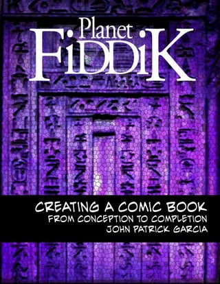
  • 1. Creating a Comic Book From Conception to Completion John Patrick Garcia
  • 2. John Patrick Garcia ID#@0025778 MART 697 Field Project Creating a Comic Book From Conception to Completion Commitee Chairperson Kerry Loewen Discipline Member Conor Peterson Outside Member David Lobdell Oral Defense Date 12/11/2014
  • 3. Table of Contents Conceptualization 04 A Goal-Based Approach 04 The essentials 05 Hardware/Software 05 before the panels 06 celtx program 06 concept art 07 set design 08 character development 09 thumbnail layouts 11 page layout 13 inking/black levels 15 grayscale 16 painting with transparency 16 Textures and overlays 17 color correction 19 formatting 20 printing 21 influences 22 presentation 26
  • 4. Creating a comic book has been a project that I have been considering for many years. I have spent much of my academic and professional career developing the skills and work ethic necessary to complete such a time- consuming endeavor. All of the aspects of my media arts background have in some way prepared me for my first attempt at creating a full color comic book. From the fundamentals of drawing, to the camera angles found in cinematography, from storyboarding The entire process, despite requiring a relatively small number of resources, is much more involved than a few casual evenings of doodling in a sketchbook. The purpose of this paper is to describe the steps I took in my personal approach. A Goal-Based approach layouts and screenwriting, to graphic design and typography, this project has tested all of my accumulated design skills. Of course, a comic author could spend as much money as desired on computers, printing, drawing tablets, and art supplies. But in the end, the bare material necessities for creating a comic book are a box of pencils, a stack of paper, and basic graphics editing software. This paper will discuss both the content of my book, as well as the method behind its creation CoNCEPTUALIZATION Besides the obvious goal of ‘completing a comic book’, it is a good idea to establish a set of timely goals and reasons for creating a book in the first place. My decision to create a comic book came from a desire to tell an ongoing story that would continue to evolve with myself as an artist. Having complete creative control over my story was an appealing idea. With very little need for access to expensive equipment and resources, I would be able to create my book in any vision that I could manage to put down on paper. Money and commercial success are never guaranteed in the comics and graphic novel field. However, no one is sucessful in writing comic books who didn’t first write an actual comic book. Thus, a lateral goal of mine is to produce a book that can be commercially viable, or to at least begin the journey towards creating books that will sell.
  • 5. the essentials Here is a description of the materials that I used to create my book. Throughout the course of my project I have used over 50 #2 HB pencils. I bought very inexpensive school grade pencils. I did not need the wide variety of drawing pencils used in other forms of pencil art. I did not need the subtle hardness and shades that I have used in life-drawing and fine-art settings. I utilized white plastic erasers. They were perfect for removing marks from a smooth surface, without damaging the paper like pink erasers. For ruling pages, I used a common T-square, and also a 90 degree metal L-ruler. Other straight lines were created with a common school ruler. A compass was used for perfect arcs and circles. The paper I used was a 100lb cold press paper. I procured this paper from a thrift store. What would have cost me $200 in an art store, I was lucky enough to obtain for under $20. Other accessories included electric and manual pencil sharpeners, a brush to remove eraser and pencil shavings, razor blades, and other standard drawing and graphic design tools. hardware and software I made use of common graphics processing software during the entire process. Desktop applications have made it possible to complete the work of multiple artists in a fraction of the time. I utilized a 14 megapixel snapshot camera to digitize my drawings. Natural sunlight, and a careful angle proved to be somewhat quicker than using a flatbed scanner. The difference in quality is negligible for my purposes. I would be surprised if anyone could tell which pages I scanned and which I photographed. I used Photoshop to import, format, ink, and paint the images. I also utilized the text funtions for my lettering. I downloaded a copyright/royalty-free font called “Evil Genius” in .TTF format (This font is also used in the section headers of this paper). I used Indesign’s booklet printing capablilties to format and prepare double-sided layouts of my comic book. I hope to make professionally printed copies of my book in the near future. I wrote the script for my book in a free version of Celtx. My personal laptop, with built-in screen stylus sensitivity proved extremely convenient when it came time to ink and paint the pages. When stationed at a powerful desktop, I made extensive use of a basic Wacom tablet and stylus.
  • 6. before the Comic Panels I worked from a screenplay that I had written prior to this project. It quickly became apparent that each page of my screenplay equated to roughly one page in my comic book. My screeplay was over 100 pages long. I decided to create the opening scene of my screenplay as a ‘first issue’ of my comic book version. This particular scene works as a short story which would be enough material for a comic book between 32 and 40 pages. I made revisions in dialogue, pacing, and other aspects as I converted the screenplay to a comic book script. From here, I was able to begin the preliminary work. This involved creating conceptual designs. I made early drawings for characters and settings involved in my story. This was the stage where I experimented with different drawings and designs. Using my conceptual drawings as models, I attempted to keep a continuity in the appearance of characters, objects and settings. Celtx utilized in a comic Not specifically designed with comic books in mind, the free screenwriting software,Celtx, proved to be a useful tool in the production of Fiddik. The standard screenwriting format is very easy to follow, and it lends itself to being interpreted into a graphic novel/comicbook format. There are modules in Celtx which allow an author to create character and setting biography profiles. I used this function to keep track of important information regarding characters, settings, and other plot information. There is even an option for uploading image files to character profiles. I found Celtx to be a helpful way to keep track of key elements in my story. Perhaps there are software suites that may be specifically tailored for comic books, and I am interested in researching them. However, these sort of softwares are simply organizational tools, not necessary to the overall process. Many authors have no need to keep such detailed notes, or if they do keep notes, a paper filing system is more than adequate. It is recommended that authors keep some sort of reference file in relation to their own stories. It can be difficult to keep numerous story elements consistent, especially in longer, serial comic books.
  • 7. Concept art Perhaps one of the most enjoyable stages of creating a comic book is the conceptual design phase. Here is where the artist is free to sketch ideas without too many restrictions. Of course, I worked from notes I had written prior, and from the screenplay itself. Character treatments in text form gave me all of the information necessary to visualize and draw my major subjects. Settings and locations are also sketched out at this point. I had envisioned my story taking place in a science fiction setting. I wanted it to be a stylized cartoon, set in a very colorful world. My characters would mostly be anthropomorphized animals and robots. Many of the characters would be bipedal Reptilians. Jimador, the protagonist, like all Reptilians in the Fiddik setting, is born into a life of servitude. The story takes place in a Reptilian egg hatchery located on a small planet called Ophidia 3. Here is where thousands of worker reptiles are born, raised, and indoctrinated in the ways of the Order of Draco, a fictional cult.. Each Hachery is home to a ‘Mother Reptile’ who is attended by dozens of lesser Reptilians. These bipedal workers make sure to nourish, sedate, and protect the Mother. She is enslaved, with the sole task of producing more and more Reptilian offspring. In designing these characters, I studied many examples of sauropod, lizards and reptiles. I decided on a simple design, which I could easily draw dozens of times in a small amount of time. Other influences included descriptions of extra terrestrial Reptilians as found in David Icke’s conspiracy theory books “The Perception Deception” and “Children of the Matrix”. Egyptian motifs and styles reinforce the “Ancient Astronaut” themes while contrasting with the cartoon style of drawings.
  • 8. As for the architecture in the reptilian facilities, I have gone with a mix of biomechanical shapes and egyptian motifs. I wanted a fantasy/sci-fi style of architecture that might appear as if it were a living entity itself. In a later section of this paper, I will describe the methods of texture mapping that I used to create certain visual cues that reinforce the ‘reptilian’ theme throughtout the comic book. One concept that plays a central theme is the mechanism which facilitates the whole Reptilian birthing process. The ‘Birthing Machine’ is a network of automated chutes, tubes, and escalators that deliver nutrients, sperm, and mind control serum to various parts of the Hatchery. Biomechanical and steampunk elements can be found peppered throughout the book. Influences range from the works of surrealist H.R. Giger to Sci-Fi painter Ralph McQuarry. Pneumatic Tubes, assembly lines, catwalks, incinerators, force-feeding machines, sedation devices, and artificial inseminators all paint the picture of a regimented, oppresive Reptilian society. This is all in contrast with the presentation of mamallian characters, who are portrayed as warm, simple, honest family folk. The colors of the settings were chosen in a classic expressionist manner, to convey the emotion present in the current scene. Blues, purples, and greens were used to convey mystery and otherworldy feelings. Reds and bowns were used in moments of violence or death. Greens were used in moments of calm, safety. Set Design
  • 9. Character Development The characters behave as if in a fable, but with more anthropomorphic overtones. My story involves a theme which pits cold-blooded creatures against warm- blooded creatures. In this story a family of mole-people have been enslaved by the reptilians a forced into servitude. The story begins with the birth of a newborn Reptilian. Unlucky circumstances brings the young reptile, Jimador to be cast out of the reptilian brood. A chance encounter with the kind Father Mole takes Jimador beyond the walls of the reptilian Hatchery. The story serves as introduction to a few main characters, sets the stage, and opens the story up to further episodic material. The Reptilians are depicted as cold, single-minded, and ruthless subjects. They are fanatically driven to reproduce their collective and create dominon over the warmblooded animals, who they use as slaves and a food supply. Jimador was somehow different than his reptile siblings. He was born with a softer, kinder, more curious nature than his mindless brothers. Although helpless through the entire story, circumstances take Jimador to the homes of the mammalian Mole Family. This sets the stage for future events which will pit Jimador’s Reptilian instincts against the vallues he learns from his warm-blooded friends. I consulted the books of Joseph Campbell and Christopher Vogler while I created characters and settings. “The Hero With a Thousand Faces”, and “The Writer’s Journey” are excellent reference books for mythical adventure stories. Both are consulted in top Hollywood Blockbusters ranging from Star Wars to The Lion King.
  • 10. I created a simple plot structure for my story. The intent was to introduce my character, Jimador T. Reptile, in a very intimate way. Rather than focusing on a grander plot, I decided to create a detailed prologue that would be used as a starting point for broader story arcs. This entire project was exploration and experimentation for further Fiddik stories. Indeed, Jimador’s birth takes place over the course of half the pages in the issue. A helpless, imobile protagonist can be a tricky subject to work with. In order to progress the story I used a series of coincidental and circumstantial events to force calamity upon newborn baby Jimador. Of course, using gravity, a series of coveyor belts, chutes, and tubes helped to propel my character forward, against his own will. Strangely enough, Jimador is born with a fairly developed sense of being. While unable to communicate with others, he is somehow able to form fully articulated thoughts from within his soft, transparent eggshell. There is a less discussed protagonist archetype in many new fictional works. “Hero Type” characters are as old as society itself. There is no need to describe the vast pantheon of heroes in historic literature. More recently, Anti-heroes have become popular in literature. For these archetypes, the lines between good and evil are blurred. One man’s hero could be another man’s villian. Popular examples include George Lucas’ work in Star Wars (Anakin/ Vader) or Vince Gilligan’s Breaking Bad (Walter White/Heisenberg). Even more uncommon in pop culture are examples of Hero-less stories. Many cultures are not so enthusiastic about the Hero Figure. A deep mistrust has been seeded towards those that are labeld as heroes. Historically, there are many people, originally touted as social saviors who ultimately become tyranical sociopaths. It is not so hard to find a disdain for the Hero Figure in many of today’s social issues. I intend to explore that in my Fiddik stories. Jimador is not a hero, but plays the role of the well- meaning fool. Major antagonists in my book include the hungry Blood-Wasps, hell-bent on infesting Jimador with their parasitic larvae. The Reptilans themselve might seem like a malicious, heartless presence in the book. But for the larger part of this issue, they remain a mostly neutral force. They barely acknowledge Jimador’s precence at all. In fact, the only time they interact with Jimador is to treat him as a piece of infectious garbage. Not a hero, Jimador is a character who learns to take things as they come. “This entire project was exploration and experimentation for further Fiddik stories.”
  • 11. thumbnail layouts One of the most important steps in creating my graphic novel was the process of creating thumbnail sketches. Comic Books tend to have more than a passing similarity to storyboards. Many movies have been made using comic books as an initial storyboard. And yet comics have their own form of ‘storyboard’. These crude sketches are often called thumbnails. Many of the visual and logistical issues can be worked out at this stage. Camera angles, movement, story pacing, lighting, dialogue placement, and other design problems can be solved at this stage. It might seem that foregoing this process might seem to save time. In fact, it can be bypassed by an experienced artist, in certain cases. But in most situations, dropping this step will cause more time- consuming headaches down the line. As an example, I chose to drop the thumbnails in what I thought was a very simple dialgue between Jimador and Pappa Mole. I didn’t realize until I had rendered the panels, that I had broken the 180 degree camera rule, creating a major continuity error. I was forced to spend time in photoshop, mirroring the images until the orientation was correct.
  • 12. Many artists choose to use a lightbox or projector to transfer a thumbnail sketch to a larger, rendered comic panel. In my case, I decided to redraw the panel from scratch. In many other cases, I cut up the thumbnails and rearranged them in different configurations. I would say that this is one of the most important lessons that I learned during this project. As I continue to author comic books, I will place heavy priority on creating thumbnails. This is not to suggest that I drew all of the thumbnails before I began the next phase. For the majority of the project, I would draw a few pages of thumbnails and then I would render those pages in clean pencil. Once I had a handful of pages rendered, I would refer back to my script and produce 4 or 5 more thumbnails. In this way, I was able to break up the tedium that can occur in certain phases of the writing process. In fact, breaking up a repetitive process (at least for me) was something that I became very adept at throught my project. A certain fatigue can creep up on an artist after they have been working on a specific task for numerous hours. While it is important to vary the tasks to avoid fatigue, it is important that an artist builds a ‘drawing stamina’ in order to complete a specific work goal. This reminds me that each stage in the comic book process can be broken down into sub-stages. For example, the scripting process might be broken up into a plot outline stage before fleshing out the details. Lettering the pages might be the 3rd step in the writing process. The drawing stage is broken down into preparation phases. Concept drawings precede thumbnail layouts, precede rendered panels. The same is true of the coloring process. In my case, establishing grayscale values precedes the selection of a color palette, which precedes the final painting process.
  • 13. Page Layouts With thumbnails in hand, I was ready to proceed with the process of penciling my page panels. Using 100 lb cold press paper, I began this step by ruling my paper. Of course, it is possible to purchase pre-ruled comic book paper from Dlick Blick, or other such art suppliers, but those cost nearly twice as much money. Using a T-square, I ruled out my pages to 13” x 19”, with 1” safety gutters. Using my thumbnails as guides, I render clean, finished drawings to the art paper. This step is the most time consuming part of the process, but it is arguably the most important. A cleaner line-drawing is much easier to paint . An alternate possibility at the layout stage is to forego actual paper and pencil altogether. I have created certain panels in my blook directly as digital drawings. With a bit of practice it is easy to become comfortable using a Wacom or touch screen/stylus to create incredibly detailed drawings. While missing some of the traditional qualities or good old fashioned drawing media, digital drawings offer a different set of advantages. For example drawing directly in the computer saves the time required to digitize physical drawings. Also, using a laptop or tablet to draw is much more portable than lugging a large box of drawings around. As well, using CTRL-Z will erase a mistake in a fraction of a second.
  • 14. After accumulating a pile of pencil drawings, it comes close to the time for digitizing. The most common method is to utilize a flatbed scanner to capture all of the subtle line work. But even before this, it is a good idea to clean up the artwork. Pencil smudges, fingerprints, eraser scraps all leave behind artifacts which will reproduce on the digitized version. It is possible, and ultimately necessary to correct these sort of imperfections in photoshop, but it is prudent to address as many of these issues before proceeding. In my case, white plastic erasers, white-out, or other masking techniques worked best. A large, modern flatbed scanner is the most accurate method for capturing line work. Using hardware and software settings, it is possible to capture and convert physical drawings to digital formats such as .jpg, .tiff, and .png. In my case 13”x 19” is slightly larger than common flatbed scanners. While using scanners when possible, I have found that using digital cameras are acceptable alternatives. In fact, using a simple snapshot camera has certain advantages. Utilizing a 14 megapixel Kodak Easy Share, I am able to digitize dozens of drawings in a couple minutes. I found that natural sunlight works best for this method. Taking care to have a perpendicular angle is important, or skewed images might occur. Photoshop can take care of any issues like this, but it is best to prevent problems like this before they occur. This method is not unlike the old method of using photos to capture slide prints for viewing art pieces on projectors. Near the end of the project, I became comfortable with the practice of drawing directly into the computer, without using paper or pencil. There are considerable differences between using a pencil and paper, and using stylus and tablet. However, there are advantages to both. I recommend spending the time to learn digital painting and drawing. The learning curve may seem daunting, but is ultimately very rewarding. Such online resources as Feng Zhu Design, Gnomon, Stan Winston Creature Design, and others provide excellent tutorials (often free to the public) regarding digital design using stylus and tablet techniques. For my project, I attempted to blend traditional and digital techniques to create the images that I imagined in my head.
  • 15. Pseudo-Inking and the art of black levels Inked pages have long been a staple of comic book art. But working alone, time is never on the side of a comic book author. (At least if you don’t want to take 5 years to write a book). Being that I had already made clean pencil drawings, it seemed a bit redundant to ink all of my work again. This was a creative decision, and the vast majority of modern comics are still inked in some way or another. I made a compromise. Instead of inking over my pencils, I decided to employ a technique I learned a few years ago as an undergrad . A type of pseudo-ink can be applied to clean pencil drawings. The first step was to reduce a scanned or photographed panel to a grayscale file. From there, it is a matter of using Photoshop to adjust the black, white, and gray levels. As you can see in the photographs, I began with a clean pencil drawing. By adjusting the levels, I was able to accentuate the blacks and whites, while nearly removing gray values all together. While this method may not capture the distinct effect of black ink, it preserved the delicate subtleties of pencil lines. In any case, the process takes mere moments, saving hours of time.
  • 16. establishing gray-scale values The next step in my process involves airbrush or other digital painting techniques, Using multiple layers of transparent gray tones, blacks and highlights, I bring volume and depth, light and shadow to a line drawing. Photoshop is convenient, as its airbrush tool has a very even, mechanical, and adustable flow rate. Corel Painter has a number of sophisticated, natural painting tools, including blendable oils, watercolors, and inks. While it is quite possible to proceed straight to painting in color, there are a few advantages to building a grayscale layer first. In a sense, I don’t really skip the inking phase at all, but implemented a modern, digital reincarnation of the process. Painting on Transparency LaYers. Using transparency combinations within Photoshop or Corel, I am able to paint color hues over the gray scale without compromising the value I established in the previous step. Without going into a lengthy explanations of transparency modes, I will say that parameters in Adobe Photoshop and Corel Painter provided unexpected and surprising results that I employed in my final work. It is like working with unlimited amounts of clear celluloid sheets, endless inkwells, and paint tubes. Being able to digitally save countless itterations, rework mistakes, and edit in a non-destructive manner are some of the greatest advantages that a lone artist can exploit from modern technology. While many of these digital advances are already over a decade old, it is interesting to see how they are being employed in subtle ways that do not appear to be digital. I have tried to use the digital technologies as a way to showcase my skills in more traditiional styles.
  • 17. TExtures and overlays Finishing touches to the panels can be as complicated or as simple as necessary to communicate what is happening or to create a sense of atmosphere, or texture. For example, I made use of photographs of dust particles, and other ‘noisy’ textures to create air partical effects, and other atmoshepherics. Sometimes it is effective and economical to use photgraphic textures to describe actual rocks or bricks, or metal, etc. Using photoshop, it is possible to skew and warp textures over pencil drawings I have found that subtle and reserved use of texture overlays works best. It is easy to overuse this. Often times a texture used out of context can create interesting effect. Of course, more layers means more memory demands, so I tended to be frugal with my use. In some instances I employed the look of traditional comic halftones. There area wide variety of tones available for free useage on the internet. Effects range from straight gradients, radial gradients, or hatchwork and other patterns. These give certain cartoon-like style.
  • 18. Here are a few examples of photo textures used to describe a rough, rocky floor. The metal door and the ribbed texture of the walls are also described using photo textures. In other panels, I have used photos of organic textures to suggest the surfaces of unrelated objects. The microscopic texture of insect chitin looks completely alien when it is used as the texture of a wall or a floor. This is another example of when experimentation works great when designing Sci-Fi settings. Using photos in combination with drawings and illustration has been utilized before the advent of digital imaging techniques. Using razors and a steady hand, it was possible to cut out relief patterns and paste them to the drawing. In my case, I was able to utilize the digital equivalent of a razorblade and glue to composite drawings and photo images together. It is interesting to use a program like Photoshop, which was designed for photography manimpulation to discover techniques that were not intended specifically for comicbook art. Many magazine publications such as Fantasy Illustrator, Digital Artist, and countless instructional books detail new ways that illustrators can take advantage of unorthodox methods to create exciting styles. Artists such as David Mckeen and My Pet Skeleton, have been major pioneers in using digital illustration and compositing in the last decade. I will provide some example of their work later in this paper, along with other artists that continue to infulence my work.
  • 19. Color Correction Laying out pages in an array is a good idea. In this way it is easier to see if there are continuity issues or color consistency issues. I wanted color shifts between individual pages to be subtle or sudden as necessary. My goal was to look at my panels at this point and see if I could discern the progression of the story without using text. I went back through my pages adding last details or making corrections. I made 2 versions of my book. Each version was color corrected in a different way. One version was optimized for viewing on screens and monitors. The other was color corrected for print. Monitors can display a wider color gamut than printed media. Video screens display brilliant deep blues and reds, which are difficult to reproduce on paper. The printed versions have a darker appearance. To counter this, I adjusted values to create a brighter image. I consulted Photoshop’s histogram monitor window in order to get a better range of colors for printing. The final result was a printed version that compares to the screen version in a satisfactory manner. Both versions have their advantages and disadvantages.
  • 20. Formatting The book When I was satisfied with my progress, it was time to add black borders, add word balloons where needed, and other compositional elements. I created a template to overlay all of my pages. This template was as simple as a black rectangular border with a 1” thickness. I used this black border as a safety- zone when printing. Any inconsistencies or misaligned prints were allowed a little room to breathe by creating a black bleed around the entire page. This is also helpful when printing to different aspect ratios or length/width proportions. Also, a black border helps to keep titles, text, and important artwork within a safe viewing zone. This is especially important for visual elements which may come close to the spine of the book. Words or art may become lost if they are too close to the inside of the book. In future issues, or even in future prints of my 1st issue, I may forego the use of black borders. A full-bleed, with art printed up to the very edge of the page, might look nice. But for this endeavor I have used the border as a way to become familiar with the formatting and printing process. While not used prevalently in this project, I have experimented with the concept of breaking the border, or the edge of the page. In certain instances, breaking the borders and grid structures can be very effective in story telling. This entire project has been an educational experience. Employing established design rules was important in keeping a sense of coherent visual flow. But there were many times when I was tempted to see what broken rules would produce visually. There is no replacement for experience in projects like this. I have found all my time spent on this book was well worth the effort. It is somewhat easy to visualize a story concept, characters, settings, and even to form a clear picture of the finished project. However, it is much more dificult to actualize the concept in a finished piece. I consider this book as an absolutely neccessary step in ACtion and Title Safe Zone
  • 21. creating future work. There are many great books detailing the process (such as Gertler and Lieber’s “Creating a Graphic Novel”). There are even more books detailing the techniques in drawing. But the truth is that application and repetition are abolutely neccessary. Sequential art and story telling are a complete language of their own. The act of drawing the same character and location must be learned through practice. For beginners, the tedium of repetition can be offputting. It is hard to draw something over and over, from multiple angles. For me, it was hard to focus on one moment in a story, when I wanted to move ahead to the next jump to more exciting parts. There is a concept in art and drawing which involves a work stamina, not unlike a marathon runner’s stamina. These creative processes require long hours of uninterrupted work (especially lengthy, ongoing series work). There is probably a lot of advice and techniques towards maintaining artist stamina. But in any case, once the process begins, time becomes irrelevant. With the exclusion of deadlines, the uninterrupted process takes as long as it requires. printing The final, and for me, the least artistic phase was the printing process. After the artwork was complete, the last thing I wanted to do was to force my brain into the role of troubleshooter. However, I forced myself to embrace this aspect of creating a comic book. I quickly learned to enjoy the new techniques and subtleties of printing. I quickly accepted that almost all of my artwork looks more luminous when viewed on a screen, monitor, or tablet. There is a quality to the illuminated pixels which causes colorful artwork to glow in an almost magical way. This radiance is somewhat diminished when it is translated to the printed page. There are pros and cons in both versions of media. For this reason I formatted my work to both platforms. The online, screen version is optimized for a wider range of colors. There is simply no way to capture the intensity of certain blues and reds in another medium than video. Even so, the color range between devices varies greatly. Art work will look different when viewed on different platforms. Knowing this, I worked on different devices, noting that I would have a different appearance on each, but coming to an averaged compromise overall. The biggest differences came during printing time. It is well known that converting RGB color (video) to CMYK color (print) is a tricky process. I worked in a somewhat limited, older video color range (RGB 1998). I tried to select as many colors as possible that would reproduce faithfully in printing color ranges. There are many tools within Photoshop that can help with this process. In the end, I still found that my colors printed at a darker value than was apparent on my screen. This required me to create a separate set of files optimized for printing. Fortunately the process was not too difficult or time consuming. It was a matter of using basic photoshop tools to lighten the color values and/or adjust contrast. The histogram window in Photoshop provided a good guide to determining the spectrum of levels of black, gray, and white in a given image.
  • 22. Influences Here are some of the artists that have influenced or inspired my work. I will discuss some of the projects and techniques which have served as reference as I worked on Fiddik. Tony Diterlizzi Known for his work as an illustrator, and more recently as an author and screen writer, Tony DiTerlizzi combines a mixture of art and word to bring his fantasy worlds to life. Initially known for his work in the fantasy roleplaying franchise Dungeons & Dragons, T.D. moved on to projects spanning from comic books, collectible card games, and finallly to self-authored, illustrated novels. One of his more recent novels, “The Spiderwick Chronicles”, was adapted to the bigscreen. His earlier work was praised due to its unique style and personality. He was sucesful for producing large amounts of detailed sketches on a tight deadline. A dedicated pencil artist, T.D. has learned to embraced the advantages of digital color processes.
  • 23. Gerald Brom Brom was inspired by the classic fantasy illustrations of Frank Frazetta. Brom is a traditional fantasy oil painter. Another alumni of the Dungeons and Dragons illustrators, Brom has become well-known for his disturbing depictions of Cyberpunk, Fantasy, and Biomechanical worlds. Like Diterlizzi, Brom has been successful in writing his own novels, Such as “The Child Thief”, and “Krampus, The Yule Lord”. His current work spans from video games such as “Diablo”, card games like “Magic the Gathering”.
  • 24. Nobuhiro Watsuki Japanese manga artist, best known for his samurai-themed series Rurouni Kenshin. Watsuki employed traditional pencil and ink styles for his wildly popular manga series. Rurouni Kenshin has gone on to spawn animated TV series, full-length animated features, and live-action films. His clean linework and flowing action have come to define the modern Japanese comic style. According to the Anime News Network, The Rurouni Kenshin manga has over 70 million copies in circulation as of 2014, while its anime has ranked among the 100 most watched series in Japan. The sheer volume of work that Watsuki has produced in the past 2 decades is rather impressive, and great source of inspiration to those interested in creating a serialized story that has the potential to span years and volumes of work.
  • 25. Chuck Jones The great, late Chuck Jones was an animator, cartoon artist, screenwriter, producer, and director of animated films. He was most know for his work on Warner Brothers “Looney Toons” films during the 1950s. He is known for revamping classic Characters such as Bugs Bunny and Porky Pig. These iterations of the beloved cartoons are still used in modern Warner Bros. animation work. His pacing, and tempo were uncommon in animations of the time. He employed a method known as pose-to-pose animation. This is an economical, yet effective way of creating grand movements in animation, that works well with music and other beat Film Inspiration Here are a few examples of films that have inspired the tone and feeling of my work on Fiddik. A recurring theme in these works is the anthropomorhic characters, fantasy locales, and dark themes. Notable films would include Jim Henson’s “Dark Crystal” (1982), Don Bluth’s “Secret of Nihm”, Wolfgang Peterson’s “The Neverending Story” (1984), Ridley Scott’s “Legend” (1985), Ron Howard’s “Willow” (1988), Terry Giliam’s “The Adventures of Baron Munchausen” (1988), and George Lucas’s “Star Wars” (1977). These films best represent the attitude and tone that I am trying to convey in my work.
  • 26. pRESENTATION After printing a book and set of wall displays, I created a presentation display. I created 2-page spreads for the 40 pages I created. This was an important experience for exploring the possibilities of future product pitches. Working within a limited spatial area, I quickly discovered how much space that a 40-page comic book could take up. Comic book and Sci-Fi conventions are a good place for unpublished authors to showcase their work. Many conventions, such as Comicon and Starfest offer dedicated showspace for new artists. These showcases involve a submission process where the best applicants are chosen to exhibit their work. I have seen a lot of the work presented at these conventions. The best exhibits showcase a complete, polished product. The standout pieces appear as if they were already an officially licensed product. Many exhibits showcase supporting marketing material. This would include fully functioning websites, merchandise, digital material, and even action figures. For my exhibit, Inot only did I print 40 full-color pages, I also showcases 20 black and white preproduction posters. I brought these “in-progress” works to show example of the the working process involved in my project. These preproduction pieces seemed appropriate for an academic setting, but I would probably not include them in a convention setting, where only the final product matters. In addition to the the printed pages, I included a set of cut-out puppets to supplement the comic book. These cut-outs are similar to the standing cardboard cut- outs seen in movie theaters. I printed large scale versions of Fiddik characters, fixed them to foamcore backboards, and then cutting them into shape with a razor blade. These are an inexpensive, yet attractive way to add some supporting media to the display.
  • 27. My intention was to create a finished book that would serve as a starting point for an ongoing comic series. I hope to create even more sophisticated, detailed work as I progress. I learned many of the fundamentals involved in writing graphic novels. There are many aspects in the production of a book that go beyond the simple act of drawing pictures in a sketchbook. These different processes require a draftsman’s attention to small details. A careful plan is required to work in an efficient manner. I hope to submit my work to publishers as I continue to grow my repertoire. The larger the body of work that I create, the more refined and polished the final product will become. The comic book industry is as competitive as any in the entertainment field. It is of utmost importance that I continue to push my creative skills to the next level. In the meantime, I want to use my book as another part of my professional portfolio. I want it to showcase my technical and artistic skills. But just as importantly, I hope that it will demostrate my work ethic. This has been a long-term project which I have seen through from start to finish. I am confident that my work on Fiddik will open doors to future oportunities.