Tester 1 and Tester 2 had mixed results finding the weekly cost of meal plans on SunBasket.com. Tester 1 was immediately prompted to sign up without seeing pricing, while Tester 2 found the pricing page but noticed inconsistencies between meal plan options that made comparisons difficult. Both testers felt the site could do a better job clearly displaying pricing and plan details upfront before requiring personal information. The biggest problem was inconsistencies between meal plan variables that hindered understanding costs.
1. 303 – Intro to Web Publishing Jocelyn Contreras
Usability Analysis Basedon User Field Testing Oct. 15th, 2018
Usability Test for SunBasket.com
Test Preparation
My preparations for the test consisted of snuggling up in bed, sitting up against the wall
with my laptop on my lap and turning on my music to start browsing. Once that was set up I
proceeded to use my school laptop on my default browser of Google Chrome connected to my
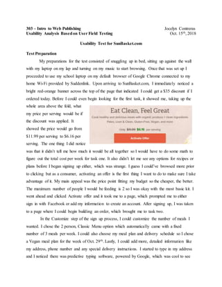
home Wi-Fi provided by Suddenlink. Upon arriving to SunBasket.com, I immediately noticed a
bright red-orange banner across the top of the page that indicated I could get a $35 discount if I
ordered today. Before I could even begin looking for the first task, it showed me, taking up the
whole area above the fold, what
my price per serving would be if
the discount was applied. It
showed the price would go from
$11.99 per serving to $6.16 per
serving. The one thing I did notice
was that it didn’t tell me how much it would be all together so I would have to do some math to
figure out the total cost per week for task one. It also didn’t let me see any options for recipes or
plans before I began signing up either, which was strange. I guess I could’ve browsed more prior
to clicking but as a consumer, activating an offer is the first thing I want to do to make sure I take
advantage of it. My main appeal was the price point fitting my budget so the cheaper, the better.
The maximum number of people I would be feeding is 2 so I was okay with the most basic kit. I
went ahead and clicked Activate offer and it took me to a page, which prompted me to either
sign in with Facebook or add my information to create an account. After signing up, I was taken
to a page where I could begin building an order, which brought me to task two.
In the Customize step of the sign up process, I could customize the number of meals I
wanted. I chose the 2 person, Classic Menu option which automatically came with a fixed
number of 3 meals per week. I could also choose my meal plan and delivery schedule so I chose
a Vegan meal plan for the week of Oct. 29th. Lastly, I could add more, detailed information like
my address, phone number and any special delivery instructions. I started to type in my address
and I noticed there was predictive typing software, powered by Google, which was cool to see
2. knowing how important it is to keep up with Google’s pace. I found my address before finishing
the street name and it “auto-magically” filled in the appropriate slots. All I had to do was add my
apartment number and phone number. As I continued, I was taken to the Order step of the
process, where you ideally would choose the recipes you want from a plethora of options. I chose
the Vegan meal kit so the options were limited to the three recipes they had to offer and they
were already chosen for me. On the final step, I had a pop up that was related to one of my
browser plug-ins called Honey, that automatically searches for coupons online that matches your
order. It gave me the options to activate my available rewards,
which was only explained by a rewards rate of 1-5% that I had
never seen with this plug-in before. Nothing happened upon
clicking Activate but there was a code automatically in the
designated slot. The code spelled out Partners, probably referring
to a partnership between Honey
and Sun Basket. Upon clicking
Apply, there was also no
change, almost as if it disabled so I figured it would apply if I
were to actually place my order. In this step, I was asked for credit
card information or to choose PayPal Checkout. In the Order
Summary, the $35 discount and the word “FREE” for shipping
were outlined in green, which I like because it clearly showed my offers applied. I was finally
able to answer the question of whether my uncle’s $65 would cover my kit and the answer is yes,
according to the $37.95 total price after special offers.
The third task was to figure out the cost of shipping for my first order and the following
orders. There was free shipping on the first order but I realized that in the fine print it said the
total cost for my next delivery would be $79.94 including shipping and estimated taxes. That was
a dramatic jump for me so it makes me hesitant to buy another box. The fourth and final task was
to assume I had a serious food allergy and find a way to accommodate those restrictions. While
browsing information tabs at the very bottom of the page, I was able to find important allergy
information in the Help and Contact tab. It was the first thing on its list of important information
so I clicked on it to find out anyone with a serious food allergy shouldn’t order from Sun Basket
to be on the safe side.
3. Choosing Participants
Tester 1: Julie Medrano
My first tester is my roommate and the cook of the house, Julie Medrano. She is a 22-
year-old female and she works as a server at El Maguey when she is free from her
responsibilities as a full time college student. She is familiar with these types of online meal kit
delivery services in general and has interest in learning more about them but has never ventured
into the research or any specific company’s information or website. She has also never ordered
any type of food products online so she has always been hesitant to make the first move. Julie
broke down her internet usage by how much time was spent leisurely and how much was for
schoolwork or productive purposes. Roughly, 5 hours were spent browsing social media, looking
at Amazon, and streaming Netflix. She did mentioned that about 2 hours of that social media
browsing was done on a mobile device through the apps. Another 4 hours are used for doing
homework like doing research, work in Canvas and so on. She is a perfect candidate for this test
because she is a woman that likes to cook and wants an easier way to shop and cook for meals,
two prime characteristics for Sun Basket’s target audience. She also estimated that her browsing
consisted of 70% being on social media and 30% doing other types of browsing. “My browsing
is sparked from social media sometimes due to ads or other types of tweets so I’ll go look for
more information”, she explained. She also deemed herself a high-experience user of the Internet
because it is such a big part of her day-to-day tasks.
Environment for Tester 1
Location of test: Julie’s preferred place for leisure internet browsing was in her bed. She
chose to wrap herself up in a blanket and lounged against her multitude of decorative pillows
with her laptop next to her on the bed. She chose this spot because it is her “Zen place” and
she does most of her internet browsing there in general. Our apartment is usually pretty cold
so she likes to do almost everything tucked in bed.
Physical environment: As we walked into her room, she turned off her lights, plugged in the
Christmas lights strung around her room and turned on her wax warmer, which gives off just
enough light to create a relaxing mood. She was actually painting her nails before our
scheduled test time so she continued as we began the test for authenticity. She would
periodically stop to paint her nails while I took note, would take a second to screw the cap
4. back on and would type and maneuver very carefully and with one finger as not to mess up
her nails. She also adjusted herself on the bed halfway through her test so she was sitting up
more than laying down so she could browse better due to her nails drying.
Technical environment: For the technical environment, Julie uses her school laptop for
everything, which is an HP and she uses Google Chrome as her default browser. She was
connected to our home Wi-Fi provided by Suddenlink. She had no browser plug-ins
downloaded but she did have a lot of bookmarked tabs and folders for her stuff.
Tester 2: Andy Howard
The second tester is my best friend and another awesome cook, Andy Howard. He is a
22-year-old male, a part time college student at the University of Missouri – Kansas City
(UMKC), and a night stocker in a warehouse for a company called Grainger. He mentioned his
sister had tried HelloFresh, another meal kit delivery service, for a date night with her boyfriend
a long time ago. He was familiar with the concept of them but really had no idea how the process
worked or where to start looking for information as far search results. As far as internet usage,
Andy says he spends about 7-8 hours a day on the web. He pointed out that a lot of that estimate
was done on his mobile device because he entertained himself at work with social media and
streaming music on his mobile device. The rest was for productive things, like schoolwork. He
said that he spends his time split 50/50 between social media and browsing. He feels that when
he’s not at work, looking through social media, he’s always studying or doing homework just
about everywhere else he frequents. This makes him a high-experience user of the internet.
Andy is the perfect candidate because he enjoys cooking and would actually buy
something like this if it made it easier to cook and eat with his hectic school/work schedule. He’s
also the complete opposite of Tester 1 even though they’re the same age; opposite genders,
different schools and different schedules. He was familiar enough, yet new enough to the concept
to give a genuine first impression just like Julie above.
Environment for Tester 2
Location of test: I met him Andy at his favorite local coffee shop called Crows Coffee. He
chose this location because it is where he ends up doing a lot of social media browsing and
Amazon “treasure hunting” as he likes to refer to it as. It’s a homey place where he’s become
5. a regular, it’s close to campus and it offers free Wi-Fi. Even though he goes there to study
right after his classes, he says. To make it even better, the table he took me to was his
favorite table because it was the only one with an easy access outlet for charging his
electronics.
Physical Environment: This coffee shop
had just enough lighting to make the place
feel relaxing. The table was big enough
where him and Sarah were able to spread
of their coffee and snacks, laptops, books
and papers and still be comfortable. There
wasn’t many people when we went there so there wasn’t many distractions from other
customers. Andy did mention that on the days when they showed up earlier in the day,
sometimes kids would come in with their parents or groups would come in and it would get
too loud. The main distraction was from people watching or the blenders going off when the
baristas made drinks in the louder machines.
Technical Environment: Andy uses his personal computer, which is very similar to our
school computer, same HP brand but a little bit bigger in size. We were using the coffee
shop’s free Wi-Fi; it wasn’t the best but it didn’t pose any problems. He used Google
Chrome as the default browser and he had no browser plug-ins or even bookmarked sites.
Test Results
Initial Site Thoughts
Julie’s initial thought upon arriving to SunBasket.com, was “Who’s Ezekiel and why are
they giving me a $40 gift card?” There was a red-orange banner across the top of her screen but
unlike mine, hers said, “Ezekiel gave you a gift card for $40!” She said she’s always had a bad
impression of sites that offer you “free money” like that or overly eager discounts. “It makes me
feel like they’re not real or trying to overcompensate with discounts”, Julie commented. From
her first glance above the fold, Julie also mentioned the picture of the food looked a little fake or
too perfect looking but as she kept scrolling she was immediately reassured with the USDA
partnership logo. She also liked all the cool benefits that the site offered like weekly recipes
because she felt you were getting a fuller experience and “getting more bang for your buck”.
6. She also really liked that any question she had was easily found the more she scrolled down the
homepage.
Andy’s initial thoughts started out very similar to Julie’s. He was confused about the deal
that was offered to him in the banner across the top of his page. The only difference was that he
had a completely different offer than her, and even me. After going back into SunBasket.com, I
found the offer
given to him.
He mentioned
the wording made it hard to understand at first glance because so many different numbers were
thrown at you. Andy commented a lot on the word choice, saying “I like the words like Vegan,
Paleo, Lean and Clean. It already makes me feel healthy and organic as someone who definitely
is not”. The slideshow of blown up dishes grabbed his attention because he felts that if the dishes
actually look that good, then it’s good that they’re promoting them front and center to get
customers. He mentioned that he enjoyed the quality of the photos as well and how that part of it
was designed. Andy did mention that he liked that they included things that made them “legit”
like, information on the chef and dietician making the meals and the USDA logo just like Julie.
“It makes me feel better about a concept a lot of people feel sketchy about upon first ordering, I
trust the experts rather than a random online website”, he added.
Aside from all the different comments they made, they did both hit on some of the same
exact things. First, they both liked how simple the format of the site was so it was easy to
navigate. They both liked that the homepage was good at generically explaining the process to
newbies. Another thing they both mentioned was how nice the bright colors were. The deals
being red got your attention compared to the other lighter colors, Julie pointed out. She also felt
like that the Sun Basket color scheme of light orange shades was very fitting for the tone of the
site. Lastly, they both got really excited about the mobile app offer. Julie said that she is more
likely to download the app if a website offers it. Andy said it made things easier if they were on
his phone for when he had downtime and wanted to check things out.
Task 1: Determine the weekly cost of a meal plan that appeals to you. Will your uncle’s budget
cover the cost of your preferred meal plan?
Summary for Both Testers
7. Tester 1: Julie Tester 2: Andy Average
Average Satisfaction 0 5 2.5
Success Rate 50% 100% 75%
Highlights
1. Both testers did two different things to figure out the pricing. Julie clicked Activate from the
gift card offer she was given because she figured the next page would show her pricing.
Andy, on the other hand, saw the Pricing tab at the top and clicked there for his pricing. It
was interesting to see that Julie was taken right to a place, like me, where I had to start
signing up immediately, skipping straight to task 2. Andy was taken to a page dedicated to
pricing so he was able to find it immediately. The pricing page was neatly organized until
further inspection.
2. Andy specifically noticed when looking for what meal plan would benefit him the most, the
variables for choosing the
number of meals and
recipes weren’t consistent
so he had to do a second,
more thorough look-
through before he
accidently made a
mistake. In one plan, you
could change the number
of people but you had a fixed number of meals. In the other plan, you had a set number of
people but you had the choice of the number of meals. He immediately didn’t like that “it
hurt his brain to understand that at first glance”.
3. Julie mentioned that she didn’t like that it gave you the option to start your Sun Basket
experience by jumping right into a sign up page. That’s why her satisfaction is 0. There was
little to no information about pricing leading up to the sign up page. It made her feel like she
was being forced into it, and way too quickly. Like previously stated, it pushed her straight to
task two and she wasn’t able to find the exact pricing until after completing most of the later
steps. Her success rate reflects that she was able to find the pricing, just not until later in the
8. process. Just like with my logic about an offer, that was the first thing she wanted to click on
and “it actually made me want to click back out quickly before it tried to make me put in card
information”.
Biggest Problem
The biggest problem I saw was with the inconsistency of variables. As previously stated,
in the Classic meal plan, you could choose the number of people but it already had a set number
of meals. On the other hand, the Family meal plan had a set number of people to feed but you
could choose the amount of meals. That’s fine but the way it was designed made it hard for the
tester to quickly go through and make a decision on what to buy. Because the offer was already
applied, you saw the discounted price which was nice but it didn’t tell you much about shipping
or something to fully answer if the $65 would cover the cost. It also didn’t make sense to them
that in the Classic Menu, you could still choose to feed up to 4 people, the maximum for the
Family menu, and pay less. The plans didn’t look distinct enough for them.
Lastly, the testers had very different results based on how they were taken through the
website. One entered through the informational tabs and the other was enticed by the discount.
Not much information was given on the pricing breakdown and it rushed the testers right into the
sign up process, turning one off to it.
Alignment to Heuristic: Consistency and standards
The Usability Heuristic that best matches these problems is the Consistency and
standards heuristic. It deals with the users not having to wonder about the meaning of different
words, situations and or actions. Going back to the buttons being connected to opposite variables
in each plan is a prime example of this heuristic. You don’t want the user to be confused about
what buttons control what part of your meal plan. It could potentially cause the ordering of too
many or too little meals. It also relates to the entry into the website as well. Since each of us got
into the process a different way, it wasn’t good that we were all a little confused if we were in
the right place or not. This must be consistent for the user to feel most comfortable navigating
through it.
Task 2: Go through the process of building an order and choose specific meals you’d like to
receive.
9. Tester 1: Julie Tester 2: Andy Average
Average Satisfaction 2 4 3
Success Rate 100% 100% 100%
Highlights
1. Both testers were prompted to sign up with two different options, signing in through
Facebook or typing in your information. Julie chose to use the Facebook route because it
made things easier for her, all she had to do was type in a zip code. She even mentioned, “If
it allows me to sign up or in through Facebook, the chances I actually do it is so much
higher”. Andy did something different but with the same intention of Julie. He typed in his
information but his computer had predictive typing so as soon as he typed “An” it already
had his full name “Andrew” ready to go. As he clicked it, it filled in the rest of the slots it
could, like his last name, his email and his zip code in this case. All he had to do was make a
quick password. It cut out time for both in different ways. When Andy proceeded a pop up
came up asking to save the password for the site and he chose “Never” as it is a test site.
2. Both testers specifically mentioned that they liked the way the “progress bar” and “steps”
looked. It was very clear-cut as
to what would come next
because up until that point we
all had no idea if we were on the right track. Julie still held on to her stance that it was
forcing her into buying it, before she could even read up on it. She felt that it was mostly her
fault for jumping the gun but also theirs for the way it was presented to her as stated above.
They both saw that they would have to pay at the end of the process and it turned them off to
the idea again.
3. Both testers commented on how many recipes there were and how they wished there was
more information on the recipes once they were already in the ordering stage of the website.
Neither tester actually looked through ingredients prior so without a way to view them there
they were lost on what they were ordering. They were surprised to find out there was no way
to click on them and see ingredients or anything. Both testers said that it didn’t help that the
recipes were so gourmet and specialized that some of the names in the titles were completely
foreign. They both ended up going with whatever looked more familiar to them. Having
10. more information at this stage for those that came in through different ways would have
made their experience better by their comments.
Biggest Problem
The biggest problem for both testers was the fact that even though the recipes looked
absolutely delicious, the name of the recipe wasn’t enough information to make a choice on 3
meals. To add on to the problem, most of the recipes were so specialized and foreign that they
weren’t familiar to the testers and they both almost immediately made a face at it. It seemed to
be more of a headache for both of the testers. They made comments like “Is this even in
English?” and “How am I supposed to know what this means?”. As if that wasn’t enough, there
was no way to find information on the recipes on that page. You couldn’t click anywhere besides
back out into the Menu tab on the homepage, causing you to start the process all the way over.
Andy specifically struggled to make a decision on one because the names didn’t sound appealing
to him and the pictures didn’t really show what was in them. Especially because Julie came in to
the sign up process in such a strange way, she had no what kind of ingredients or foods any of
the recipes contained. Her satisfaction was also on the lower side because of this.
Alignment to Heuristic: Match between system and the real world
The match between system and the real world heuristic matches this problem the best
because it relates to the type of language, words, phrases and concepts that are familiar to the
user. In this case, Sun Basket is using names that were way too complicated for the user to
understand. The ingredients were foreign to begin with so wording it in a user-friendly way
would’ve been better. Also, there’s always some way to click for more information even in the
checkout so it caught the attention of the testers that Sun Basket didn’t let them. Having that
connection to the user would’ve increased satisfaction.
Task 3: Determine the cost of shipping your first order and all subsequent orders.
Tester 1: Julie Tester 2: Andy Average
Average Satisfaction 5 5 5
Success Rate 50% 50% 50%
Highlights
11. 1. Both testers got the “secret offer” for free shipping so it was applied when they were in the
Checkout page and both testers answered the question with free shipping for the first order.
Instead of having a price, it said FREE so it was clear and easy for them to see and point out.
2. Both testers looked for other places to see the shipping cost for the rest of the order but they
weren’t able to find it. Andy even went as far as backing out to the homepage to see if he had
missed the regular shipping cost in his initial inspection. Julie just scrolled and browsed the
page but wasn’t able to find anything.
3. Both still gave the satisfaction a 5 because they both mentioned how they liked the way the
shipping was clearly outlined. Julie said that other sites like Amazon just give you a “$0.00”
and sometimes at first glance while clicking through, it’s hard to hard to differentiate all the
numbers. This one said words said another way to clean up the mess.
Biggest Problem
The biggest problem with this task was that there was no further information on how to
find the subsequent price on shipping. My testers weren’t able to make the connection in the fine
print about the next box being $79.74 including shipping, or whatever the total may be. It
involved you doing the math and it was a very convoluted way to get to the answer. People are
very visual so if it isn’t spelled out for them they won’t go looking for it. Both my testers were
content with saying that there was no shipping shown for subsequent orders. I also didn’t do the
math and just took the total they gave me. If it was outlined better everyone would know what
was going on if they were to order again.
Alignment to Heuristic: Visibility of system status
The heuristic that fits this problem the best is the Visibility of system status. According to
Jakob Nielsen, “the system should always keep users informed about what is going on, through
appropriate feedback within reasonable time”. Because the testers didn’t know what their next
week’s order shipping cost would be, a system to show them what’s going on would be
beneficial. Something like a calendar with system to show the different shipping statuses
depending on your price point.
Task 4: Assume you have a very serious food allergy. Determine how to go about placing an
order that accommodates that allergy.
12. Tester 1: Julie Tester 2: Andy Average
Average Satisfaction 3 4 3.5
Success Rate 0% 100% 50%
Highlights
1. Tester 1 was not able to find the allergy information. She looked through the menus and
meal plans to find information on them individually and was unable to. She chalked up her
conclusion to no allergy information on the site. In order to accommodate she said someone
with a food allergy could look at their recipes and check themselves. She noted that it
sounded like a lot of work for those with allergies.
2. Tester 2’s first instinct was to start in the FAQ and he had to scroll forever before he found
some very vague information on the allergies. He said that “for something that could be a life
or death matter, the information on it is really hidden”. It shows that regardless of how good
the allergy information may be, it’s still very hard to get to.
3. Both testers were unable to get to the allergy information. Tester 2 found something but
tester 1 didn’t even know where to begin to look in the tabs. They wouldn’t have been able to
accurately accommodate someone with a food allergy.
Biggest Problem
The biggest problem with this task was that there was no easy access to very important
information. According to the actual Sun Basket allergy information, its not suitable with people
with serious food allergies. That has to be something that is displayed at least a little bit more
prominently. Both testers mentioned they had no allergies so it was fine for them but for people
that do, it might be a hassle to go on a wild goose chase for it. They also had no idea where to
begin looking for. Andy used his process of elimination to come to the conclusion that allergy
information would most likely be a frequently asked question. It was buried deep and the
information was pretty vague. Julie was not able to find the correct information and even
struggled a little to find the answer to it. It should be added into a banner on the homepage or
possibily given a whole tab at the top of the page to show those customers they are important too
even if the food can’t cater to them.
Alignment to Heuristic: Error prevention
13. The Heuristic that I saw best fit this task was Error Prevention. Accidently ordering a
meal that has something either you or someone else is seriously allergic to is a huge error Sun
Basket should try to avoid. Having little to no information and hiding it also doesn’t help. A pop
up could come up after choosing a meal plan saying something along the lines of “You chose a
meal plan with lots of food allergens! Please double check that you are not allergic!”. Or maybe
a disclaimer at the beginning of the ordering process to save those that shouldn’t order, the time
of signing up.
Final Site Thoughts
Julie’s final thoughts were a little mixed based on some of the strange occurrences from
her test. She said, “it felt like being on a roller coaster” because some parts were really well
thought out and other parts were really frustrating as a newbie. She wished there was more
information before starting a sign up process and a lot more friendly for first time visitors.
Another thing she pointed out was that it seemed like people who were foodies or maybe worked
as chefs would like this a lot more than a college student. She like the overall graphics and
positioning of certain aspect of Sun Basket. Andy’s final thoughts were generally all positive. He
also mentioned that it seemed like it wasn’t for him because he didn’t understand the recipes and
it was really girly. It’d be something he’d get his sister to try first and review it for him. When he
took the time to look at the menu, he really liked how they told you everything in the bag and
added different little added perks for every recipe. It just would’ve been nice to have that in the
sign up, he said.
Both testers did mention the little roadblocks along the process, and that they were
definitely turn offs for the site in their eyes. They both referred to the ease of the website, from
navigating through the top tabs and quickly finding answers on the homepage. They both liked
the design and how the pictures were used, or as Andy said, “everything up until the sign up
process”. I asked if they would recommend it, I got a 50/50. Overall, it was easy to tell what kind
of website it was, what they offered and for the most part, how it worked.
Recommendation to Improve User Experience
Single problem being fixed: No information on the recipes once the sign up process has begun
Problem Involvement:
14. The biggest problem that really stalled the process and made the user a little frustrated
was the fact that once in the sign up process, you can’t click on recipes to expand on them and
there’s no information for anything on that page. Granted a user should do their research on the
recipes before wanting to sign up but there’s a lot of recipes to remember and it would be nice to
have a way to still see all that comes in the bag, the different angles of the dish, prep time, maybe
even the instructions, etc. My idea was to do just that by adding a Quick View button. In the
Before section, you see there is nothing but a title and a few keywords for the meal plan they fit
into. My inspiration came from Fossil.com, a site I recently got my mom a gift on. I really
appreciated their Quick View feature because you didn’t even have to click out of the options
page and all the information would should up in a big blurb. I wanted to use that same concept to
make Sun Basket’s order building a little bit easier. In the After section, you are able to see a
Quick View button in the bottom corner of the recipe and if you roll over it, a blurb pops up with
an enlarged picture of the food, different angle, “In the Bag” information and prep time. Not only
will the user be able to see everything in one place, it’ll make it a way faster and less confusing
process.
Before “Are these even
in English?
– Tester 1