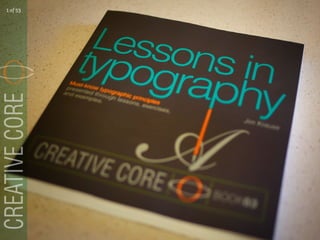
Lessons In Typography
•
94 gostaram•28,754 visualizações

20 reasons YOU just might need this book: Lessons In Typography, by Jim Krause

Recomendados
Mais conteúdo relacionado
Último
Último (20)
Destaque
Destaque (20)
Lessons In Typography
- 1. 1 of 53
- 2. {A book you just might need } 2 of 53
- 3. Especially if you’re new to design, a mid-level designer, or an experienced pro. In other words, this book is for pretty much anyone who wants improve their know-how and skill when it comes to choosing and using typefaces for logos, layouts, and websites. 3 of 53
- 4. Let’s get started. Here are 20 reasons just might need this book. you 4 of 53
- 5. { Reason #1 } Lessons in Typography reminds you that typefaces are works of art that deserve appreciation. Why is this important? 5 of 53
- 6. It’s because appreciation makes us want to look closer and learn more. Which leads to more appreciation and more learning. And on and on... forever... 6 of 53
- 7. { Reason #2 } You’ll learn the language of type. 7 of 53
- 8. The good news here is double: The language of type is easy to learn, and, once you learn it, you’ll be able to talk type with designers who know what they’re doing. 8 of 53
- 9. { Reason #3 } Your ear for typographic voices will become more acute. And this is good. Really good. 9 of 53
- 10. After all, a typeface’s visual persona is exactly what allows it to speak in voices that are bold, quiet, no-nonsense, elegant, rebellious, silly, sarcastic, and much more. 10 of 53
- 11. You are listening to your typefaces’ voices, aren’t you? 11 of 53
- 12. { Reason #4 } Lessons in Typography talks about all kinds of ways of breathing life into your typographic projects—from first sketch to final art. 12 of 53
- 13. { Reason #5 } You’ll be shown a bunch of ways to create designs using as few as one or two characters. 13 of 53
- 14. And, yes, just about everything in this book is taught with real-world applications in mind. 14 of 53
- 15. { Reason #6 } You’ll get a good look at digital techniques that can be used to modify and enhance typographic characters— 15 of 53
- 16. techniques that can be employed to add decor and imagery around, behind, within, and on top of letterforms. 16 of 53
- 17. These methods might prove very useful the next time you’re working on a monogram, drop-cap, or any other kind of single-letter design. 17 of 53
- 18. { Reason #7 } Ever hear of the Glyphs menu? You’ll hear about it in this book. 18 of 53
- 19. So, what’s the Glyphs menu? It’s a menu within Illustrator and InDesign that offers hidden typographic goodies like ligatures, alternate characters, symbols, and even... 19 of 53
- 20. lining and non-lining numerals. (And don’t worry if you haven’t heard of some of these things—they’re explained in the book.) 20 of 53
- 21. { Reason #8 } You only live once, and there’s still time to fall in love with punctuation marks. 21 of 53
- 22. Ampersands especially. What’s not to love about a cleverly designed ampersand? 22 of 53
- 23. { Reason #9 } Lessons in Typography understands that you’re probably looking for ideas that will help you craft good-looking headlines and word-graphics. 23 of 53
- 24. So don’t worry. There’s plenty of those inside this book. 24 of 53
- 25. So many, in fact, that you’ll never again look at certain letters—the capital O—for example, as one-trick typographic ponies. 25 of 53
- 26. { Reason #10 } You’ll find lots of examples of logos made entirely from type. 26 of 53
- 27. Examples that show you how designs can be built from a single typeface, assembled from two or more skillfully selected fonts, 27 of 53
- 28. and arranged in ways that allow chosen words to call out for the attention they deserve. 28 of 53
- 29. { Reason #11 } You’ll get to take advantage of something that sets Lessons in Typography apart from most other books about type: 29 of 53
- 30. This book swarms with imagery. And why not? After all, designers are always looking for ways of combining type, decor, and images for logos, layouts, and websites. 30 of 53
- 31. { Reason #12 } Because you want to have fun designing. 31 of 53
- 32. And what’s more fun than getting to wrap words with decorative enclosures, illustrated borders, colorful backdrops, or eye-catching typographic frames? 32 of 53
- 33. { Reason #13 } Lessons in Typography takes into account that you’re probably among the 99% of all designers who would skip lunch... 33 of 53
- 34. if given the green light to produce the oversized—or even full-page—purely typographic composition you’ve been dreaming of. 34 of 53
- 35. { Reason #14 } You’ve always wanted to create your own font. 35 of 53
- 36. And this book shows you how. 36 of 53
- 37. { Reason #15 } You’ll learn that software, a pen, or a paintbrush are all you need to create intriguing one-of-a-kind letterforms, 37 of 53
- 38. words that spell things out using more than just their alphabetic characters, 38 of 53
- 39. and words that are presented as larger-than-life ideas. 39 of 53
- 40. { Reason #16 } As a designer, you can always use more advice and information about choosing fonts, presenting type on a page, 40 of 53
- 41. and ensuring that your type is clear and legible. 41 of 53
- 42. { Reason #17 } You were wondering, just the other day, about alternative ways of presenting paragraphs— 42 of 53
- 43. with or without a few images inserted. 43 of 53
- 44. { Reason #18 } This book will supply you with proven legibility-preserving methods of placing text over images. 44 of 53
- 45. And by the way, all the typographic samples in this book are meant to be as fun to look at as they are informative. 45 of 53
- 46. { Reason #19 } You’re looking for overall design tips that’ll help you find effective and attractive ways of adding type to layouts— 46 of 53
- 47. tips involving columns, margins, gutters, 47 of 53
- 48. and grids. 48 of 53
- 49. { Reason #20 } Lessons in Typography contains all kinds of practical how-to demonstrations, 49 of 53
- 50. hands-on exercises, 50 of 53
- 51. and, of course, lessons in typography. 51 of 53
- 52. Hi, I’m Jim Krause. I wrote and illustrated this book and I want to thank you for taking the time to check it out. Lessons in Typography is the third title in New Riders’ Creative Core series. Links to my site and all three of the Creative Core books are on the next page. 52 of 53
- 53. Find it: Visual Design Color For Designers Lessons in Typography Jim Krause Design 53 of 53