Top Rated Pune Call Girls Pimpri Chinchwad ⟟ 6297143586 ⟟ Call Me For Genuin...
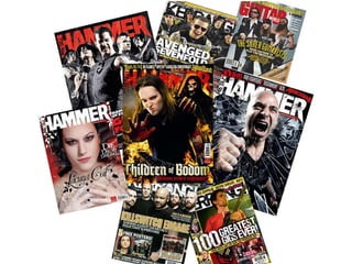
Magasine covers
1.
2. This is a front cover of Metal Hammer; it features the band Avenged Sevenfold. The main colours present are red and black, the red stands out a lot from the black, and the colour red normally represents danger, which would tie in well with the image of the band with weapons. The band are positioned in a way which is posed, and arrow shaped – the lead singer at the front, flanked by the rest of the band. The subtitle: ‘Live From the City Of Evil’ is a play on words with the album they were releasing, because that album was called ‘City of Evil’. The band are represented to be a hard rock/metal band that gives you the attitude not to mess with them. The background/setting has been edited a lot because, in the image it is raining and there is a lot of unusual light, also the background is black and the band is glowing a bit from the light. This is the same band, but on a different magazine cover, they are still represented to be a little dangerous and rebellious. They are featured with weapons again, but the singer/front man has a sinister smile/laugh, which also shows they do like to have fun. Kerrang! doesn’t seem to use that much editing on the pictures, they include a lot more writing, pictures and magazine conventions that the Metal Hammer magazine. The skyline gives bands that are included inside so it appeals to more of the target audience, which is also the same for the cover line, which has even more bands, that are included inside. The magazine also has Free posters advertised on the front, which is in the most important third of the front cover.
3. These are more Metal Hammer front covers. All of them have significant editing and a lot of time spent on them, as the effects seem very professional, and eye catching to the audience. I have noticed, that when I look for this magazine I can always seem to find it, because it normally jumps out, because it looks so effective and different to other magazine covers. The first two covers include skylines, while last one does not, but the first in the first two taglines, the first band is always in the bands signature typeface, as is the last one, and are separated by a lightening strike. These covers seem to have less on them than the other magazine covers. However, the last cover seems a lot more mysterious, and relaxing, though her eyes are a very strong feature that seems to hold your gaze and see to see through you. The embellishments used on the type face of the magazine name and band name give a dark fairytale feel to it. Two of the Metal Hammer titles are in white, and one is red with some flames on; this may be because the white compliments the colour schemes in the two covers that have the white title, while the red name compliments and adds to the effect of the flame/hell-like scheme.
4. This is another Kerrang! Magazine featuring Killswitch Engage, they are presented as a serious, mature band, but the small smile from the frontman shows that they are also nice. As Kerrang! puts a lot of writing and pictures on the front cover, they leave the Most important part of the image clear; their faces. Everything that is included in the Magazine, has been placed under the band to show the bands importance, and significance. The feature for ‘5 free posters’ is in the most important third, so the target audience will Notice and take interest. This is another different magazine cover. It seems to include more layers and more Writing. This magazine is about learning and teaching guitar. Included on the front Are three extremely influential guitarists: Steve Vai, Alexi Laiho and Zakk Wylde. The Name ‘Guitar’ is in a bright bold red, so it stands out, as the colour red can cannote Danger. The guitarists are represented mainly by the way their body is positioned, Facial expressions and their clothes, for example Steve Vai is relaxed in a ‘cool’ way And his stance is relaxed. When he wears the shades, he seems to give off the vibes That he is important, laidback and a bit mysterious, meanwhile Zakk Wylde seems More…wild, like his chosen name, as he seems to be screaming and he has a Powerful stance. The quote ‘The Super Guitarists’ is in the front in the middle of the Image, and is in yellow, which is also well known for being on car signs and signs of hazards., so it would be easily noticed. ‘Show you how to play the impossible’ would Be a very luring statement because having three influential, respected guitarists Teaching ‘the impossible’ because then the reader will know that all what they teach You would be very helpful because many influential guitarists are self-taught so they Would have been in the same position as the learners.