SlideShare a Scribd company logo
1 of 15
Music Magazine Construction
when looking through a variety of fonts , this was the first one that stood out to me however when choosing this font I noticed it had more of a horror style to it.  When coming across my second font it looked more like something you would see in a pop magazine The third and final one I came across was perfect as It was a basic font which was what I wanted.
When first designing my magazine flat plan I chose to put the features on the right hand side as I though this is where it would look best however when designing the real thing visually the features looked better on the left. As it meant I could fit everything on one side such s the barcode and quotes I created Nemours layers for each feature  and headings as I wanted each of these to have a different font and font size, as when doing my magazine research I notched on most magazine all the text had a different font and font size. In contras to my first design of my   front cover  as all the text was the same  I didn’t want to  much on the front of my magazine as when doing my magazine research the magazines with too much on the front I lost interest in as there was just to much to read so therefor I wanted to make it as straight forward as possible, by doing this it would appeal to my young target audience as they also lose interest quickly when the see a lot of information  at once.
When I decided where to position my features , I then went on to choose a suitable image for my front cover. i then chose this picture and uploaded it onto Photoshop, the editing process for this picture was very basic as at this point I was not that experienced in using Photoshop therefor during the editing process of this picture all I did was erase the background and adjust the contrast of the image.
Once the editing process this image was complete, I then created a new layer on InDesign and place the image on my front cover. When doing this I realised it wasn’t the right image for my front cover as the image of the model didn’t look very professional as her facial express showed her as looking very shocked as this wasn’t the image I wanted to portray. After looking through my images I decided to upload and start editing a close up image on Photoshop to be my main image  After flicking through my images I uploaded a close up image onto Photoshop and started the editing process of erasing the background and opening the image onto filter gallery which automatically improved the standard of my image.  My main image was the last thing added to my front cover as I wanted the text on first so I had a cleat indication of the right image and where to position it which is why I chose a close up image instead of the midshot.
My main image was the last thing added to my front cover as I wanted the text on first so I had a cleat indication of the right image and where to position it which is why I chose a close up image instead of the midshot. I then created a new layer on InDesign then replaced my previous mid shot image with my new close up image. This now meant my front cover was now completed to how I imagined it.
I then  went onto creating my double page article, firstly I created my grey back ground on Photoshop and uploaded it onto InDesign  After doing this I created the main title for my double page article which was a question and answer with a famous grime artist  I wanted this to be the largest content on my double page article as the question and answer interview was the main feature advertised on the front of my magazine therefor it had to standout
The next step was positioning  my questions I previously wrote on Word and copy and pasted them onto InDesign, when copy my question I had a separate layer to the answers as it made it easier to resize and change the font colour.  after placing the question and answers where I wanted them, I then went onto making the text stand out.  I then added a outer glow effect to my question to make them standout, as when I looked and other magazine which included interviews the questions  stood out the most on the page.
When I got  my question's how I wanted them I then added my first image on my double page article.  The editing process for this pictures was very simple as all  had to do was cut out the background. After this I placed the image onto InDesign. Once it was on InDesign I new I had to enlarge and stretch the image to make it stand out as when doing my research I noticed that larger image looked better as they stood out and were more powerful than the smaller images
The next step was adding my final image to my double page article, similarly to the  image the editing was very basic and because of this when uploading it onto InDesign I had to enlarge the image as much as possible, when doing this I noticed the standard of the pictures was very poor as that when I was cutting out the image on Photoshop I missed parts of the background out out
When enlarging both images as much as possible my double page article was then complete
When creating my contents page I spent the least amount of time on this  as I spent most of my time on the front cover and the double page article which is why I could not design my contents page as good as I wanted too. The first step was creating my background on InDesign I wanted to keep my colour pallet the same throughout my magazine I chose a black background with a blue bottom strip.
When first designing  the flat plan for my contents page I decided to title the contents ‘features’ however when doing more research into contents pages I didn’t come across many magazine with contents pages were titled as features therefore I changed it to ‘contents’ After designing the masthead for my contents page I then when on to positioning the page numbers and what was going to the feature on that page
I first decided to place all the features and page numbers into rectangular boxes I then added colour to these boxes and placed the writing over the text. After looking over this I didn’t feel it looked like something you would see in a real magazine  I then decided to remove the boxes and leave the page numbers and features plain which I felt looked better.
The final stage to my music magazine was editing the contents picture for my magazine which like the others is was very basic editing of erasing the background and changing the contrast on the image After resizing the image all that was left to do was place it where I wanted it

More Related Content

What's hot

Music Magazine Construction
Music Magazine ConstructionMusic Magazine Construction
Music Magazine Constructionryans96
 
Music Magazine Construction
Music Magazine ConstructionMusic Magazine Construction
Music Magazine Constructionryans96
 
Screen shot
Screen shotScreen shot
Screen shotryans96
 
Evidence of Front Cover
Evidence of Front CoverEvidence of Front Cover
Evidence of Front CoverTiaMaletta
 
As media c+d ( development), with final outcome
As media   c+d ( development), with final outcomeAs media   c+d ( development), with final outcome
As media c+d ( development), with final outcomejuhelmiah
 
Double page spread process
Double page spread processDouble page spread process
Double page spread processMattRogero
 
Production Reflection
Production ReflectionProduction Reflection
Production ReflectionImogen Minto
 
Production Reflection
Production ReflectionProduction Reflection
Production ReflectionImogen Minto
 

What's hot (16)

Screenshots dps
Screenshots dps Screenshots dps
Screenshots dps
 
Music Magazine Construction
Music Magazine ConstructionMusic Magazine Construction
Music Magazine Construction
 
Music Magazine Construction
Music Magazine ConstructionMusic Magazine Construction
Music Magazine Construction
 
Screen shot
Screen shotScreen shot
Screen shot
 
Production diary new
Production diary newProduction diary new
Production diary new
 
Evidence of Front Cover
Evidence of Front CoverEvidence of Front Cover
Evidence of Front Cover
 
7
77
7
 
As media c+d ( development), with final outcome
As media   c+d ( development), with final outcomeAs media   c+d ( development), with final outcome
As media c+d ( development), with final outcome
 
Media production log
Media production logMedia production log
Media production log
 
Media evaluation
Media evaluationMedia evaluation
Media evaluation
 
Task Schedule
Task ScheduleTask Schedule
Task Schedule
 
Question 5
Question 5Question 5
Question 5
 
Q7 powerpoint
Q7 powerpointQ7 powerpoint
Q7 powerpoint
 
Double page spread process
Double page spread processDouble page spread process
Double page spread process
 
Production Reflection
Production ReflectionProduction Reflection
Production Reflection
 
Production Reflection
Production ReflectionProduction Reflection
Production Reflection
 

Viewers also liked

Media example
Media exampleMedia example
Media examplerreardon1
 
In what ways does your media product use mr stevens 2
In what ways does your media product use mr stevens 2In what ways does your media product use mr stevens 2
In what ways does your media product use mr stevens 2edthompson13
 
CT2010: Dialogue session 3: Who am I? Media, Identity & Worldviews
CT2010: Dialogue session 3: Who am I?  Media, Identity & WorldviewsCT2010: Dialogue session 3: Who am I?  Media, Identity & Worldviews
CT2010: Dialogue session 3: Who am I? Media, Identity & WorldviewsTony Watkins
 
Social Media U: The Role of Social Media and your Identity
Social Media U: The Role of Social Media and your IdentitySocial Media U: The Role of Social Media and your Identity
Social Media U: The Role of Social Media and your IdentityDouglas Strahler
 

Viewers also liked (6)

Media example
Media exampleMedia example
Media example
 
Media planning and buying
Media planning and buyingMedia planning and buying
Media planning and buying
 
Hannah lock
Hannah lockHannah lock
Hannah lock
 
In what ways does your media product use mr stevens 2
In what ways does your media product use mr stevens 2In what ways does your media product use mr stevens 2
In what ways does your media product use mr stevens 2
 
CT2010: Dialogue session 3: Who am I? Media, Identity & Worldviews
CT2010: Dialogue session 3: Who am I?  Media, Identity & WorldviewsCT2010: Dialogue session 3: Who am I?  Media, Identity & Worldviews
CT2010: Dialogue session 3: Who am I? Media, Identity & Worldviews
 
Social Media U: The Role of Social Media and your Identity
Social Media U: The Role of Social Media and your IdentitySocial Media U: The Role of Social Media and your Identity
Social Media U: The Role of Social Media and your Identity
 

Similar to Music Magazine Construction

6. production reflection(1) 1
6. production reflection(1) 16. production reflection(1) 1
6. production reflection(1) 1jackedwards46
 
Production reflection - print project
Production reflection - print projectProduction reflection - print project
Production reflection - print projectJoyLucyBuck
 
Screen caps for fc !!
Screen caps for fc !!Screen caps for fc !!
Screen caps for fc !!Leah Hancox
 
Media construction
Media constructionMedia construction
Media constructionguest278914
 
Evaluation on main task
Evaluation on main taskEvaluation on main task
Evaluation on main taskToddy888
 
Creating my double page spread
Creating my double page spreadCreating my double page spread
Creating my double page spreadTiaMaletta
 
Construction of contents page
Construction of contents pageConstruction of contents page
Construction of contents pageAS Media Column D
 
production reflection magazine
production reflection magazine production reflection magazine
production reflection magazine DanMorland
 
Skills development front cover
Skills development front coverSkills development front cover
Skills development front coverFridawaywell
 
6. What have you learnt about technologies from the process of constructing t...
6. What have you learnt about technologies from the process of constructing t...6. What have you learnt about technologies from the process of constructing t...
6. What have you learnt about technologies from the process of constructing t...caitlinhulse
 
Print screens
Print screens Print screens
Print screens asmediad14
 
Making the front cover evaluation
Making the front cover   evaluationMaking the front cover   evaluation
Making the front cover evaluationdannywatt1995
 
Making the front cover evaluation
Making the front cover   evaluationMaking the front cover   evaluation
Making the front cover evaluationdannywatt1995
 
Post production diary magazine
Post production diary magazinePost production diary magazine
Post production diary magazineGrace Crawford
 

Similar to Music Magazine Construction (20)

6. production reflection(1) 1
6. production reflection(1) 16. production reflection(1) 1
6. production reflection(1) 1
 
Production reflection - print project
Production reflection - print projectProduction reflection - print project
Production reflection - print project
 
Screen caps for fc !!
Screen caps for fc !!Screen caps for fc !!
Screen caps for fc !!
 
Evaluation
EvaluationEvaluation
Evaluation
 
Magazine Evaluation PowerPoint
Magazine Evaluation PowerPointMagazine Evaluation PowerPoint
Magazine Evaluation PowerPoint
 
Media construction
Media constructionMedia construction
Media construction
 
Evaluation on main task
Evaluation on main taskEvaluation on main task
Evaluation on main task
 
Creating my double page spread
Creating my double page spreadCreating my double page spread
Creating my double page spread
 
Construction of contents page
Construction of contents pageConstruction of contents page
Construction of contents page
 
production reflection magazine
production reflection magazine production reflection magazine
production reflection magazine
 
Fmp evaluation
Fmp evaluationFmp evaluation
Fmp evaluation
 
Skills development front cover
Skills development front coverSkills development front cover
Skills development front cover
 
6. What have you learnt about technologies from the process of constructing t...
6. What have you learnt about technologies from the process of constructing t...6. What have you learnt about technologies from the process of constructing t...
6. What have you learnt about technologies from the process of constructing t...
 
Print screens
Print screens Print screens
Print screens
 
Making the front cover evaluation
Making the front cover   evaluationMaking the front cover   evaluation
Making the front cover evaluation
 
Making the front cover evaluation
Making the front cover   evaluationMaking the front cover   evaluation
Making the front cover evaluation
 
Post production diary magazine
Post production diary magazinePost production diary magazine
Post production diary magazine
 
The soup presentation
The soup presentationThe soup presentation
The soup presentation
 
The soup presentation
The soup presentationThe soup presentation
The soup presentation
 
The soup presentation
The soup presentationThe soup presentation
The soup presentation
 

Music Magazine Construction

  • 2. when looking through a variety of fonts , this was the first one that stood out to me however when choosing this font I noticed it had more of a horror style to it. When coming across my second font it looked more like something you would see in a pop magazine The third and final one I came across was perfect as It was a basic font which was what I wanted.
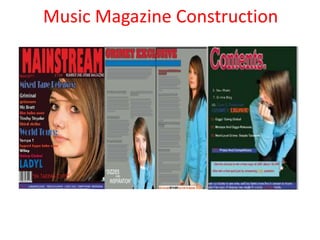
  • 3. When first designing my magazine flat plan I chose to put the features on the right hand side as I though this is where it would look best however when designing the real thing visually the features looked better on the left. As it meant I could fit everything on one side such s the barcode and quotes I created Nemours layers for each feature and headings as I wanted each of these to have a different font and font size, as when doing my magazine research I notched on most magazine all the text had a different font and font size. In contras to my first design of my front cover as all the text was the same I didn’t want to much on the front of my magazine as when doing my magazine research the magazines with too much on the front I lost interest in as there was just to much to read so therefor I wanted to make it as straight forward as possible, by doing this it would appeal to my young target audience as they also lose interest quickly when the see a lot of information at once.
  • 4. When I decided where to position my features , I then went on to choose a suitable image for my front cover. i then chose this picture and uploaded it onto Photoshop, the editing process for this picture was very basic as at this point I was not that experienced in using Photoshop therefor during the editing process of this picture all I did was erase the background and adjust the contrast of the image.
  • 5. Once the editing process this image was complete, I then created a new layer on InDesign and place the image on my front cover. When doing this I realised it wasn’t the right image for my front cover as the image of the model didn’t look very professional as her facial express showed her as looking very shocked as this wasn’t the image I wanted to portray. After looking through my images I decided to upload and start editing a close up image on Photoshop to be my main image After flicking through my images I uploaded a close up image onto Photoshop and started the editing process of erasing the background and opening the image onto filter gallery which automatically improved the standard of my image. My main image was the last thing added to my front cover as I wanted the text on first so I had a cleat indication of the right image and where to position it which is why I chose a close up image instead of the midshot.
  • 6. My main image was the last thing added to my front cover as I wanted the text on first so I had a cleat indication of the right image and where to position it which is why I chose a close up image instead of the midshot. I then created a new layer on InDesign then replaced my previous mid shot image with my new close up image. This now meant my front cover was now completed to how I imagined it.
  • 7. I then went onto creating my double page article, firstly I created my grey back ground on Photoshop and uploaded it onto InDesign After doing this I created the main title for my double page article which was a question and answer with a famous grime artist I wanted this to be the largest content on my double page article as the question and answer interview was the main feature advertised on the front of my magazine therefor it had to standout
  • 8. The next step was positioning my questions I previously wrote on Word and copy and pasted them onto InDesign, when copy my question I had a separate layer to the answers as it made it easier to resize and change the font colour. after placing the question and answers where I wanted them, I then went onto making the text stand out. I then added a outer glow effect to my question to make them standout, as when I looked and other magazine which included interviews the questions stood out the most on the page.
  • 9. When I got my question's how I wanted them I then added my first image on my double page article. The editing process for this pictures was very simple as all had to do was cut out the background. After this I placed the image onto InDesign. Once it was on InDesign I new I had to enlarge and stretch the image to make it stand out as when doing my research I noticed that larger image looked better as they stood out and were more powerful than the smaller images
  • 10. The next step was adding my final image to my double page article, similarly to the image the editing was very basic and because of this when uploading it onto InDesign I had to enlarge the image as much as possible, when doing this I noticed the standard of the pictures was very poor as that when I was cutting out the image on Photoshop I missed parts of the background out out
  • 11. When enlarging both images as much as possible my double page article was then complete
  • 12. When creating my contents page I spent the least amount of time on this as I spent most of my time on the front cover and the double page article which is why I could not design my contents page as good as I wanted too. The first step was creating my background on InDesign I wanted to keep my colour pallet the same throughout my magazine I chose a black background with a blue bottom strip.
  • 13. When first designing the flat plan for my contents page I decided to title the contents ‘features’ however when doing more research into contents pages I didn’t come across many magazine with contents pages were titled as features therefore I changed it to ‘contents’ After designing the masthead for my contents page I then when on to positioning the page numbers and what was going to the feature on that page
  • 14. I first decided to place all the features and page numbers into rectangular boxes I then added colour to these boxes and placed the writing over the text. After looking over this I didn’t feel it looked like something you would see in a real magazine I then decided to remove the boxes and leave the page numbers and features plain which I felt looked better.
  • 15. The final stage to my music magazine was editing the contents picture for my magazine which like the others is was very basic editing of erasing the background and changing the contrast on the image After resizing the image all that was left to do was place it where I wanted it