
Recommended
More Related Content
What's hot
What's hot (18)
Viewers also liked
Viewers also liked (20)
Similar to Euro shop 2014 trend recap
Similar to Euro shop 2014 trend recap (20)
Recently uploaded
Recently uploaded (20)
Euro shop 2014 trend recap
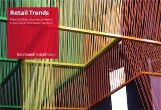
- 1. Retail Trends from EuroShop 2014 and store tours in DÜsseldorf, Amsterdam and Paris
- 2. RETAIL DESIGN TRENDS FROM EUROSHOP
- 3. www.interbranddesignforum.com SIMPLE MATERIALS Reclaimed wood has been a trend for a few years now but at EuroShop there was a movement to more unfinished wood and cardboard. Simple materials were used for merchandising, signage and furniture. This trend answers the call for sustainable, eco-friendly design solutions while allowing product to take the spotlight.
- 5. www.interbranddesignforum.com UP-CYCLING The idea of reinterpreting various materials to create something new is fascinating. From water bottles as a decorative element to plastic trays used to create walls, EuroShop upcycling had some truly innovative results. Plus, these displays get bonus points for sustainability.
- 6. www.interbranddesignforum.com NATURE INSPIRED Many fixtures and displays were inspired by nature. The organic shapes were unique, eye-catching and made spaces feel relaxed and inviting.
- 8. www.interbranddesignforum.com GEOMETRIC & ANGULAR In sharp contrast to the organic motifs, EuroShop was also full of geometric patterns and angular shapes.
- 10. www.interbranddesignforum.com LAYERED PANELS The practice of layering materials was evident throughout the show. Dynamic forms were created for signage, seating, ceiling elements and decorative elements. This trend is intriguing as it makes a design look different from every angle.
- 11. www.interbranddesignforum.com SHIELDED SPACES Many booth walls were created with cutouts allowing visitors to get a sneak peek of what was inside while still maintaining a distinctive space. This tactic made small spaces feel much larger and larger spaces feel more intimate.
- 12. www.interbranddesignforum.com REPETITION Repetition was used throughout EuroShop to quickly create a large visual impact. The use of a shape to create an expected pattern was less impactful than when repetition was used to create rhythm, energy and movement.
- 13. www.interbranddesignforum.com COLOR BLOCKING While not a new design tactic, color blocking seemed fresh at EuroShop compared to many minimalist, futuristic concepts. The bright colors were particularly successful when set off of a dark background and when color slowly gradated from one shade to the next.
- 14. www.interbranddesignforum.com ARCHITECTURAL TYPOGRAPHY The use of large-scale type at EuroShop was an interesting hidden design element. In many cases the type was used for more than simply conveying a message, rather it was a booth opening, ceiling element or fixture and if you noticed it was saying something, the surprise was an added delight.
- 16. www.interbranddesignforum.com IT MUST BE A TOUCHSCREEN Overall, there was a disappointing amount of digital innovation at EuroShop. Several times we approached a screen to touch and interact with the display only to find it was not a touchscreen. Several booths used RFID chips to enable customers to learn more about a product. Augmented reality was also used to encourage product trial.
- 18. A DESTINATION, RATHER THAN A STORE
- 19. www.interbranddesignforum.com CITADIUM PARIS For a retail concept that targets a young, brand-aware crowd you would expect the space to be filled with digital; however, they took the opposite approach and almost removed it entirely. Instead they opted for old-fashioned visual merchandising delivered in clever ways. One of the most attention grabbing displays was presented by Converse. In the center of their space was a pillar clad with sneakers hanging from their laces and covered in graffiti. Shoppers were invited to add their own mark and did so from Twitter handles to small doodles. The only really unique use of digital was a temporary Sharingbox by CAT Footwear, which encourages shoppers to engage with a product, take a “selfie” and then share their brand experience across a range of social media platforms.
- 20. www.interbranddesignforum.com McDONALD’S DUSSELDORF This McDonald’s location felt higher-end and had a look similar to chain’s like Starbucks and Panera. Interesting and unique elements of the design included digital menuboards and optional ordering via kiosk. iPads for browsing social media networks were free to use and music videos and pop culture news were playing on multiple screens.
- 21. www.interbranddesignforum.com URBAN OUTFITTERS AMSTERDAM UO always has an interesting retail space but this location took the experience to a whole other level. Amsterdam has a lot of street art/ graffiti and cannabis coffee shops and this Urban Outfitters owns its city’s unique personality and culture. The design invited customers to hang out in the store rather than come in, buy something and leave.
- 22. Contact Scott Smith at scott.smith@interbrand.com T + 937 312 8904 M + 937 830 5102 THANK YOU Interested in building an innovative retail experience?