SlideShare uma empresa Scribd logo
1 de 8
Analysis of magazine front covers Cover 1.NME Sept 2009  Dizzee
FRONT COVER ANALYSIS 1 THE MASTHEAD Immediately informs the reader what magazine this is and prepares them for the style of the magazine. Use of large red block capital font highlights importance and adds an element of a rebellious and mischievous nature particularly through the use of the colour red. The outline suggests that this is the place to be at the moment within this industry and again reflects the importance of the content in the magazine. This also contrasts with the messy, hectic style of the rest of the front cover increasing the aesthetical appearance no end.  THE HEADER… The header is bold in parts emphasising the key words catching the eye of the reader, the header highlights how exclusive the magazine and that this is a one off, implying that the reader should make the most of this and definitely buy the magazine if in doubt.  THE SELL LINES/COVER LINES The sell lines also correspond to the red, white and black colour scheme. The give the reader more information on the content of the magazine, in this case introducing more current band which ,ay attract the reader into either buying the magazine or reading on.  THE MAIN IMAGE …. The main image is an iconic hip hop artist, the artist is dressed In fashionable, unique clothes allowing people to follow the trends set by him and corresponding to the colour scheme of the background. A medium crouched shot is used to do this effectively.  THE MAIN COVER LINE The main cover line informs the reader of the star within the magazine and highlights the topic of the magazine. This is block capitals emphasising the importance of this. The ‘ZZ’s’ are slightly convex emphasising Dizzie Rascals large bicep muscles adding an element of humour.  Barcode-date/issue/price The barcode is situated in a very discrete place so that it doesn’t detract from the magazine aesthetically as they're not the most attractive thing to look at. This also gives information on the date, issue number and price informing the reader of vital purchasing details and keeping NME informed of whether the magazine is successful, who is buying the magazines and how often they are buying the magazine. This can also inform NME of the shrinkage numbers and how they can minimize this from happening.  THE FOOTER  The footer is used to very good effect, it informs the reader of other appropriate bands which link to the current focus of the magazine either through collaborations or genre.  These will appeal to the audience as they are of the same category as Dizzie Rascal and appear on the current music scene.  USE OF A PULL QUOTE  The pull quote informs the reader of Dizzie rascals intensions within the music industry and allows the audience to relate to the main star. By using a personal quote it adds an element of intimacy to the magazine. This is also very eye catching, again serving its purpose which is to attract a specific audience. The quote itself also excites the audience stating future prospects for the star and how this can influence not only them but the rest of the world.  BACKGROUND The background is very colourful which highlights the happy, busy and exciting lifestyle which Dizzie Rascal leads. The use of graffiti reinforces the urban stereotype and maintains Dizzie Rascals commercial image which emphasises the feel good factor and encouraging people to read the magazine, attracting them with quite an eye catching background. The background is very vibrant yet subtle in comparison to the main cover image ensuring that it doesn’t detract the focus from the main star. The background also attracts a specific target audience effectively which is people who are interested in Dizzie Rascal and the urban music genre.  USE OF A FLASHER-(offering something extra to T.A)  The flasher in this magazine is designed to shock the reader yet also gives them extra information within the magazine. The use of colloquial language within the flasher ‘Wowee’ reflects the urban style of Dizzie Rascal and corresponds to the area of music in which the article is based around.  RULE OF THIRDS/THE LEFT THIRD The left third of the magazine highlights the important information within the cover which consequently becomes the most important side of the magazine, with the main star leaning to this side. The left third includes main features of the magazine such as the pull quote, the flasher and the majority of the cover image, which all combine to create an effective left third of the magazine.
target audience The average age is 25 years old, but overall between 17-30. This is reflected through their magazines in various different ways, in the  Dizzie Rascal issue relatively young fonts and very current artists are used, adding an element of youth and style, which is reinforces by Dizzie’s fashion sense.  The target audience within NME magazine is 73% male around the ABC1  social class, showing that  there is an element of male  dominance within their target  audience. The use of jewellery within the cover  emphasises the relatively  wealthy target  audience The cost of the magazine is  £2.20, which is higher than the average magazine  immediately attracting a  certain social class They love the latest current  bands and can afford these demanding desires. They want the latest gossip on  these bands.
Analysis of magazine front covers Cover 2.NME December 2010  Simon Cowell
FRONT COVER ANALYSIS 2 THE MASTHEAD The  NME masthead signifies what magazine it is and allows the reader to immediately recognise what type of magazine it is. The masthead has been modified  slightly with the Christmas feel adding a few sparkles and the snow effect on top of the text .This  adds a seasonal element and manipulates that time of year to appeal to a wider audience. The bold outline of the masthead adds certainty and strength to the font in contrast to the light background and contributes to reflecting the stern nature of Simon Cowell and complete the NME logo.  THE HEADER… The header includes two different colours yet maintains the same font. The key words ‘Double issue’ are highlighted in gold, which reintroduces that classy style, and makes the reader recognise these words clearer than the others. This is especially effective in this case as they are getting more than initially expected with the ‘double issue’ and makes them feel as if they are receiving extra privileges form NME, increasing the probability that they will buy a NME magazine again.  THE SELL LINES/COVER LINES The sell lines reflect competition and excitement as they go ‘Head to head with Simon Cowell’. This highlights the competitive nature of the music industry and adds mystery and excitement within the readers mind as to what is coming next in the magazine. Elegance and class is reflected once again  by using a flowing, slanted font. This corresponds to Simon Cowell’s prestigious status as a celebrity and contrasts with the raw indie style of the magazine.  THE MAIN IMAGE …. The main image is an iconic superstar who is currently dominating the music industry, This fulfils the purpose of NME and meets the demands of their audience, as he is music related and current. He is staring at the camera with a smug grin, this contrasts to the purity and innocence portrayed  through the rest of the magazine. NME manipulates the use of a medium close up shot to show this gesture effectively. He is wearing a suit which reflects the ABC1 class attracted through the magazine and adds a touch of class to the magazine. His shirt is  undone slightly, which also adds an element of promiscuity and sexiness.  THE MAIN COVER LINE This is in block capital font with a white fill. This emphasises the importance of the cover line, makes it stand out whilst also carries the festive element through, making that subtle connection to snow and innocence, which is contrasted by the menacing glare of Simon Cowell. The actual words create an element of humour and corresponds to the audiences view of Simon Cowell  being a miserable, harsh character, much like the ‘Grinch’ . This immediately creates a connection between the magazine and the reader. The ‘Grinch’ is also associated with Christmas, therefore making their festive marketing campaign successful and portrays the main star of the magazine in a comical way. This also gives a little information on what is to come within the magazine implying that there is an interview with Simon Cowell as he ‘speaks’ making the reader want to continue past the cover.  Barcode-date/issue/price The barcode displays the essential marketing and retail information within the magazine. This gives information to NME and to stores that are selling the magazine with things like shrinkage, volume of sales and the specific types of consumers. This also gives information to the audience as is shows the price of the magazine, the date and issue number. This is situated in a remote position, in the corner of the cover, so that it doesn't detract from the cover yet still remains relatively easy to detect for the cashier scanning the barcode. Without this the magazine marketing would be unsuccessful and NME wouldn't be able to sell the magazines.  BACKGROUND The mellow grey background contrasts with the vibrant, colourful and bold nature of the magazine. It work well as it doesn't detract anything away form the main cover image or cover lines yet reinforces the festive element with great subtlety using sparkles and a slight gradient to complement the colours within the models clothes, skin tone and eyes and the text used on the front cover.  USE OF A FLASHER-(offering something extra to T.A)   The flasher adds more information to the cover  and  enhances the aesthetical appearance of the cover by breaking the usual structured nature of a magazine cover. The flashers continue the festive feel as they are shaped like ball balls yet provide information in the latest ‘cool’ band which also feature within the NME magazines. This is clever as it attracts initial interest yet takes the opportunity to inform the reader of more interesting information within NME magazines.  RULE OF THIRDS/THE LEFT THIRD  The left third contains most of the important information, as the main cover line and all of the shockers/ extra advertisement is placed here. This is also the side that the masthead is situated implying that this side of the cover is vital and all of the useful information is placed here.
Analysis of magazine front covers Cover 3.Kerrang December 2005
FRONT COVER ANALYSIS 3 THE MASTHEAD The use of onomatopoeia within the masthead highlights the musical element introducing a sound similar to that of a guitar smashing. This rugged, smashed style is reinforced by the use of broken font.  THE HEADER …  The header contains rock bands and important dates which correspond to the main bands overall giving the reader more information on other bands which may be of interest to them due to their tastes and current interests.  This also indicates the colour scheme, which is yellow, black and white. The use of words such as ;Arch enemy’ connote conflict and violence, again referring back to the rock industry. THE SELL LINES/COVER LINES The cover lines give more information to the reader, informing them of other bands and latest information relating to the magazine. THE MAIN IMAGE …. The main image is the lead singer of the ‘Foo Fighters’. By using such an iconic band it attracts many people just by looking at the cover, which in turn increases gross sales. A medium shot reflects his fashion sense, nonchalant gesture and clear importance within the magazine as he dominates the cover. This also allows the magazine to highlight his irritant, rocker attitude.  THE MAIN COVER LINE This is all in capitals suggesting that it is important information and highlights how, most of the time, this band is the main centre of attraction through headlining festivals etc. The text is slanted reflecting an element of rebellious nature within their lifestyle and follows the rock genre of the magazine. The drop shadow implies that the ‘Foo Fighters’ are leading the industry and other bands are constantly in their shadow.  Barcode-date/issue/price The barcode contains important information for the organization as they sell the magazine. It informs the customers of price and availability. This also reverts back to sales figures, giving Kerrang an idea of how many magazines they are selling, how often they are selling the magazines and who is buying the magazines. It is positioned in the corner of the cover making sure that it doesn't detract from the main feature. Without this Kerrang could not put the magazine on the shelves.  BACKGROUND The background appears to be in America through the use of palm trees and what seems to be bright weather. The background is muted ensuring that it doesn't detract the focus form the lead singer.  RULE OF THIRDS/THE LEFT THIRD The left third of the magazine appears to be where most of the information is situated. This side of the magazine gives information on other bands, adding variety to the magazine to keep interest. The left side also gives a hint as to what music genre it is and interweaves information about the extra features that the reader gets, extra images of bands are used to enhance the aesthetical appearance and create a visual association for the reader. This breaks the structure of the cover up and adds interest and variety to the cover.
Target audience  The kerrang target audience is aimed predominantly at the rock market, this is implied through the use of fonts and general band featuring within the magazine such as the ‘Foo Fighters’. Also the cover image of this particular magazine reinforces that through the pose of the model highlighting rebellious nature corresponding to rock.  The main target audience for Kerrang magazine is 15-19 year olds who are interested in rock, indie, punk and grunge music. This is highlighted through the type of bands listed at the bottom of the cover, informing the reader of the bands that will feature in the magazine. The layout of the Kerrang covers reinforces this grungy element within their target audience using quite a messy, cluttered cover reflecting the hectic rebellious lifestyle of these characters and appealing to a specific audience.

Mais conteúdo relacionado

Destaque

Lesson 3 magazine analysis audience profiling
Lesson 3 magazine analysis audience profilingLesson 3 magazine analysis audience profiling
Lesson 3 magazine analysis audience profilingshadianakazibwe
 
Magazine analysis
Magazine analysisMagazine analysis
Magazine analysishan-sun
 
Magazine Analysis
Magazine AnalysisMagazine Analysis
Magazine AnalysisJessDruett
 
Q Magazine Analysis
Q Magazine AnalysisQ Magazine Analysis
Q Magazine Analysispriasandhu
 
Analysis of audience profiling of a music magazine
Analysis of audience profiling of a music magazineAnalysis of audience profiling of a music magazine
Analysis of audience profiling of a music magazine_arlindm1
 
MS1 Magazine front cover analysis
MS1 Magazine front cover analysisMS1 Magazine front cover analysis
MS1 Magazine front cover analysisAmanda Simmons
 
Magazine cover analysis main coursework
Magazine cover analysis   main courseworkMagazine cover analysis   main coursework
Magazine cover analysis main courseworksarah123ashcroft
 

Destaque (7)

Lesson 3 magazine analysis audience profiling
Lesson 3 magazine analysis audience profilingLesson 3 magazine analysis audience profiling
Lesson 3 magazine analysis audience profiling
 
Magazine analysis
Magazine analysisMagazine analysis
Magazine analysis
 
Magazine Analysis
Magazine AnalysisMagazine Analysis
Magazine Analysis
 
Q Magazine Analysis
Q Magazine AnalysisQ Magazine Analysis
Q Magazine Analysis
 
Analysis of audience profiling of a music magazine
Analysis of audience profiling of a music magazineAnalysis of audience profiling of a music magazine
Analysis of audience profiling of a music magazine
 
MS1 Magazine front cover analysis
MS1 Magazine front cover analysisMS1 Magazine front cover analysis
MS1 Magazine front cover analysis
 
Magazine cover analysis main coursework
Magazine cover analysis   main courseworkMagazine cover analysis   main coursework
Magazine cover analysis main coursework
 

Mais de HartwellT1

Edit decision list
Edit decision list Edit decision list
Edit decision list HartwellT1
 
Edit decision list 2
Edit decision list 2Edit decision list 2
Edit decision list 2HartwellT1
 
Edit decision list 1
Edit decision list 1Edit decision list 1
Edit decision list 1HartwellT1
 
'Degree or not degree’ mood board
'Degree or not degree’ mood board'Degree or not degree’ mood board
'Degree or not degree’ mood boardHartwellT1
 
Codes and conventions tv listings magazine
Codes and conventions tv listings magazineCodes and conventions tv listings magazine
Codes and conventions tv listings magazineHartwellT1
 
Double page spread draft 2
Double page spread draft 2Double page spread draft 2
Double page spread draft 2HartwellT1
 
Double page spread draft 1
Double page spread draft 1Double page spread draft 1
Double page spread draft 1HartwellT1
 
Double page detailed analysis
Double page detailed analysisDouble page detailed analysis
Double page detailed analysisHartwellT1
 
Analysis of articles
Analysis of articlesAnalysis of articles
Analysis of articlesHartwellT1
 
Tv listings double page spread analysis
Tv listings double page spread analysisTv listings double page spread analysis
Tv listings double page spread analysisHartwellT1
 
Codes and conventions for a radio trailer
Codes and conventions for a radio trailerCodes and conventions for a radio trailer
Codes and conventions for a radio trailerHartwellT1
 
Codes and conventions of interviews
Codes and conventions of interviewsCodes and conventions of interviews
Codes and conventions of interviewsHartwellT1
 
Types of narrative
Types of narrativeTypes of narrative
Types of narrativeHartwellT1
 
Types of narrative
Types of narrativeTypes of narrative
Types of narrativeHartwellT1
 
Documentary genre
Documentary genreDocumentary genre
Documentary genreHartwellT1
 
Documentary styles and influences
Documentary styles and influencesDocumentary styles and influences
Documentary styles and influencesHartwellT1
 

Mais de HartwellT1 (20)

Question 1
Question 1Question 1
Question 1
 
Question 3
Question 3Question 3
Question 3
 
Question 1
Question 1Question 1
Question 1
 
Edit decision list
Edit decision list Edit decision list
Edit decision list
 
Edit decision list 2
Edit decision list 2Edit decision list 2
Edit decision list 2
 
Edit decision list 1
Edit decision list 1Edit decision list 1
Edit decision list 1
 
'Degree or not degree’ mood board
'Degree or not degree’ mood board'Degree or not degree’ mood board
'Degree or not degree’ mood board
 
Codes and conventions tv listings magazine
Codes and conventions tv listings magazineCodes and conventions tv listings magazine
Codes and conventions tv listings magazine
 
Double page spread draft 2
Double page spread draft 2Double page spread draft 2
Double page spread draft 2
 
Double page spread draft 1
Double page spread draft 1Double page spread draft 1
Double page spread draft 1
 
Double page detailed analysis
Double page detailed analysisDouble page detailed analysis
Double page detailed analysis
 
Analysis of articles
Analysis of articlesAnalysis of articles
Analysis of articles
 
Storyboard
StoryboardStoryboard
Storyboard
 
Tv listings double page spread analysis
Tv listings double page spread analysisTv listings double page spread analysis
Tv listings double page spread analysis
 
Codes and conventions for a radio trailer
Codes and conventions for a radio trailerCodes and conventions for a radio trailer
Codes and conventions for a radio trailer
 
Codes and conventions of interviews
Codes and conventions of interviewsCodes and conventions of interviews
Codes and conventions of interviews
 
Types of narrative
Types of narrativeTypes of narrative
Types of narrative
 
Types of narrative
Types of narrativeTypes of narrative
Types of narrative
 
Documentary genre
Documentary genreDocumentary genre
Documentary genre
 
Documentary styles and influences
Documentary styles and influencesDocumentary styles and influences
Documentary styles and influences
 

Último

call girls in Kamla Market (DELHI) 🔝 >༒9953330565🔝 genuine Escort Service 🔝✔️✔️
call girls in Kamla Market (DELHI) 🔝 >༒9953330565🔝 genuine Escort Service 🔝✔️✔️call girls in Kamla Market (DELHI) 🔝 >༒9953330565🔝 genuine Escort Service 🔝✔️✔️
call girls in Kamla Market (DELHI) 🔝 >༒9953330565🔝 genuine Escort Service 🔝✔️✔️9953056974 Low Rate Call Girls In Saket, Delhi NCR
 
ENGLISH6-Q4-W3.pptxqurter our high choom
ENGLISH6-Q4-W3.pptxqurter our high choomENGLISH6-Q4-W3.pptxqurter our high choom
ENGLISH6-Q4-W3.pptxqurter our high choomnelietumpap1
 
Grade 9 Quarter 4 Dll Grade 9 Quarter 4 DLL.pdf
Grade 9 Quarter 4 Dll Grade 9 Quarter 4 DLL.pdfGrade 9 Quarter 4 Dll Grade 9 Quarter 4 DLL.pdf
Grade 9 Quarter 4 Dll Grade 9 Quarter 4 DLL.pdfJemuel Francisco
 
Barangay Council for the Protection of Children (BCPC) Orientation.pptx
Barangay Council for the Protection of Children (BCPC) Orientation.pptxBarangay Council for the Protection of Children (BCPC) Orientation.pptx
Barangay Council for the Protection of Children (BCPC) Orientation.pptxCarlos105
 
What is Model Inheritance in Odoo 17 ERP
What is Model Inheritance in Odoo 17 ERPWhat is Model Inheritance in Odoo 17 ERP
What is Model Inheritance in Odoo 17 ERPCeline George
 
Proudly South Africa powerpoint Thorisha.pptx
Proudly South Africa powerpoint Thorisha.pptxProudly South Africa powerpoint Thorisha.pptx
Proudly South Africa powerpoint Thorisha.pptxthorishapillay1
 
Transaction Management in Database Management System
Transaction Management in Database Management SystemTransaction Management in Database Management System
Transaction Management in Database Management SystemChristalin Nelson
 
INTRODUCTION TO CATHOLIC CHRISTOLOGY.pptx
INTRODUCTION TO CATHOLIC CHRISTOLOGY.pptxINTRODUCTION TO CATHOLIC CHRISTOLOGY.pptx
INTRODUCTION TO CATHOLIC CHRISTOLOGY.pptxHumphrey A Beña
 
ECONOMIC CONTEXT - PAPER 1 Q3: NEWSPAPERS.pptx
ECONOMIC CONTEXT - PAPER 1 Q3: NEWSPAPERS.pptxECONOMIC CONTEXT - PAPER 1 Q3: NEWSPAPERS.pptx
ECONOMIC CONTEXT - PAPER 1 Q3: NEWSPAPERS.pptxiammrhaywood
 
USPS® Forced Meter Migration - How to Know if Your Postage Meter Will Soon be...
USPS® Forced Meter Migration - How to Know if Your Postage Meter Will Soon be...USPS® Forced Meter Migration - How to Know if Your Postage Meter Will Soon be...
USPS® Forced Meter Migration - How to Know if Your Postage Meter Will Soon be...Postal Advocate Inc.
 
Field Attribute Index Feature in Odoo 17
Field Attribute Index Feature in Odoo 17Field Attribute Index Feature in Odoo 17
Field Attribute Index Feature in Odoo 17Celine George
 
AUDIENCE THEORY -CULTIVATION THEORY - GERBNER.pptx
AUDIENCE THEORY -CULTIVATION THEORY -  GERBNER.pptxAUDIENCE THEORY -CULTIVATION THEORY -  GERBNER.pptx
AUDIENCE THEORY -CULTIVATION THEORY - GERBNER.pptxiammrhaywood
 
Difference Between Search & Browse Methods in Odoo 17
Difference Between Search & Browse Methods in Odoo 17Difference Between Search & Browse Methods in Odoo 17
Difference Between Search & Browse Methods in Odoo 17Celine George
 
ENGLISH 7_Q4_LESSON 2_ Employing a Variety of Strategies for Effective Interp...
ENGLISH 7_Q4_LESSON 2_ Employing a Variety of Strategies for Effective Interp...ENGLISH 7_Q4_LESSON 2_ Employing a Variety of Strategies for Effective Interp...
ENGLISH 7_Q4_LESSON 2_ Employing a Variety of Strategies for Effective Interp...JhezDiaz1
 
4.18.24 Movement Legacies, Reflection, and Review.pptx
4.18.24 Movement Legacies, Reflection, and Review.pptx4.18.24 Movement Legacies, Reflection, and Review.pptx
4.18.24 Movement Legacies, Reflection, and Review.pptxmary850239
 
Concurrency Control in Database Management system
Concurrency Control in Database Management systemConcurrency Control in Database Management system
Concurrency Control in Database Management systemChristalin Nelson
 

Último (20)

call girls in Kamla Market (DELHI) 🔝 >༒9953330565🔝 genuine Escort Service 🔝✔️✔️
call girls in Kamla Market (DELHI) 🔝 >༒9953330565🔝 genuine Escort Service 🔝✔️✔️call girls in Kamla Market (DELHI) 🔝 >༒9953330565🔝 genuine Escort Service 🔝✔️✔️
call girls in Kamla Market (DELHI) 🔝 >༒9953330565🔝 genuine Escort Service 🔝✔️✔️
 
ENGLISH6-Q4-W3.pptxqurter our high choom
ENGLISH6-Q4-W3.pptxqurter our high choomENGLISH6-Q4-W3.pptxqurter our high choom
ENGLISH6-Q4-W3.pptxqurter our high choom
 
LEFT_ON_C'N_ PRELIMS_EL_DORADO_2024.pptx
LEFT_ON_C'N_ PRELIMS_EL_DORADO_2024.pptxLEFT_ON_C'N_ PRELIMS_EL_DORADO_2024.pptx
LEFT_ON_C'N_ PRELIMS_EL_DORADO_2024.pptx
 
YOUVE GOT EMAIL_FINALS_EL_DORADO_2024.pptx
YOUVE GOT EMAIL_FINALS_EL_DORADO_2024.pptxYOUVE GOT EMAIL_FINALS_EL_DORADO_2024.pptx
YOUVE GOT EMAIL_FINALS_EL_DORADO_2024.pptx
 
Grade 9 Quarter 4 Dll Grade 9 Quarter 4 DLL.pdf
Grade 9 Quarter 4 Dll Grade 9 Quarter 4 DLL.pdfGrade 9 Quarter 4 Dll Grade 9 Quarter 4 DLL.pdf
Grade 9 Quarter 4 Dll Grade 9 Quarter 4 DLL.pdf
 
Barangay Council for the Protection of Children (BCPC) Orientation.pptx
Barangay Council for the Protection of Children (BCPC) Orientation.pptxBarangay Council for the Protection of Children (BCPC) Orientation.pptx
Barangay Council for the Protection of Children (BCPC) Orientation.pptx
 
What is Model Inheritance in Odoo 17 ERP
What is Model Inheritance in Odoo 17 ERPWhat is Model Inheritance in Odoo 17 ERP
What is Model Inheritance in Odoo 17 ERP
 
Proudly South Africa powerpoint Thorisha.pptx
Proudly South Africa powerpoint Thorisha.pptxProudly South Africa powerpoint Thorisha.pptx
Proudly South Africa powerpoint Thorisha.pptx
 
YOUVE_GOT_EMAIL_PRELIMS_EL_DORADO_2024.pptx
YOUVE_GOT_EMAIL_PRELIMS_EL_DORADO_2024.pptxYOUVE_GOT_EMAIL_PRELIMS_EL_DORADO_2024.pptx
YOUVE_GOT_EMAIL_PRELIMS_EL_DORADO_2024.pptx
 
Transaction Management in Database Management System
Transaction Management in Database Management SystemTransaction Management in Database Management System
Transaction Management in Database Management System
 
INTRODUCTION TO CATHOLIC CHRISTOLOGY.pptx
INTRODUCTION TO CATHOLIC CHRISTOLOGY.pptxINTRODUCTION TO CATHOLIC CHRISTOLOGY.pptx
INTRODUCTION TO CATHOLIC CHRISTOLOGY.pptx
 
Raw materials used in Herbal Cosmetics.pptx
Raw materials used in Herbal Cosmetics.pptxRaw materials used in Herbal Cosmetics.pptx
Raw materials used in Herbal Cosmetics.pptx
 
ECONOMIC CONTEXT - PAPER 1 Q3: NEWSPAPERS.pptx
ECONOMIC CONTEXT - PAPER 1 Q3: NEWSPAPERS.pptxECONOMIC CONTEXT - PAPER 1 Q3: NEWSPAPERS.pptx
ECONOMIC CONTEXT - PAPER 1 Q3: NEWSPAPERS.pptx
 
USPS® Forced Meter Migration - How to Know if Your Postage Meter Will Soon be...
USPS® Forced Meter Migration - How to Know if Your Postage Meter Will Soon be...USPS® Forced Meter Migration - How to Know if Your Postage Meter Will Soon be...
USPS® Forced Meter Migration - How to Know if Your Postage Meter Will Soon be...
 
Field Attribute Index Feature in Odoo 17
Field Attribute Index Feature in Odoo 17Field Attribute Index Feature in Odoo 17
Field Attribute Index Feature in Odoo 17
 
AUDIENCE THEORY -CULTIVATION THEORY - GERBNER.pptx
AUDIENCE THEORY -CULTIVATION THEORY -  GERBNER.pptxAUDIENCE THEORY -CULTIVATION THEORY -  GERBNER.pptx
AUDIENCE THEORY -CULTIVATION THEORY - GERBNER.pptx
 
Difference Between Search & Browse Methods in Odoo 17
Difference Between Search & Browse Methods in Odoo 17Difference Between Search & Browse Methods in Odoo 17
Difference Between Search & Browse Methods in Odoo 17
 
ENGLISH 7_Q4_LESSON 2_ Employing a Variety of Strategies for Effective Interp...
ENGLISH 7_Q4_LESSON 2_ Employing a Variety of Strategies for Effective Interp...ENGLISH 7_Q4_LESSON 2_ Employing a Variety of Strategies for Effective Interp...
ENGLISH 7_Q4_LESSON 2_ Employing a Variety of Strategies for Effective Interp...
 
4.18.24 Movement Legacies, Reflection, and Review.pptx
4.18.24 Movement Legacies, Reflection, and Review.pptx4.18.24 Movement Legacies, Reflection, and Review.pptx
4.18.24 Movement Legacies, Reflection, and Review.pptx
 
Concurrency Control in Database Management system
Concurrency Control in Database Management systemConcurrency Control in Database Management system
Concurrency Control in Database Management system
 

Analysis of 3 magazine covers

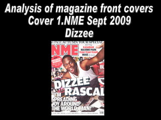
  • 1. Analysis of magazine front covers Cover 1.NME Sept 2009 Dizzee
  • 2. FRONT COVER ANALYSIS 1 THE MASTHEAD Immediately informs the reader what magazine this is and prepares them for the style of the magazine. Use of large red block capital font highlights importance and adds an element of a rebellious and mischievous nature particularly through the use of the colour red. The outline suggests that this is the place to be at the moment within this industry and again reflects the importance of the content in the magazine. This also contrasts with the messy, hectic style of the rest of the front cover increasing the aesthetical appearance no end. THE HEADER… The header is bold in parts emphasising the key words catching the eye of the reader, the header highlights how exclusive the magazine and that this is a one off, implying that the reader should make the most of this and definitely buy the magazine if in doubt. THE SELL LINES/COVER LINES The sell lines also correspond to the red, white and black colour scheme. The give the reader more information on the content of the magazine, in this case introducing more current band which ,ay attract the reader into either buying the magazine or reading on. THE MAIN IMAGE …. The main image is an iconic hip hop artist, the artist is dressed In fashionable, unique clothes allowing people to follow the trends set by him and corresponding to the colour scheme of the background. A medium crouched shot is used to do this effectively. THE MAIN COVER LINE The main cover line informs the reader of the star within the magazine and highlights the topic of the magazine. This is block capitals emphasising the importance of this. The ‘ZZ’s’ are slightly convex emphasising Dizzie Rascals large bicep muscles adding an element of humour. Barcode-date/issue/price The barcode is situated in a very discrete place so that it doesn’t detract from the magazine aesthetically as they're not the most attractive thing to look at. This also gives information on the date, issue number and price informing the reader of vital purchasing details and keeping NME informed of whether the magazine is successful, who is buying the magazines and how often they are buying the magazine. This can also inform NME of the shrinkage numbers and how they can minimize this from happening. THE FOOTER The footer is used to very good effect, it informs the reader of other appropriate bands which link to the current focus of the magazine either through collaborations or genre. These will appeal to the audience as they are of the same category as Dizzie Rascal and appear on the current music scene. USE OF A PULL QUOTE The pull quote informs the reader of Dizzie rascals intensions within the music industry and allows the audience to relate to the main star. By using a personal quote it adds an element of intimacy to the magazine. This is also very eye catching, again serving its purpose which is to attract a specific audience. The quote itself also excites the audience stating future prospects for the star and how this can influence not only them but the rest of the world. BACKGROUND The background is very colourful which highlights the happy, busy and exciting lifestyle which Dizzie Rascal leads. The use of graffiti reinforces the urban stereotype and maintains Dizzie Rascals commercial image which emphasises the feel good factor and encouraging people to read the magazine, attracting them with quite an eye catching background. The background is very vibrant yet subtle in comparison to the main cover image ensuring that it doesn’t detract the focus from the main star. The background also attracts a specific target audience effectively which is people who are interested in Dizzie Rascal and the urban music genre. USE OF A FLASHER-(offering something extra to T.A) The flasher in this magazine is designed to shock the reader yet also gives them extra information within the magazine. The use of colloquial language within the flasher ‘Wowee’ reflects the urban style of Dizzie Rascal and corresponds to the area of music in which the article is based around. RULE OF THIRDS/THE LEFT THIRD The left third of the magazine highlights the important information within the cover which consequently becomes the most important side of the magazine, with the main star leaning to this side. The left third includes main features of the magazine such as the pull quote, the flasher and the majority of the cover image, which all combine to create an effective left third of the magazine.
  • 3. target audience The average age is 25 years old, but overall between 17-30. This is reflected through their magazines in various different ways, in the Dizzie Rascal issue relatively young fonts and very current artists are used, adding an element of youth and style, which is reinforces by Dizzie’s fashion sense. The target audience within NME magazine is 73% male around the ABC1 social class, showing that there is an element of male dominance within their target audience. The use of jewellery within the cover emphasises the relatively wealthy target audience The cost of the magazine is £2.20, which is higher than the average magazine immediately attracting a certain social class They love the latest current bands and can afford these demanding desires. They want the latest gossip on these bands.
  • 4. Analysis of magazine front covers Cover 2.NME December 2010 Simon Cowell
  • 5. FRONT COVER ANALYSIS 2 THE MASTHEAD The NME masthead signifies what magazine it is and allows the reader to immediately recognise what type of magazine it is. The masthead has been modified slightly with the Christmas feel adding a few sparkles and the snow effect on top of the text .This adds a seasonal element and manipulates that time of year to appeal to a wider audience. The bold outline of the masthead adds certainty and strength to the font in contrast to the light background and contributes to reflecting the stern nature of Simon Cowell and complete the NME logo. THE HEADER… The header includes two different colours yet maintains the same font. The key words ‘Double issue’ are highlighted in gold, which reintroduces that classy style, and makes the reader recognise these words clearer than the others. This is especially effective in this case as they are getting more than initially expected with the ‘double issue’ and makes them feel as if they are receiving extra privileges form NME, increasing the probability that they will buy a NME magazine again. THE SELL LINES/COVER LINES The sell lines reflect competition and excitement as they go ‘Head to head with Simon Cowell’. This highlights the competitive nature of the music industry and adds mystery and excitement within the readers mind as to what is coming next in the magazine. Elegance and class is reflected once again by using a flowing, slanted font. This corresponds to Simon Cowell’s prestigious status as a celebrity and contrasts with the raw indie style of the magazine. THE MAIN IMAGE …. The main image is an iconic superstar who is currently dominating the music industry, This fulfils the purpose of NME and meets the demands of their audience, as he is music related and current. He is staring at the camera with a smug grin, this contrasts to the purity and innocence portrayed through the rest of the magazine. NME manipulates the use of a medium close up shot to show this gesture effectively. He is wearing a suit which reflects the ABC1 class attracted through the magazine and adds a touch of class to the magazine. His shirt is undone slightly, which also adds an element of promiscuity and sexiness. THE MAIN COVER LINE This is in block capital font with a white fill. This emphasises the importance of the cover line, makes it stand out whilst also carries the festive element through, making that subtle connection to snow and innocence, which is contrasted by the menacing glare of Simon Cowell. The actual words create an element of humour and corresponds to the audiences view of Simon Cowell being a miserable, harsh character, much like the ‘Grinch’ . This immediately creates a connection between the magazine and the reader. The ‘Grinch’ is also associated with Christmas, therefore making their festive marketing campaign successful and portrays the main star of the magazine in a comical way. This also gives a little information on what is to come within the magazine implying that there is an interview with Simon Cowell as he ‘speaks’ making the reader want to continue past the cover. Barcode-date/issue/price The barcode displays the essential marketing and retail information within the magazine. This gives information to NME and to stores that are selling the magazine with things like shrinkage, volume of sales and the specific types of consumers. This also gives information to the audience as is shows the price of the magazine, the date and issue number. This is situated in a remote position, in the corner of the cover, so that it doesn't detract from the cover yet still remains relatively easy to detect for the cashier scanning the barcode. Without this the magazine marketing would be unsuccessful and NME wouldn't be able to sell the magazines. BACKGROUND The mellow grey background contrasts with the vibrant, colourful and bold nature of the magazine. It work well as it doesn't detract anything away form the main cover image or cover lines yet reinforces the festive element with great subtlety using sparkles and a slight gradient to complement the colours within the models clothes, skin tone and eyes and the text used on the front cover. USE OF A FLASHER-(offering something extra to T.A) The flasher adds more information to the cover and enhances the aesthetical appearance of the cover by breaking the usual structured nature of a magazine cover. The flashers continue the festive feel as they are shaped like ball balls yet provide information in the latest ‘cool’ band which also feature within the NME magazines. This is clever as it attracts initial interest yet takes the opportunity to inform the reader of more interesting information within NME magazines. RULE OF THIRDS/THE LEFT THIRD The left third contains most of the important information, as the main cover line and all of the shockers/ extra advertisement is placed here. This is also the side that the masthead is situated implying that this side of the cover is vital and all of the useful information is placed here.
  • 6. Analysis of magazine front covers Cover 3.Kerrang December 2005
  • 7. FRONT COVER ANALYSIS 3 THE MASTHEAD The use of onomatopoeia within the masthead highlights the musical element introducing a sound similar to that of a guitar smashing. This rugged, smashed style is reinforced by the use of broken font. THE HEADER … The header contains rock bands and important dates which correspond to the main bands overall giving the reader more information on other bands which may be of interest to them due to their tastes and current interests. This also indicates the colour scheme, which is yellow, black and white. The use of words such as ;Arch enemy’ connote conflict and violence, again referring back to the rock industry. THE SELL LINES/COVER LINES The cover lines give more information to the reader, informing them of other bands and latest information relating to the magazine. THE MAIN IMAGE …. The main image is the lead singer of the ‘Foo Fighters’. By using such an iconic band it attracts many people just by looking at the cover, which in turn increases gross sales. A medium shot reflects his fashion sense, nonchalant gesture and clear importance within the magazine as he dominates the cover. This also allows the magazine to highlight his irritant, rocker attitude. THE MAIN COVER LINE This is all in capitals suggesting that it is important information and highlights how, most of the time, this band is the main centre of attraction through headlining festivals etc. The text is slanted reflecting an element of rebellious nature within their lifestyle and follows the rock genre of the magazine. The drop shadow implies that the ‘Foo Fighters’ are leading the industry and other bands are constantly in their shadow. Barcode-date/issue/price The barcode contains important information for the organization as they sell the magazine. It informs the customers of price and availability. This also reverts back to sales figures, giving Kerrang an idea of how many magazines they are selling, how often they are selling the magazines and who is buying the magazines. It is positioned in the corner of the cover making sure that it doesn't detract from the main feature. Without this Kerrang could not put the magazine on the shelves. BACKGROUND The background appears to be in America through the use of palm trees and what seems to be bright weather. The background is muted ensuring that it doesn't detract the focus form the lead singer. RULE OF THIRDS/THE LEFT THIRD The left third of the magazine appears to be where most of the information is situated. This side of the magazine gives information on other bands, adding variety to the magazine to keep interest. The left side also gives a hint as to what music genre it is and interweaves information about the extra features that the reader gets, extra images of bands are used to enhance the aesthetical appearance and create a visual association for the reader. This breaks the structure of the cover up and adds interest and variety to the cover.
  • 8. Target audience The kerrang target audience is aimed predominantly at the rock market, this is implied through the use of fonts and general band featuring within the magazine such as the ‘Foo Fighters’. Also the cover image of this particular magazine reinforces that through the pose of the model highlighting rebellious nature corresponding to rock. The main target audience for Kerrang magazine is 15-19 year olds who are interested in rock, indie, punk and grunge music. This is highlighted through the type of bands listed at the bottom of the cover, informing the reader of the bands that will feature in the magazine. The layout of the Kerrang covers reinforces this grungy element within their target audience using quite a messy, cluttered cover reflecting the hectic rebellious lifestyle of these characters and appealing to a specific audience.