SlideShare a Scribd company logo
1 of 8
The magazine masthead is in larger
  Micro Elements                                                                                                         size than the images and text in
                                                                                                                         order to draw attention of the
This slogan creates anticipation of very                                                                                 potential target audience. By using
detailed interesting articles about                                                                                      an alarming colour of red the
upcoming films. In saying this the                                                                                       audience will immediately to the
audience will automatically expect                                                                                       magazine. “Empire” connotes with
unique articles.                                                                                                         something large, so the audience
                                                                                                                         will immediately anticipate it’s a
                                                                                                                         grand magazine. In using such a
                                                                                                                         title the audience will be expecting
These cover lines cover a range of
                                                                                                                         something rather large.
mystical & magical films. This
suggests that the target audience are                                                                                  By using a celebrity as the a medium
those of a younger generation. In                                                                                      shot on the magazine, it creates
comparison to the masthead the                                                                                         intertexuality. the audience will relate
writing is in smaller font in order to                                                                                 Daniel Radcliffe to the previous Harry
create familiarity with the masthead.                                                                                  Potter movies. In having him look
The magazine chooses to use a range                                                                                    directly at the audience it will create an
of colours, such as silver, and yellow,                                                                                intimate relationship between both
it makes the magazine cover more                                                                                       parties. With the cover line placed on
attractive.                                                                                                            top of the image, it creates a link
                                                                                                                       between the article and the image. In
The magazine uses a very dominant                                                                                      portraying the character with blood on
image, but by the use of dominant                                                                                      his face, the audience will automatically
large texts with alarming colours it                                                                                   be drawn into the magazine because it
balances it out. By using colours of red                                                                               is very peculiar for this character. Also
it has alarming, dangerous                                                                                             by using this image we have a synopsis
connotations.                                                                                                          of who the target audience is and the
                                                   By placing the strap line on the bottom of the                      genre of the magazine.
                                                   magazine cover, the audience will be drawn into the                           This is the barcode.
                                                   magazine. This also acts as a covert advert, the movies                       This is normal for
                                                   presented will create anticipation. This calls the                            magazines to have the
                                                   attention of the audience.                                                    barcode on the front
                                                                                                                                 cover.
  The price of the magazine is placed in smaller font in order for the audience to not be deferred by the expensive price. Rather they use the information to
  draw the audience into the magazine. This magazine chooses to use very structured layout, with text placed on the left and the image on the right, indeed
  the movies are aimed at a younger audience and this magazines follows this convention as it shouts its information at the audience “45 NEW MOVIES YOU
  NEED TO KNOW RIGHT NOW’, but having the image in the bottom left in a box again we have an idea about the target audience being much younger. By
  using direct addresses such as “you” again implies the audience is much younger.
Representations
                                                     This magazine uses an image of Harry Potter with blood on his face, this might suggest that
                                                     it is aimed at those who take pleasure in gruesome action films. The image is rather
                                                     stereotypical of the white race because the image uses a white boy which suggests that this
                                                     race may enjoy such activities. Also by using a male it proposes the idea that these
                                                     individuals enjoy such “manly” roles in society. Rather than using a female this is rather
                                                     unconventional and would not be representative of the youngsters who enjoy these types
                                                     of films because the protagonist is always male. In addition to this idea, young males are
                                                     always depicted as negatively, this magazine uses this ideology.
                                                     Tone and register
                                                      The tone that is adopted in this magazine cover is very masculine, we get an understanding
                                                     that maybe this magazine is aimed at males. The magazine uses very basic English
                                                     language, which may suggest that the magazine is aimed at the lower middle class
                                                     individuals or a younger audience. “harry comes out fighting”. The magazine uses very
                                                     direct language such as “… You need to know right now!” This magazine uses very little
                                                     formality “bloody hell!”, it uses very colloquial language which again suggests who the
                                                     magazine is aimed at.
                                                     Effect and Effectiveness
                                                     This magazine achieves the purpose of drawing in the target audience through the use of
                                                     basic language and the alarming colours used on the magazine cover. This magazine may
                                                     use methods such as test screenings, which will explain why the magazine is effective
                                                     enough to have an online base.
Target Audience
Through this magazine the target audience are younger. The magazine online website is placed in the tagline, which suggests again the class of
the youngsters this would only be applicable to those who have internet access at home. We can tell this through the films featured on the
cover of the magazine, these cover lines are very reflective of the audience, we understand that they prefer magical, mystical, action type
films . Also we understand that the target audience may be individuals of white race, through the fact Harry Potter is largely known, we know
the movie is very mystical and is based on the idea of magic and the deep beyond. Children of other cultures and religions may not be
permitted to watch this because it may contradict with their religious backgrounds. This magazine is aimed at middle class youngsters because
they will be able to buy this magazine, as it is priced at £3.90 and children from a much lower class wouldn’t be able to afford this magazine on
a weekly basis. Also we learn that the intended audience are those who like thriller type movies again through the cover lines and the main
image of Harry Potter. Also we learn that the audience are those who prefer a magazine, rather than a radio station may suggest the age of the
audience, that they are of a younger age.
Micro Elements.                                                                                                       The masthead uses white
                                                                                                                      large font, this is effective in
 This is the skyline, which
                                                                                                                      drawing in the audiences
 calls the audience to the
                                                                                                                      gaze. In using “Total Film”,
 special attraction of
                                                                                                                      the magazine directly
 articles featured in the
                                                                                                                      informs the audience what
 magazine. This directly
                                                                                                                      the magazine is about and
 draws in the audience.
                                                                                                                      also those who are
                                                                                                                      unaware.

                                                                                                                      This anchor text it
                                                                                                                      informs the audience
The cover lines feature a                                                                                             as to why this celebrity
range of film topics                                                                                                  is featured on the
through the use of                                                                                                    front of the magazine.
colloquial language we                                                                                                All this is to lure them
understand that this                                                                                                  to want to read the
magazine may be aimed at                                                                                              article inside the
those of a lower middle                                                                                               magazine about
class social background.                                                                                              Johnny Depp.
The cover lines feature                                                                                               Magazines conventionally
films from the USA which                                                                                              use a barcode on the front
may suggest it is a global                                                                                            rather than on the back.
magazine. The reference
to these film articles
suggest that this article is
aimed at film fans.
This medium shot of Johnny Depp has been chosen to create a relationship between the audience and the celebrity. Also it creates
intertexuality, the audience will automatically reference this celebrity to other films he has starred in and will be more likely to buy this
magazine, through the familiarity created. Also it gives some idea about the kind of magazine it is, and also the age of the target audience.
Through the costume used we can create some idea of the character in which he plays. The use of velvet material of his jacket has rich
connotations so the audience will feel the character he plays is of a wealthy background. Also by using a background taken directly from
Charlie And the Chocolate Factory, the audience will anticipate this film, and also it will create a magical type fairytale atmosphere, also it
suggests the innocence associated with this magazine. The use of costume also sets the time period in which the film is set in, the top hat
suggests that the film is from an older period. By featuring Johnny Depp it acts as a covert advert, the audience will become more familiar
with this character and anticipate his other work.
Micro Elements                                                                                                             This is the slogan which is used to
                                                                                                                           hype up the magazine. This is used
  This magazine uses direct                                                                                                to draw in the audience against
  address and speaks to the                                                                                                competing magazines. By using
  audience which will create                                                                                               words such as “Ultimate” , the
  audience involvement. By                                                                                                 audience will automatically place
  having Johnny Depp making                                                                                                this magazine in a higher category
  direct eye contact with the                                                                                              and would associate this magazine
  audience it will achieve                                                                                                 with prestige's.
  intimacy.
This magazine is informal by the use of
layout, it uses cover lines on both the left and
                                                                                                                           The colours used in the main
right of the magazine cover and also on the
                                                                                                                           image are very dominant colours
bottom of the page. This magazine features
                                                                                                                           such as burgundy, purple and
stars, circle and rectangle shapes which shout
                                                                                                                           green but this magazine has
more at the audience and draw in the
                                                                                                                           balanced out these dominant
attention of the audience, by using a range of
                                                                                                                           colours by using very neutral
shapes it will visually attract the audience into
                                                                                                                           colours such as white and silver,
the content of the magazine. This magazine
                                                                                                                           this creates a wealthy feel to the
uses rectangle shapes on a slanted angle
                                                                                                                           magazine. By using the colour of
again to draw in the attention of the audience.
                                                                                                                           white, the connotations are of
The feature placed on the left of the page
                                                                                                                           something pure and innocent
draws the attention of the audience to other
                                                                                                                           which may suggest that the
contents in the magazine. The magazine uses
                                                                                                                           magazine is aimed at children’s
direct address such as you again to make the
                                                                                                                           parents which may want to read
audience feel involved in the magazine, this is
                                                                                                                           more about what their kids watch.
effectives because the audience will feel more
                                                                                                                           By using the colour of silver, the
included in the magazine.
                                                                                                                           connotations are of something
                                    This coverline acts as a covert advert, it advertises the summer preview and the       very grand which will make the
                                    Charlie And The Chocolate Factory. The use of exclamation marks hypes up the           audience feel they are prestige
                                    magazine making the audience feel they are being involved in top secret                and this magazine is one of class.
                                    information. This is the main attraction of the magazine, as it placed in large font
                                    and uses shapes such as star which will create the idea this is direct top secret
                                    information. By using large font the audience will be drawn directly to magazine
                                    because the text stands out.
Macro elements                                     Representation
                                                   The image portrays this group in
Tone and register                                  society as friendly inviting, respectful
This magazine uses formal language and             people, I learnt this through the
correct grammar by doing this it may suggest       image used of where Johnny Depp
that this magazine is aimed at an older            greets his audience. This magazine
audience. . The tone adopted on the front of       represents white people as friendly.
this magazine cover is an inviting tone by         Also we can see that this character
using words such as “Grab your golden              looks rather young, without any facial
ticket’. The vocabulary in this magazine is        hair which may mean it is targets the
basic to address the parents of the children,      parents of these children.
by doing this the average parent will be able
to understand the language used. This uses
an average degree of formality which may
suggest that the magazine is just a basic          Effective and
guideline and aims to address the parents          effectiveness
with respect.                                      I believe this magazine is effective in
Target Audience                                    drawing in the attention of the
I think the intended audience of this edition of   audience through the use of friendly
the magazine was parents mainly because of         words such as “your golden ticket”
the image of Johnny Depp and the anchor            which will make the reader feel
text used, I felt this was a basic outline about   included in the magazine. Also the
what the film is about, the language used is       degree of formality is not
too advanced for younger children to be the        overbearing and speaks to directly to
intended audience. I also came up with the         most of the parent population.
conclusion that this magazine is aimed at
parents through the skyline “From Batman to
Star Wars: The 50 must see movies for
summer” as kids are on holidays at this time, I
felt this again acts as an advert for the best
age appropriate films for them to be
entertained with. I also believe this magazine
is aimed at a particular race or religion
because the advertised films and Johnny
Depp on the front cover is appropriate for all
religious and race backgrounds.
This is the slogan                                                                                                          The masthead uses a very bold
which hypes up the                                                                                                          alarming colour of red, which will
magazine and                                                                                                                stand out and draw in the attention of
consequently make the                                                                                                       the audience. By using the title
audience feel like this                                                                                                     ‘Empire’ it suggests that this
magazine is the best                                                                                                        magazine is something grand.
and unique in
                                                                                                                            This advertises the magazines online
comparison to other
                                                                                                                            base, which suggests that this
film magazines.
                                                                                                                            magazine is known world wide, and
                                                                                                                            is quite large.
                                                                                                                            This is the barcode
                                                                                                                            which is normally
                                                                                                                            placed on the front
This is the anchor text which will                                                                                          of the magazine.
inform the audience as to why this
particular celebrity is featured on
the front cover, it lures in the
audience to read an article inside
the magazine. Also it acts as a
covert advert, advertising Megan
Fox as an actress and the film she
is featured in.


This image of Megan Fox imposing nude, suggests that this edition is aimed at males, by having here look directly at the audience it creates intimacy which will
be particularly effective in drawing the attention of the audience,. The use of tattoo’s may depict that this woman isn’t the typical “lady” but may be more
masculine. This edition will increase the number of males who will read this magazine, due to the fact that sex sells. Megan Fox is well known for being very
attractive, having here impose nude on the magazine cover will create anticipation within the male audience, they would want to read her article featured
because they may get to see her nudity. Her image overlaps the masthead which suggests that the main attraction is Megan Fox. This woman has been chosen
because she exudes high sex appeal which will wheel in, the male crowd and popularising the magazine. This magazine is effective in drawing in a much older
crowd in comparison to the other edition I have previously analysed. By using a long shot, Megan Fox is being shown directly for the benefit of guys who want to
see her nudity.
This calls the attention of the
  The price is placed very small at the top                                                                                     readers to an attraction as it is
  of magazine in order to avoid distracting                                                                                     placed at the top of the
  the audience from the amazing articles                                                                                        magazine.
  featured in the magazine.


                                                                                                                            This magazine is informal in its
This magazine uses and informal layout by                                                                                   organisation because it has
having their cover lines placed on the left,                                                                                placed text around the central
but not aligned, which may suggest it is                                                                                    image without aligning them to
aimed at younger, less thoughtful males.                                                                                    the left, this suggests that the
This coverline features a range of film                                                                                     audience are of adolescent
articles, this may suggest that the                                                                                         males who aren't to thoughtful
magazine is aimed at individuals who love                                                                                   and wouldn’t be too fussed by
films and are serious about the films                                                                                       the layout of the magazine.
featured. It also suggests it is aimed at                                                                                   This magazine doesn’t use any
those who aren’t too interested in very                                                                                     shapes which creates a calmer
detailed articles but want to get straight to                                                                               approach to the audience, by
the point. It suggests the age of audience.                                                                                 doing this it keeps the focus on
                                                                                                                            the central image. This
                                                                                                                            magazine uses a puff in the
                                                                                                                            corner to exclaim about other
                                                                                                                            content in the magazine.
By using images instead of text for
these coverlines it creates a different
way of giving information and also is
more visual for those who like to see
rather than to read. In doing this, this
magazine suggests that the readers
are younger and prefer more images
and less text. Also it acts as advert,
advertising the films, creating                 The image uses very neutral colours of back leggings by doing this the magazine has made way for very
intertexuality with the celebrities             colourful alarming text. By using red with this image, it connotates with the idea of passion and lust the
featured both these are successful in           readers are left lusting after Megan Fox. By having bright colours such as red with a nude colour doesn’t
creating familiarity.                           make the magazine messy. By having language such as “Hot” it has sexual connotations when placed along
                                                with the image, by doing this the magazine have heightened sexual desires within their readers, which may
                                                suggest that this magazine is aimed at those older.
Macro Elements                                     Representation
                                                   This magazine represents the target
Tone and Register                                  audience as heterosexual men who are
This magazine uses both formal and informal        entertained by women’s nudity. It portrays
language such as “woman, megastars” which          the female ‘s in society as being
may suggest the intended target audience. We       specimen’s of the male gaze, this woman is
also learn that this magazine aimed at people      here to pleasure and entice men. This
from outside Hollywood, by doing this the          conforms to the idea that women are
reader will feel unique in reading such an         sexual objects to the alpha male. By having
article. This magazine uses correct grammar        an image of Megan Fox displaying her
and refrains from using colloquial language        tattoos may suggest that this magazines
again may suggest that the magazine is aimed       wants to lure in all males and also may
at a larger audience. This magazine uses very      suggest the role of women changing in
simple vocabulary, they did this in order not to   society.
overwhelm the target audience with words
they don’t understand. The magazine uses
very little text which may suggest the age of      Effect and effectiveness
the audience as those who prefer images to         I think this magazine cover is effective in
text which creates a house style.                  drawing in the attention of males and
                                                   making them actually want to buy the
Target Audience
                                                   magazine.
I think that the intended target audience are
males because of the main image used, I feel
this magazine has done this to draw in the
gaze of the reader, also most men would feel
privileged to have a naked Megan Fox looking
at them. Also by having this image I feel that
the magazine is aimed at all types of men
mostly being heterosexual because they will
only take pleasure in such an image. Also I
feel this magazine is aimed at those who are
not religious because the image uses some
nudity which wouldn’t be appropriate for those
with strong religious ethics. By having a
magazine it may suggest that the target
audience are those in their mid 20s and above
because being this the paper back version, the
younger audience will prefer other media

More Related Content

What's hot

Existing product research (front cover)
Existing product research (front cover)Existing product research (front cover)
Existing product research (front cover)alextownsley
 
Movie Magazine Cover & Poster analysis
Movie Magazine Cover & Poster analysis Movie Magazine Cover & Poster analysis
Movie Magazine Cover & Poster analysis Naomi Collins
 
Magazine cover research
Magazine cover research Magazine cover research
Magazine cover research Janet Lunkusé
 
Annotated conventions of rock music magazines
Annotated conventions of rock music magazinesAnnotated conventions of rock music magazines
Annotated conventions of rock music magazinesJoshd96
 
Research pt. 1
Research pt. 1Research pt. 1
Research pt. 1958212
 
Nme magazine analysis
Nme magazine analysisNme magazine analysis
Nme magazine analysisasmediaf12
 
Media Evaluation
Media EvaluationMedia Evaluation
Media Evaluationrebeccatp45
 
Planning ancillaries
Planning ancillariesPlanning ancillaries
Planning ancillariesDanny Norton
 
Planning for ‘In tune’ magazine
Planning for ‘In tune’ magazinePlanning for ‘In tune’ magazine
Planning for ‘In tune’ magazine014207
 
Magazine cover analysis
Magazine cover analysis Magazine cover analysis
Magazine cover analysis emilylivesey
 
Content cover analysis [1]
Content cover analysis [1]Content cover analysis [1]
Content cover analysis [1]jasminepleass
 
Semi double page
Semi double pageSemi double page
Semi double pagechiquitahx
 

What's hot (19)

My evaluation
My evaluationMy evaluation
My evaluation
 
Existing product research (front cover)
Existing product research (front cover)Existing product research (front cover)
Existing product research (front cover)
 
NME
NMENME
NME
 
Movie Magazine Cover & Poster analysis
Movie Magazine Cover & Poster analysis Movie Magazine Cover & Poster analysis
Movie Magazine Cover & Poster analysis
 
.
..
.
 
Magazine cover research
Magazine cover research Magazine cover research
Magazine cover research
 
Film poster analysis
Film poster analysis Film poster analysis
Film poster analysis
 
Annotated conventions of rock music magazines
Annotated conventions of rock music magazinesAnnotated conventions of rock music magazines
Annotated conventions of rock music magazines
 
Magazine Analysis
Magazine AnalysisMagazine Analysis
Magazine Analysis
 
Research pt. 1
Research pt. 1Research pt. 1
Research pt. 1
 
Nme magazine analysis
Nme magazine analysisNme magazine analysis
Nme magazine analysis
 
Media Evaluation
Media EvaluationMedia Evaluation
Media Evaluation
 
Planning ancillaries
Planning ancillariesPlanning ancillaries
Planning ancillaries
 
Planning for ‘In tune’ magazine
Planning for ‘In tune’ magazinePlanning for ‘In tune’ magazine
Planning for ‘In tune’ magazine
 
Magazine cover analysis
Magazine cover analysis Magazine cover analysis
Magazine cover analysis
 
Content cover analysis [1]
Content cover analysis [1]Content cover analysis [1]
Content cover analysis [1]
 
Semi double page
Semi double pageSemi double page
Semi double page
 
Double page
Double pageDouble page
Double page
 
Evaluation question 1
Evaluation question 1Evaluation question 1
Evaluation question 1
 

Viewers also liked

Conocomientos curriculares específicos
Conocomientos curriculares específicosConocomientos curriculares específicos
Conocomientos curriculares específicos0013
 
Clasificacion de redes
Clasificacion de redesClasificacion de redes
Clasificacion de redesjohanra
 
Cultura de la legalidad fase 2
Cultura de la legalidad fase 2Cultura de la legalidad fase 2
Cultura de la legalidad fase 2Alba Jimenez
 
Flexitime y la biblioteca
Flexitime y la biblioteca Flexitime y la biblioteca
Flexitime y la biblioteca Edpe3129
 
Blender Coda Voda Iit
Blender Coda Voda IitBlender Coda Voda Iit
Blender Coda Voda IitGaurav M
 
(A very) basic principles of merchandising
(A very) basic principles of merchandising(A very) basic principles of merchandising
(A very) basic principles of merchandisingAbdi Januar Putra
 
MOOCS and the Future of Higher Education
MOOCS and the Future of Higher EducationMOOCS and the Future of Higher Education
MOOCS and the Future of Higher Educationbeboac
 
Norma tecnica tb 2006
Norma tecnica tb 2006Norma tecnica tb 2006
Norma tecnica tb 2006Esr Pct Ica
 
Renovación de la atención primaria de la salud en las américas 2007
Renovación de la atención primaria de la salud en las américas 2007Renovación de la atención primaria de la salud en las américas 2007
Renovación de la atención primaria de la salud en las américas 2007UDI
 
1752M12_EAF5_Memòria_G1_BLOG
1752M12_EAF5_Memòria_G1_BLOG1752M12_EAF5_Memòria_G1_BLOG
1752M12_EAF5_Memòria_G1_BLOGPaki EStepa
 
Como hacer talleres guia práctica para capacitadores
Como hacer talleres   guia práctica para capacitadoresComo hacer talleres   guia práctica para capacitadores
Como hacer talleres guia práctica para capacitadorescesar augusto mancilla castro
 
Normativa alimentaria fao oms - higiene de los alimentos
Normativa alimentaria fao oms - higiene de los alimentosNormativa alimentaria fao oms - higiene de los alimentos
Normativa alimentaria fao oms - higiene de los alimentosVictor Morales
 
Apuntes Historia del Arte (a mano) COU
Apuntes Historia del Arte (a mano) COUApuntes Historia del Arte (a mano) COU
Apuntes Historia del Arte (a mano) COUmayores25
 

Viewers also liked (20)

Conocomientos curriculares específicos
Conocomientos curriculares específicosConocomientos curriculares específicos
Conocomientos curriculares específicos
 
Evaluacion
EvaluacionEvaluacion
Evaluacion
 
Clasificacion de redes
Clasificacion de redesClasificacion de redes
Clasificacion de redes
 
Cultura de la legalidad fase 2
Cultura de la legalidad fase 2Cultura de la legalidad fase 2
Cultura de la legalidad fase 2
 
Etsy
EtsyEtsy
Etsy
 
Flexitime y la biblioteca
Flexitime y la biblioteca Flexitime y la biblioteca
Flexitime y la biblioteca
 
Blender Coda Voda Iit
Blender Coda Voda IitBlender Coda Voda Iit
Blender Coda Voda Iit
 
Titanic
TitanicTitanic
Titanic
 
(A very) basic principles of merchandising
(A very) basic principles of merchandising(A very) basic principles of merchandising
(A very) basic principles of merchandising
 
Norma a.130 requisitos_de_seguridad
Norma a.130 requisitos_de_seguridadNorma a.130 requisitos_de_seguridad
Norma a.130 requisitos_de_seguridad
 
MOOCS and the Future of Higher Education
MOOCS and the Future of Higher EducationMOOCS and the Future of Higher Education
MOOCS and the Future of Higher Education
 
Norma tecnica tb 2006
Norma tecnica tb 2006Norma tecnica tb 2006
Norma tecnica tb 2006
 
Renovación de la atención primaria de la salud en las américas 2007
Renovación de la atención primaria de la salud en las américas 2007Renovación de la atención primaria de la salud en las américas 2007
Renovación de la atención primaria de la salud en las américas 2007
 
Pirámides de población de España
Pirámides de población de EspañaPirámides de población de España
Pirámides de población de España
 
1752M12_EAF5_Memòria_G1_BLOG
1752M12_EAF5_Memòria_G1_BLOG1752M12_EAF5_Memòria_G1_BLOG
1752M12_EAF5_Memòria_G1_BLOG
 
Administracion de un centro de computo
Administracion de un centro de computoAdministracion de un centro de computo
Administracion de un centro de computo
 
Como hacer talleres guia práctica para capacitadores
Como hacer talleres   guia práctica para capacitadoresComo hacer talleres   guia práctica para capacitadores
Como hacer talleres guia práctica para capacitadores
 
Normativa alimentaria fao oms - higiene de los alimentos
Normativa alimentaria fao oms - higiene de los alimentosNormativa alimentaria fao oms - higiene de los alimentos
Normativa alimentaria fao oms - higiene de los alimentos
 
Apuntes Historia del Arte (a mano) COU
Apuntes Historia del Arte (a mano) COUApuntes Historia del Arte (a mano) COU
Apuntes Historia del Arte (a mano) COU
 
Derecho alimentario en el peru
Derecho alimentario en el peruDerecho alimentario en el peru
Derecho alimentario en el peru
 

Similar to Magazine analysis

Similar to Magazine analysis (20)

Soap analysing
Soap analysingSoap analysing
Soap analysing
 
Ancillary tasks
Ancillary tasksAncillary tasks
Ancillary tasks
 
Ancillary tasks
Ancillary tasksAncillary tasks
Ancillary tasks
 
Magazines
MagazinesMagazines
Magazines
 
Soap magazine FC analysis
Soap magazine FC analysisSoap magazine FC analysis
Soap magazine FC analysis
 
Magazine Analysis Front Covers
Magazine Analysis Front CoversMagazine Analysis Front Covers
Magazine Analysis Front Covers
 
TV Mag Analysis
TV Mag AnalysisTV Mag Analysis
TV Mag Analysis
 
Soap analysing
Soap analysingSoap analysing
Soap analysing
 
Empire magazine
Empire magazineEmpire magazine
Empire magazine
 
Q5 Evaluation
Q5 EvaluationQ5 Evaluation
Q5 Evaluation
 
Magazines
MagazinesMagazines
Magazines
 
Soap Magazines Analysis
Soap Magazines AnalysisSoap Magazines Analysis
Soap Magazines Analysis
 
Music magazine cover and contents analysis
Music magazine cover and contents analysisMusic magazine cover and contents analysis
Music magazine cover and contents analysis
 
Magazine analysis
Magazine analysisMagazine analysis
Magazine analysis
 
Drafts
DraftsDrafts
Drafts
 
Ancillary stages
Ancillary stages Ancillary stages
Ancillary stages
 
Front cover analysis
Front cover analysisFront cover analysis
Front cover analysis
 
Magazine analysis
Magazine analysisMagazine analysis
Magazine analysis
 
Magazineanalysis 120905080442-phpapp01
Magazineanalysis 120905080442-phpapp01Magazineanalysis 120905080442-phpapp01
Magazineanalysis 120905080442-phpapp01
 
Soap Mags Analysis
Soap Mags AnalysisSoap Mags Analysis
Soap Mags Analysis
 

More from ElizabethAdeoye23 (20)

Evaluation
Evaluation Evaluation
Evaluation
 
Cast,scene number breakdown
Cast,scene number breakdownCast,scene number breakdown
Cast,scene number breakdown
 
Production week
Production weekProduction week
Production week
 
Locationscouting 121120095428-phpapp02
Locationscouting 121120095428-phpapp02Locationscouting 121120095428-phpapp02
Locationscouting 121120095428-phpapp02
 
Production budgeting propsal1
Production budgeting propsal1Production budgeting propsal1
Production budgeting propsal1
 
Presentation1
Presentation1Presentation1
Presentation1
 
Copy (3) of caasting sheet
Copy (3) of caasting sheetCopy (3) of caasting sheet
Copy (3) of caasting sheet
 
Locations
Locations Locations
Locations
 
Locations
Locations Locations
Locations
 
Shotno 121104113430-phpapp02
Shotno 121104113430-phpapp02Shotno 121104113430-phpapp02
Shotno 121104113430-phpapp02
 
Storyboard analysis
Storyboard analysis Storyboard analysis
Storyboard analysis
 
Storyboard analysis
Storyboard analysis Storyboard analysis
Storyboard analysis
 
Little red riding hood
Little red riding hoodLittle red riding hood
Little red riding hood
 
Audiences (taglines and inter titles) 2
Audiences (taglines and inter titles) 2Audiences (taglines and inter titles) 2
Audiences (taglines and inter titles) 2
 
Research and planning (week 2)
Research and planning (week 2)Research and planning (week 2)
Research and planning (week 2)
 
Research (week 1)
Research (week 1)Research (week 1)
Research (week 1)
 
Research and planning for production (week 3)
Research and planning for production (week 3)Research and planning for production (week 3)
Research and planning for production (week 3)
 
Research and planning (media week 1)
Research and planning (media week 1)Research and planning (media week 1)
Research and planning (media week 1)
 
Research
ResearchResearch
Research
 
Evaluation final draft
Evaluation final draftEvaluation final draft
Evaluation final draft
 

Magazine analysis

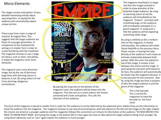
  • 1. The magazine masthead is in larger Micro Elements size than the images and text in order to draw attention of the This slogan creates anticipation of very potential target audience. By using detailed interesting articles about an alarming colour of red the upcoming films. In saying this the audience will immediately to the audience will automatically expect magazine. “Empire” connotes with unique articles. something large, so the audience will immediately anticipate it’s a grand magazine. In using such a title the audience will be expecting These cover lines cover a range of something rather large. mystical & magical films. This suggests that the target audience are By using a celebrity as the a medium those of a younger generation. In shot on the magazine, it creates comparison to the masthead the intertexuality. the audience will relate writing is in smaller font in order to Daniel Radcliffe to the previous Harry create familiarity with the masthead. Potter movies. In having him look The magazine chooses to use a range directly at the audience it will create an of colours, such as silver, and yellow, intimate relationship between both it makes the magazine cover more parties. With the cover line placed on attractive. top of the image, it creates a link between the article and the image. In The magazine uses a very dominant portraying the character with blood on image, but by the use of dominant his face, the audience will automatically large texts with alarming colours it be drawn into the magazine because it balances it out. By using colours of red is very peculiar for this character. Also it has alarming, dangerous by using this image we have a synopsis connotations. of who the target audience is and the By placing the strap line on the bottom of the genre of the magazine. magazine cover, the audience will be drawn into the This is the barcode. magazine. This also acts as a covert advert, the movies This is normal for presented will create anticipation. This calls the magazines to have the attention of the audience. barcode on the front cover. The price of the magazine is placed in smaller font in order for the audience to not be deferred by the expensive price. Rather they use the information to draw the audience into the magazine. This magazine chooses to use very structured layout, with text placed on the left and the image on the right, indeed the movies are aimed at a younger audience and this magazines follows this convention as it shouts its information at the audience “45 NEW MOVIES YOU NEED TO KNOW RIGHT NOW’, but having the image in the bottom left in a box again we have an idea about the target audience being much younger. By using direct addresses such as “you” again implies the audience is much younger.
  • 2. Representations This magazine uses an image of Harry Potter with blood on his face, this might suggest that it is aimed at those who take pleasure in gruesome action films. The image is rather stereotypical of the white race because the image uses a white boy which suggests that this race may enjoy such activities. Also by using a male it proposes the idea that these individuals enjoy such “manly” roles in society. Rather than using a female this is rather unconventional and would not be representative of the youngsters who enjoy these types of films because the protagonist is always male. In addition to this idea, young males are always depicted as negatively, this magazine uses this ideology. Tone and register The tone that is adopted in this magazine cover is very masculine, we get an understanding that maybe this magazine is aimed at males. The magazine uses very basic English language, which may suggest that the magazine is aimed at the lower middle class individuals or a younger audience. “harry comes out fighting”. The magazine uses very direct language such as “… You need to know right now!” This magazine uses very little formality “bloody hell!”, it uses very colloquial language which again suggests who the magazine is aimed at. Effect and Effectiveness This magazine achieves the purpose of drawing in the target audience through the use of basic language and the alarming colours used on the magazine cover. This magazine may use methods such as test screenings, which will explain why the magazine is effective enough to have an online base. Target Audience Through this magazine the target audience are younger. The magazine online website is placed in the tagline, which suggests again the class of the youngsters this would only be applicable to those who have internet access at home. We can tell this through the films featured on the cover of the magazine, these cover lines are very reflective of the audience, we understand that they prefer magical, mystical, action type films . Also we understand that the target audience may be individuals of white race, through the fact Harry Potter is largely known, we know the movie is very mystical and is based on the idea of magic and the deep beyond. Children of other cultures and religions may not be permitted to watch this because it may contradict with their religious backgrounds. This magazine is aimed at middle class youngsters because they will be able to buy this magazine, as it is priced at £3.90 and children from a much lower class wouldn’t be able to afford this magazine on a weekly basis. Also we learn that the intended audience are those who like thriller type movies again through the cover lines and the main image of Harry Potter. Also we learn that the audience are those who prefer a magazine, rather than a radio station may suggest the age of the audience, that they are of a younger age.
  • 3. Micro Elements. The masthead uses white large font, this is effective in This is the skyline, which drawing in the audiences calls the audience to the gaze. In using “Total Film”, special attraction of the magazine directly articles featured in the informs the audience what magazine. This directly the magazine is about and draws in the audience. also those who are unaware. This anchor text it informs the audience The cover lines feature a as to why this celebrity range of film topics is featured on the through the use of front of the magazine. colloquial language we All this is to lure them understand that this to want to read the magazine may be aimed at article inside the those of a lower middle magazine about class social background. Johnny Depp. The cover lines feature Magazines conventionally films from the USA which use a barcode on the front may suggest it is a global rather than on the back. magazine. The reference to these film articles suggest that this article is aimed at film fans. This medium shot of Johnny Depp has been chosen to create a relationship between the audience and the celebrity. Also it creates intertexuality, the audience will automatically reference this celebrity to other films he has starred in and will be more likely to buy this magazine, through the familiarity created. Also it gives some idea about the kind of magazine it is, and also the age of the target audience. Through the costume used we can create some idea of the character in which he plays. The use of velvet material of his jacket has rich connotations so the audience will feel the character he plays is of a wealthy background. Also by using a background taken directly from Charlie And the Chocolate Factory, the audience will anticipate this film, and also it will create a magical type fairytale atmosphere, also it suggests the innocence associated with this magazine. The use of costume also sets the time period in which the film is set in, the top hat suggests that the film is from an older period. By featuring Johnny Depp it acts as a covert advert, the audience will become more familiar with this character and anticipate his other work.
  • 4. Micro Elements This is the slogan which is used to hype up the magazine. This is used This magazine uses direct to draw in the audience against address and speaks to the competing magazines. By using audience which will create words such as “Ultimate” , the audience involvement. By audience will automatically place having Johnny Depp making this magazine in a higher category direct eye contact with the and would associate this magazine audience it will achieve with prestige's. intimacy. This magazine is informal by the use of layout, it uses cover lines on both the left and The colours used in the main right of the magazine cover and also on the image are very dominant colours bottom of the page. This magazine features such as burgundy, purple and stars, circle and rectangle shapes which shout green but this magazine has more at the audience and draw in the balanced out these dominant attention of the audience, by using a range of colours by using very neutral shapes it will visually attract the audience into colours such as white and silver, the content of the magazine. This magazine this creates a wealthy feel to the uses rectangle shapes on a slanted angle magazine. By using the colour of again to draw in the attention of the audience. white, the connotations are of The feature placed on the left of the page something pure and innocent draws the attention of the audience to other which may suggest that the contents in the magazine. The magazine uses magazine is aimed at children’s direct address such as you again to make the parents which may want to read audience feel involved in the magazine, this is more about what their kids watch. effectives because the audience will feel more By using the colour of silver, the included in the magazine. connotations are of something This coverline acts as a covert advert, it advertises the summer preview and the very grand which will make the Charlie And The Chocolate Factory. The use of exclamation marks hypes up the audience feel they are prestige magazine making the audience feel they are being involved in top secret and this magazine is one of class. information. This is the main attraction of the magazine, as it placed in large font and uses shapes such as star which will create the idea this is direct top secret information. By using large font the audience will be drawn directly to magazine because the text stands out.
  • 5. Macro elements Representation The image portrays this group in Tone and register society as friendly inviting, respectful This magazine uses formal language and people, I learnt this through the correct grammar by doing this it may suggest image used of where Johnny Depp that this magazine is aimed at an older greets his audience. This magazine audience. . The tone adopted on the front of represents white people as friendly. this magazine cover is an inviting tone by Also we can see that this character using words such as “Grab your golden looks rather young, without any facial ticket’. The vocabulary in this magazine is hair which may mean it is targets the basic to address the parents of the children, parents of these children. by doing this the average parent will be able to understand the language used. This uses an average degree of formality which may suggest that the magazine is just a basic Effective and guideline and aims to address the parents effectiveness with respect. I believe this magazine is effective in Target Audience drawing in the attention of the I think the intended audience of this edition of audience through the use of friendly the magazine was parents mainly because of words such as “your golden ticket” the image of Johnny Depp and the anchor which will make the reader feel text used, I felt this was a basic outline about included in the magazine. Also the what the film is about, the language used is degree of formality is not too advanced for younger children to be the overbearing and speaks to directly to intended audience. I also came up with the most of the parent population. conclusion that this magazine is aimed at parents through the skyline “From Batman to Star Wars: The 50 must see movies for summer” as kids are on holidays at this time, I felt this again acts as an advert for the best age appropriate films for them to be entertained with. I also believe this magazine is aimed at a particular race or religion because the advertised films and Johnny Depp on the front cover is appropriate for all religious and race backgrounds.
  • 6. This is the slogan The masthead uses a very bold which hypes up the alarming colour of red, which will magazine and stand out and draw in the attention of consequently make the the audience. By using the title audience feel like this ‘Empire’ it suggests that this magazine is the best magazine is something grand. and unique in This advertises the magazines online comparison to other base, which suggests that this film magazines. magazine is known world wide, and is quite large. This is the barcode which is normally placed on the front This is the anchor text which will of the magazine. inform the audience as to why this particular celebrity is featured on the front cover, it lures in the audience to read an article inside the magazine. Also it acts as a covert advert, advertising Megan Fox as an actress and the film she is featured in. This image of Megan Fox imposing nude, suggests that this edition is aimed at males, by having here look directly at the audience it creates intimacy which will be particularly effective in drawing the attention of the audience,. The use of tattoo’s may depict that this woman isn’t the typical “lady” but may be more masculine. This edition will increase the number of males who will read this magazine, due to the fact that sex sells. Megan Fox is well known for being very attractive, having here impose nude on the magazine cover will create anticipation within the male audience, they would want to read her article featured because they may get to see her nudity. Her image overlaps the masthead which suggests that the main attraction is Megan Fox. This woman has been chosen because she exudes high sex appeal which will wheel in, the male crowd and popularising the magazine. This magazine is effective in drawing in a much older crowd in comparison to the other edition I have previously analysed. By using a long shot, Megan Fox is being shown directly for the benefit of guys who want to see her nudity.
  • 7. This calls the attention of the The price is placed very small at the top readers to an attraction as it is of magazine in order to avoid distracting placed at the top of the the audience from the amazing articles magazine. featured in the magazine. This magazine is informal in its This magazine uses and informal layout by organisation because it has having their cover lines placed on the left, placed text around the central but not aligned, which may suggest it is image without aligning them to aimed at younger, less thoughtful males. the left, this suggests that the This coverline features a range of film audience are of adolescent articles, this may suggest that the males who aren't to thoughtful magazine is aimed at individuals who love and wouldn’t be too fussed by films and are serious about the films the layout of the magazine. featured. It also suggests it is aimed at This magazine doesn’t use any those who aren’t too interested in very shapes which creates a calmer detailed articles but want to get straight to approach to the audience, by the point. It suggests the age of audience. doing this it keeps the focus on the central image. This magazine uses a puff in the corner to exclaim about other content in the magazine. By using images instead of text for these coverlines it creates a different way of giving information and also is more visual for those who like to see rather than to read. In doing this, this magazine suggests that the readers are younger and prefer more images and less text. Also it acts as advert, advertising the films, creating The image uses very neutral colours of back leggings by doing this the magazine has made way for very intertexuality with the celebrities colourful alarming text. By using red with this image, it connotates with the idea of passion and lust the featured both these are successful in readers are left lusting after Megan Fox. By having bright colours such as red with a nude colour doesn’t creating familiarity. make the magazine messy. By having language such as “Hot” it has sexual connotations when placed along with the image, by doing this the magazine have heightened sexual desires within their readers, which may suggest that this magazine is aimed at those older.
  • 8. Macro Elements Representation This magazine represents the target Tone and Register audience as heterosexual men who are This magazine uses both formal and informal entertained by women’s nudity. It portrays language such as “woman, megastars” which the female ‘s in society as being may suggest the intended target audience. We specimen’s of the male gaze, this woman is also learn that this magazine aimed at people here to pleasure and entice men. This from outside Hollywood, by doing this the conforms to the idea that women are reader will feel unique in reading such an sexual objects to the alpha male. By having article. This magazine uses correct grammar an image of Megan Fox displaying her and refrains from using colloquial language tattoos may suggest that this magazines again may suggest that the magazine is aimed wants to lure in all males and also may at a larger audience. This magazine uses very suggest the role of women changing in simple vocabulary, they did this in order not to society. overwhelm the target audience with words they don’t understand. The magazine uses very little text which may suggest the age of Effect and effectiveness the audience as those who prefer images to I think this magazine cover is effective in text which creates a house style. drawing in the attention of males and making them actually want to buy the Target Audience magazine. I think that the intended target audience are males because of the main image used, I feel this magazine has done this to draw in the gaze of the reader, also most men would feel privileged to have a naked Megan Fox looking at them. Also by having this image I feel that the magazine is aimed at all types of men mostly being heterosexual because they will only take pleasure in such an image. Also I feel this magazine is aimed at those who are not religious because the image uses some nudity which wouldn’t be appropriate for those with strong religious ethics. By having a magazine it may suggest that the target audience are those in their mid 20s and above because being this the paper back version, the younger audience will prefer other media