
Recomendados
Recomendados
Mais conteúdo relacionado
Último
Último (20)
Destaque
Destaque (20)
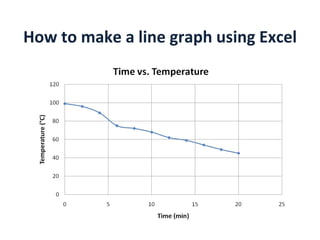
How to Make a Line Graph Using Excel
- 1. How to make a line graph using Excel
- 2. First, type in your data. Make sure your independent variable is in the first column and your dependent variable is in the second column.
- 3. Next, click and drag your mouse over all of your data to ‘select’ your data. Click here Drag to here
- 4. Next, choose a Chart Type. From the menus choose: Insert , Scatter , Smooth Line Scatter Plot (Click)
- 5. 1. Then your graph will display. We need to add a few things to this graph. 2. From the menus, choose Design, then the first Chart Layout. This will display a title, and vertical and horizontal axis labels.
- 6. If you only have one line on your graph, you can delete your Chart Legend. Click on it and press delete.
- 7. Click on your title and labels to edit them.
- 8. To get a special symbol that is not found on your keyboard, like degrees °, from the menus choose: Insert, Symbol, then find your symbol and click I nsert and it will appear where your cursor is, in the spot you left off where you were typing.
- 9. You are now free to use the options in the Home menu to change the fonts and colors of the parts of your graph. You can click and drag the corners to change the size. You can right-click here to copy your graph and paste it to other documents, like Powerpoint, Word, and more!