2. Question 1
In what ways does your
media product use,
develop or challenge
forms and conventions of
real media products?
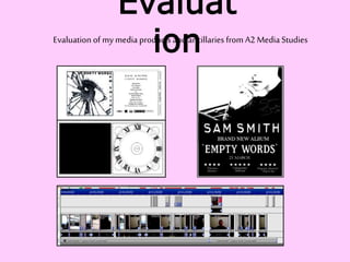
3. I used Serif MoviePlus to create my music
video, and PagePlus to make my ancillary
products (digiPak and magazine advert. As I
used PagePlus last year to complete my music
magazine as part of my AS Media Product, I
believed it would be more effective to use it
again as I am used to the format and how to
use it. MoviePlus was new to me this year but
it was fairly easy to use and I could easily
manipulate the images and videos for my
music video and alternating between the
video and the soundtrack was easy too.
Nowadays in the music industry there
are three main types of music video.
There are
*Ballad-inspired: slow fades and cuts.
Less lip-syncing.
*Carnivalesque: catchy tune, upbeat
tempo, fast cuts, more lip-syncing,
easy to follow narrative and bright,
attractive colours.
*Abstract: either balladic or up-tempo –
special effects or very slow fades in
order to convey a message of confusion,
exaggeration, mental state or fun.
I was inspired by many other artists
other than Sam Smith. I was originally
inspired by Christina Aguilera and
Beyoncé as their singles usually offer a
balance between ballads and fun pop
tunes.
https://www.google.co.uk/search?q=christina
+aguilera+music+video&safe=strict&espv=2&
biw=1280&bih=923&source=lnms&tbm=isch&
sa=X&ei=Owg5VcnGLszhat_7gNAE&ved=0CAc
Q_AUoAg
Other inspirations: The Killers,
Florence & the Machine, Amy
Winehouse and Ellie Goulding. Many
analyses of these can be found
throughout my blog
http://www.danieljacksona2.blogspot.
co.uk/
Ellie Goulding’s ‘How Long Will I Love
You’ is a narrative music video shot
entirely on a mobile phone – added a
great feel to the video. Shaky at times,
in their personal space which gave a
more personal tone. Conveyed the
message of the song’s lyrics further.
This idea is something I found inspiring
and I wanted to experiment with some
filming via phone but still making it fit
my brief and look professional.
Music Video Influences I based my personality to conform to the conventions
of pop music videos, within my music video on Sam
Smith himself, as I wanted to convey similar messages
to the ones he puts across (as seen in these still
images)
https://www.google.co.uk/search?q=sam+smith+leave+
your+lover+video&safe=strict&es_sm=93&biw=1280&bi
h=923&source=lnms&tbm=isch&sa=X&ei=kQg5VfSMOY
LwarGhgOgI&ved=0CAgQ_AUoAw
One main thing that influenced my
music video is Ellie Goulding’s ‘How
Long Will I Love You’ as she films it with
her mobile phone. I tried to film certain
aspects of mine with my mobile phone
to add a more personal tone – as it adds
a sense of rush, panic or raw emotion (a
disequilibrium (Todorov’s theory) to the
video.
https://www.youtube.com/watch?v=an4yS
OlsUMY
4. Ancillary Product Influences
I wanted to
keep my
magazine
advertiseme
nt fairly
simple and
bold in
order to
lure the
reader and
stand out
from a
standard
colourful
magazine
page.
I enjoyed the
symbolic nature
of these
magazine
adverts as the
use of black
and white
stands out to an
audience.
One thing I took
influence from
mainly was the
split of the
page. Top half
photo, bottom
half text. This is
used to
enhance the
advert as the
image stands
out more and
needs to be
bold – like mine.
There were many
influences for my
DigiPak but most of
these seemed too
dissimilar to what I
wanted to create so I
discarded some.
Of my possible
influences, I looked
into the album of
Sam Smith himself,
but also more typical
pop albums as they
seem to be the most
effective and most
attention-grabbing.
Other influences included Dali’s ‘In
Voluptas Mors’ for my penultimate album
cover as the layout of the portrait links to
the typography on my album cover but I
soon changed my mind to an image of
broken glass in front of an eye symbolising
that people can still see through broken
times in their lives. This also linked to my
first idea of a broken heart-shaped piece of
glass.
The influence for the
clock face in the inner
tray of my DigiPak was
to pay homage to the
original title ‘In The
Lonely Hour.’
Other album cover
influences included
http://danieljacksona2.blog
spot.co.uk/2015/02/researc
h-organisation-deadline-
13th.html
6. My music video has quite a dark colour scheme
and depicts quite slow activities such as slow-
paced driving, walking, looking around at
standstill.
This conveys the message of life being a long and
lonely road we all have to travel on.
My digiPak cover depicts and grayscale
eye with broken glass protruding from the
corners. This was my final of at least 20
different designs, and I liked this one the
best as it delivers the message of seeing
through broken glass – how the things you
see can hurt you, but still our minds
continue to look. It stemmed from my
original idea of a broken glass heart, how
hearts are easy to break, but I felt this was
a little too basic for an album cover of this
calibre.
I wanted the back cover of my digiPak to be almost
identical to the original CD as it is basic, bold,
simplistic and eye-catching. The track titles are
central with the record logo and copyright text at the
bottom, with Sam Smith’s unique font illustrating his
name and album title.
My original idea for the back of the album booklet
on the inner left was a grayscale image of trees. A
dark night in a forest, to depict the dark path life
leads us on but this idea seemed too busy as the
album design and layout was already particularly
busy and I wanted the disc tray to be quite detailed
so I decided to leave this fully black, as like the
original Sam Smith booklet.
Finally, the CD tray (inner right) is under the
disc and I wanted to pay homage to the
original Sam Smith album ‘In The Lonely
Hour’ by depicting a clock. This is one of the
first ideas I had when creating my product as
I wasn’t clear on the rules for changing the
album title. So when I changed it I thought of
‘Empty Words’ which is why the album is
called Empty Words, which is why the track
list on the back cover is simplistic and un-
numbered and also why the clock face has
no hands.
My album advert is black and white, with an
image of me (the artist) in the top half. The large
unique font in the centre lures the reader and the
dates and ratings are clearly visible below.
The black and white shows a contrast and it also
has a strong symbiosis to my other products.
7. As you can see, my digiPak, magazine advert and video are all
linked together by colour scheme, format, layout, style,
conveyed message and themes (darkness, loneliness etc.) This
is effective as each piece of my project has the power to stand
alone but also fits perfectly amongst a group of products and
ancillary texts.
My main product and ancillary texts are
very well pieced together. I have changed
my ideas for my digiPak design at least 20
times (no, that’s not an exaggeration) and
this is because there are so many different
messages that the symbiosis between video
and digiPak can put across. I wanted the
digiPak to have more of a bizarre design.
The magazine advert’s design came to me
after visualizing a scene from my video and
the format of my digiPak, combined to
make a classic bold statement on the page.
I opted for a classic minimalist design
which would stand out on the page after
researching and taking influence from
similar magazine advert posters which can
be seen at significant stages of research
and analysis on my blog
http://www.danieljacksona2.blogspot.com
VIDEO
Dark lighting. Star is always
alone or distant from
others. Black and white
imagery portrays contrast of
emotions. Slow fades and
cuts show an arduous
change between phases of
life. Bold statement through
unrequited love and
loneliness within narrative.
DIGIPAK
Dark images. Abstract eye
conveys message of
loneliness. The clock face on
the inside shows how life is
long and difficult. The dark,
bold fonts are at times
overwhelming like the
emotions carried through in
the lyrics.
ADVERT
The dark, bold fonts are
synonymous to Sam Smith
and the 50/50 split
between image and text
intrigues the reader to
glimpse at the text after
seeing the image of ‘Sam
Smith’. The message of
loneliness is carried
through.
There is a clear symbiosis between my main products and ancillary products- also theories such as
Roland Barthes’ Enigma Code which is prevalent in most media texts. In my music video there is a
question in the viewer’s mind saying ‘what is the outcome going to be?’ ‘What is going to happen to
him?’ Thisisanexampleof a narrativetheorythatcan be appliedto my mediaproduct.
Mymusicvideoconveysthemessageofunrequitedlove,lonelinessanddespair– whichissynergictoSam
Smith’s originalmusicvideoandothersonhisalbum.Itisechoingthatofhisusualconventionsofhismusic
videosincludinglip-syncingsometimespresent,cutsbetweenscenes.Amelancholynarrativeanddarkcolours
appearthroughouttoo.
9. Feedback
I asked ten people from my target audience, to view my music
video during production to get an equal percentage. Also, I asked
the same ten people to look at and judge my ancillary product
ideas.
I also put a 15 second clip of my video during production on
Instagram and asked people to like and comment. The video
received 77 likes from peers (my target audience) and also
received some comments stating that the video had a good
narrative, was filmed very well, some even said it made them cry.
I responded to the feedback by adding more cuts to the video
after seeing that normal conventions of pop music videos had
more cross-cuts.
Mostly target audience
Some target audience
It was a benefit to have other
viewpoints, particularly of
those in my target audience –
as I then knew what I needed
to keep/change in order to
relate to their needs.
Some feedback during lesson
presentations included that:
‘There were unnecessary scenes that
did not relate to the overall storyline’
‘There are not enough cuts and it
doesn’t flow.’
‘There are repeated scenes which
disrupts the narrative.’
I used this feedback and created four new scenes all
over 6 seconds in length and added them – including
one of the panoramic view of Birmingham which
ended up being my establishing shot.
General Feedback - Album
Cover(s)
Too simple, not enough room for typography.
This was some people’s favourite but some people
thought that the heart was a bit too feminine for my deep
and male-oriented video. Also the subliminal message
‘Love Yourself’ in the heart itself wasn’t clearly visible.
Bold and symbolic, stands out to audience.
Typography is unique – good progression
through ideas.
10. Question 4
How did you use media
technologies in the
construction, research, planning
and evaluation stages?
11. Research and Planning
Blogger enabled me to create and
change blog posts- also embed
hyperlinks and images in order to
make it more accessible.
Youtube: research similar music videos
Links accessible from anywhere
Comments & likes, to judge an aspect
of the video. Also, I could upload my
own work for feedback from a world-
wide public.
Using Gmail and Google
Drive also enabled me to
share files with those
helping me with
filming/cast. Therefore I
could share links to my
blog with them so they
could see my ideas for
filming day.
http://danieljacksona2.blogspot.
co.uk/2015/01/drafting-and-
planning-still-footage.html
EVALUATION
To create my evaluation I used
Microsoft PowerPoint and
uploaded it to Issuu afterwards
using my account on their website.
Some hyperlinks don’t work on SlideShare as I
learned from my AS project and I found that Prezi
changed the layout and font of my evaluation
automatically so Issuu seemed the best
programme.
12. TECHNOLOGY DURING CONSTRUCTION
MUSIC VIDEO
-Sony HQ Video Recorder
-Panasonic Lumix Digital Camera
-Apple iPhone
To create my music video, I decided to use
Serif MoviePlus as I had already used Serif
programmes at AS and felt I would be more
accustomed to it. It was easy to apply the
soundtrack and manipulate cuts and timings
and very beneficial to my project.
Some disadvantages of MoviePlus is that the
software wasn’t completely updated so the
video kept slipping out of sync with each other –
also, it took a long time to manipulate the video
clips and add cross-fades in the particular way I
wanted as there was not a range of effects.
Timeline from MoviePlus
MAGAZINE ADVERTISEMENT
-Serif PagePlus; Microsoft Office; Paint.Net; Photoshop; Picasa 3
To create my template for my magazine advertisement, I selected the A3.5
ratio as magazines tend to be slightly bigger than A4 but when open are
slightly smaller than A3. Once open, it was easy to add, crop, recolour images
and format them easily.
I used Picasa and Photoshop to add effects to my image, to make it look less
like me and more like Sam Smith (my star.)
I used Microsoft Office and Paint.Net to add the text over the top as there
were some extra fonts downloaded from http://www.dafont.com
DIGIPAK
-Serif PagePlus; Microsoft Office; Picasa 3; Paint.Net; Instagram Editor
Firstly, I created my DigiPak template after creating to scale imaging of a real-life digiPak
case. Then I began adding labels (front, back etc) and began importing my images onto
PagePlus. I had used PagePlus for my AS project so I was fairly able to reuse my skills.
I used Instagram Photo Editor to utilise the photo filters they have to enhance a photo
and I thought this was necessary to add a modern effect to my album cover.
13. EVALUATION OF
A2 MEDIA STUDIES: G324
CHOSEN BRIEF: Music promo video (with magazine advertisement and digiPak)
For full blog, see:
http://www.danieljacksona2.blogspot.com
With extra thanks to my good friends Joe, Charlotte, Talia, Kamila, Rian, Jenn and the whole of my group! Thanks to anyone else and most of all thank you to Sam Smith.