1. This is the front cover of Calvin Harris’ 18 Months album. As you can see, the
digipak is very bright which links well to the genre of pop and dance. From the
front cover we can identify the artist’ name and album title, which is some vital
information. The picture of Calvin Harris that has been used on this digipak,
represents him as a role model and puts him as the main focus of the product.
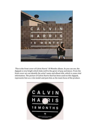
2. This is the CD design for the digipak, which is quite simple and plain. The white
font makes the CD more appealing and draws the audience’s attention towards
it. The font colour also is a particular style that has been carried through the
front cover, the CD and the back cover. The black and white theme makes it have
a more professional kind of look to the digipak. The font choice is also simple and
is in capitals to make it bold to the fans and easy to read. The CD includes the
record labels name also and says ‘All rights served’ which backs up how the
album is professional.
This is the back cover of the digipak. The artist Calvin Harris is placed in the
center of the picture to show once again that he is the main focus of this product.
The back cover includes simple but important aspects such as; barcode, record
label’s name and the listing of songs which feature in the digipak. The image
which has been used on the back cover is very much similar to the one that has
been used on the front, however it is using a different camera angle, it is more
zoomed out and more imagery in this photo. The track list uses continuity white
font, which is also something else that has been carried through all the aspects of
the digipak.