Six Myths about Ontologies: The Basics of Formal Ontology
Print screens for blog
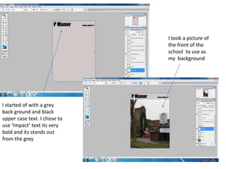
1. I took a picture of
the front of the
school to use as
my background
I started of with a grey
back ground and black
upper case text. I chose to
use ‘Impact’ text its very
bold and its stands out
from the grey
2. I then used the
eyedropper tool to
use the same colour
as the grass, then
used the brush tool
to paint blobs of
green on the front
cover and then
added text on top
I then took a picture
of a 6th former and
used the Magnetic
lasso tool to cut
around the image,
then dropped it on to
my page
3. I decided to use Impact font
because it’s sharp and bold and
stands on the green
4. I used the same Magnetic
Lasso tool to cut around the
student then placed him on
the left hand side
I stuck with the same colours of
green, black and grey. I used the
rectangle tool to do the triangle
on the top, then used a long
rectangle down the middle to
divide the page. I used the same
font and left the content in the top
corner
5. I decided to divided the
students and the
information about the
school on two separate
sides, so that they could
compliment each other. I
didn’t put too much on my
contents page so that it
doesn’t look to cluttered
so it gives it a smoother
appearance
I added the same green
blobs to show the
continuity through my
front cover and contents
page- I stuck with the font
and kept to the colours