
Recomendados
Mais conteúdo relacionado
Mais procurados
Mais procurados (18)
Destaque
Destaque (12)
Semelhante a Project 2
Semelhante a Project 2 (20)
Último
Último (20)
Project 2
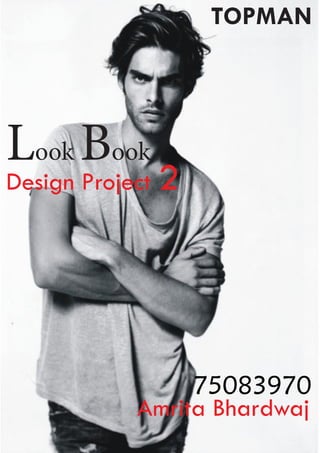
- 1. TOPMAN Look Book Design Project 2 75083970 Amrita Bhardwaj
- 2. INTRODUCTION A look book’ is a collection of photographs compiled to show off a model, a photog- rapher, a style, or a clothing line. It is an especially popular term with “fashion bloggers’. Look Books in their online form can be described as “fashion diaries” because bloggers are constantly updating them on a daily or weekly basis’ . Look books have their origins as runway-fashion flipbooks that designers and retailers often sent magazine editors. The new high-tech iteration of the Look Book is to be found throughout the Fashion blogging community often with an emphatic emphasis on street style. These self-made blogger Look Books have started to attract the attention of high- end fashion brands such as Maison Michel, Tommy Hilfiger and Dolce & Gabbana who are increasingly making more lavish and immersive online.
- 3. Consumers that exhibit a high level of fashion innovativeness and opinion leadership may place a greater T emphasis on the layout/advertising aspects of fashion magazines because they feel that high-quality photographs and glossy pages demonstrate the same level of quality that they place on H E fashion’ Summers, J.O. (1972), “Media exposure patterns of consumer innovators”, Journal of Marketing, Vol. 36 No. 1, pp. 43-9. In this project, you will develop an online, media rich, interactive, multimedia Look Book for a High Street P R Fashion retailer. You must use a predicted fashion trend or a seasonal thematic as its basis. Your look book must be dynamic, exciting to use and easy to navigate. You can use sound, video and O J still images in anyway that allows the viewer to experience something that is radically different from a conventional Look Book (online or in print. E C T
- 4. To develop a greater understanding of intermediate CAD skills in the visualisation of high street Fashion retailing online, multimedia marketing materials. To introduce a basic understand of how CAD can assist in the development of internet fashion marketing To introduce a basic understand of how CAD can assist in the development of internet fashion marketing To gain an understanding of how use multimedia to enhance customer awareness. To develop a greater awareness of fashion Retailing brand design using CAD software To develop further research and development skills, communication skills and visualisations of CAD concepts. AIMS
- 5. CHOSEN RETAILER TOPMAN Born in 1978 topman with profits of more was launched as a the one million brother to the sister pound. brand topshop, Then in the late topmen’s launch ninety’s and early is prompted by 96 topman in- encouraging creased its foot sales in men’s ware and fashion, now accessories as is one of to strengthen the leading high its position street brand as a market leader retailer for young and also updated men’s fashion, the shop fit to ap- shifting the way ple to the younger men approaches and more fashion to shopping , the conscious consumers. brand’s attitude to Thereafter topman creating brilliant, never looked back affordable and with a whopping authoritative men of 185 stores in The ware is second to UK almost ever high none. street in the country Within two years boasted its very own of its launch slice of topman, the topman has be- rest of the globe was come an catching up too. immediate success
- 6. topman owned stores in over sixty cities worldwide stretching across twenty countries while boutiques in America, China and Japan stock the brand. To cope with the internet world topman sees over 160000 visitors on its traditional website topman. com with current shipping to the uk, Eire, Europe,USA and Australia. TOPMAN
- 7. DEFINITIVE TOPMAN CUSTOMER IS HARD TO PIN DOWN: IT’S A PRET T Y DIVERSE CROWD. In one corner, the trend conscious bright-young Sub-cultural groups, largely things snaffle up driven by the music scene to the minute a vintage menswear fashion forward influence are heavy in the pieces on their Topman mix. way to the latest Cue indie boys shuffling club. In anoth- around comparing er, the man who cardigans or vintage finds wants to top-up as they plot their next gig his wardrobe with move or the new-rave crew essential basics enthusing over neon and and classic fashion retro 1980’s style sports- staples is perusing wear. the rails alongside Some men are adding to the young buck in their already busy ward- suiting who’s kit- robes, so they plan to mix ting himself out their new Topman with a with affordable dash of Dior. Others, like sharp tailoring for the pack of lads in the a new job. changing rooms, tying on new denims and shirts are looking for a whole new outfit for Saturday night. What unites these various man-tribes is the brilliant
- 8. variety on offer in the collections found under one roof at Topman. In one corner, the trend conscious bright young things snaffle up to the minute fashion forward pieces on their way to the latest club. In another, the man who wants to top-up his ward- robe with essential basicsand classic fashion staples is perusing the rails alongside the young buck in suiting who’s kitting himself out with affordable sharp tailoring for a new job. Sub-cultural groups, largely driven by the music scene a vintage menswear influence are heavy in the Topman mix. Cue indie boys shuffling around comparing cardigans or vintage finds as they plot their next gig move or the new-rave crew enthusing over neon and retro 1980’s style sportswear. Some men are adding to their already busy wardrobes, so they plan to mix their new Topman with a dash of Dior. What unites these various man-tribes is the brilliant variety on offer in the collections found under one roof at Topman. TOPMAN
- 9. BRAND T IMAGE O P M A N Topman has an in house reliable design range which revolves around new trends and refreshed on a monthly biases. This is where jeans or t shirts are giv- en new twist and turns to suit the market’s current mood, the premium collection on the other side have more focus on fit detail and fabrication. Also topman embraced more echo friendly products that is one of the major concerns of the fashion industry by launching a range on fair trade cot- ton that meets the international BRAND IMAGE fair trade standards.
- 10. Headed and created by director Gordon Richardson and his in house design team Topman’s design collection debuted in autumn winter 2005 with a distant vision of developing more individual, design led clothing somewhere pushes trend harder providing its own top end line for the brand. Ever since after the launch topman is showcased seasonally in London fashion week on official schedule as a part of cat walk event MAN- a collaborative partnership between highly reputable fashion east initiative and topman.
- 11. TIME LINE 2002 - Graduate Fashion Week winner, Andreas Edbauer taken on to design capsular collection for Topman. 2003 - Yuko Yoshitake, Gradu- ate Fashion week Winner asked along with other designers from the week to produce pieces from their show for Topman. 2004 - Topman show solo at Truman Brewery to the press - styled by Alister Mackie. 2005 - Topman Design show- cases solo for the first time at Christchurch as an A/W cat- walk presentation to the press, styled by Alister Mackie. First MAN show takes place at the Truman Brewery to an audience of over 500 press and buyers.
- 12. 2006 - Topman Design launch- es in store. Maximo Park, Kaiser Chiefs, Boy Kill Boy, The Cazals and The Paddingtons design t-shirts for the everyman campaign. 2007 - White Shirt Project Topman Design and 5 other designers interpret their ideal of the white shirt. This will be on going project focusing on different takes on staples from a man’s wardrobe. Designers for launch are Carola Euler, Siv Støldal, Richard Nicoll, Ute Ploier, Deryck Walker. 2008 - Collaboration with Antony Price (Famous for his designs for Bryan Ferry and David Bowie) on the first ever high street collection.
- 13. CHOSEN THEAM Cinematic Colors of Life Inspired by William Shakespeare’s poem ”The Seven Ages of Man” The basic notion behind the concept, is to portrait different roles one plays at different stages of life.
- 14. JOY ATTITUDE
- 15. HARD WORK AR LE SS FE
- 16. The office guy A mix of bright and dark Colors gives an idea of balancing hard work, and stress but still Carrying on with a calm mind.. At work!! BE THE BOSS
- 17. Keeping in mind “All in denim” this image is inspired by the Fearless, energetic yet matured stage Of life, the blue demin represents energy The white colour represents a sense of Understanding… BE THE NEXT
- 18. ROCK n ROLL After all the hard work its time to rock!! The black and white color gives a stylish Look and a sense of confidence within..
- 19. FUN The bright colors, floral print Gives a notion of energy and will to stand out the crowd Happy and young stage of life.. Also such prints could be found In smart shirts collection of Topman
- 20. KEEP IT UNUSUAL!!!! Inspired by the last stage of life the dull color gives a towards old age feeling , with fear of Separation satisfaction of Fulfilling duties of life….
- 21. Look Book Critique Chosen Retailers FRENCH CONNECTTION LACOSTE Levi’S Burberry Topman ALL SAINTS H&M
- 22. FRENCH CONNECTION NOITCENNOC HCNERF French connection look book is a very interactive and easy to navigate lookbook… It is an innovative concept where the viewer can actually assemble the man from top to bottom to create a new combination of cloths, the viewer could play with different heads even, with adds a fun part to the look book at the same time gives a verity to the viewer choose his type of face i.e. long face or a round face…etc The model in the book posed in not more than 3 postures thus must have reduced the photo shoot cost for fcuk . Absence of music could be added to the limitation of the look book, a particular sought of music if added to the book, might make it more interesting and fun to play with.Other then the music, a few more faces with different hair styles could be added to give a wide variety to the customers.
- 23. f c u k
- 24. For Levis the webpage is divided into 3 major parts…. Part a) plays a very beautifully animated video, promoting Levi’s new jeans manufacturing technology, which could save up to 200 million litre of water every year. The video very wonderfully utilizes almost all objects we take in our daily use to convey this message, it is a very colourful video and creative video, which would engage the customer. Apart from the tech- nical side it is a good step forward by Levi’s words environment wel- fare . The only limitation seen in the video is its navigation options which limits it to rewind, and because the video Connery writ- ten messages the consumer might not be able to read it at once and might not be willing to watch the video over and over to understand it. Part b) is about Levi’s latest campaign CURVE ID which actually guide you on what type of jeans you should buy, it contains a quiz how you choose your pair of jeans. The look book for Levis is very or- dinaryone with no innovations but still easy to navigate. Levis could have made a better background for the look book some sought of innovation like they have it on their windows
- 25. also I felt the webpage was a bit messy and lack straight forward headings. Part c) is about a film workshop that Levi’s conducting in los angles.
- 26. Loceste’s look book is all about “unconventionalchic” there new collection, the tag lines like “ stand up for uniqueness”,” make it look easy”,” change the rules of the game “…. Are used with key look which very much matches to the brand image (being started by tennis player). The key colours used in this collection are black and gray and white in particular, which makes it stand out from the other look book’s.. The styling for this particular shoot is so unique that it gives a reason to by the regular but signature style white lecoste t shirt (for men)…. For women loceste they to a different part ….they tried coming up with new styles though the collection is very limited but that’s what make lecoste different from other competitors in the market…. In look book is again simple but fun to look at….easy navigations, less slide show and more videos , good back ground music and a making video of the shoot, story of the origin and basic idea behind unconventional chic that actually, could inspire people to take a look at the collection in store. Simple white back grounds but a zoomed in image of the cloth to give the viewer a better idea. Overall an interesting one.
- 28. It’s a very interesting one, Burberry have actually added clips of the catwalk in the book. Otherwise the book is a slide show but of small video clips, instead of images.. It helps to give a overall 3d view of the dress and off course watching is better than clicking and specially when you have a wonderful song added to the background. The navigation is easy the is divided into 3 parts. Watch the campaign, look through the catwalk and go to the shop.
- 29. All Saints All saints has a causal look book with images in it, and just a zoom options. No music, no background, no animation so was not some extra ordinary book. Just opposite of is unique and eye catching brand image.
- 30. TOPMAN The look book of topman is not very interactive, it is very clear and at the same it is very informative, unlike other look books it give the viewer a detailed description ho what are the trends running and thems chosen for topman.i chose to review this particular look book for two reasons, first is to gain a better understanding of the retailer, other is it’s a bit different from other books. My suggestion for this book is they could have added a a bit of animations to the book if not videos.
- 31. TOPMAN
- 32. TECHNICAL DEVELOPEMENT For complishion of this project i have used a combination of all the three softwares indesign, illustrator and photoshop. The contribution of illustrator is not much in the project, but photoshop and indesign were widely used.
- 33. I didn’t want every page in one rhythm, that’s why I opted for different backgrounds for different pages. I wanted every page with a particular feel, so that it catches the eyes balls of user. I wanted it to be capable of holding user’s attention. It doesn’t mean that I worked in an un-formatted way, I wrote every text in Verdhana font and left 4.4 mm gap around.
- 34. Normally, I used Photoshop for cutting backgrounds and adding effects, for adding that I used quick selection tool or redefine edges, whereas for adding effects to the pictures I also took help of menu curve.
- 35. Afterwards, I got those images to Indesign, and played with many in design options, like texts, colors, lines, or objects. At some places I also used effects of Indesign. One more thing that I liked very much was in design’s new option ‘animated menu’, which I used a lot. And playing with these options allowed me to create something new, I really enjoyed it.