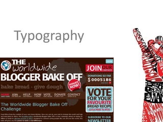
SlideShare a Scribd company logo
1 of 48
Typography
The anatomy of typography
   http://www.nhsdesigns.com/graphic/typography/anatomy.php
1. Serif
2. Mean line
3. Ascender     Meanline

4. Cap height
5. X-Height
6. Point Size
7. Baseline
8. Set Width
9. Decender     Baseline
Type Families
• All licensed, commercial fonts are available in
  a number of styles and weights: usually roman
  (sometimes known as plain or book), italic
  (sometimes called oblique), bold and bold
  italic.
• For flexible working, it's best to choose a
  broad type family rather than use many
  different fonts.
A Sans-Serif Fonts
    • It contains many
      intermediary weights: light,
      book, medium, bold, and
      extra bold. It also contains
      several condensed versions
      for more slender type
•             Gothic
             Serif
A Serif Fonts
• The serif font below,
  New Bodoni DT, also
  has many weight
  variants.
Antique Fonts


• Antique fonts have a long history
  and can be used to evoke a period
  feel.
Decorative Fonts
• Decorative fonts include highly decorated and
  really eccentric fonts, often with very specific
  uses and rarely appropriate for more than
  three words at a time.
Script Fonts
• Script fonts, which resemble handwriting, can be
  subdivided into traditional scripts that look as
  though they were produced by a quill pen and
  those that mimic modern styles of handwriting.
Symbol Fonts
• Symbol fonts are composed of graphic icons to
  provide embellishments to text. These are
  sometimes created to complement a specific
  font
Non-Commercial Fonts
• A     problem      with    non-
  commercial fonts, such as
  those decorative fonts that
  have free usage or are Internet
  downloads, is that they often
  have only one weight and are
  therefore of limited use.
• Another problem is that font
  sizes may not be standardized.
  For example, a 12 point version
  of a display font may be much
  smaller than 12 points for
  traditional fonts
•


•
•
Styling & Formatting
Type Size
• A point (pt) is the usual measurement for type
  and is equal to 1/72 of an inch.
• Type that is smaller than 7pt is difficult to read
  and type that is smaller than 3pt is utterly
  illegible.
Serif or Sans Serif?
• A serif font is easier to read over long
  passages (blocks of text) than a sans serif font.
  It is therefore often chosen for designs
  incorporating high quantities of body copy,
  such as novels and newspapers. However, a
  sans serif font is frequently perceived as being
  more modern.
Leading
• Leading is the vertical space separating
  baselines in text and is traditionally
  measured in points. The term is derived
  from the days of setting type in hot metal,
  when strips of lead were used to add space
  between lines.
Leading

Font size: 14pt; leading: 18pt.

                                  Font size: 14pt; leading: 16pt.


Font size: 14pt; leading: 14pt
(set solid).

                                 Font size: 14pt; leading: 12pt.
Spacing
•             Text
    Spacing
Measure
• Measure means t he width of the text column.
  It is also a critical factor in the legibility of
  type. A wide measure can be tiring to read
  because the eye cannot easily scan from the
  end of one line to the start of the next.
• A short measure can also disrupt readability
  and can lead to unsightly line breaks. The
  optimum line length for body copy is 60-70
  characters.
Measure
Alignment
• Alignment refers to the arrangement of lines
  of text in relation to the page margins.
• Ranged left (ragged right), in which the text is
  aligned to the left-hand margin, is most
  common, legible and aesthetically pleasing.
  The majority of your text should be aligned
  left unless you have a sound reason to do
  otherwise.
Alignment
• Ranged right (ragged left) is hard to read at
  speed because the eye struggles to find the
  start of each new line. However, it can be
  stylish for short blocks of text.
Alignment
• Centered text, in which text is centered on
  each line, should be used sparingly. While
  appropriate for display type and headings, it
  should not be used for body copy.
Alignment
• Justified text, ranging to both left and right
  margins, can be a neat solution. However, it
  can create excessive spaces between words
  and may require hyphenation.
Paragraph Formatting
• Text styles are not simply defined by font and
  weight; paragraph styling or "formatting" also
  has a part to play. For example, you will also
  have to decide whether to include a line space
  before each new paragraph or whether to
  simply indent the first line of each.
Heading Hierarchies
• The titles and headings are your display text
  and you may elect to treat them entirely
  different from body text, although all headings
  within a piece should belong to a single type
  family, with depth and contrast arising from
  changes in size and weight.
Text as Image
Text as Image
Font new edit
Font new edit
Font new edit
Font new edit
Font new edit
Font new edit
Font new edit
Font new edit
Font new edit
Font new edit
Font new edit
Font new edit
Font new edit
Font new edit
Font new edit

More Related Content

What's hot

What's hot (16)

Science of font
Science of fontScience of font
Science of font
 
Text and typography
Text and typographyText and typography
Text and typography
 
Text and typography1
Text and typography1Text and typography1
Text and typography1
 
Engineering drawing (engineering lettering) lesson 3
Engineering drawing (engineering lettering) lesson 3Engineering drawing (engineering lettering) lesson 3
Engineering drawing (engineering lettering) lesson 3
 
Clear Large Print Workshop Round Table 2010
Clear Large Print Workshop Round Table 2010Clear Large Print Workshop Round Table 2010
Clear Large Print Workshop Round Table 2010
 
[DevDay2019] Spacing and Typography, keys to a professional UI design - By Ng...
[DevDay2019] Spacing and Typography, keys to a professional UI design - By Ng...[DevDay2019] Spacing and Typography, keys to a professional UI design - By Ng...
[DevDay2019] Spacing and Typography, keys to a professional UI design - By Ng...
 
Typography Primer | ADOBE
Typography Primer | ADOBETypography Primer | ADOBE
Typography Primer | ADOBE
 
Topic 3
Topic 3Topic 3
Topic 3
 
Working with text
Working with textWorking with text
Working with text
 
Unit 13 Typography
Unit 13 TypographyUnit 13 Typography
Unit 13 Typography
 
Bad and good rules for powerpoint presentations
Bad and good rules for powerpoint presentationsBad and good rules for powerpoint presentations
Bad and good rules for powerpoint presentations
 
Typography class 2
Typography class 2Typography class 2
Typography class 2
 
Unit 2 graphics
Unit 2 graphicsUnit 2 graphics
Unit 2 graphics
 
Unit2 type anatomy_categories_spacing
Unit2 type anatomy_categories_spacingUnit2 type anatomy_categories_spacing
Unit2 type anatomy_categories_spacing
 
Project 3 instructions
Project 3 instructionsProject 3 instructions
Project 3 instructions
 
Describing type
Describing typeDescribing type
Describing type
 

Similar to Font new edit

1.01 Typography Usability and Readability
1.01 Typography Usability and Readability1.01 Typography Usability and Readability
1.01 Typography Usability and ReadabilityMsGilbert
 
Chapter 2 : TEXT
Chapter 2 : TEXTChapter 2 : TEXT
Chapter 2 : TEXTazira96
 
16. A Basic Introduction to Typography (Inglés) (Presentación) autor Northern...
16. A Basic Introduction to Typography (Inglés) (Presentación) autor Northern...16. A Basic Introduction to Typography (Inglés) (Presentación) autor Northern...
16. A Basic Introduction to Typography (Inglés) (Presentación) autor Northern...prologuitoedic
 
Presentation 1 asgardia
Presentation 1 asgardiaPresentation 1 asgardia
Presentation 1 asgardiaAlix Fraser
 
what is Font in multimedia
 what is Font in multimedia what is Font in multimedia
what is Font in multimediamaliksiddique1
 
Lec14 15 16 text
Lec14 15 16 textLec14 15 16 text
Lec14 15 16 textDom Mike
 
What is Font and Typefaces? Explain any five font’s families in DTP. By Shobh...
What is Font and Typefaces? Explain any five font’s families in DTP. By Shobh...What is Font and Typefaces? Explain any five font’s families in DTP. By Shobh...
What is Font and Typefaces? Explain any five font’s families in DTP. By Shobh...Shobhit Jain
 
Neoito — Typography for the web
Neoito — Typography for the webNeoito — Typography for the web
Neoito — Typography for the webNeoito
 
prepress 1st chapter.pptx
prepress 1st chapter.pptxprepress 1st chapter.pptx
prepress 1st chapter.pptxIndumeenalR
 
Fonts and colours
Fonts and coloursFonts and colours
Fonts and coloursmagda rak
 

Similar to Font new edit (20)

Text
TextText
Text
 
1.01 Typography Usability and Readability
1.01 Typography Usability and Readability1.01 Typography Usability and Readability
1.01 Typography Usability and Readability
 
Chapter 2
Chapter 2Chapter 2
Chapter 2
 
Chapter 2 : TEXT
Chapter 2 : TEXTChapter 2 : TEXT
Chapter 2 : TEXT
 
Typography class 3
Typography class 3Typography class 3
Typography class 3
 
16. A Basic Introduction to Typography (Inglés) (Presentación) autor Northern...
16. A Basic Introduction to Typography (Inglés) (Presentación) autor Northern...16. A Basic Introduction to Typography (Inglés) (Presentación) autor Northern...
16. A Basic Introduction to Typography (Inglés) (Presentación) autor Northern...
 
Day01 design final
Day01 design finalDay01 design final
Day01 design final
 
Type
TypeType
Type
 
Presentation 1 asgardia
Presentation 1 asgardiaPresentation 1 asgardia
Presentation 1 asgardia
 
what is Font in multimedia
 what is Font in multimedia what is Font in multimedia
what is Font in multimedia
 
Fonts!
Fonts!Fonts!
Fonts!
 
Type standards[1]
Type standards[1]Type standards[1]
Type standards[1]
 
Lec14 15 16 text
Lec14 15 16 textLec14 15 16 text
Lec14 15 16 text
 
What is Font and Typefaces? Explain any five font’s families in DTP. By Shobh...
What is Font and Typefaces? Explain any five font’s families in DTP. By Shobh...What is Font and Typefaces? Explain any five font’s families in DTP. By Shobh...
What is Font and Typefaces? Explain any five font’s families in DTP. By Shobh...
 
Neoito — Typography for the web
Neoito — Typography for the webNeoito — Typography for the web
Neoito — Typography for the web
 
Typography Basics for DTP
Typography Basics for DTPTypography Basics for DTP
Typography Basics for DTP
 
prepress 1st chapter.pptx
prepress 1st chapter.pptxprepress 1st chapter.pptx
prepress 1st chapter.pptx
 
Typography
TypographyTypography
Typography
 
CHAPTER – 3 Text
CHAPTER – 3    TextCHAPTER – 3    Text
CHAPTER – 3 Text
 
Fonts and colours
Fonts and coloursFonts and colours
Fonts and colours
 

More from Attaporn Ninsuwan

More from Attaporn Ninsuwan (20)

J query fundamentals
J query fundamentalsJ query fundamentals
J query fundamentals
 
Jquery enlightenment
Jquery enlightenmentJquery enlightenment
Jquery enlightenment
 
Jquery-Begining
Jquery-BeginingJquery-Begining
Jquery-Begining
 
Br ainfocom94
Br ainfocom94Br ainfocom94
Br ainfocom94
 
Chapter 12 - Computer Forensics
Chapter 12 - Computer ForensicsChapter 12 - Computer Forensics
Chapter 12 - Computer Forensics
 
Techniques for data hiding p
Techniques for data hiding pTechniques for data hiding p
Techniques for data hiding p
 
Stop badware infected_sites_report_062408
Stop badware infected_sites_report_062408Stop badware infected_sites_report_062408
Stop badware infected_sites_report_062408
 
Steganography past-present-future 552
Steganography past-present-future 552Steganography past-present-future 552
Steganography past-present-future 552
 
Ch03-Computer Security
Ch03-Computer SecurityCh03-Computer Security
Ch03-Computer Security
 
Ch02-Computer Security
Ch02-Computer SecurityCh02-Computer Security
Ch02-Computer Security
 
Ch01-Computer Security
Ch01-Computer SecurityCh01-Computer Security
Ch01-Computer Security
 
Ch8-Computer Security
Ch8-Computer SecurityCh8-Computer Security
Ch8-Computer Security
 
Ch7-Computer Security
Ch7-Computer SecurityCh7-Computer Security
Ch7-Computer Security
 
Ch6-Computer Security
Ch6-Computer SecurityCh6-Computer Security
Ch6-Computer Security
 
Ch06b-Computer Security
Ch06b-Computer SecurityCh06b-Computer Security
Ch06b-Computer Security
 
Ch5-Computer Security
Ch5-Computer SecurityCh5-Computer Security
Ch5-Computer Security
 
Ch04-Computer Security
Ch04-Computer SecurityCh04-Computer Security
Ch04-Computer Security
 
Chapter5 - The Discrete-Time Fourier Transform
Chapter5 - The Discrete-Time Fourier TransformChapter5 - The Discrete-Time Fourier Transform
Chapter5 - The Discrete-Time Fourier Transform
 
Chapter4 - The Continuous-Time Fourier Transform
Chapter4 - The Continuous-Time Fourier TransformChapter4 - The Continuous-Time Fourier Transform
Chapter4 - The Continuous-Time Fourier Transform
 
Chapter3 - Fourier Series Representation of Periodic Signals
Chapter3 - Fourier Series Representation of Periodic SignalsChapter3 - Fourier Series Representation of Periodic Signals
Chapter3 - Fourier Series Representation of Periodic Signals
 

Font new edit

  • 2. The anatomy of typography http://www.nhsdesigns.com/graphic/typography/anatomy.php
  • 3. 1. Serif 2. Mean line 3. Ascender Meanline 4. Cap height 5. X-Height
  • 4. 6. Point Size 7. Baseline 8. Set Width 9. Decender Baseline
  • 5. Type Families • All licensed, commercial fonts are available in a number of styles and weights: usually roman (sometimes known as plain or book), italic (sometimes called oblique), bold and bold italic. • For flexible working, it's best to choose a broad type family rather than use many different fonts.
  • 6. A Sans-Serif Fonts • It contains many intermediary weights: light, book, medium, bold, and extra bold. It also contains several condensed versions for more slender type • Gothic Serif
  • 7. A Serif Fonts • The serif font below, New Bodoni DT, also has many weight variants.
  • 8. Antique Fonts • Antique fonts have a long history and can be used to evoke a period feel.
  • 9. Decorative Fonts • Decorative fonts include highly decorated and really eccentric fonts, often with very specific uses and rarely appropriate for more than three words at a time.
  • 10. Script Fonts • Script fonts, which resemble handwriting, can be subdivided into traditional scripts that look as though they were produced by a quill pen and those that mimic modern styles of handwriting.
  • 11. Symbol Fonts • Symbol fonts are composed of graphic icons to provide embellishments to text. These are sometimes created to complement a specific font
  • 12. Non-Commercial Fonts • A problem with non- commercial fonts, such as those decorative fonts that have free usage or are Internet downloads, is that they often have only one weight and are therefore of limited use. • Another problem is that font sizes may not be standardized. For example, a 12 point version of a display font may be much smaller than 12 points for traditional fonts
  • 14.
  • 15.
  • 17. Type Size • A point (pt) is the usual measurement for type and is equal to 1/72 of an inch. • Type that is smaller than 7pt is difficult to read and type that is smaller than 3pt is utterly illegible.
  • 18. Serif or Sans Serif? • A serif font is easier to read over long passages (blocks of text) than a sans serif font. It is therefore often chosen for designs incorporating high quantities of body copy, such as novels and newspapers. However, a sans serif font is frequently perceived as being more modern.
  • 19. Leading • Leading is the vertical space separating baselines in text and is traditionally measured in points. The term is derived from the days of setting type in hot metal, when strips of lead were used to add space between lines.
  • 20. Leading Font size: 14pt; leading: 18pt. Font size: 14pt; leading: 16pt. Font size: 14pt; leading: 14pt (set solid). Font size: 14pt; leading: 12pt.
  • 22. Text Spacing
  • 23. Measure • Measure means t he width of the text column. It is also a critical factor in the legibility of type. A wide measure can be tiring to read because the eye cannot easily scan from the end of one line to the start of the next. • A short measure can also disrupt readability and can lead to unsightly line breaks. The optimum line length for body copy is 60-70 characters.
  • 25. Alignment • Alignment refers to the arrangement of lines of text in relation to the page margins. • Ranged left (ragged right), in which the text is aligned to the left-hand margin, is most common, legible and aesthetically pleasing. The majority of your text should be aligned left unless you have a sound reason to do otherwise.
  • 26. Alignment • Ranged right (ragged left) is hard to read at speed because the eye struggles to find the start of each new line. However, it can be stylish for short blocks of text.
  • 27. Alignment • Centered text, in which text is centered on each line, should be used sparingly. While appropriate for display type and headings, it should not be used for body copy.
  • 28. Alignment • Justified text, ranging to both left and right margins, can be a neat solution. However, it can create excessive spaces between words and may require hyphenation.
  • 29. Paragraph Formatting • Text styles are not simply defined by font and weight; paragraph styling or "formatting" also has a part to play. For example, you will also have to decide whether to include a line space before each new paragraph or whether to simply indent the first line of each.
  • 30. Heading Hierarchies • The titles and headings are your display text and you may elect to treat them entirely different from body text, although all headings within a piece should belong to a single type family, with depth and contrast arising from changes in size and weight.
  • 31.

Editor's Notes

  1. The size range for body copy in a book or magazine article should be between 8pt and 14pt. In general, 9pt and 10pt are the most practical choices
  2. Body copy should always be set in upper- and lower-case because the irregular shapes are rich with cues that improve legibility. Upper case (capital) letters are uniform in height and lack diversity of form, which impairs reading. upper-case text also consumes about a third more space than the equivalent in lower-case.
  3. Where leading is set to the same point size of the copy, it is referred to as "set solid." Although text set solid is often entirely legible, large blocks of copy set solid are tiring to read. Where possible, you should add at least 2 points of leading to your body copy. For example, for 9pt type choose 11pt leading. Leading of more than this amount is often aesthetically pleasing if your design can accommodate it.If leading is set below the type size, ascenders and descenders crash, which looks unsightly and affects legibility
  4. Some other formatting considerations are color, shade, space above and/or below paragraph headings and the use of graphic elements within the typographic structure.