![What you need to know: ,[object Object],[object Object]](data:image/gif;base64,R0lGODlhAQABAIAAAAAAAP///yH5BAEAAAAALAAAAAABAAEAAAIBRAA7)
Recomendados
Mais conteúdo relacionado
Mais procurados
Mais procurados (20)
Destaque
Semelhante a Types Of Charts
Semelhante a Types Of Charts (20)
Mais de wmassie
Mais de wmassie (20)
Último
Último (20)
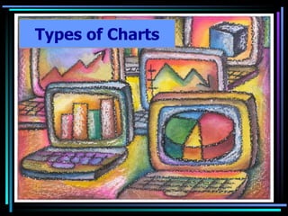
Types Of Charts
- 5. Column Chart This chart compares Senior, Junior, and Sophomore attendance rates at assemblies over a period of four months.
- 7. Stacked Bar This chart focuses more on each group’s contribution to the whole for any given month
- 8. Line This chart would be okay if we were analyzing trends in attendance rates, but it does not provide a good side-by-side comparison
- 9. XY Scatter This chart is trying to determine if there is a correlation between the month and the attendance rate
- 10. Pie Finally, this chart is useless for representing the data because it only allows for one data series.
- 13. Stacked Bar This example shows the contributions of three components: Computers, Printers, and Monitors to total sales during each quarter (three-month period)
- 14. Compare
- 15. Column This chart does not accurately represent the contributions of each part to the whole and is instead comparing them against each other
- 16. Line What about this chart? Can you clearly identify each component’s contribution to the whole?
- 17. XY Scatter Why does this chart not work?
- 18. Pie The chart only looks at one department
- 22. Compare
- 24. Stacked Bar Does this chart describe trends?
- 25. Pie The pie chart fails to present all of the data
- 28. XY Scatter What affect did the wait time in the principal’s office have on pulse rate? What affect did the wait time in the doctor’s office have on pulse rate? This data is fictional
- 29. Compare
- 30. Column As you can see, if this chart is used, the data is confusing and not easily interpreted
- 31. Stacked Bar This chart is also hard to interpret
- 32. Pie The pie chart, once again, is clearly not the preferred chart for representing and communicating the data!
- 35. Pie Chart Which item contributed the most percent to total sales?
- 39. Stacked Bar
- 40. XY Scatter
- 41. Column Chart
- 42. Exploded Pie
- 43. Pie
- 44. Line
Notas do Editor
- Which group attends assemblies most consistently? – The sophomores have the most consistent attendance as evidenced by the green bars. Which group attends the assemblies most inconsistently? The seniors. Their attendance increases in January and February, shows a dramatic increase in March, and declines by more than half in April.
- The components are displayed in the order presented in the spreadsheet. What was the total sales for the first quarter? About $18,000 How much did printer sales contribute to the total sales for the first quarter? $5,000 How would you determine the percent of sales for printers to the total sales for the first quarter?
- Stacked bar Line Bar Exploded pie Pie XY Scatter