Strengths and weakness of data presentation
•
23 gostaram•103,350 visualizações

A summary of the Geographical presentation techniques for exams

Recomendados
Mais conteúdo relacionado
Mais procurados
Mais procurados (20)
Mais de Will Williams
Mais de Will Williams (20)
Strengths and weakness of data presentation
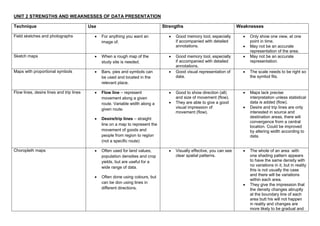
- 1. UNIT 2 STRENGTHS AND WEAKNESSES OF DATA PRESENTATION Technique Use Strengths Weaknesses Field sketches and photographs For anything you want an Good memory tool, especially Only show one view, at one image of. if accompanied with detailed point in time. annotations. May not be an accurate representation of the area. Sketch maps When a rough map of the Good memory tool, especially May not be an accurate study site is needed. if accompanied with detailed representation. annotations. Maps with proportional symbols Bars, pies and symbols can Good visual representation of The scale needs to be right so be used and located in the data. the symbol fits. relevant place. Flow lines, desire lines and trip lines Flow line – represent Good to show direction (all) Maps lack precise movement along a given and size of movement (flow). interpretation unless statistical route. Variable width along a They are able to give a good data is added (flow). given route. visual impression of Desire and trip lines are only movement (flow). interested in source and Desire/trip lines – straight destination areas, there will convergence from a central line on a map to represent the location. Could be improved movement of goods and by altering width according to people from region to region data. (not a specific route) Choropleth maps Often used for land values, Visually effective, you can see The whole of an area with population densities and crop clear spatial patterns. one shading pattern appears yields, but are useful for a to have the same density with no variations in it, but in reality wide range of data. this is not usually the case and there will be variations Often done using colours, but within each area. can be don using lines in They give the impression that different directions. the density changes abruptly at the boundary line of each area butt his will not happen in reality and changes are more likely to be gradual and
- 2. to bear little relation to the boundary lines. With line shading it’s difficult to draw lines accurately and it’s time consuming. With the colouring method, the shades of colouring are difficult to achieve, especially with a large number of classes unless more than one colour is used. Isoline maps Can be used for any data set Data can be represented Can be difficult to construct. where there are specific without artificial area There is some element of locations. boundaries. Therefore guess work involved in the changes in value occur positioning of the isolines Examples are contour maps, smoothly and not abruptly. between values. This makes meteorological maps This makes maps useful for them rather subjective, interpreting general trends in especially if there is a lack of (isotherm - temperature, distribution. known values. isobar - pressure, isohyets - rainfall and isohel - sunshine) Dot maps Mainly used for population Good visual representation of Lacks precise location and distributions, but can also distributions. value of each individual item. show crop yields, livestock Allows the major features of a Too many dots will fail to be and mineral distributions. distribution to be shown. useful as they will all merge into one or too few and it will create the impression of emptiness. Regular spacing of the dots is extremely difficult to achieve, as is accurate counting. Areas can be missed out if they don’t conform to the scale. Will only indicate general variations between areas. Line (arithmetic) graphs Show changes over time or with Can compare multiple Only to be used with distance. continuous data sets easily continuous data. Interim data can be inferred
- 3. Smooth line when changes are from graph line. gradual or straight line to emphasise changes Long-sections and cross-sections Often used in relation to Long sections show a view of Either section is more useful rivers. the whole length. when the other is available. Cross sections show a view of Only a snapshot in time. a segment. As it is mostly used for rivers in Geography, it is ahighly susceptible to weather and geological conditions. Bar graphs Useful for absolute values and Good visual representation of Graph categories can be contrasts between areas and statistical data. reordered to emphasize places. Simple to construct and easy certain effects to understand. Use only with discrete data Limited space for labelling with vertical bar graphs Scattergraphs Used to compare two sets of It will show you a correlation Too few datapoints can data. between two data sets produce skewed results, Often used in combination Relatively easy to construct. producing in correct graph with Spearman’s rank. Shows data spread clearly analysis and any anomalies stand out. Impossible to label data points, hard to ascertain exact values Too many data points can quickly make graph unreadable Cannot show relationship between more than two variables at once Pie charts Useful for %’s, statistical data. Shows % of each segment. Too many segments make the Easy to draw. graph cumbersome. They can be used to Calculation of the amounts is represent a wide range of more difficult than the bar statistical data and are chart visually very effective, as the If there are a lot of small contribution of each segment segments then they are is easy to see. difficult to analyse. No exact numerical data.
- 4. Hard to compare 2 data sets. "Other" category can be a problem. Total unknown unless specified. Best for 3 to 7 categories. Triangular graphs Show the relationship Show relative importance Data must be in %. between three different which may not be easily Can be difficult to read and to components. apparent form a data table. construct. Shows clusters. The dominant component in each case can be seen. Kite diagrams Used to show percentage allow you to view how much can be tricky to construct and change with distance. of each species is there and analyse accurately. where they are in relation to each other in a chart format Radial diagrams Good when one variable is a The advantage of radial These graphs have a limited directional feature. diagrams in that they allow use and can only be used with you to display several specific types of data, as the independent variables. scale around the edge must be of a continuous nature. Logarithmic graphs Large data sets or when the Very useful when a large Can be difficult to construct rate of change is more range of data needs to be and analyse. important than the actual presented. amount. Dispersion graphs Shows a range of values in a Visually effective as the full Data must be in a form which data set. range of data can be seen can be placed along a number together with the patterns and line. groupings of the data. Particularly useful for making comparisons either between areas or at the same location over a period of time.