

Recomendados
Mais conteúdo relacionado
Mais procurados
Mais procurados (17)
Semelhante a Analysis of Cover - NME
Semelhante a Analysis of Cover - NME (20)
Mais de Will Jones
Último
Último (20)
Analysis of Cover - NME
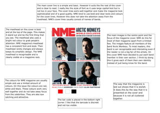
- 1. The main cover line is a simple and basic. However it suits the the rest of the cover and is clear to read. I really like the style of font as it uses large capital text but is not too in your face. The cover lines work well together and make the magazine look sophisticated and of a good quality. NME tend to use bold and clear texts and colours for the cover lines. However this does not take the attention away from the masthead. NME’s cover lines usually consist of names of bands. The masthead on this cover is bold and at the top of the page. This makes it stand out and be the first thing that you see. The masthead also uses a bright red colour to grab people’s attention. NME magazine’s masthead has a consistent font and style. Their masthead rarely changes and always keeps its simplistic design. The NME masthead is recognisable and is clearly visible on a magazine rack. The main images is the centre point and the focus of the magazine cover. NME do this for most of their magazine apart from a limited few. The images feature all members of the band Arctic Monkeys. To most readers, this band is ver recognisable and interesting even if the reader is not a big fan of the artists. On this cover NME have decided to put each band member in their own section. I think by doing this it gives each of them their own identity instead of just being know for the band. The colours for NME magazine are usually simple and use a limited amount of colours. On this issue the colours are red, white and black. These colours work very well together and do not take away focus from the celebrities. They are also eye catching and attractive. The bar code is placed in the bottom right corner. I like that the barcode is discreet and not too visible. The way that the magazine is laid out shows that it is stylish. It does this by the way that it is presented on the cover and because it is not all cluttered together.