
Recomendados
Mais conteúdo relacionado
Mais procurados
Mais procurados (17)
Semelhante a Magazine comparison research
Semelhante a Magazine comparison research (20)
Mais de whslaura
Mais de whslaura (20)
Último
Último (20)
Magazine comparison research
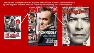
- 1. I have decided to analyse the music magazine NME as I have drawn a lot of inspiration for my own magazine from this, and I will also briefly be comparing NME to Rolling Stone
- 2. NME is so individual because their range of front covers and house styles vary so widely, barely any two covers are similar or the same. Even down to the logo of the magazine, NME is constantly changing up their image to keep readers excited. One trait of NME’s house style is that the artist on the front cover is always the anchorage and the main pull focus – this shows that their magazine is all about the music and they draw in their readers with the use of artists that would appeal to their target audience. Text is always big and bold to also catch the reader’s attention and draw in their interest with stories about their favourite music artists once their attention is already captured by the picture, this is the next thing they see so NME have to make it sound interesting to make the reader want to find out more and buy the magazine. NME also use very effective and dramatic colours – typically but not always bright, which shows their magazine is fun and out-there, which will appeal to their readership.
- 3. In comparison to NME, Rolling Stone has a much more distinctive house style, and each front cover shares a few of the same features – i.e same logo style, similar photograph angles (mid-shot or close up) Each cover also typically has a very plain background, showing that the artist is the main focus on the cover. The anchorage is also usually the artist’s name, as it is always in bold and large font, meaning Rolling Stone rely on the artist’s identity to sell magazines. One thing that does tend to vary on Rolling Stone’s front covers is font – each font is different depending on the artist on the front cover, so if the artist is perceived as a classic artist the font will be simple and elegant, or if the artist is bold and exciting the font will be large and exaggerated. One thing that both magazines do is that they make the artist the main focus of the cover, the text is ordered around them and the pictures are always studio shots that make the artist appear important, which shows that both magazines are all about the music so the pictures that they put on the front of each cover is very important.
- 4. From what I have looked at so far I have looked back at my own magazine and decided to make a few adjustments. I have decided to add some more colour and depth to my magazine logo to make it appear bolder and more distinctive. I think this is a good change to make because it gives the magazine more of an identity, for example Rolling Stone’s distinctive title is very recognisable and creates more of an identity for the magazine. I would also like to decrease the size of my article text and possibly add in another picture to draw inspiration from NME’s busy and vibrant look that appeals to my younger target audience.
- 5. I have made the changes and this is what my magazine looks like now:
- 6. Large pictures featuring the main star of the magazine Lots of pictures – the magazine want to appear visually attractive to younger audience who are less interested in long chunks of writing Distinctive and recognisable house style Large, blocky and bold text to catch the reader’s and help them decide which articles they are interested in Clear organisation of layout – pictures are always in the left hand side and text is always on the right Noticeably more text, this magazine is aimed at an older audience that is interested in more information Both texts have clear house styles on their contents pages, they want their readers to feel familiar to the magazine Colour – Darker, shows that the magazine is more alternative Colour – distinctive and simple, shows the magazine has a strong identity and house style and they stick to it
- 7. Band’s name is in big bold letters to catch reader’s attention and make it clear what the article is about Brief description to show what the interview/article consists of Large picture of the band Pull quotes to engage interest Band’s name is in big bold letters to catch reader’s attention and make it clear what the article is about Brief description to show what the interview/article consists of Large picture of the band Large blocks of writing, lots of information
- 8. Band aimed at older music fans of classic rock and rock fans (these are the kind of people that would be interested in this film) Younger generation alternative band Simple yet effective – lets the iconic logo do the talking but adds a twist to show the film’s sense of humour Shows band popularity/sh ows that they’re in demand Main focus is the band/the new album There are some very obvious differences between these adverts – for example the NME advert is advertising the new album and tour of the band The Black Keys, whereas Rolling Stone is advertising about a film based around music. This shows that NME is all about the music whereas Rolling Stone features other things as well. Also this further shows the age gap in their target market as The Black Keys are a modern alternative band and their typical listeners are usually younger people, however the play on the iconic AC/DC logo would appeal to an older audience too as they would have grown up listening to rock bands such as AC/DC and therefore would be tempted to go and see the film.