Flat Design - A Primer
•
20 likes•10,896 views

The world is, once again, flat. What is flat design? Learn about the 'less is more' aesthetic popularized by Apple, Microsoft and Google.

Recommended
More Related Content
What's hot
What's hot (20)
Viewers also liked
Viewers also liked (19)
Similar to Flat Design - A Primer
Similar to Flat Design - A Primer (20)
More from wedu, Inc
Recently uploaded
Recently uploaded (20)
Flat Design - A Primer
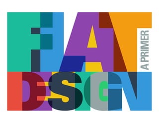
- 1. APRIMER
- 2. The world is, once again, flat. What is flat design? Flat design style embraces visual minimalism, forgoing textures, drop shadows and lighting effects for simple shapes and flat colors. Flat design has actually been around for quite a long time. Its roots go back to Swiss design (also called International Style or International Typographic Style), dating from the 1940s-1950s. Prominent in poster design. Often we creatives refer to this as the “Less is More” principal.
- 3. Why do designers like it? Why do we want to start implementing it? It’s trend aware. Fresh design direction, moving away from skeuomorphic styles that have been prevalent for years now. Simple, elegant style that is focused on stylized pictographs, solid color, no textures or gradients, and is heavily typography- driven. Many elements that marry with modern (as a style) graphic design practices.
- 4. How is this different from skeuomorphic or realism as a design style? What the heck is skeuomorphic anyway???? Skeuomorphic elements are graphics/interfaces that mimic real-world textures, or designed to look like something from the physical world. Leather, wood, metal, glass etc. Apple has been a champion of this design style and for years now, and many web, mobile and digital interfaces have incorporated these methods into their visual aesthetic.
- 5. Why are we seeing this trending in UI? Two huge influences: Microsoft’s Metro UI/Windows 8, and the hotly anticipated and much rumored iOS 7 redesign.
- 6. Where else is flat design used? Flat design has always been a strong principle in environmental design. Wayfinding signage (terminal maps, outdoor city directory maps), public informational signage, billboards, bus shelter advertising, and museum exhibit signage are examples of the application of this principle. This move to flat design makes sense in some respects. We are seeing an increasing connection between the digital spaces we create, and the physical objects already in place that help people navigate their physical world. It’s a similar process that involves strategizing the visualization of information in ways that provide highly functional, yet easily digestible, content.
- 7. Is this really just a designer’s desire to do something different or follow a trend? That is certainly be part of it. Seriously, it’s our job to be trend-aware. However, the Apple skeuo model has been around for a while now, and it’s starting to feel a tad outdated. Change is good!
- 8. Ok, Ok, so designers like flat design. How do developers feel about it? There may always be a place, depending on the project or overall objective, where another design style will work better than flat design. This is one of the decisions that are important to strategize and discuss as we begin each new project. That said, though, flat design is particularly useful in a responsive environment. It does alleviate some challenges (headaches!) that more richly rendered interfaces can present. Moving from texture-heavy realism towards the more flexible and lighter-weight flat style has benefits.
- 9. Less loading, can do most with CSS rather than images and looks classy. Flat design forces us to really care about typography and layout, two areas where web design has traditionally lagged behind its more established print disciplines. In mobile UI, flat design can make it easier to focus on animation and interaction design, as apps like Google Now and Clear demonstrate.
- 10. What are the downsides of flat design? The better question here is: What do we as UX/UI designers have to understand BEFORE implementing any design style, flat or not? Interface users have come to rely on a lot of subtle clues to make their way through an interface: buttons have slight gradients and rounded corners, form fields have a soft inner shadow, and navigation bars “float” over the rest of the content. If ywe remove all these clues, and we end up with a world where every
- 11. element is suddenly placed at the same level, we potentially lead to confusion: a user may ask themself, is this a button, or simply a banner? That’s something we always have to think of. In order to achieve the flat design aesthetic, we designers must focus on what things do, rather than what they will look like. Ornamental elements can sometimes be a distraction from the user experience. What non-designers need to appreciate – or at least be open to appreciating – is that flat design does not mean overly simplistic or boring. The goal is create simple visuals that convey messages and actions more quickly than more detailed illustrations, all to serve user comprehension. Which, by the way, is a huge part of our job as UX/UI designers.
- 12. The big takeaway from all this: Flat design is awesome! But… no amount of beautiful flat design will mask a really bad UX/UI strategy. good flat design ! bad UX/UI :(
- 13. Some examples of flat design: Facebook’s new flat “F” Google Now http://www.google.com/landing/now/ Microsoft Windows 8 http://www.microsoft.com/en-gb/default.aspx Built By Buffalo http://builtbybuffalo.com/ Svpply https://svpply.com/ Apple’s WWDC app Clear app https://itunes.apple.com/us/app/clear/id493136154?mt=8