School Smart Analytics by eTechSchool.
Techlead has come up with the innovative solutions for the schools names as eTechSchool - School Analytics. Its now being widely used by schools across India to monitor the performance of the school with few clicks. Being informed all the time, reduces the time for admin work, hence more focus can be given to ClassRoom Teaching.
Hence, Smart Analytics is equivalent to Improved Teaching !!
Visit us @ www.etechschoolonline.com
1. School Smart Analytics
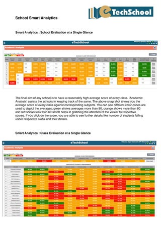
Smart Analytics : School Evaluation at a Single Glance
The final aim of any school is to have a reasonably high average score of every class. 'Academic
Analysis' assists the schools in keeping track of the same. The above snap shot shows you the
average score of every class against corresponding subjects. You can see different color codes are
used to depict the averages; green shows averages more than 80, orange shows more than 60
and red shows less than 60 which helps in grabbing the attention of the viewer to respective
scores. If you click on the score, you are able to see further details like number of students falling
under respective slabs and their details.
Smart Analytics : Class Evaluation at a Single Glance
2. If a specific class is selected for viewing the academic analysis, then along with the class average
against corresponding subjects individual student performance is also shown. Here again the color
code is followed which makes it really simple to highlight students with good performance, those
with average performance and those with poor performance.
Smart Analytics : Class Performance Summary
This graph shows number of students falling under corresponding percentage slabs. For instance,
in this graph there is not a single student who has scored marks > 90 in Sanskrit, 7 students have
scored between 81-90.
Smart Analytics : Co-Scholastic Performance Summary
3. This graph shows number of students who have aquired respective grade shown on X Axis in
corresponding categories. The different color codes represent different categories.
Smart Analytics : Class Progress
These graphs shows progress of the class as a whole in successive years. Difference colored lines
are used to represent maximum score, minimum score, average score and standard deviation of
the class. The first two graphs show the performance for corresponding years and the third graph
shows the difference in respective scores. i.e. it shows difference in maximum scores, minimum
scores and average which have been plotted in the first two graphs.