
Recomendados
Mais conteúdo relacionado
Mais procurados
Mais procurados (18)
Semelhante a Masthead feedback
Semelhante a Masthead feedback (20)
Mais de tashaa_smith
Mais de tashaa_smith (20)
Masthead feedback
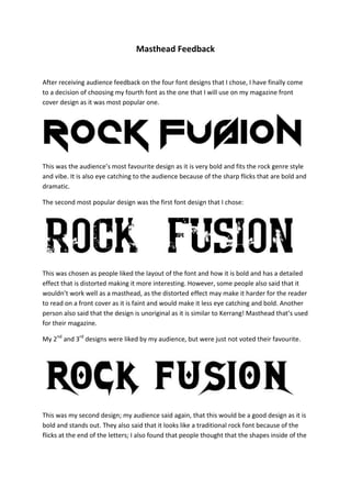
- 1. Masthead Feedback After receiving audience feedback on the four font designs that I chose, I have finally come to a decision of choosing my fourth font as the one that I will use on my magazine front cover design as it was most popular one. This was the audience’s most favourite design as it is very bold and fits the rock genre style and vibe. It is also eye catching to the audience because of the sharp flicks that are bold and dramatic. The second most popular design was the first font design that I chose: This was chosen as people liked the layout of the font and how it is bold and has a detailed effect that is distorted making it more interesting. However, some people also said that it wouldn’t work well as a masthead, as the distorted effect may make it harder for the reader to read on a front cover as it is faint and would make it less eye catching and bold. Another person also said that the design is unoriginal as it is similar to Kerrang! Masthead that’s used for their magazine. My 2nd and 3rd designs were liked by my audience, but were just not voted their favourite. This was my second design; my audience said again, that this would be a good design as it is bold and stands out. They also said that it looks like a traditional rock font because of the flicks at the end of the letters; I also found that people thought that the shapes inside of the
- 2. letters make it more interesting. Although, some people found it was a bit over the top, and would be better kept as a simpler font design. This design has more cons than pros; people thought that this design would stand out as a masthead as well as it is quite faint and faded and not that bold. This design might blend in a bit too much with the magazine making it unreadable or easily recognisable.