
Recomendados
Mais conteúdo relacionado
Mais de swizzy246
Mais de swizzy246 (20)
Último
Último (20)
Poster analysis
- 1. Poster Analysis By Yunus Kasim
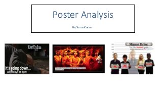
- 2. The channel 4 logo is used to “inform” (Katz) the audience that they are watching Hollyoaks on channel 4, and to remind them the drama is all occurring in that channel. The different images of the cast illustrated on the poster foreshadows that the episode will be filled with drama, likewise it connotes that relationships will be damaged and communities will drift apart. This keeps the audience engaged and wanting to watch the episode as soon as possible, this therefore increases the views for channel 4. The characters facial expressions whilst being on fire, reflects on their reactions when they’re under pressure or suffering in the dilemmas that they will individually face. Although they are on fire of which acts as clothing, they still appear as naked, and this is significant as it emphasises the type of characters they are. The different hand gestures and body language demonstrates what type of characters they are. ‘The week that will change Hollyoaks forever starts Fri 5Nov’ this text is enough to give the audience enough information of when the episode is, and build tension before the episode starts. The frame used ‘signifies’ (De Saussure) that the characters are trapped and so must face what's coming to them. It also makes the poster look clear and gives it clarity. Having more females than males, further emphasises that females are more in control. Also, it brings in the fact that the majority of the audience are women and so it attracts mostly females. Although, there will be male audiences as the female characters act as the male gaze (Laura Mulvey).
- 3. The inclusion of social media differentiates from other posters, and gives the audience an alternative, as they can see other features on the soap opera ‘Manor Drive’. The image fading away, connotes that she was the one who got murdered and she is a vulnerable character that the audience may empathises with. The different characters stating that they are not guilty, is effective because it keeps the audience in suspense as they are unable to work out who is guilty from the line-up, and so they must watch the soap to find out. ‘Let the vengeance begin…’ is an exciting line as it demonstrates that the soap will take many twists and turns. The date of the episodes ‘Wednesday 8.30pm’ ‘informs’ the audience when the episodes will be shown on ‘BBC Three’.
- 4. The character used laying on the floor is significant as it enables the audiences to take sides, and so some sympathise with the character, whilst others may hate him. Either way this image attracts both sets of fans to watch the episode. The background is dark and the floor is dirty. This is parallel with the image and makes it a more attractive poster for the audience as it enables the audience to visualise how the scene will look. Having the soap name ‘Eastenders’ as well as the channel ‘BBC’ together, is effective because it tells the demographic that for them to be able to watch the episode they must go to the channel, and so this clarity will give the audience direction. ‘It’s going down… Weekdays at 8pm’ This not only builds more tension, but gives the audience a time, and so they are able to adjust anything that they usually do at that time, and get themselves prepared to watch the exciting episode. The codes and conventions used on this poster are similar to the ones on the Hollyoaks one, however it looks more simplistic due to the concentration of one image, and lack of bright colours.