Netsuke - Mobile ecommerce conversion - Read Speaker Notes!
•Transferir como PPT, PDF•
0 gostou•649 visualizações

20 x 20 x 20 second slides. Hard writing this but if you talk fast - you can do this flat in 6 mins 30 secs. Phew. Hope you like this bonsai powerpoint!

Recomendados
Recomendados
Mais conteúdo relacionado
Semelhante a Netsuke - Mobile ecommerce conversion - Read Speaker Notes!
Semelhante a Netsuke - Mobile ecommerce conversion - Read Speaker Notes! (20)
Mais de Craig Sullivan
Mais de Craig Sullivan (20)
Último
Último (20)
Netsuke - Mobile ecommerce conversion - Read Speaker Notes!
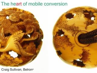
- 1. The he art of mobile conversion Craig Sullivan, Belron ®
- 2. Craig Sullivan, Belron ® Growth: Handset reach Performance User Experience
- 4. Nice day at the office dear?
- 5. Visitor Device Context Location Goals
- 9. Multi channel and platform Insight
- 11. “ To the user, the interface is the product” Jono, Mozilla Labs
- 12. Joshua Bixby Strangeloop Google Site Speed (Live!) Steve Souders
- 13. Comprehension Clarity Simplicity Persuasion Scanning
- 14. If you read these books, you’ll look much smarter at work.
- 18. bit.ly/qgHX5r
- 20. Email Twitter LinkedIn Slideshare : [email_address] : @OptimiseOrDie : linkd.in/pvrg14 : slidesha.re/phpa45
Notas do Editor
- Today I’ll be talking about the art of mobile conversion. The thinking that goes into making high converting mobile websites, and how you can tap into this. I chose this picture because it’s a Netsuke. This is the 17 th century Japanese equivalent of the mobile phone – something always carried, that’s both practical and ornamental.
- Mobile growth has been huge for us this year and our key markets now get more than 20% of revenue and visitors from mobile devices. What we *have* learned from all of this work is that there are three factors for success: Handset reach, Performance and the User experience on mobile.
- I love miniature things and well designed mobile sites are an artform too. But to do it properly, your business needs to be Bonsaied, in order to fit on these small screens. But which bits do you prune? How are you going to keep everyone happy?
- You might have a fight on your hands, deciding what to build or optimise on your mobile site. As Dirty harry said – opinions are like assholes – everyone’s got one. So how do you go about getting the right stuff in there?. How about we start with the customers.
- So where do we start on the mobile product? With the customer of course, then their handsets, where they are, what they are doing and what they want to accomplish. As Nielsen says : More research = more questions = more answers = a better product. This is the glue, the oxygen of our work.
- To stop wasting time, you need to build where there’s an audience for your platform. This means you need device analytics, to tell you what device formats and types are are tryin to engage with you Take a look at Bango, Wurfl and Deviceatlas for handset analytics data. Last tip – always check low converting devices as this might indicate a problem.
- Confused by all the claims about what handsets to support? Well actually, there’s only one game in town – smartphones. Other phones don’t browse and they certainly don’t buy. Android, Apple and Windows are the only growing segments now – others are in steep decline. It’s a highly specific smartphone world and you’ll need analytics help to work out what devices you should be building for.
- User centred design is the Agile technique we use to get stuff right, first time (click) You can think of the technology expression as being our online brand (click) that generates feelings about us (click) Being in the middle here makes you unique amongst your competitors. This is the sweet spot (click) We do continual improvements of our products - in a permanent state of designing and testing, just like Dyson, Edison and Jobs showed us.
- And the future for us is multi-platform. We’ve designed our web, iPhone, Android and tablet experiences to be in that sweet spot I mentioned. Most importantly, by improving them in concert, the entire product suite is aligned and optimised for user experience and contact methods.
- So this is the moment of the conversion – that finger tap that I’m after. So what are the biggest influence factors?
- And simplicity is paramount on mobile. Join.me works so well as a product because it’s the only screen sharing or webinar stuff that always works, and because it is so simple, so easy to use, so unlikely to break. It’s simple and invisible. Your mobile site has to be frictionless for the goals of the user or you will lose business.
- You can’t rely on good performance, even in the city. Just try having an iPhone on o2 – you know what I mean. 75% of people whining mobile about websites, said performance was the number one issue. The office Wi-Fi doesn’t count as testing here. Check out these search keywords on Google.
- With a smaller screen, copy expertise is vital for mobile sites and apps. Every word and every syllable counts. Belron used a specialised agency, Foolproof, to minify the content. We drove legal crazy but amped up the clarity and comprehension for the customer, with high conversion the result.
- Persuasion is a key part of our work. We want both persuasive design and compelling copy – to get people to do more things that we like. One one micro test we ran 2 weeks ago, a single line of copy added to a page will net us 500K Euros per year of revenue.
- And don’t forget testing – we usability test at least 3 times in a product cycle and Foolproof do great work for us here. And remember handset testing. I’d recommend you buy the top customer handsets for your audience and then use Deviceanywhere.com to test others. Make sure you have more than one Android screen format, preferably three. Always test on all iPhone models too. If you cant test – then check your analytics for badly converting handsets and fix.
- And what does this mean for you? In my view, it will mean a complete change in how you code, display or optimise online content – and not just for mobile devices. Nearly all modern browsers and mobile handsets support HTML5 already. You need to get your developers engaged here, over how you’ll adopt and take advantage of HTML5.
- This is a table from my Mobile Optimisation report, available on Econsultancys website. There’s lots of bullshit around on mobile, so please read this. You’ll be surprised to learn how much of the phone hardware you can access, just from a plain old website. On our site, we integrate with email, phone calls and the GPS function – on Android, iPhone and Blackberry models.
- So - stop worrying about IE6 – you’ve got a big design problem to solve across a huge mesh of different screens. Responsive design is a great solution, that adapts your content to fit the device mix. It’s a way to use HTML5 to give an optimised experience on every device or size of screen. Great article on here.
- And what about the future? Well I can’t predict that but there will be cool new stuff and exciting products ahead. Mobile devices are here to stay and will eventually be your main source of traffic, revenue and insight.
- And if you think that’s a load of old balls, you can get in touch!