
Recomendados
Mais conteúdo relacionado
Mais procurados
Mais procurados (14)
Destaque
Semelhante a Color
Semelhante a Color (18)
Color
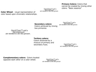
- 1. Primary Colors: Colors that cannot be created by mixing other QuickTime™ and a colors. “Basic essence” decompressor are needed to see this picture. Color Wheel: visual representation of color based upon chromatic relationships. QuickTime™ and a Secondary colors: decompressor are needed to see this picture. Colors achieved by mixing two primaries QuickTime™ and a decompressor are needed to see this picture. Tertiary colors: Colors achieved by a mixture of primary and secondary hues. QuickTime™ and a decompressor are needed to see this picture. Complementary colors: Colors located opposite each other on a color wheel. QuickTime™ and a decompressor are needed to see this picture.
- 2. Chroma: How pure a hue is in relation to gray Saturation: The degree of purity of a hue. QuickTime™ anddecompressor a The brightness or decompressorthis a QuickTime™Intensity: and are needed to see needed to see this of a by addingmay lower are picture. dullness picture. white or the intensity hue. One black. Luminance / Value: A measure of the amount of light reflected from a hue. Those hues with a high content of white have a higher luminance or value Shade and tint are terms that refer to a variation of a hue. Shade: A hue produced by the QuickTime™ and decompressor a decompressorthis a QuickTime™ and addition of black. are needed to seeare needed to see thisApicture. by the picture. Tint: hue produced addition of white.
- 3. QuickTime™ and a decompressor are needed to see this picture.
- 4. QuickTime™ and a decompressor are needed to see this picture.
- 5. The color wheel can be divided into ranges that are visually active or passive. Active colors will appear to advance when placed against passive hues. QuickTime™ and a decompressor are needed to see this picture. Passive colors appear to recede when positioned against active hues.▪ Advancing hues are most often thought to have less visual weight than the receding hues.▪Most often warm, saturated, light value hues are "active" and visually advance.▪Cool, low saturated, dark value hues are "passive" and visually recede.▪Tints or hues with a low saturation appear lighter than shades or highly saturated colors.▪Some colors remain visually neutral or indifferent.
- 6. QuickTime™ and a decompressor are needed to see this picture.
- 7. QuickTime™ and a QuickTime™ and a decompressor QuickTime™ and a decompressor are needed to see this picture. decompressor are needed to see this picture. are needed to see this picture. QuickTime™ and a QuickTime™ and a decompressor QuickTime™ and a decompressor are needed to see this picture. decompressor are needed to see this picture. are needed to see this picture. Complementary colors bring out the best in each other. When fully saturated complements are brought together, interesting effects are noticeable.
- 8. QuickTime™ and a decompressor are needed to see this picture.
- 9. QuickTime™ and a decompressor are needed to see this picture. Monochromatic colors: Colors that are shade or tint variations of the same hue
- 10. QuickTime™ and a decompressor are needed to see this picture.
- 11. QuickTime™ and a decompressor are needed to see this picture.
- 12. QuickTime™ and a decompressor are needed to see this picture.
- 13. QuickTime™ and a decompressor are needed to see this picture.
- 14. QuickTime™ and a decompressor are needed to see this picture.
- 15. QuickTime™ and a decompressor are needed to see this picture.
- 16. QuickTime™ and a decompressor are needed to see this picture.
Notas do Editor
- Saturation describes how bright or intense a hue is. Highly saturated colors haven’t been mixed with any white or black yet. Value is how dark or light the color is. High value is called tint, whereas low value is referred to as shading.
- The contrast is formed by juxtaposition of light and dark values and their relative saturation Light and dark values