3. Q2) How effective is the
combination of your main product
and ancillary texts?
4. Mood Board
I created a mood board of the
Hollyoaks soap as my soap
would have a similar audience.
It also is seen on E4 which is
the institution I have decided
to use for my soap.
6. Magazine ancillary
Cursive feminine font.
Looks like lipstick to
appeal to target
audience
Large masthead taking
up a fifth of the page
Magazine special
telling you what's in the
magazine
Anchoring to the star.
Tells you what the star
has to do with the
magazine
Main heading same size
as masthead. Feminine
as it looks like it has
been written in mascara
Banner at bottom
saying magazine extras
7. Magazine ancillary
Subheading promoting
the magazine
Website and issue
number
Eyes a third of the way
down the page and
looking at audience
Simple colour scheme
of one or two colours.
Star dressed in them
colours
Intertextuality to add a
story behind the picture
Subheading to the main
story
8. Magazine ancillary
No price or
baarcodebecause it is
given away free with a
paper
Subtle colours which
go together
One main picture with
no others. No bubbles
as it is a classy
magazine
Mention of where the
star is from
‘Dolled up’ to portray a
perfect woman who the
audience would ideally
want to be
Usually one star on the
front
10. Similar Media
Time frame/date of
when the soap starts E4 logo which
follow the E4 style
guide regulations
Clear Main characters
Banner which appeals to which overlapping in a row
and excites the audience
11. Similar Media
Time frame/date of
when the soap starts E4 logo which
follow the E4 style
guide regulations
Clear Main characters
Banner which appeals to which overlapping in a row
and excites the audience
12.
13.
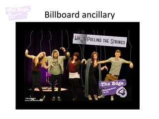
14. Branding/Institution
I decided to advertise my product with E4.
This is because my soap is based around
Hollyoaks, an E4 soap. Similar to Hollyoaks I
named my soap after the wealthy place it was
set. For me this is Aulderly Edge, so we
named it The Edge.
The Edge
The Edge
The Edge
The Edge
The Edge After experimenting with fonts I chose to use American
The Edge Typewriter as it is typical to E4 shows like skins. I then
made it bold so it stood out so it followed the
The Edge conventions of the E4 style guide. I then stuck to the
The Edge colours of E4 with the purple and white. This means that
The Edge my soap will now be associated with popular E4 shows.
It is easy to read but and is also eye catching
The Edge
The Edge
The Edge
15. These are the specifications given in the E4 style guide.
I made sure my products conformed to these to create
an identity which will appeal to my demographic.
22. Presenting a region
The stars are all Mancunian so therefore have ‘manc’
accents. This tells the audience that the soap is set in
Manchester and therefore help to portray stereotypical views
that people may have.
23. Genre
My soap is a Uk soap which is based around realistic
problems so is therefore catharsis. They are there so the
audience dont feel like they are the only ones with that
problem. However more commonly found in US soap our
soap is based on classy characters and is set in a well off
area. The characters are trashy/tacky and kind of fake. They
try and come over as classy but are not posh at all. The
characters are young adults who have just left college/
school.
I resembled this genre in my soap, billboard and magazine
front cover.