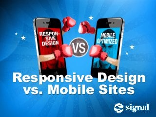
Responsive Design vs Mobile Sites
•
2 gostaram•6,490 visualizações

These days every business wants to accommodate smartphones and tablets with a mobile-optimized website, and there are two basic ways to go about it. Your site can be built to forward mobile users to a separate mobile site, with content formatted to fit smaller screens, and navigation optimized for touching instead of clicking. The other option is responsive design, in which one unified site has the flexibility to adapt automatically to best suit whatever device it’s being viewed on. So the question facing everyone is, which do I choose? Which is better, a separate mobile site or a responsive site?

Recomendados
Recomendados
Mais conteúdo relacionado
Último
Último (20)
Destaque
Destaque (20)
Responsive Design vs Mobile Sites
- 1. ★ ★ ★ ★ ★ Responsive Design vs. Mobile Sites
- 2. Two basic options for mobile-optimized sites Which do I choose? Which is better? ★ ★ ★ ★ ★ OPTION 1: Responsive Design OPTION 2: Separate Mobile Site
- 3. How do they work? ★ ★ ★ ★ ★ OPTION 1: Responsive Design OPTION 2: Separate Mobile Site > Servesthe same page > Detectsthe user’s device code to all users type on the server side > CSS and Javascript > Serves the appropriate reformat web pages in version of the site, either the user’s web browser mobile or desktop on the client side ★ ★ ★
- 4. Responsive Design: The Pros > More elegant and streamlined > One set of code covers all platforms ★ > Most likely represents the future of ★ the mobile web ★ ★ ★
- 5. Responsive Design: The Cons > Not a simple patch or site add-on – typically requires complete UI redesign and larger budget > Challenging to achieve “perfect” results on all the possible platforms – requires development trial and error > Large file sizes for the desktop assets can slow down the mobile experience ★ ★ ★
- 6. Responsive Design: The Verdict > Consider responsive if you are starting a whole new site from scratch. > If you’re happy with your current desktop site and want to improve the mobile experience, responsive may not be right for you. ★ ★ ★ ★
- 7. Separate Mobile Site: The Pros > Should not be viewed as the lesser alternative to responsive – sometimes makes more sense > Allows you to craft a different user experience to match mobile users’ needs > Smaller file sizes for faster mobile viewing > Mobile templates can be more economical than custom responsive solutions ★ ★ ★
- 8. Separate Mobile Site: The Cons > Multiple site versions to keep maintained, updated and in sync > A simplified mobile experience may not satisfy users who expect full features and capabilities ★ ★ ★ ★ ★
- 9. Separate Mobile Site: The Verdict > The practical choice if you don’t want to overhaul your current desktop site. > Makes sense if your users have distinct needs and expectations based on the device they’re using. > Opportunity to offer a fast, streamlined mobile site and a deep, comprehensive desktop site. ★ ★ ★
- 10. Final Analysis ★ ★ ★ ★ ★ ★ ★ It’s a Draw! Remember: your users don’t care whether your site is responsive or mobile. They just want it to work.
- 11. There’s more where that came from. Visit www.signalinc.com