

Recomendados
Mais conteúdo relacionado
Destaque
Destaque (20)
Semelhante a 6308 Casper Presentationupdated2
Semelhante a 6308 Casper Presentationupdated2 (20)
Mais de Cma Mohd
Mais de Cma Mohd (20)
Último
Último (20)
6308 Casper Presentationupdated2
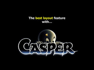
- 1. The best layout feature with…
- 2. Visual Graphics for Instructional Design require a few standard rules
- 3. ONTRAST LIGNMENT IMPLICITY ROXIMITY MPHASIS EPETITION
- 4. 1 CONTRAST
- 5. CONTRAST Color Image Typography (font) Visual Graphics for Instructional Design
- 6. [ Distinguish the contrast ] Color Image Typography (font) Visual Graphics for Instructional Design
- 7. cont rast hard to see Visual Graphics for Instructional Design
- 8. contrast Must be high contrast to be easily seen Visual Graphics for Instructional Design
- 9. Low contrast is for camouflage
- 10. Easiest way to check high contrast is if picture has clear definition when in black & white
- 11. This is grey scale black & white
- 12. This is pure high contrast black & white
- 13. Low contrast pictures are not clear in black & white
- 14. typography Desktop publishing graphics Theories of multimedia animation Information Processing Learning Theories of Constructivism But sometimes you purposely want confusion
- 15. 2 ALIGNMENT
- 16. ALIGNMENT Text1 Images Text2
- 17. [ Arrange in a parallel order ] Text1 Images Text2
- 18. Focus Graphic Layout Proportion The focus of the visual stimuli must very clearly reflect and emphasize its objective Visual Graphics for Instructional Design . Focus on the page with no one section is heavier than the other. Or, a designer may intentionally throw elements out of balance to create tension or a certain mood.
- 19. balance can be symmetrical Visual Graphics for Instructional Design
- 23. OR balance can be a symmetrical Visual Graphics for Instructional Design
- 26. Center focus alignment is most Powerful but beware of poor division of information because it can cause disruption in reading Graphic Layout Proportion
- 27. Center focus alignment is most Powerful but beware of poor division of information because it can cause disruption in reading Focus Division of Information Graphic Layout Proportion
- 28. But beware! Center Focus Alignment is NOT good for multiple layer or long presentations. Center Focus tends to imply “ self-containment ”, thus implying “the end”. It is most effective when designing a “ one-off ” visual, like a poster. For longer information, if it must be symmetrical, a better layout would be the Forced Justify . Graphic Layout Proportion
- 29. However, the Forced Justify _ alignment _ is very difficult to control, as you may find _ funny _ gaps _ in _ between text that cannot be controlled. Graphic Layout Proportion
- 30. Visual Graphics for Instructional Design best rule to remember…
- 31. 3 SIMPLICITY
- 32. SIMPLICITY
- 34. [ Simplify your presentation ]
- 35. Simplicity is the best policy “ Superfluous graphics can interfere with understanding” Anglin, G., Towers, R., & Levie, H. (1996). Visual message design and learning: The role of static and dynamic illustrations. In D.H. Jonassen (Ed.), Handbook of Research for Educational Communications and Technology . New York: Simon and Schuster Macmillan. Visual Graphics for Instructional Design
- 36. Visual Graphics for Instructional Design Graphics four functions: Levie, W.H. & Lentz, R. (1982). Effects of text illustrations: A review of research. Educational Communications and Technology Journal, 30 (4), 195-232. helping poor readers by adding pictorial clues to decode text compensatory pictures increase comprehension to improve recollection and retention, or to provide information that is not otherwise available cognitive pictures enhance enjoyment or affect emotions and attitudes affective pictures or graphics attract attention to the material or direct attention within the material attention
- 37. Issues to consider in Graphics: Misanchuk, E., Schwier, R. & Boling, E. (in press). Visual design for instructional multimedia Larger pictures have more impact however, it is necessary to balance the need to have a graphic which is large with technical limitations, such as download time or computer capacity Size Users from other cultures may be offended by certain colors or graphics Culture Graphics should be as simple as possible and complexity should be added only where absolutely required Complexity Simplified drawings are better instructional aids since they focus attention on the salient points under construction Realism An essential picture which cannot be removed without harming comprehension Germaneness
- 38. Text Should also be simple “ An overabundance of fonts or colors can distract rather than assist learning” Levie, W.H. & Lentz, R. (1982). Effects of text illustrations: A review of research. Educational Communications and Technology Journal, 30 (4), 195-232. Visual Graphics for Instructional Design
- 39. Consistency & Simplicity Do NOT use more than three (3) font variations: Size Typeface Effects
- 40. Consistency & Simplicity Do NOT use more than three (3) font variations: Size Typeface Effects … by the way notice the Focus
- 41. “ The Whole is More Than the Sum of Its Parts” Wertheimer, M. (1924). Gestalt theory. Social Research, 11, translation of lecture at the Kant Society, Berlin. Powerful Presentations using Creative Media for Instructional Design with maximum Impact & Effect Strategy & Tactics Using both graphics and text
- 42. figures adapted from examples in: Mullet, K. & Sano, D. (1995). Designing visual interfaces: Communication oriented techniques. Englewood Cliffs, NJ: Prentice Hall Gestalt Theory
- 43. 4 PROXIMITY
- 44. PROXIMITY proximity or closeness creates a bond between people and between elements on a page. How close together or far apart elements are placed suggests a relationship (or lack of) between otherwise disparate parts.
- 45. PROXIMITY Gap between Texts Gap between Graphics Gap between Texts and Graphics
- 46. [ Do a suitable space within object ] Gap between Texts Gap between Graphics Gap between Texts and Graphics
- 47. 5 EMPHASIS
- 48. EMPHASIS
- 49. [ You should have one main item ]
- 50. 6 REPETITION
- 51. REPETITION Color Consistency Standardizes Font Type Related Shapes and Images
- 52. [ Use repetition only if you need ] Color Consistency Standardizes Font Type Related Shapes and Images
- 53. Always remember CASPER…. Thank you to: My Lecture PN Firuz H.Husin, My friend Zana, JU ICT Gombak, and others.