
Recomendados
Mais conteúdo relacionado
Mais de shaunahughes
Magazine cover analysis_worksheet.docx 1.doc
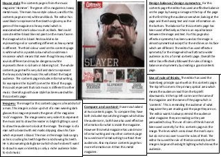
- 1. House style This contents page is from the music Design balance/ design symmetry For this magazine ‘Hammer’. The genre of his magazine is heavy contents page the editor has used an effective balance Salford City College metal music.Ecclesmain house style colours used for this The Centre on the page by having an image at the top of the page AS Media Studies contents page are red, white and black. The editor has Foundation Portfolio as the first thing the audience see when looking at the used black to represent either death or gloomy as the page and then having text and more information on genre of the magazine is heavy metal which is the bottom. The balance for this contents page has associated with dark colours such as black. Red could been used effectively as there is an equal balance connote either blood like red paint on the mans face in between the image and text. For this page also the image which is blood. Red could also be effective symmetry has been used as the image is representing evil or something different as heavy metal almost symmetrical accept for the red lines on his face is different. The third colour used on this contents page which are different. The editor has used effective is white which is a pastel colour which could mean symmetry for the image which will attract a wider innocence which means that even though heavy metal audience as it is a formal contents page. Overall the sounds different and may be dangerous white editor has effectively followed the rules of design represents there is no harm in listening to it. The whole balance and symmetry by creating a good contents contents page itself is very dull and dark to represent page. the heavy rock/metal music this will attract the target audience. The contents page includes informal writing, Use of rule of thirds: The editor has used the for example in the top left corner the title of the page, Gutenberg principle quiet well on this contents page. this could represent that rock music is different to other The top left corner is the primary optical area which music. Overall a good house style has been used within means the audience read from the top left this contents page. downwards. In the top left corner are the name of the magazine and the name of the page which is Imagery: The image for this contents page is a head shot of ‘contents’. This is reminding the audience of what a man. This image is a close up shot of a man wearing dark Compare and contrast I have now looked magazine they are reading and the page they are on. glasses this image represents the genre of the magazine at two contents pages. To compare they have The editor wants to always remind the audience ‘rock’ magazine. The image seems very violent to represent both included eye catching images which draw what magazine they are reading so they are the music and to draw the reader in. bright lighting is used the audience in, both have also used effective persuaded to buy The use of rules of thirds has not to draw the audience to look at the image. The image is of a information for what is inside the magazine. been used correctly for this contents page on the man with a beard with red marks dripping down his face However this metal magazine has used more image. The lines which cross down the man’s eyes which represent s blood. The man in the image looks angry informal writing and my other contents page but do not cross over to use the rules of third. The as he is crushing his teeth together and showing his teeth. has used more formal writing to attract their editor has used the rule of thirds incorrectly but the He is also wearing dark glasses which show he doesn’t want audiences. Also my dance contents page has image is large and has bright lighting which draws the to show his eyes or identity as only a niche audience listen more information on it than this metal audience. to rock music. magazine.