SlideShare uma empresa Scribd logo
1 de 6
Module No. - 6
Excel Charts:
Representing the data in the form of chart is one of the most popular methods, which are
used for the purpose of data analysis. Excel provides various tools and capabilities. Using
these tools, you can transform the data into charts. For example, let us take following data
and analyze it. The data pertains to sales and expenditure figures of three companies, viz.
Company 1, Company 2, and Company 3.
A

1
2
3
4

B
C
D
Jan
Feb
Mar
Comp 1
10
50
80
Comp 2
20
40
80
Comp 3
40
60
100
A chart is the graphical representation of data.
The data values are represented in terms of bars, lines, columns, pie, slices etc.
Different bars, columns, lines etc. are colored with different color so that different data
series can be distinguished from one another.
Standard data values are also plotted horizontally and vertically so as to get the exact
idea of their magnitude.
Excel supports different types of charts to represent the data clearly and effectively.
Each type of chart has its own sub type or variant.
Which type of chart will be suited best to your data would depend upon what the data
pertains to.
For example, if you have to compare the sales figure of three companies, the bar chart
would suit best. But if you have to illustrate that out of the total market share 20% is
taken by company 1, 50% is taken by company 2 and 30% is taken by company 3 then
for such data representation, Pie chart will suit best. So before we go into the
operational aspects of drawing the chart, let us first get introduced to different types of
charts that can be generated in Excel.

Area Chart:
It shows relative importance of values over a period of time.
It emphasizes the amount of change that has taken place between the two intervals
(magnitude), rather than the values at that time or the rate of change. For example, the data
and corresponding area chart are illustrated below.
A
1

B
Jan

C
Feb

D
Mar
2
3
4

Tek
Sun
Net

10
20
40

50
40
60

80
80
100

300
250
100

200
150

80

60

100

Net
Sun
Tek

40

50 40
20
0 10

80

50

Jan

Feb

Mar

Bar Chart:
This type of chart represents the values in the form of bars.
The length of the bar represents the magnitude of the value.
It shows individual figures at a specific time or illustrates comparison between
items.
In such type of charts, categories are plotted vertically, while the values are placed
horizontally, so the emphasis is more on comparison and less on time.
Sample Sales figure for three companies, for the month of January 2004 are
represented in following bar chart.
A
1
2

Jan-04

B
Net
200

C
Sun
600

D
Tek
900

Jan-00
Tel
Sun

Jan-00

Net
0

200

400

600

800 1000

2
Column Chart:
Column chart is similar to Bar chart except that the categories are placed horizontally
and the values are plotted vertically. Generally it is used to illustrate comparison between the
items over a period of time. Sales data of Tek Company for the last three months of the
financial year i.e. January, February and March is given below along with the column chart.
A
1
2
3

Tek

B
Jan
10

C
Feb
50

D
Mar
80

Tek
1500
1300
1100
900
700
500
300
100
-100

Tek

Jan

Feb

Mar

Whenever a comparison is to be made between different items, bar chart or column
chart is preferred.
Line Chart:
This Chart is similar to the normal x-y graph with which you may already been
familiar with. It shows the trend of the changes in the data over period of time at even
intervals. The Sales figure for the three companies for three months are given below and line
chart has been prepared as follows:
A
1
2
3
4

Tek
Sun
Net

B
Jan
2000
6000
10000

C
Feb
4000
12000
15000

D
Mar
8000
13000
5000

15000

10000

Tek
Sun
Net
3

5000

0
Jan

Feb

Mar
Pie Chart:
This chart shows the proportion of individual items in the complete whole. Complete
whole is represented in terms of a circle (which represents 100%) called pie. While
individual item's share is represented by an arc called slice. The size of any slice will depend
upon, what percentage the item (which represents the slice) occupies in the complete whole.
Sales figures of these companies are given below and the corresponding chart is also shown.
A
Tek
20000

1
2
3

B
Sun
30000

C
Net
60000

D

18%

Tek
Sun
Net

55%
27%

Doughnut Chart :
This chart is similar to Pie chart, but the difference is that the individual item's share
is not illustrated as a slice in the pie but as a segment in a ring. The advantage of this type of
chart is that it can accommodate multiple data series. For example, sales data for the three
companies for two months is given. Its corresponding doughnut chart is also shown in the
following diagram.

A
1
2
3

Jan
Feb

B
Tek
20000
30000

C
Sun
30000
40000

D
Net
60000
30000

4
4

Tek
Sun
Net

XY Scatter Chart:
It is similar to the line charts but does not have the lines, joining the dots. It shows the
relationship or degree of relationship between the numeric values in several chart data series.
This type of chart is mainly used for scientific data. For example, you want to plot the
maximum temperature of three cities for the four day.
A
1
2
3
4

B
Sun
15
30
40

Srinagar
Delhi
Jaipur

C
Mon
20
32
42

D
Tue
17
35
45

E
Wed
12
20
35

50
40
Srinagar

30

Delhi
20

Jaipur

10
0
0

1

2

3

4

3-D Charts:
Excel supports different types of charts and charts that have three-dimensional looks
i.e. in x-y-z plane. These charts are called 3-D charts. For example, the column chart prepared
using 3-D effects would be display as follows:
A
1

B

C

D

Jan

Feb

Mar
5
2

Tek

500

700

1500

3

Tek

1500
1000
Tek

500
0
Jan

Tek
Feb

Mar

The various types of 3-D charts can be plotted in Excel and some of them are 3-D Area Chart, 3-D - Bar Chart, 3-D - Column Chart, 3-D - Line Chart, 3-D - Pie Chart, etc.
Assignment No. – 7
Q.1.

What is chart?

Q.2.

How many types of charts available in MS Excel?

Q.3.

Write short notes on the following charts:
a). Bar Chart
b). Line Chart
c). Pie Chart
d). Doughnut chart

6

Mais conteúdo relacionado

Mais procurados

Excel SUMIFS Function
Excel SUMIFS FunctionExcel SUMIFS Function
Excel SUMIFS FunctionExcel
 
Training On Microsoft Excel
Training On Microsoft ExcelTraining On Microsoft Excel
Training On Microsoft ExcelTimesRide
 
MS Excel Learning for PPC Google AdWords Training Course
MS Excel Learning for PPC Google AdWords Training CourseMS Excel Learning for PPC Google AdWords Training Course
MS Excel Learning for PPC Google AdWords Training CourseRanjan Jena
 
MS Excel Pivot Table Reports & Charts
MS Excel Pivot Table Reports & ChartsMS Excel Pivot Table Reports & Charts
MS Excel Pivot Table Reports & Chartsdnbakhan
 
Ms excel ppt presentation
Ms excel ppt presentationMs excel ppt presentation
Ms excel ppt presentationvethics
 
1.2 Zep Excel.pptx
1.2 Zep Excel.pptx1.2 Zep Excel.pptx
1.2 Zep Excel.pptxPizzaM
 
ms excel presentation...
ms excel presentation...ms excel presentation...
ms excel presentation...alok1994
 
Ms excel basic about Data, graph and pivot table
Ms excel basic about Data, graph and pivot table Ms excel basic about Data, graph and pivot table
Ms excel basic about Data, graph and pivot table Alomgir Hossain
 
Excel Crash Course: Pivot Tables
Excel Crash Course: Pivot TablesExcel Crash Course: Pivot Tables
Excel Crash Course: Pivot TablesBobby Jones
 
Excel Top 10 formula For The Beginners
Excel Top 10 formula For The BeginnersExcel Top 10 formula For The Beginners
Excel Top 10 formula For The BeginnersStat Analytica
 
Functions and formulas of ms excel
Functions and formulas of ms excelFunctions and formulas of ms excel
Functions and formulas of ms excelmadhuparna bhowmik
 
Introduction to Excel
Introduction to ExcelIntroduction to Excel
Introduction to ExcelNajma Alam
 
Spreadsheets Concepts and Vocab
Spreadsheets Concepts and VocabSpreadsheets Concepts and Vocab
Spreadsheets Concepts and VocabDanny Ambrosio
 
Microsoft Excel Project 1 Presentation
Microsoft Excel Project 1 PresentationMicrosoft Excel Project 1 Presentation
Microsoft Excel Project 1 Presentationjmartinvvc
 

Mais procurados (20)

Pivot Tables
Pivot TablesPivot Tables
Pivot Tables
 
Excel SUMIFS Function
Excel SUMIFS FunctionExcel SUMIFS Function
Excel SUMIFS Function
 
Advanced Excel Demo
Advanced Excel DemoAdvanced Excel Demo
Advanced Excel Demo
 
Training On Microsoft Excel
Training On Microsoft ExcelTraining On Microsoft Excel
Training On Microsoft Excel
 
MS Excel Learning for PPC Google AdWords Training Course
MS Excel Learning for PPC Google AdWords Training CourseMS Excel Learning for PPC Google AdWords Training Course
MS Excel Learning for PPC Google AdWords Training Course
 
MS Excel Pivot Table Reports & Charts
MS Excel Pivot Table Reports & ChartsMS Excel Pivot Table Reports & Charts
MS Excel Pivot Table Reports & Charts
 
Ms excel ppt presentation
Ms excel ppt presentationMs excel ppt presentation
Ms excel ppt presentation
 
1.2 Zep Excel.pptx
1.2 Zep Excel.pptx1.2 Zep Excel.pptx
1.2 Zep Excel.pptx
 
ms excel presentation...
ms excel presentation...ms excel presentation...
ms excel presentation...
 
Ms excel basic about Data, graph and pivot table
Ms excel basic about Data, graph and pivot table Ms excel basic about Data, graph and pivot table
Ms excel basic about Data, graph and pivot table
 
MS Excel 2nd
MS Excel 2ndMS Excel 2nd
MS Excel 2nd
 
Advanced Excel ppt
Advanced Excel pptAdvanced Excel ppt
Advanced Excel ppt
 
Excel Crash Course: Pivot Tables
Excel Crash Course: Pivot TablesExcel Crash Course: Pivot Tables
Excel Crash Course: Pivot Tables
 
Excel Top 10 formula For The Beginners
Excel Top 10 formula For The BeginnersExcel Top 10 formula For The Beginners
Excel Top 10 formula For The Beginners
 
Ppt on pivot table
Ppt on pivot tablePpt on pivot table
Ppt on pivot table
 
Pivot table
Pivot tablePivot table
Pivot table
 
Functions and formulas of ms excel
Functions and formulas of ms excelFunctions and formulas of ms excel
Functions and formulas of ms excel
 
Introduction to Excel
Introduction to ExcelIntroduction to Excel
Introduction to Excel
 
Spreadsheets Concepts and Vocab
Spreadsheets Concepts and VocabSpreadsheets Concepts and Vocab
Spreadsheets Concepts and Vocab
 
Microsoft Excel Project 1 Presentation
Microsoft Excel Project 1 PresentationMicrosoft Excel Project 1 Presentation
Microsoft Excel Project 1 Presentation
 

Destaque

Module 6 component of excel chart
Module 6 component of excel chartModule 6 component of excel chart
Module 6 component of excel chartDr. Shalini Pandey
 
Excel Template Projects
Excel Template ProjectsExcel Template Projects
Excel Template Projectstharvey2
 
16 making charts
16 making charts16 making charts
16 making chartsMrQaz996
 
Delta Management excercise
Delta Management excerciseDelta Management excercise
Delta Management excerciseMarcelo Honores
 
MVC From Beginner to Advance in Indian Style by - Indiandotnet
MVC From Beginner to Advance in Indian Style by - IndiandotnetMVC From Beginner to Advance in Indian Style by - Indiandotnet
MVC From Beginner to Advance in Indian Style by - IndiandotnetIndiandotnet
 
Advanced Excel course
Advanced Excel courseAdvanced Excel course
Advanced Excel courseAshwani Kumar
 
Excel chart helper guide
Excel chart helper guideExcel chart helper guide
Excel chart helper guidejohnmika
 
MIS 226: Chapter 3
MIS 226: Chapter 3MIS 226: Chapter 3
MIS 226: Chapter 3macrob14
 
Manage Project Agreements and Fundings in Oracle EBS Projects via MS-Excel us...
Manage Project Agreements and Fundings in Oracle EBS Projects via MS-Excel us...Manage Project Agreements and Fundings in Oracle EBS Projects via MS-Excel us...
Manage Project Agreements and Fundings in Oracle EBS Projects via MS-Excel us...Project Partners LLC
 
How To Make A Link Profile In Excel (Pie Chart)
How To Make A Link Profile In Excel (Pie Chart) How To Make A Link Profile In Excel (Pie Chart)
How To Make A Link Profile In Excel (Pie Chart) Christopher Dill
 
Create A Chart In Excel
Create A Chart In ExcelCreate A Chart In Excel
Create A Chart In ExcelBrian Lowery
 
Different types of charts
Different types of chartsDifferent types of charts
Different types of chartsZakaria Salim
 
Online Excel Course (Basic to Advanced)
Online Excel Course (Basic to Advanced)Online Excel Course (Basic to Advanced)
Online Excel Course (Basic to Advanced)Sumit Bansal
 
Excel Elbow Grease: How to Fool Excel into Making (Pretty Much) Any Chart You...
Excel Elbow Grease: How to Fool Excel into Making (Pretty Much) Any Chart You...Excel Elbow Grease: How to Fool Excel into Making (Pretty Much) Any Chart You...
Excel Elbow Grease: How to Fool Excel into Making (Pretty Much) Any Chart You...Innovation Network
 
Column and stacked column : Mixed chart in excel and powerpoint
Column and stacked column : Mixed chart in excel and powerpointColumn and stacked column : Mixed chart in excel and powerpoint
Column and stacked column : Mixed chart in excel and powerpointSatya Mahesh Kallakuru
 

Destaque (20)

Module 6 component of excel chart
Module 6 component of excel chartModule 6 component of excel chart
Module 6 component of excel chart
 
Excel Template Projects
Excel Template ProjectsExcel Template Projects
Excel Template Projects
 
Creating a chart in Excel
Creating a chart in Excel Creating a chart in Excel
Creating a chart in Excel
 
16 making charts
16 making charts16 making charts
16 making charts
 
Delta Management excercise
Delta Management excerciseDelta Management excercise
Delta Management excercise
 
04 ms excel
04 ms excel04 ms excel
04 ms excel
 
MVC From Beginner to Advance in Indian Style by - Indiandotnet
MVC From Beginner to Advance in Indian Style by - IndiandotnetMVC From Beginner to Advance in Indian Style by - Indiandotnet
MVC From Beginner to Advance in Indian Style by - Indiandotnet
 
Advanced Excel course
Advanced Excel courseAdvanced Excel course
Advanced Excel course
 
Chart In Excel
Chart In ExcelChart In Excel
Chart In Excel
 
Excel chart
Excel chartExcel chart
Excel chart
 
Excel chart helper guide
Excel chart helper guideExcel chart helper guide
Excel chart helper guide
 
MIS 226: Chapter 3
MIS 226: Chapter 3MIS 226: Chapter 3
MIS 226: Chapter 3
 
Manage Project Agreements and Fundings in Oracle EBS Projects via MS-Excel us...
Manage Project Agreements and Fundings in Oracle EBS Projects via MS-Excel us...Manage Project Agreements and Fundings in Oracle EBS Projects via MS-Excel us...
Manage Project Agreements and Fundings in Oracle EBS Projects via MS-Excel us...
 
How To Make A Link Profile In Excel (Pie Chart)
How To Make A Link Profile In Excel (Pie Chart) How To Make A Link Profile In Excel (Pie Chart)
How To Make A Link Profile In Excel (Pie Chart)
 
Create A Chart In Excel
Create A Chart In ExcelCreate A Chart In Excel
Create A Chart In Excel
 
Different types of charts
Different types of chartsDifferent types of charts
Different types of charts
 
Online Excel Course (Basic to Advanced)
Online Excel Course (Basic to Advanced)Online Excel Course (Basic to Advanced)
Online Excel Course (Basic to Advanced)
 
Excel Elbow Grease: How to Fool Excel into Making (Pretty Much) Any Chart You...
Excel Elbow Grease: How to Fool Excel into Making (Pretty Much) Any Chart You...Excel Elbow Grease: How to Fool Excel into Making (Pretty Much) Any Chart You...
Excel Elbow Grease: How to Fool Excel into Making (Pretty Much) Any Chart You...
 
Print Slides
Print SlidesPrint Slides
Print Slides
 
Column and stacked column : Mixed chart in excel and powerpoint
Column and stacked column : Mixed chart in excel and powerpointColumn and stacked column : Mixed chart in excel and powerpoint
Column and stacked column : Mixed chart in excel and powerpoint
 

Semelhante a Module 6 (2) type of excel chart

Microsoft Excel.pptx
Microsoft Excel.pptxMicrosoft Excel.pptx
Microsoft Excel.pptxSIMNchannel
 
DATA SCIENCE TRAINING IN HYDERABAD
DATA SCIENCE TRAINING IN HYDERABADDATA SCIENCE TRAINING IN HYDERABAD
DATA SCIENCE TRAINING IN HYDERABADRS Trainings
 
Graphexamples how-to-do
Graphexamples how-to-doGraphexamples how-to-do
Graphexamples how-to-doMelody Teoxon
 
Understanding on graph in bpo
Understanding on graph in bpoUnderstanding on graph in bpo
Understanding on graph in bpoAjit Kumar
 
Types of charts in Excel and How to use them
Types of charts in Excel and How to use themTypes of charts in Excel and How to use them
Types of charts in Excel and How to use themVijay Perepa
 
Lab file on research methodology
Lab file on research methodologyLab file on research methodology
Lab file on research methodologySukhchain Aggarwal
 
Excel Slope Instruction
Excel Slope InstructionExcel Slope Instruction
Excel Slope Instructiontotoros_girl
 
Introduction to Business analytics unit3
Introduction to Business analytics unit3Introduction to Business analytics unit3
Introduction to Business analytics unit3jayarellirs
 
Line & Bar Graphs 97
Line & Bar Graphs 97Line & Bar Graphs 97
Line & Bar Graphs 97herbison
 
Microsoft Offices Excel application allows users to store, model a.pdf
Microsoft Offices Excel application allows users to store, model a.pdfMicrosoft Offices Excel application allows users to store, model a.pdf
Microsoft Offices Excel application allows users to store, model a.pdfdavid16271
 
Excel_2007_Final.pptx
Excel_2007_Final.pptxExcel_2007_Final.pptx
Excel_2007_Final.pptxZORAIZ HAIDER
 
IPT Preliminary Spreadsheets
IPT Preliminary SpreadsheetsIPT Preliminary Spreadsheets
IPT Preliminary Spreadsheetsthowell1985
 
Line graph bar graph
Line graph bar graphLine graph bar graph
Line graph bar graphAyesha Arshad
 

Semelhante a Module 6 (2) type of excel chart (20)

Microsoft Excel.pptx
Microsoft Excel.pptxMicrosoft Excel.pptx
Microsoft Excel.pptx
 
Charts in MS Excel
Charts in MS ExcelCharts in MS Excel
Charts in MS Excel
 
DATA SCIENCE TRAINING IN HYDERABAD
DATA SCIENCE TRAINING IN HYDERABADDATA SCIENCE TRAINING IN HYDERABAD
DATA SCIENCE TRAINING IN HYDERABAD
 
Graphexamples how-to-do
Graphexamples how-to-doGraphexamples how-to-do
Graphexamples how-to-do
 
Understanding on graph in bpo
Understanding on graph in bpoUnderstanding on graph in bpo
Understanding on graph in bpo
 
Types of charts in Excel and How to use them
Types of charts in Excel and How to use themTypes of charts in Excel and How to use them
Types of charts in Excel and How to use them
 
Lab file on research methodology
Lab file on research methodologyLab file on research methodology
Lab file on research methodology
 
Charts in excel
Charts in excelCharts in excel
Charts in excel
 
Excel Slope Instruction
Excel Slope InstructionExcel Slope Instruction
Excel Slope Instruction
 
Introduction to Business analytics unit3
Introduction to Business analytics unit3Introduction to Business analytics unit3
Introduction to Business analytics unit3
 
Computer midterms
Computer midtermsComputer midterms
Computer midterms
 
Line & Bar Graphs 97
Line & Bar Graphs 97Line & Bar Graphs 97
Line & Bar Graphs 97
 
Excel
ExcelExcel
Excel
 
Excel booklet
Excel bookletExcel booklet
Excel booklet
 
Advanced excel unit 01
Advanced excel unit 01Advanced excel unit 01
Advanced excel unit 01
 
Microsoft Offices Excel application allows users to store, model a.pdf
Microsoft Offices Excel application allows users to store, model a.pdfMicrosoft Offices Excel application allows users to store, model a.pdf
Microsoft Offices Excel application allows users to store, model a.pdf
 
Excel_2007_Final.pptx
Excel_2007_Final.pptxExcel_2007_Final.pptx
Excel_2007_Final.pptx
 
Visualization-1
Visualization-1Visualization-1
Visualization-1
 
IPT Preliminary Spreadsheets
IPT Preliminary SpreadsheetsIPT Preliminary Spreadsheets
IPT Preliminary Spreadsheets
 
Line graph bar graph
Line graph bar graphLine graph bar graph
Line graph bar graph
 

Mais de Dr. Shalini Pandey (20)

Flip book on consumer awareness
Flip book on consumer awarenessFlip book on consumer awareness
Flip book on consumer awareness
 
50 management techniques
50 management techniques50 management techniques
50 management techniques
 
Circulation management
Circulation managementCirculation management
Circulation management
 
Stress
StressStress
Stress
 
Stress
StressStress
Stress
 
Ankit report
Ankit reportAnkit report
Ankit report
 
Advertisment fo anaemia awareness camp
Advertisment fo anaemia awareness campAdvertisment fo anaemia awareness camp
Advertisment fo anaemia awareness camp
 
Advertisment practical file
Advertisment practical fileAdvertisment practical file
Advertisment practical file
 
Res525 shalini
Res525 shaliniRes525 shalini
Res525 shalini
 
Res525 origin of earth and earth atmosphere
Res525 origin of earth and earth atmosphereRes525 origin of earth and earth atmosphere
Res525 origin of earth and earth atmosphere
 
Data processing
Data processingData processing
Data processing
 
Introduction Advertising
Introduction AdvertisingIntroduction Advertising
Introduction Advertising
 
Climate smart agriculture 2
Climate smart agriculture 2Climate smart agriculture 2
Climate smart agriculture 2
 
Climate smart agriculture
Climate smart agricultureClimate smart agriculture
Climate smart agriculture
 
Farmers Right
Farmers RightFarmers Right
Farmers Right
 
Critical analysis of welfare schemes
Critical analysis of welfare schemesCritical analysis of welfare schemes
Critical analysis of welfare schemes
 
College of home science leaflet
College of home science leafletCollege of home science leaflet
College of home science leaflet
 
Health problems related to nutrition
Health problems related to nutritionHealth problems related to nutrition
Health problems related to nutrition
 
Farmers kit
Farmers kitFarmers kit
Farmers kit
 
Digital india program
Digital india programDigital india program
Digital india program
 

Module 6 (2) type of excel chart

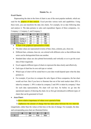
  • 1. Module No. - 6 Excel Charts: Representing the data in the form of chart is one of the most popular methods, which are used for the purpose of data analysis. Excel provides various tools and capabilities. Using these tools, you can transform the data into charts. For example, let us take following data and analyze it. The data pertains to sales and expenditure figures of three companies, viz. Company 1, Company 2, and Company 3. A 1 2 3 4 B C D Jan Feb Mar Comp 1 10 50 80 Comp 2 20 40 80 Comp 3 40 60 100 A chart is the graphical representation of data. The data values are represented in terms of bars, lines, columns, pie, slices etc. Different bars, columns, lines etc. are colored with different color so that different data series can be distinguished from one another. Standard data values are also plotted horizontally and vertically so as to get the exact idea of their magnitude. Excel supports different types of charts to represent the data clearly and effectively. Each type of chart has its own sub type or variant. Which type of chart will be suited best to your data would depend upon what the data pertains to. For example, if you have to compare the sales figure of three companies, the bar chart would suit best. But if you have to illustrate that out of the total market share 20% is taken by company 1, 50% is taken by company 2 and 30% is taken by company 3 then for such data representation, Pie chart will suit best. So before we go into the operational aspects of drawing the chart, let us first get introduced to different types of charts that can be generated in Excel. Area Chart: It shows relative importance of values over a period of time. It emphasizes the amount of change that has taken place between the two intervals (magnitude), rather than the values at that time or the rate of change. For example, the data and corresponding area chart are illustrated below. A 1 B Jan C Feb D Mar
  • 2. 2 3 4 Tek Sun Net 10 20 40 50 40 60 80 80 100 300 250 100 200 150 80 60 100 Net Sun Tek 40 50 40 20 0 10 80 50 Jan Feb Mar Bar Chart: This type of chart represents the values in the form of bars. The length of the bar represents the magnitude of the value. It shows individual figures at a specific time or illustrates comparison between items. In such type of charts, categories are plotted vertically, while the values are placed horizontally, so the emphasis is more on comparison and less on time. Sample Sales figure for three companies, for the month of January 2004 are represented in following bar chart. A 1 2 Jan-04 B Net 200 C Sun 600 D Tek 900 Jan-00 Tel Sun Jan-00 Net 0 200 400 600 800 1000 2
  • 3. Column Chart: Column chart is similar to Bar chart except that the categories are placed horizontally and the values are plotted vertically. Generally it is used to illustrate comparison between the items over a period of time. Sales data of Tek Company for the last three months of the financial year i.e. January, February and March is given below along with the column chart. A 1 2 3 Tek B Jan 10 C Feb 50 D Mar 80 Tek 1500 1300 1100 900 700 500 300 100 -100 Tek Jan Feb Mar Whenever a comparison is to be made between different items, bar chart or column chart is preferred. Line Chart: This Chart is similar to the normal x-y graph with which you may already been familiar with. It shows the trend of the changes in the data over period of time at even intervals. The Sales figure for the three companies for three months are given below and line chart has been prepared as follows: A 1 2 3 4 Tek Sun Net B Jan 2000 6000 10000 C Feb 4000 12000 15000 D Mar 8000 13000 5000 15000 10000 Tek Sun Net 3 5000 0 Jan Feb Mar
  • 4. Pie Chart: This chart shows the proportion of individual items in the complete whole. Complete whole is represented in terms of a circle (which represents 100%) called pie. While individual item's share is represented by an arc called slice. The size of any slice will depend upon, what percentage the item (which represents the slice) occupies in the complete whole. Sales figures of these companies are given below and the corresponding chart is also shown. A Tek 20000 1 2 3 B Sun 30000 C Net 60000 D 18% Tek Sun Net 55% 27% Doughnut Chart : This chart is similar to Pie chart, but the difference is that the individual item's share is not illustrated as a slice in the pie but as a segment in a ring. The advantage of this type of chart is that it can accommodate multiple data series. For example, sales data for the three companies for two months is given. Its corresponding doughnut chart is also shown in the following diagram. A 1 2 3 Jan Feb B Tek 20000 30000 C Sun 30000 40000 D Net 60000 30000 4
  • 5. 4 Tek Sun Net XY Scatter Chart: It is similar to the line charts but does not have the lines, joining the dots. It shows the relationship or degree of relationship between the numeric values in several chart data series. This type of chart is mainly used for scientific data. For example, you want to plot the maximum temperature of three cities for the four day. A 1 2 3 4 B Sun 15 30 40 Srinagar Delhi Jaipur C Mon 20 32 42 D Tue 17 35 45 E Wed 12 20 35 50 40 Srinagar 30 Delhi 20 Jaipur 10 0 0 1 2 3 4 3-D Charts: Excel supports different types of charts and charts that have three-dimensional looks i.e. in x-y-z plane. These charts are called 3-D charts. For example, the column chart prepared using 3-D effects would be display as follows: A 1 B C D Jan Feb Mar 5
  • 6. 2 Tek 500 700 1500 3 Tek 1500 1000 Tek 500 0 Jan Tek Feb Mar The various types of 3-D charts can be plotted in Excel and some of them are 3-D Area Chart, 3-D - Bar Chart, 3-D - Column Chart, 3-D - Line Chart, 3-D - Pie Chart, etc. Assignment No. – 7 Q.1. What is chart? Q.2. How many types of charts available in MS Excel? Q.3. Write short notes on the following charts: a). Bar Chart b). Line Chart c). Pie Chart d). Doughnut chart 6