
Recomendados
Recomendados
Mais conteúdo relacionado
Mais procurados
Mais procurados (20)
Mais de sconnin
Último
Último (20)
Data graphics - CAMP
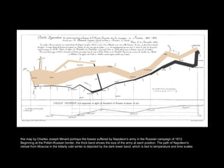
- 1. this map by Charles Joseph Minard portrays the losses suffered by Napoleon's army in the Russian campaign of 1812. Beginning at the Polish-Russian border, the thick band shows the size of the army at each position. The path of Napoleon's retreat from Moscow in the bitterly cold winter is depicted by the dark lower band, which is tied to temperature and time scales
- 4. Example
- 5. Example
- 6. Example
- 10. Area, Angle, Length, Position Angle + Slope
- 11. Shading Length
- 12. Position on Common Scale Length
- 13. Position on Identical but Non-Aligned Scales
- 15. “ People’s accuracy in describin the embellished charts was no worse than for plain charts….and their recall after a Two to three week gap was significantly better” (Bateman et al. 2010)
Notas do Editor
- Power of a graph is the ability to enable one to take in the quantitative information, organize it, and see patterns and structure not readily revealed by other means of studying the data. Graphs function in analysis and communication A graph is successful only if the information contained can be readily decoded – interpretation and generalization/extrapolation follow this step. must effectively support specific cognitive processes in order to promote learning
- perceptual features of visualizations can interfere with successful comprehension power of graphs comes from our preattentive visual system to detect geometric patterns and assess magnitudes. Such patterns are integrated in our ability to retrieve quantitative and qualitative meaning. preattentive vision follows from our ability to recognize and decipher pattern.
- Preattentive decoding of color
- Preattentive decoding of shape
- See segregation on the left via. color even though shapes are mixed See random pattern on right due to color, even though the shapes are segregated Color is visually dominant here. Decoding can be complicated by competing visual cues. We need to be aware of such interactions.
- Balance of imports and exports from England
- Categorical encodings 3 judgments per encoding 10 reps per subject 127 experimental subjects Criterion - Error = (judge%-true%) Note – each encoding represents a single parameter design. Cleveland didn’t look at the relative effectiveness of multiple parameter designs.
- our visual system is geared to judging angle rather than slope * Angle contamination of slope. We are trying to judge the ratio of the slope of line segment BC to line segment AB in the three panels. The ratio is the same in all three
- statistical maps that use shading are commonly used for portraying measurements as a function of geographical location. To judge the values of a real variable encoded on a patch map with shading, one must perform the elementary perceptual task of judging shading, which is at the bottom of our perceptual hierarchy. Can use framed-rectangles Its also worth noting the emotional impact of color. Here murder rates are represented using black. This may elicit a strong emotional reaction that can impact one’s ability to view the information objectively. Also notice the impact of shape. The area of Florida is > twice the square mileage than that of Georgia but this fact is obscured because of their relative shapes. Georgia = 69700 square miles and Florida = 170304 square miles.
- * Divided bar chart requires judgment of length and position
- Note: subsequent studies suggest that this hierarchy isnt clear cut. In general, area and volume create less accurate encoding responses than the remainder. Outright discrimination between the other parameters varies from study to study.