Power point tw 2012
•
0 gostou•244 visualizações

This is the presentation from today's workshop

Recomendados
Mais conteúdo relacionado
Mais procurados
Semelhante a Power point tw 2012
Semelhante a Power point tw 2012 (20)
Último
Último (20)
Power point tw 2012
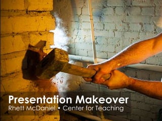
- 1. Presentation Makeover Rhett McDaniel • Center for Teaching
- 4. “It is easy to dismiss design – to relegate it to mere ornament, the prettifying of places and objects to disguise their banality. But that is a serious misunderstanding of what design is and why it matters.” Daniel Pink
- 11. Help them understand • Metaphors and symbols • Common experiences • Cultural references Source: Ellen Finkelstein
- 12. Help them understand Metaphors and symbols Source: Ellen Finkelstein
- 13. Help them understand Common experiences Source: Ellen Finkelstein
- 14. Help them understand Cultural references Source: Ellen Finkelstein
- 15. Agenda • Global Resistance Trends • Gram-Positive Resistance • Gram-Negative Resistance (Europe) • Multi-antibiotic Resistant Gram-Negative Resistance (US)
- 17. DO Don’t • Be easy to find • Shout • Provide timely info • Repeat yourself • Ask advice • Be aggressive • Engage with your community • Auto-tweet
- 25. Now It’s YOUR Turn
- 27. Photo Credits by Yuek Hahn by Olivander by darkmatter by Paul Watson by catspyjamasnz by Ilovetypography From Presentation Zen From blogs.fonts.com http://creativecommons.org/
Notas do Editor
- Microsoft says there are 30 Million PowerPoint presentations given a dayhttp://www.squidoo.com/goodslides?utm_source=google&utm_medium=imgres&utm_campaign=framebusterDesigned in 1987 to print black and white projector slides
- The word WHAT is here for a few reasons.________________________________________What are we doing today?Talk about best practicesWhy you might use certain design elementsWhat you need to know to complete common tasksWHAT are the elements that make up a great PowerPoint presentation? 1) Engaging? 2) Easy to understand? 3) Clear? 4) Entertaining?WHY?? are your barriers to creating better PPT? 1) Knowledge? 2) Time? 3) Skill?
- PowerPoint Information is like Water on the BrainWhen heavy rains pour down repeatedly on a dirt road, they eventually carve out ruts on their way to the lowest point.Your brain operates in a similar way. We humans tend to think reproductively, not productively. That is, When we are faced with a problem, our responses automatically follow the familiar and previously experienced paths.So we approach PowerPoint presentations as we always have and have always seen others do. BREAK THE HABITS!The good news is that brain ruts can be changed or avoidedHow to be a creative genius (in five minutes or less) Gary Unger 2011
- It’s easy to think of PowerPoint as an afterthought…oh yeah, I should make up some slides…and not consider it from the very beginning.The design of your presentation sends messages to your viewers so you need to make sure your content and design are in sync and not acting in opposition to each other.
- I have Good news/bad news when it comes to designing better PowerPoint slides_______________________________________ ON THE ONE HAND:Tons of resources- there is absolutely NOTHING about PowerPoint that is not documented (YouTube, Microsoft) since 1987 (Originally Mac – called Presenter) keynote is now MacFair use is on your sideYou can easily post them online (slideshare)Lots of templates out thereON THE OTHER HAND:Good PowerPoints take more time (a PPT will expand to the time you have to give to it)Presentations are iterative, not staticIt's part of Microsoft office not Microsoft education so templates are geared toward businessto make sales presentationsDo you feel like you HAVE to use PowerPoint? What if you didn’t?
- Yes but how??
- First, how you shouldn’t use PowerPoint.The very people who make the product can’t use it. Don’t trust them to tell you.It’s a microsoft OFFICE application , not a microsoft CLASSROOM
- The slides are for the audience NOT for you!Slides are NOT handsoutsASK:have you EVER referenced an old print out from a slide show?PowerPoint is NOT a word processor!The point of a PowerPoint slide is not to cram as much information into a single slide as possible. The idea of a slide is to have memory joggers that trigger thinking in the audience. That means you do not need to even have complete sentences (although it is a bonus if the words are spelled correctly). Simple statements work just fine.Most of your audience probably knows how to readA corollary to the thinking that PowerPoint is a word processor is that far too many presenters stand on stage reading the slides. It turns out that most of the audience members probably are literate and can read the slides for themselves. The purpose of a presentation is not to do so for them. A presentation is about explaining things to people that go above and beyond what they get in the slides. If it weren't, they might just as well get your slides and read them in the comfort of their home, boat, or bathroom.
- A picture is worth a thousand words, possibly moreJust because PowerPoint has bullets is no reason to use them. There is no way you can convey as much information in a slide full of bullets as you can in a slide with a single picture on it.Try this next time: Put a picture in instead of the bullets and then talk about the picture. People will find it much more interesting and much more informative. Bullets are bad, stories are goodThere is no law that says everything you say has to fit in a bullet. In fact, teaching by bullet points was never one of the more interesting approaches. Think back to the classes that you enjoyed. Most of the time they were the ones where the teacher related the material to real life by telling a story that illustrated the points.
- The product will lead you down the slippery slope. Feel empowered to NOT USE THE TEMPLATE!
- Let’s consider this example. Looks pretty good right? Pretty typical. But how could you make it even better?
- Sometimes Bullet Points are perfectly acceptable. Just be intentional
- ORGANIZE!If you DO USE a bulleted list then be consistent and intentional!Whether you intend it or not, people will naturally try to draw correlations between size and color in your presentation.Remember the Daniel Pink quote: Design is not just prettification.
- Look at this for a moment. What correlations might someone gleen from these lists?What might take them a minute to understand?
- Here is where I can get on my soap box about my opinion on fonts.Try not to use serifs, keep it clean
- Comic Sans has one use: comic strips bubbles.
- Now,let’s consider another slide and think about it critically.This is from a recent PowerPoint presentation by NY governor, Andrew CuomoAt first glance you might think this slide looks good. It has a high-quality image in the background and the stacks of coins are a good way to show graphically the amount of money. BUT,When you first encountered the slide, what drew your eye first?Was it the key content, that pension costs have risen 476% in 15 years?Or did you examine the money in the back ground and superimposed fireworks behind the arrow?Sometimes when we attempt to emphasize the point with a background image, we accidently end up distracting from important content. It’s a beautiful image but distracting from the content.
- Consider in this case, less is more. Sure the grapic was technically stunning but that’s not always best which brings me to my next slide. . .
- So jus like the Cuomo slide, don’t get lured into an image just because it looks good or is high resolution.Google image searches and the proliferation stock photo sights have made it easier than ever to add quality images to your PowerPoint presentations.The real trick is using these images effectively. Here are some questions to ask yourself before you add that photo.Does it say what I want?How might it make someone feel?Am I decorating or communicating?Where to find imagesCompfight.com
- Yes but how??
- A note to add:Consider taking your own photos with your cell phone. I took this one and the previous ones of my hands. It can be quicker and easier than finding that perfect image online.
- IMAGES: Import - Compfight.com, GoogleCropSizeColorCompress Picture (double click on photo) Editing without Photoshop: Pixlr.comVIDEO: Download YouTube: Keepvid.com – URLs on last slide Point to URLTransitions/AnimationsPath animation like the question markRESOURCESRhettmcdaniel.wetpaint.com