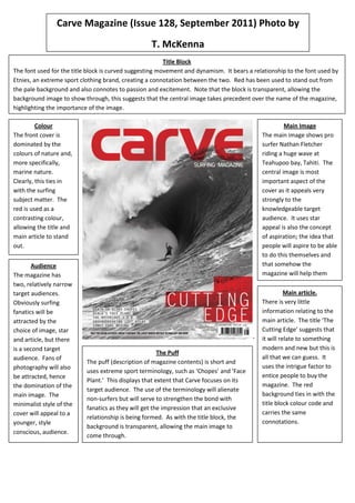
The font of the title block suggests movement and relates to an extreme sports brand to connote that genre. Red stands out from the pale background and connotes passion and excitement. The transparent block allows the main surfing image to take precedence. The magazine cover is dominated by natural colors like the sea to tie in with its surfing subject matter. Red contrasts to make the title and main article stand out. The target audiences are surfing fanatics attracted to the image, star, and article, and photography fans drawn to the dominance of the main image. The minimalist style appeals to a younger, style-conscious demographic.
1. Carve Magazine (Issue 128, September 2011) Photo by
T. McKenna
Title Block
The font used for the title block is curved suggesting movement and dynamism. It bears a relationship to the font used by
Etnies, an extreme sport clothing brand, creating a connotation between the two. Red has been used to stand out from
the pale background and also connotes to passion and excitement. Note that the block is transparent, allowing the
background image to show through, this suggests that the central image takes precedent over the name of the magazine,
highlighting the importance of the image.
Colour Main Image
The front cover is The main image shows pro
dominated by the surfer Nathan Fletcher
colours of nature and, riding a huge wave at
more specifically, Teahupoo bay, Tahiti. The
marine nature. central image is most
Clearly, this ties in important aspect of the
with the surfing cover as it appeals very
subject matter. The strongly to the
red is used as a knowledgeable target
contrasting colour, audience. It uses star
allowing the title and appeal is also the concept
main article to stand of aspiration; the idea that
out. people will aspire to be able
to do this themselves and
Audience that somehow the
The magazine has magazine will help them
two, relatively narrow achieve it.
target audiences. Main article.
Obviously surfing There is very little
fanatics will be information relating to the
attracted by the main article. The title ‘The
choice of image, star Cutting Edge’ suggests that
and article, but there - it will relate to something
is a second target modern and new but this is
The Puff
audience. Fans of all that we can guess. It
The puff (description of magazine contents) is short and
photography will also uses the intrigue factor to
uses extreme sport terminology, such as ‘Chopes’ and ‘Face
be attracted, hence entice people to buy the
Plant.’ This displays that extent that Carve focuses on its
the domination of the magazine. The red
target audience. The use of the terminology will alienate
main image. The background ties in with the
non-surfers but will serve to strengthen the bond with
minimalist style of the title block colour code and
fanatics as they will get the impression that an exclusive
cover will appeal to a carries the same
relationship is being formed. As with the title block, the
younger, style connotations.
background is transparent, allowing the main image to
conscious, audience.
come through.