P1 Glyphs - Character Set & Typesetting Projects
•
0 gostou•401 visualizações

This document appears to be a student portfolio documenting explorations and projects in a graphic design course focused on typography. It includes explorations of drawing glyphs, typesetting with different typefaces, kerning, and typographic hierarchy. It also includes projects on character sets, type posters, letterhead and business cards. The portfolio demonstrates the student's growing skills and understanding of typographic principles.

Recomendados
Mais conteúdo relacionado
Destaque
Destaque (20)
Semelhante a P1 Glyphs - Character Set & Typesetting Projects
Semelhante a P1 Glyphs - Character Set & Typesetting Projects (13)
Mais de RAWAN. AbdulElah
Último
Último (20)
P1 Glyphs - Character Set & Typesetting Projects
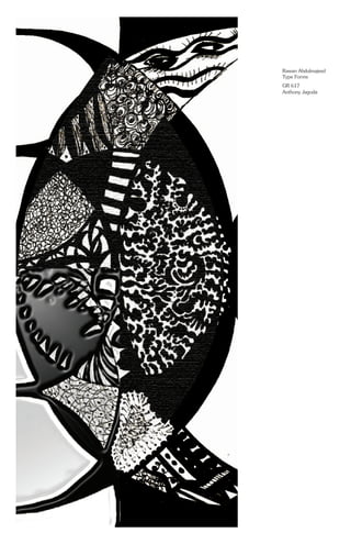
- 1. Rawan Abdulmajeed Type Forms GR 617 Anthony Jagoda
- 2. Content: Project 1 Glyphs - Character Set Exploration 1 Drawing Glyphs Exploration 2 Typesetting Project 2 Type posters Exploration 3 Kerning Project 3 Letterhead + Business Card Exploration 5 Typographic Hierachy
- 3. Rawan Abdulmajeed Project #1 P1 / Glyphs - Character Set
- 4. Exp1 / Drawing Glyphs
- 5. Exp1 / Drawing Glyphs
- 6. Exp1 / Drawing Glyphs
- 7. Exp1 / Drawing Glyphs
- 8. Exp1 / Drawing Glyphs
- 9. Exp1 / Drawing Glyphs
- 10. Truth Rawan Abdulmajeed Exploration Two 225/225 Perpetua Exp 2 / Typesetting
- 11. The quick brown fox jumped over the lazy dog. Rawan Abdulmajeed Exploration Two 60/66 Didot Exp 2 / Typesetting
- 12. The rules of typography can be broken, but never ignored. Rawan Abdulmajeed Exploration Two 36/48 Frutiger Exp 2 / Typesetting
- 13. Type design is rarely, if ever, about being wholly original. At root, there is the need to conform to a great tradition of letterforms., a tradition which enables us to have the notion of a readable alphabet. And yet, a totally unreadable font driven out the familiar territory of a keyboard is created within the context of language-making tools. Something familiar through which we know our instructions are being codified, our orders remembered. Forget the bookthe magazine, or the television - they are secondary realizations of typography. It is the keyboard and screen that are our typographic mediators now, and our typographic intelligence is bonded with that of computers. Type is about much more than questions of legibility or readability. Fashions and technological change are just part of the backdrop. What makes typography fascinating, and an essential enquiry for anybody involved in design,is that this activity is a manifestation of our search for greater efficiency and greater power in the written word. It reveals personalities, politics, and economic factors, along with advances in science. It is a celebration of humanity, and a vital and subtle indicator of values. - Lewis Blackwell, Twentieth Century Type Rawan Abdulmajeed Exploration Two 10/18 Garamond Exp 2 / Typesetting
- 14. Rawan Abdulmajeed Exploration Two 8/33 Futura Type design is rarely, if ever, about being wholly original. At root, there is the need to conform to a great tradition of letterforms., a tradition which enables us to have the notion of a readable alphabet. And yet, a totally unreadable font driven out the familiar territory of a keyboard is created within the context of language-making tools. Something familiar through which we know our instructions are being codified, our orders remembered. Forget the bookthe magazine, or the television - they are secondary realizations of typography. It is the keyboard and screen that are our typographic mediators now, and our typographic intelligence is bonded with that of computers. Type is about much more than questions of legibility or readability. Fashions and technological change are just part of the backdrop. What makes typography fascinating, and an essential enquiry for anybody involved in design,is that this activity is a manifestation of our search for greater efficiency and greater power in the written word. It reveals personalities, politics, and economic factors, along with advances in science. It is a celebration of humanity, and a vital and subtle indicator of values. - Lewis Blackwell, Twentieth Century Type Exp 2 / Typesetting
- 15. Rawan Abdulmajeed Exploration Two 7/12 ITC Century Type design is rarely, if ever, about being wholly original. At root, there is the need to conform to a great tradition of letterforms., a tradition which enables us to have the notion of a readable alphabet. And yet, a totally unreadable font driven out the familiar territory of a keyboard is created within the context of language-making tools. Something familiar through which we know our instructions are being codified, our orders remembered. Forget the bookthe magazine, or the television - they are secondary realizations of typography. It is the keyboard and screen that are our typographic mediators now, and our typographic intelligence is bonded with that of computers. Type is about much more than questions of legibility or readability. Fashions and technological change are just part of the backdrop. What makes typography fascinating, and an essential enquiry for anybody involved in design,is that this activity is a manifestation of our search for greater efficiency and greater power in the written word. It reveals personalities, politics, and economic factors, along with advances in science. It is a celebration of humanity, and a vital and subtle indicator of values. - Lewis Blackwell, Twentieth Century Type Exp 2 / Typesetting
- 16. R R R R R R R R Didone Didot is a name given to a group of typefaces named after the famous French printing and type producing family. The classification is known as modern, or Didone. The typeface we know today was based on a collection of related types developed in the period 1784–1811. Firmin Didot (1764–1836) cut the letters, and cast them as type in Paris. His brother, Pierre Didot used the types in printing. His edition of La Henriade by Voltaire P2 / Type posters
- 17. Slab Serif Rockwell is a serif typeface belonging to the classification slab serif, or Egyptian, where the serifs are unbracketed and similar in weight to the horizontal strokes of the letters. The typeface was designed at the Monotype foundry's in-house design studio in 1934. The project was supervised by Frank Hinman Pierpont. Slab serifs are similar in form and in typographic voice to realist sans-serifs like Franklin Gothic. Rockwell is geometric. P2 / Type posters
- 18. AAAAAAAAAAAA AA A A AAAAAAAAAAAAAAAAAAAAAAAAAA A A Sans-Serif H. Berthold AG was one of the largest and most successful type foundries in the world for most of the modern typgraphic era, making the transition from foundry type to cold type successfully and only coming to dissolution in the digital type era. Established in 1858 by Hermann Berthold P2 / Type posters
- 19. Truth Rawan Abdulmajeed ExplorationThree 270/270 Gill Sans Light Exp 3 / Kerning
- 20. Rawan Abdulmajeed Exploration Three 140/140 Bodoni Bold Condensed Word & Image Exp 3 / Kerning
- 21. “artistic” license. Rawan Abdulmajeed Exploration Three 68/72 Frutiger Black Exp 3 / Kerning
- 22. (415) 621 8019 Rawan Abdulmajeed Exploration Three 96/96 Myriad Pro Light Exp 3 / Kerning
- 23. Rawan Abdulmajeed Exploration Three 96/96 Garamond Bold RAwAn ABDULMajeed Exp 3 / Kerning
- 24. Rawan Abdulelah Abdulmajeed Graphic Designer & Art Director Raabdulmajeed.blogspot.com Behance.net/ramajeed Raabdulmajeed@gmail.com (415) 316 - 8437 From: Rawan Abdulelah Abdulmajeed 458 Bush st San Francisco, CA 46719 To: Rayan Abdulmajeed 435 Westfiled st Omaha,NE 94381 To whom it may concern, Rawan Abdulmajeed was my student in a graduate level writing class. She was very motivated to excel, and surprised me with her talent, thoughtfulness, and tenacity. Additionally and for other classes, she attended my writing workshop. Because she hardworking and creative,she improved tremendously. In her approach to her work, I notice that she is very eager to improve, very organized, attentive to detail and consistently careful. When she decides to do something, she nails it. With opportunity and direction, she creates wonderful things. Best regards, Rawan Abdulelah Abdulmajeed Graphic Designer & Art Director Behance.net/ramajeed Raabdulmajeed.blogspot.com Raabdulmajeed@gmail.com (415) 316 - 8437 P3 / Letterhead + Business Card
- 25. Rawan Abdulmajeed Exploration Five 10 / 30 Frutiger (Italic, Roman) 14 / 30 Frutiger (Bold) Letters of Introduction From Twentieth Century Type by Lewis Blackwell Type design is rarely, if ever, about being wholly original. At root, there is the need to conform to a great tradition of letterforms, a tradition which enables us to have the notion of a readable alphabet. And yet, a totally unreadable font drivenout the familiar territory of a keyboard is created within the context of language- making tools. Something familiar through which we know our instructions are being codified, our orders remembered. Forget the book the magazine, or the television- they are secondary realizations of typography. It is the keyboard and screen that are our typographic mediators now, and our typographic intelligence is bonded with that of computers. Exp5 / Typographic Hierachy
- 26. Rawan Abdulmajeed Exploration Five 9 / 14 Gill Sana (Bold, Light Italic, Black) Letters of Introduction From Twentieth Century Type by Lewis Blackwell Type design is rarely, if ever, about being wholly original. At root, there is the need to conform to a great tradition of letterforms, a tradition which enables us to have the notion of a readable alphabet. And yet, a totally unreadable font drivenout the familiar territory of a keyboard is created within the context of language- making tools. Something familiar through which we know our instructions are being codified, our orders remembered. Forget the book the magazine, or the television- they are secondary realizations of typography. It is the keyboard and screen that are our typographic mediators now, and our typographic intelligence is bonded with that of computers. Exp5 / Typographic Hierachy
- 27. Rawan Abdulmajeed Exploration Five 30 / 48 Franklin Gothic (Extra Condensed) 60 / 36 Franklin Gothic (Condensed) 24 / 24 Franklin Gothic (Extra Condensed) Letters of Introduction From Twentieth Century Type by Lewis BlackwellType design is rarely, if ever, about being wholly original. At root, there is the need to conform to a great tradition of letterforms, a tradition which enables us to have the notion of a readable alphabet. And yet, a totally unreadable font drivenout the familiar territory of a keyboard is created within the con- text of language- making tools. Something familiar through which we know our instructions are being codified, our orders remembered. Forget the book the magazine, or the television- they are secondary realizations of typography. It is the keyboard and screen that are our typographic mediators now, and our typographic intelligence is bonded with that of computers. Exp5 / Typographic Hierachy
- 28. Rawan Abdulmajeed Exploration Five Futura Family Letters of Introduction From Twentieth Century Type by Lewis Blackwell Type design is rarely, if ever, about being wholly original. At root, there is the need to conform to a great tradition of letterforms, a tradition which enables us to have the notion of a readable alphabet. And yet, a totally unreadable font drivenout the familiar territory of a keyboard is created within the context of language- making tools. Something familiar through which we know our instructions are being codified, our orders remembered. Forget the book the magazine, or the television- they are secondary realizations of typography. It is the keyboard and screen that are our typographic mediators now, and our typographic intelligence is bonded with that of computers. Exp5 / Typographic Hierachy
- 29. Rawan Abdulmajeed Exploration Five Rockwell Family Letters of Introduction From Twentieth Century Type by Lewis Blackwell Type design is rarely,if ever,about being wholly original.At root,there is the need to conform to a great tradition of letterforms, a tradition which enables us to have the notion of a readable alphabet.And yet,a totally unreadable font drivenout the familiar territory of a keyboard is created within the context of language- making tools. Something familiar through which we know our instructions are being codified,our orders remembered.Forget the book the magazine, or the television- they are secondary realizations of typography. It is the keyboard and screen that are our typographic mediators now, and our typographic intelligence is bonded with that of computers. Exp5 / Typographic Hierachy