
Recomendados
Mais conteúdo relacionado
Mais procurados
Mais procurados (20)
Destaque
Semelhante a Media presentation
Semelhante a Media presentation (20)
Mais de poppysm
Último
Último (20)
Media presentation
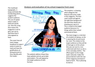
- 1. The masthead Analysis and evalua4on of my school magazine front cover typography is The strapline is showing loopy and looks like what categories the handwri4ng which features will come under suggests the in the magazine. The font student audience. used is bold and against The use of capital the light blue background le9ers makes it the dark blue stands out bold and stands drawing your eye to it. out. Also the using This is suited to the target blue means the audience because it is magazine is not to things within their school girly but not to and aimed at them. dark blue that it only appeals to The main image is a mid shot boys. of a student at lawsap, as she is wearing the id card round The cover lines all her neck. This relates to the have snappy target audience as they will be headlines to make it of that age or at the school. easier to want to Also you can see its a non read and have the uniformed sixth form as she is gra4fica4ons of in her everyday clothes. The being personal as effects given to the image, they iden4fy with The website address shows they water coloured, makes the the reader. have website and are up to date picture blend in with the rest and modern. This will appeal to of the magazine and doesn't the target audience of sixth look to harsh. This is pleasing formers. to look at.
- 2. Analysis and evalua4on of my school magazine contents page The masthead is used again in the contents page to show constancy throughout the magazine. The content of the The category 4tles are the same magazine and its colours and fonts from the features is clearly cover again showing constancy. laid out but with interes4ng and not boring format. The language used is informal and relates to the target audience, however is not so informal that only they can read it.