How to Give a Good PowerPoint Presentation
•Transferir como PPTX, PDF•
28 gostaram•91,976 visualizações

Notes from a class on how to give an effective PowerPoint talk, with a number of slides demonstrating what NOT to do...

Recomendados
Mais conteúdo relacionado
Mais procurados
Mais procurados (20)
Destaque
Semelhante a How to Give a Good PowerPoint Presentation
Semelhante a How to Give a Good PowerPoint Presentation (20)
Mais de Chad Orzel
Mais de Chad Orzel (20)
Último
Último (20)
How to Give a Good PowerPoint Presentation
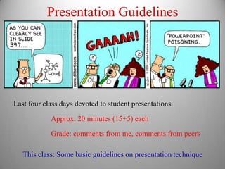
- 1. Presentation Guidelines Last four class days devoted to student presentations Approx. 20 minutes (15+5) each Grade: comments from me, comments from peers This class: Some basic guidelines on presentation technique
- 2. Know Your Audience First and most important rule: KNOW YOUR AUDIENCE Different audiences need different types of talks Fellow experts Technical jargon OK, Details good Briefing for Colleagues Some jargon OK, less detailed General Audience Minimal jargon, “Big Picture” only Know what style is appropriate for your intended audience
- 3. Know Your Point Make sure you know what you want the audience to take away 1-2 main ideas per talk Everything must come back to main points
- 4. Tell A Story Organization is key Beginning, Middle, End Clear and Logical Flow Keep audience informed Try to streamline presentation so each step is obvious For very complicated material, outline/ summary breaks
- 5. Limit Your Material Rule of thumb: 1 slide per minute MAXIMUM Lecture notes: Typically ~20 slides for 65 minute class 50-minute Research Talk: 26 slides 50-minute Social Media Talk: 32 slides 50-minute Public Lecture: 39 slides (Very image-heavy) In-class presentations: No more than 20 slides
- 6. Slide Design 1) Text Is Death The deplorable practice of putting huge blocks of text on a slide and then reading every single word to the audience probably accounts for half of the problems people have with PowerPoint. Most people in the audience will be able to read the text faster than you can say it out loud. Those who can’t will be so busy reading it that they’ll tend to miss what you’re saying. Keep words on slides to a minimum This goes double for math/equations
- 7. Slide Design 1) Text Is Death 2) Use high-contrast fonts and colors Certain colors of text are nearly invisible on some backgrounds Be aware of/ sensitive to visual impairments, like colorblindness Don’t use complicated fonts or tiny little text 8.5”x11” printout should be readable from ~10 feet
- 8. Slide Design 1) Text Is Death 2) Use high-contrast fonts and colors 3) Keep Background Images Simple Complicated background images make text disappear Use solid colors, or simple patterns
- 9. Slide Design 1) Text Is Death 2) Use high-contrast fonts and colors 3) Keep Background Images Simple 4) Use animation sparingly Sure you can use a different transition every time but it’s incredibly irritating
- 10. Know What to Say, When Reading pre-written text is deadly dull Too much text on slides is bad Need to seem improvised while being prepared 0) PRACTICE, PRACTICE, PRACTICE 1) Provide clear (but subtle) prompts on slides 2) Use “Presenter Mode” when available
- 11. If It Works, It’s Good These are suggestions, not absolute rules It’s possible to give a talk that breaks some or all of these The only solid rule of publishing is: If it works, it’s good. -- Teresa Nielsen Hayden