SlideShare a Scribd company logo
1 of 4
Plain white background used to make the photo(even the faded parts) and the text stand out on the page as the text for the article is black which contrasts against the white background. The photo has been edited so that the main artist in the band stands out on the page and the other three have been faded into the back ground. I like how the title for the article is in grey and gold which relates back to the clothing the band are wearing in the photo.  This give the page a theme which runs throughout the double page. Most of the text is black on white although quotes of the article have been picked out and have been highlighted.  These parts are white on black. Some of the text is harder to read against the darker parts of the picture although the fade effect that had been used does help against this. Questions for the article are in bolder text which make it clear to which parts of the article are questions and which are the answers
Although the picture is only on one side of the spread the title for the article goes over the double page which creates a connection between the two pages. Linked in with the contents page one of the headings on the contents page for the sections in the magazine was ‘RADAR’ this is clearly listed at the top of the page on this spread. (see the NME contents page I analysed) I like how there is a running theme on the page of blue, black and white. Quotes for the article have been highlighted in blue The blue for the need to know box on this page contrasts against the picture.  If this text was just to be placed on the picture without the blue It would be harder to read as some parts of the picture are quite dark.  This would mean a lighter colour would be needed which would break the colour scheme on the page I like the idea of how the page is in three sections; the main picture for the article, the main text for the article and the banner at the side with  more information related to the article.
I like the fact that the picture is used as he background for the page and the photo had been taken so that the main  part of the photo is on one page.  The photo has been taken so that the photo can  make up the back ground but the text for the article is not obstructing anything.  Like the last one the header for the page is ‘RADAR’ which relates back to the NME contents page.  (see the one I analysed earlier) The text used for the heading of the article is clever because the letters shape together. Blues have been used in the photo which keeps the theme constant.  Although red have also been used which contrasts against the blue to make the people in the photo stand out. Quotes highlighted in blue makes them stand out from the rest of the article. The fact box on the page has also been highlighted in blue to make it stand out on the page.
I think this spread looks boring.  The black and white theme I think works but from my perspective doesn't appeal to me as it seems quite minimalist. Although this is not a music related spread I chose to do this because the other spreads I have chosen to analyse didn't have a lot of drawback where as this one in my opinion did so I chose to highlight them on this one. I think that too much space has been wasted.  I think something should have been put here like a picture related to the article of a quote from the article instead of it left blank. Name for the magazine has been printed at the bottom  of each page. The two pages have no connection.  The picture has just been cut off. Although It works with this magazine I think it would have been more appropriate to let the picture flow onto the next page.

More Related Content

What's hot

Construction: Cover page (Making)
Construction: Cover page (Making)Construction: Cover page (Making)
Construction: Cover page (Making)fasihazaheer29
 
Double Page Feature Analysis
Double Page Feature Analysis Double Page Feature Analysis
Double Page Feature Analysis meganburnett99
 
Double page spread/article research
Double page spread/article researchDouble page spread/article research
Double page spread/article researchleahdouglas98
 
Contents page analysis
Contents page analysisContents page analysis
Contents page analysismeganburnett99
 
Magazine construction process
Magazine construction processMagazine construction process
Magazine construction processmusecake
 
College Magazine Planning Work Presentation
College Magazine Planning Work PresentationCollege Magazine Planning Work Presentation
College Magazine Planning Work PresentationJordan
 
Double page research articles
Double page research articlesDouble page research articles
Double page research articles014420
 
front cover magazine analysis
front cover magazine analysisfront cover magazine analysis
front cover magazine analysisjoannajcjmedia
 

What's hot (16)

Mix mag
Mix magMix mag
Mix mag
 
Mix mag
Mix magMix mag
Mix mag
 
Contents page rationale
Contents page rationaleContents page rationale
Contents page rationale
 
Article analysis
Article analysisArticle analysis
Article analysis
 
Construction: Cover page (Making)
Construction: Cover page (Making)Construction: Cover page (Making)
Construction: Cover page (Making)
 
Media content analysis
Media content analysisMedia content analysis
Media content analysis
 
Double Page Feature Analysis
Double Page Feature Analysis Double Page Feature Analysis
Double Page Feature Analysis
 
Double page spread/article research
Double page spread/article researchDouble page spread/article research
Double page spread/article research
 
Contents page analysis
Contents page analysisContents page analysis
Contents page analysis
 
Front cover analysis
Front cover  analysisFront cover  analysis
Front cover analysis
 
Magazine construction process
Magazine construction processMagazine construction process
Magazine construction process
 
College Magazine Planning Work Presentation
College Magazine Planning Work PresentationCollege Magazine Planning Work Presentation
College Magazine Planning Work Presentation
 
Double page research articles
Double page research articlesDouble page research articles
Double page research articles
 
front cover magazine analysis
front cover magazine analysisfront cover magazine analysis
front cover magazine analysis
 
Double page spreads
Double page spreadsDouble page spreads
Double page spreads
 
Front cover analysis
Front cover  analysisFront cover  analysis
Front cover analysis
 

Similar to Music Magazine Double Page Spread Analysis

Analysis of professional dps
Analysis of professional dpsAnalysis of professional dps
Analysis of professional dpsclaudiaohara
 
Presentation1
Presentation1Presentation1
Presentation1kenyaL
 
Presentation1
Presentation1Presentation1
Presentation1kenyaL
 
Analysis of Contents Pages
Analysis of Contents PagesAnalysis of Contents Pages
Analysis of Contents PagesJoannenmbec08
 
Double page spread of a music magazine
Double page spread of a music magazineDouble page spread of a music magazine
Double page spread of a music magazineas_media-60
 
Contents Page Analysis
Contents Page AnalysisContents Page Analysis
Contents Page Analysisbanesybaby
 
Codes and conventions of a music magazine
Codes and conventions of a music magazineCodes and conventions of a music magazine
Codes and conventions of a music magazineedwardncfc1
 
Contents page analysis
Contents page analysisContents page analysis
Contents page analysisasmediae15
 
Plans for front cover, contents page & double page spread
Plans for front cover, contents page & double page spreadPlans for front cover, contents page & double page spread
Plans for front cover, contents page & double page spreadSuzyQuinn13
 
Double page spread construction
Double page spread constructionDouble page spread construction
Double page spread constructionMike4231
 
Final plans for music magazine
Final plans for music magazineFinal plans for music magazine
Final plans for music magazineSuzyQuinn13
 
Media Evaluation 1
Media Evaluation 1 Media Evaluation 1
Media Evaluation 1 galvg005
 
Question 1 edit
Question 1 editQuestion 1 edit
Question 1 editSeandoel97
 
Analysing contents pages
Analysing contents pagesAnalysing contents pages
Analysing contents pagesKyle150
 
Double page spread development diary
Double page spread development diaryDouble page spread development diary
Double page spread development diaryLiamattridge
 
Print screens of the double page spread
Print screens of the double page spreadPrint screens of the double page spread
Print screens of the double page spreadmiariam
 

Similar to Music Magazine Double Page Spread Analysis (20)

Analysis of professional dps
Analysis of professional dpsAnalysis of professional dps
Analysis of professional dps
 
Inspirations
InspirationsInspirations
Inspirations
 
Presentation1
Presentation1Presentation1
Presentation1
 
Presentation1
Presentation1Presentation1
Presentation1
 
Analysis of Contents Pages
Analysis of Contents PagesAnalysis of Contents Pages
Analysis of Contents Pages
 
Double page spread of a music magazine
Double page spread of a music magazineDouble page spread of a music magazine
Double page spread of a music magazine
 
Contents Page Analysis
Contents Page AnalysisContents Page Analysis
Contents Page Analysis
 
Codes and conventions of a music magazine
Codes and conventions of a music magazineCodes and conventions of a music magazine
Codes and conventions of a music magazine
 
Contents page analysis
Contents page analysisContents page analysis
Contents page analysis
 
Plans for front cover, contents page & double page spread
Plans for front cover, contents page & double page spreadPlans for front cover, contents page & double page spread
Plans for front cover, contents page & double page spread
 
Double page spread construction
Double page spread constructionDouble page spread construction
Double page spread construction
 
Final plans for music magazine
Final plans for music magazineFinal plans for music magazine
Final plans for music magazine
 
Media Evaluation 1
Media Evaluation 1 Media Evaluation 1
Media Evaluation 1
 
Generic connections
Generic connectionsGeneric connections
Generic connections
 
Dps
DpsDps
Dps
 
Dps
DpsDps
Dps
 
Question 1 edit
Question 1 editQuestion 1 edit
Question 1 edit
 
Analysing contents pages
Analysing contents pagesAnalysing contents pages
Analysing contents pages
 
Double page spread development diary
Double page spread development diaryDouble page spread development diary
Double page spread development diary
 
Print screens of the double page spread
Print screens of the double page spreadPrint screens of the double page spread
Print screens of the double page spread
 

More from Naomi Hall

New Media Trailer Evaluation
New Media Trailer EvaluationNew Media Trailer Evaluation
New Media Trailer EvaluationNaomi Hall
 
Media Trailer Evaluation
Media Trailer EvaluationMedia Trailer Evaluation
Media Trailer EvaluationNaomi Hall
 
Media Trailer Evaluation
Media Trailer EvaluationMedia Trailer Evaluation
Media Trailer EvaluationNaomi Hall
 
Development of Final Product - Magazine Cover
Development of Final Product - Magazine CoverDevelopment of Final Product - Magazine Cover
Development of Final Product - Magazine CoverNaomi Hall
 
Development of Final Product - Movie Poster
Development of Final Product - Movie PosterDevelopment of Final Product - Movie Poster
Development of Final Product - Movie PosterNaomi Hall
 
Media trailer Evaluation
Media trailer EvaluationMedia trailer Evaluation
Media trailer EvaluationNaomi Hall
 
How do things compare?
How do things compare?How do things compare?
How do things compare?Naomi Hall
 
Media Evaluation New
Media Evaluation NewMedia Evaluation New
Media Evaluation NewNaomi Hall
 
School Contents Page Development
School Contents Page DevelopmentSchool Contents Page Development
School Contents Page DevelopmentNaomi Hall
 
Planning the Contents Page
Planning the Contents PagePlanning the Contents Page
Planning the Contents PageNaomi Hall
 
School Front Cover Development
School Front Cover DevelopmentSchool Front Cover Development
School Front Cover DevelopmentNaomi Hall
 
School Front Cover Evaluation
School Front Cover EvaluationSchool Front Cover Evaluation
School Front Cover EvaluationNaomi Hall
 

More from Naomi Hall (19)

New Media Trailer Evaluation
New Media Trailer EvaluationNew Media Trailer Evaluation
New Media Trailer Evaluation
 
Media Trailer Evaluation
Media Trailer EvaluationMedia Trailer Evaluation
Media Trailer Evaluation
 
Media Trailer Evaluation
Media Trailer EvaluationMedia Trailer Evaluation
Media Trailer Evaluation
 
Development of Final Product - Magazine Cover
Development of Final Product - Magazine CoverDevelopment of Final Product - Magazine Cover
Development of Final Product - Magazine Cover
 
Development of Final Product - Movie Poster
Development of Final Product - Movie PosterDevelopment of Final Product - Movie Poster
Development of Final Product - Movie Poster
 
Media trailer Evaluation
Media trailer EvaluationMedia trailer Evaluation
Media trailer Evaluation
 
How do things compare?
How do things compare?How do things compare?
How do things compare?
 
Pure horror
Pure horrorPure horror
Pure horror
 
Storyboard
StoryboardStoryboard
Storyboard
 
Storyboard
StoryboardStoryboard
Storyboard
 
Lebanon
LebanonLebanon
Lebanon
 
Lebanon -
Lebanon -Lebanon -
Lebanon -
 
Media Evaluation New
Media Evaluation NewMedia Evaluation New
Media Evaluation New
 
Evaluation
EvaluationEvaluation
Evaluation
 
Evaluation
EvaluationEvaluation
Evaluation
 
School Contents Page Development
School Contents Page DevelopmentSchool Contents Page Development
School Contents Page Development
 
Planning the Contents Page
Planning the Contents PagePlanning the Contents Page
Planning the Contents Page
 
School Front Cover Development
School Front Cover DevelopmentSchool Front Cover Development
School Front Cover Development
 
School Front Cover Evaluation
School Front Cover EvaluationSchool Front Cover Evaluation
School Front Cover Evaluation
 

Music Magazine Double Page Spread Analysis

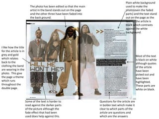
  • 1. Plain white background used to make the photo(even the faded parts) and the text stand out on the page as the text for the article is black which contrasts against the white background. The photo has been edited so that the main artist in the band stands out on the page and the other three have been faded into the back ground. I like how the title for the article is in grey and gold which relates back to the clothing the band are wearing in the photo. This give the page a theme which runs throughout the double page. Most of the text is black on white although quotes of the article have been picked out and have been highlighted. These parts are white on black. Some of the text is harder to read against the darker parts of the picture although the fade effect that had been used does help against this. Questions for the article are in bolder text which make it clear to which parts of the article are questions and which are the answers
  • 2. Although the picture is only on one side of the spread the title for the article goes over the double page which creates a connection between the two pages. Linked in with the contents page one of the headings on the contents page for the sections in the magazine was ‘RADAR’ this is clearly listed at the top of the page on this spread. (see the NME contents page I analysed) I like how there is a running theme on the page of blue, black and white. Quotes for the article have been highlighted in blue The blue for the need to know box on this page contrasts against the picture. If this text was just to be placed on the picture without the blue It would be harder to read as some parts of the picture are quite dark. This would mean a lighter colour would be needed which would break the colour scheme on the page I like the idea of how the page is in three sections; the main picture for the article, the main text for the article and the banner at the side with more information related to the article.
  • 3. I like the fact that the picture is used as he background for the page and the photo had been taken so that the main part of the photo is on one page. The photo has been taken so that the photo can make up the back ground but the text for the article is not obstructing anything. Like the last one the header for the page is ‘RADAR’ which relates back to the NME contents page. (see the one I analysed earlier) The text used for the heading of the article is clever because the letters shape together. Blues have been used in the photo which keeps the theme constant. Although red have also been used which contrasts against the blue to make the people in the photo stand out. Quotes highlighted in blue makes them stand out from the rest of the article. The fact box on the page has also been highlighted in blue to make it stand out on the page.
  • 4. I think this spread looks boring. The black and white theme I think works but from my perspective doesn't appeal to me as it seems quite minimalist. Although this is not a music related spread I chose to do this because the other spreads I have chosen to analyse didn't have a lot of drawback where as this one in my opinion did so I chose to highlight them on this one. I think that too much space has been wasted. I think something should have been put here like a picture related to the article of a quote from the article instead of it left blank. Name for the magazine has been printed at the bottom of each page. The two pages have no connection. The picture has just been cut off. Although It works with this magazine I think it would have been more appropriate to let the picture flow onto the next page.