
Recomendados
Mais conteúdo relacionado
Mais procurados
Mais procurados (20)
Destaque
Destaque (15)
Semelhante a 3 Case Studies
Semelhante a 3 Case Studies (20)
Último
Último (20)
3 Case Studies
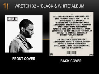
- 1. WRETCH 32 – ‘BLACK & WHITE’ ALBUM FRONT COVER BACK COVER
- 2. The front cover shows the artist as a peaceful person, who has possibly not had the greatest start in life but who has a goal and strives to reach that. The album and artist name placement were combined into the same placement, the choice of placement to the artist, is clever because the artist looks so deep in thought with his recorded thoughts at the top left, this connotes his album will always linger in the artist or whomever listens thoughts. From this digi-pak I want to take the simplicity and aim to recreate my own cover where my artist is slightly outlined by the bright white glare behind. The images used for the front and back of this front cover connote a simple, but meaningful artist. The image used as the cover art photo is a side view mid-shot of the artist Wretch 32. It is in black and white and he is looking down but not completely you can still see his side profile with his eyes closed. His body language connotes a steady stance and soothing mentality. The image connotes a fearless but humble young man. Also the black and white lighting, keeps a simple theme whilst pointing out that simplicity can come in many different shades e.g. the lighter and darker greys. Because his eyes are closed this proves a distinctive artist, who can see clearly through their music. The back cover seclusion of an image is also what I may choose to do as well, because it keeps the album more open minded and less commercial. The simple statement of the artist and songs separated by a dash is more simplicity I appreciate, as the font is italic but bold and covers the whole side.
- 3. The print advert embodies the same message as the album cover, but more appealing to a nationwide audience. The same image as the album cover is used, connoting this image of the artist with his eyes closed had real purpose with this album and its promotion, the masthead and following tour dates link with the theme of simplicity, but this deems more edgy as special guests’ feature on the advert with less classic fonts, showing the artist wants to make the journey of this album tour highlight his traditional approach to this genre but with his recreated style.
- 4. BACK COVER FRONT COVER CD COVER I AM CHIPMUNK - ALBUM
- 5. The front cover of the this album is a long shot 3d enlarged letters of the album ‘I AM CHIPMUNK’, the artist is sat of top of the A with his legs dangling. The I and AM are placed on top of the CHIPMUNK, creating a size dynamic. The font and text colour connote and eager and bright artist, who is smart but wants to remain street smart shown in his appearance of casual London boy clothes and accessories. His body language connotes a relaxed and possibly cocky but likeable artist, there is a bright white light coming from in between the A and M, which is the middle, this connotes his music is centrally inspired and lights up a room of wherever it could be coming from. The combination of the main image to the text is clever as the album cover wouldn’t be this concept if they were indeed not actually combined. His seat on the letters connotes an artist confident in his music and overall brand. From the front cover methods I would use is the bright light entering from the centre and the orange and blue colour scheme is different.
- 6. The back cover image is different to the front cover, but the artist has the same clothes on and similar facial expression. The shot is low angle long shot of the artist looking directly to the camera with his hands doing a pointing gesture. It makes the audience feel aware that the artist is conscious that his music may make people feel, hyper or even more urban, as the text and image combination works because the track list is directly to the right of the artist, showing that he is proud to have produced content he can stand by, knowing the music is relatable to the target audience. The orange background creates an open mind for the audience as this as his first album and connotes a fresh start to his career. From the back cover the representation of this artist is that he has a lot of confidence physically, musically and mentality. He looks ready to take on the industry. An idea I would take for my own back cover is the directly pointing and staring low angle long shot, I like it because it appeals to the particular target audience very much, as it shows personality.
- 7. NAS – ‘ILLMATIC’ ALBUM FRONT COVER BACK COVER
- 8. The cover image is a younger version of the artist, a close up of his face. His face is blended into another background image of an environment commonly referred to in rap and on this album. It shows blocks of flats on either side and a long street following all the way up. I think both the street photo and close up fit perfectly into each other, the flats fit either side of his head and the street and cars train up to his face and the top of his head, this was cleverly put together, as it appeals to the target audience as they may feel their environment made their younger self, neglect their innocence and were forced to grow up fast because of what surrounds them. The text and image placement are placed in the corners and the artist name NAS in italic red specify this album was made with blood sweat and tears. For my own front cover I would take the idea of submerging two images into each other, because I feel two images together can tell a story and also it just creates a more dynamic look.
- 9. This is the print advert of the Nas illmatic tour. It shows the same street used for the cd front cover. But the artist is walking in the middle of the road, possibly crossing over and looking back directly at the camera. This denotes a self- conscious but also self-professed artist. As his facial expression reads confident but distracted by whatever he is looking at, which could connote an artist who cares about his audience reactions. This image of the street is more clear, we see children on bikes which connotes the artist thinks being a child is extremely relevant. Also the black and white scheme including the font, connote a slick and simple mise en scen.