
Recomendados
Recomendados
Mais conteúdo relacionado
Último
Último (20)
Destaque
Destaque (20)
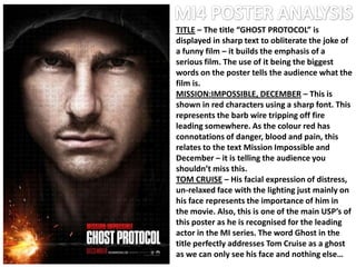
Mission Impossible 4: Poster Analysis -- A2 Media Studies
- 1. TITLE – The title “GHOST PROTOCOL” is displayed in sharp text to obliterate the joke of a funny film – it builds the emphasis of a serious film. The use of it being the biggest words on the poster tells the audience what the film is. MISSION:IMPOSSIBLE, DECEMBER – This is shown in red characters using a sharp font. This represents the barb wire tripping off fire leading somewhere. As the colour red has connotations of danger, blood and pain, this relates to the text Mission Impossible and December – it is telling the audience you shouldn’t miss this. TOM CRUISE – His facial expression of distress, un-relaxed face with the lighting just mainly on his face represents the importance of him in the movie. Also, this is one of the main USP’s of this poster as he is recognised for the leading actor in the MI series. The word Ghost in the title perfectly addresses Tom Cruise as a ghost as we can only see his face and nothing else…
- 2. INSTITUTIONS – The institutions are set in the bottom right corner with the biggest as the most important for distributing the most successful films. Viewers/fans/consumers who see this, especially critics can automatically judge this film to be a success if a main distributer is distributing the film. It also has the same colour as the main title Ghost Protocol to keep simplicity to a minimum. NUMBERS – The numbers which are in front of the poster could be used to represent the idea of decoding some sort of code to “de-fuse” the fire which is on the wire. This can push the audience to sort out this sort of enigma occurring within the poster – why is there numbers in front of the poster? Is it to unlock the ideology of “Ghost” for Tom Cruise? Why is he wearing some sort of hooded coat?