
Recomendados
Mais conteúdo relacionado
Destaque
Destaque (18)
Mais de milliefb
Magazine cover sheet analysis am
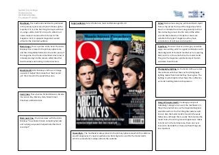
- 1. Salford City College Eccles Centre AS Media Studies Foundation Portfolio Masthead- This masthead is bold and is positioned in the primary optical area of which it takes up the majority of it; it is the first thing the buyer will look at, using a white, bold ‘Q’ on top of a vibrant red colour makes it stand out from the rest of the magazine. As Q is a popular magazine it would attractive the intended audience. target audience: Fans of Indie rock, male and female aged 15-30 Colour-Main colours are grey, white and black. Apart from a strip across the top of the magazine which is blue. To conclude the colours are generally dull, but the contrasting colours like the red and the white over the black stand out. I think the colours are suitable to the type of magazine as they have connotations of calmness and relaxation. Main image- This is a picture of the band The Arctic Monkeys this is based in the primary optical area and the strong fallow field and is the centre piece of the magazine. One the band members Alex turner is intensely staring into the camera whilst the other band members are looking in other directions. Typefaces- The cover lines are a thin grey and white upper case writing, which is a good combination with the background of the band member as he is wearing black and it is in the same font as the model credit. This gives the magazine a professional yet modern and down to earth look. Model credit-Arctic Monkeys and how a ‘strange voyeurism’ helped them make their ‘best record yet’ this is based in the weak fallow area. Photography Lighting- As the bands clothes are dark this contrasts with their faces as the photography lighting makes them look like they have a glow. The lighting is quite bright on their faces this is effective as it aids in adding detail and expression. Cover lines- These involve, Richard Branson, Arcade Fire, Green Day, Nirvana, Hain, Manic Street Preachers and Rizzle Kicks. Design Principles Used?-The design principle of Gutenberg’s design rule is used, the masthead is in the primary optical area, as the magazine designers would know this is the first thing the reader would look at. Also the model credit is based in the weak fallow area, although this is usually the last place the reader looks, the writing size and appearance makes it stand out. In the terminal area, there are cover lines and a barcode this is because these things are less important. Main cover line- ‘the Q interview’ with the Arctic Monkeys “how broken hands, competing haircuts and a strange voyeurism helped make their best record yet” House Style- The masthead is always placed in the primary optical area which the audience would recognise as it’s never anywhere else. Bold, big text is used for the model credit, which is successful as it always attracts the audience