SlideShare a Scribd company logo
1 of 5
A Textual Analysis of a Regional Magazine Front Cover- Time Out London
Title- Informs (U+G) the target audience of the name of the
magazine. They can identify (U+G) with the magazine while
purchasing the product. The use of ‘London’ also informs (U+G)
them that it is the London edition and is targeting Londoners
and tourists areas. The fact that the primary image is covering
the title and the city connotes that Time Out is already an
established magazine within the regional magazine industry.
The harsh colour of black contrasted with the white text makes
it stand out and catch the target audience’s eye. The
typography is bold, a feature that is conventional of a regional
magazine. The colours of black, white and red are apart of the
house style of this regional magazine because they feature on
every page, whether it is in the title of the articles, the colour
of the text or boarders of the primary/secondary images used.
Additionally, a magazine’s logo is stereotypically the title of
the magazine e.g. Time Out.

Barcode- Identifies (U+G) each individual product.
Distributors know how many products are being sold.
Price- In addition to the barcode, the price of the
magazine also informs (U+G) the target audience of
how much the product is to purchase. The typography
of this is red, which again connotes the house style of
the magazine through the visual codes of colour and
typography.
Issue Number- Informs (U+G) target audience of how
many issues have been distributed to the public and
allows them to keep up to date with them. Issue
numbers are also an indicator to publishers to know
how many issues of their magazine has been
distributed and purchased.
Anchorage Text- The use of the
word ‘plus’ makes the target
audience believe that they are
receiving
something
extra.
However, in reality, every
item/feature that accompanies
the magazine is included in the
end price. The typography of the
word is of a larger font size and is
big, bold and black. This further
connotes that this particular
feature is of great importance and
that the target audience should be
informed (U+G) of this.

Primary Image- This is a mid shot of a
young female model posing for the front
cover, which is stereotypical of
magazines. Clearly, this image directly
connotes the theme of this particular
issue which is London Fashion Week. The
model does not have direct mode of
address, which connotes her vulnerability
to the camera. This could represent the
wider issues in society and the fashion
industry as models are sometimes
vulnerable to fame and money.
Slogan- The repetition of ‘more’
connotes the magazine is offering the
target audience to experience more in
their lives. This is an intertextual feature.

The use of the number ‘100’ also
attracts the target audience
because numbers are a visual way
of catching the target audience’s
attention. ‘100’ is a rounded
figure, and the target audience
will be drawn to this feature of the
magazine.

Date- It is an indicator to the target
audience for the latest releases and to
distributors and editors so they can keep
up to date with the releases of issues.
Website- The fact that Time Out have an
online website instantly means that they
have a competitive advantage over other
magazines, specifically regional, in their
market. Additionally, the use of their
website means they are using
convergence as a means to promote and
market their products, whether they are
print or online. Target audiences will be
able to socially interact (U+G) online and
get in contact with Time Out very easily
through social networking sites e.g.
Facebook and Twitter. Being able to
access Time Out’s website online means
the use of convergent technology is
developing and audiences can access
information through different media
platforms.

Headline- Target audiences are able to instantly
identify (U+G) that this issue will focus upon
London Fashion Week, which is a very publicised
and worldwide event. Again, the colour red has
been used to conform to the house style of Time
Out magazines, making it intertextual to them as
an institution. The headline is big, bold and very
distinctive. The target audience will be able to
be informed (U+G) that there will be different
aspects of London Fashion Week features e.g.
coverage, fashion tips, celebrity interviews, etc.

The language used to grab the
attention of the target audience
through the use of the word ‘win’
is another technical visual element
that is conventional of regional
magazines. The fact the prize is
targeted towards a family further
connotes that regional magazines
are stereotypically targeted to
mass audience that include a
range of ages (demographics).
The word ‘FREE’ makes the target
audience believe they are
receiving a ‘free’ item, although
everything that is purchased with
the magazine is included in the
end price. This is a promotional
strategy to develop the synergy
between institutions e.g. Time Out
and Covent Garden.
This is a textual analysis that will be conducted based on the Time Out London front cover I have annotated. Time Out
is the market leader in U.K regional magazines and this is primarily why I have decided to construct this textual
analysis. Not only does Time Out publish regional magazines and websites in London, they also publish websites in
sixty countries and in eleven different languages including New York, Dubai, Rome, Madrid, Toronto and many others.
The layout of the front cover is stereotypical of regional magazines in terms of the features that are included. For
example, the title of the magazine, ‘Time Out’, is positioned to the left of the page. This is generic and is intertexual
to every issue of Time Out London. The use of the white typography against the black background is visually
appealing because the title is clear and concise. The target audience will be able to instantly identify (uses and
gratification) that this is an issue of Time Out because black and white are colours that visually work together.
Stereotypically, a regional magazine’s logo is often the title of the magazine. Therefore this further emphasises the
house style of the magazine and is consistent throughout every issue. The fact that the primary image is covering the
title connotes that Time Out are an established market leader in the regional magazine because even though the title
is slightly covered, from the layout and house style, the target audience are still able to identify (uses and
gratification) this is an issue of Time Out magazine.
The primary image dominates the front cover in terms of the rule of thirds. The model is spread out over two-thirds
of the page, connoting her importance to this issue. The way in which she does not have direct mode of address with
the audience connotes her vulnerability to the camera, and this assumption can delve into the idea that she is not
only vulnerable to the camera, but she is vulnerable to the fashion industry. The model looks very young with a very
slim figure, which is often generic through fashion and modelling. The importance of her on the front cover conveys
the idea that she is further advertising and promoting, and therefore correlating with the headline of ‘Fashion Week’.
This is a worldwide event is globally advertised. Time Out have decided to promote this event by headlining it in this
issue, accompanied with the angelic model. Time Out is a regional magazine that focuses on events, activities and
attractions in London. Therefore, when audiences decide to purchase Time Out, they will be informed (uses and
gratification) of the event, and if they are able to access any coverage or events associated with Fashion Week. The
people that purchased the magazine will then inform (uses and gratification) their family and friends, who will speak
about fashion week and the exciting events that accompany it with other people(two step flow). This can be seen as
synergy between Time Out and Fashion Week because they are working together to achieve something they could
not of done alone. Time Out are benefitting hugely from this issue because new audiences could of picked up the
magazine in the hope they could be informed (uses and gratification) on the sole purpose of where to be for Fashion
week. However, once they read through the whole magazine, they would of seen that there is more to the magazine
e.g. music, film, food, reviews and many more topics. They are then more inclined to purchase the magazine for
more than one purpose at a later date and another issue.
The language used in the text on the front cover is very important. Time Out have been very clever in using
alliteration to attract a mass audience, for example, the text at the bottom of the page which reads ‘Your insiders’
guide to the shows, the stars, the frocks and the freebies…’. The use of alliteration allows the audience to remember
the content because the words begin with the same letter. This is a language technique that is used to make
audiences remember specific things. Time Out have used alliteration again, with the text reading ‘Cheap chic’. This
has instantly captured the audience’s attention because Time Out’s target audience is primarily working class people
who want to be informed (uses and gratification) of affordable events, activities and fashion styles. The use of ‘Cheap
Chic’ has connotes that inside the magazine, the target audience can fine affordable, stylist and ‘in session’ fashion
tips and be informed (uses and gratification) of where to purchase these items. Now in the twenty-first century,
people, stereotypically young girls/women are very body and style conscious. It is important to note that in a social
and historical context, women are conventionally seen as the inferior gender. They want to look the same as
celebrities and often purchase these celebrities’ own brands/product lines so they feel a sense of security and
comfort (dyer star) and can identify (uses and gratification) with them in their own personal way. The value of Time
Out providing this information (uses and gratification) to the target audience is a very clever marketing strategy. This
is because they are going to use this issue of the magazine to find out where they can purchase the latest, stylist but
yet affordable fashion for Fashion Week, but will then later refer back to it and purchase it for other purposes e.g.
new releases of films, music, activities, other events, after having essentially ‘flicked through’ the magazine to see
what else it had to offer.
Time Out’s slogan is simple yet effective – KNOW MORE. DO MORE’. Although the size of the text is quite small, the
colour and style of the typography still makes it stand out and known to the audience. The fact that the slogan’s
typography is bold, black and capitalised, this further connotes its importance to Time Out and what they stand for.
The colour of black emphasises Time Out’s house style because it is clear that the colours of black, white , red and
blue are dominant throughout the front cover. The simplicity of the choice of words, and the use of repetition
connotes the purpose of Time Out – it is a regional magazine that informs (uses and gratification) the people of
London of the latest activities, events, restaurants, new film releases, music reviews and many more. The slogan
clearly connotes that by knowing more, people can clearly experience and do more in their lives. The use of
repetition with the word ’more’ further emphasises the concept that more is better. It is far better to know more
about the city of London and where to find certain aspects, e.g. the night life , then to not know anything and be
completely oblivious. Time Out’s slogan is intertexual to the magazine because it is a feature that is present within
every issue. Apart from the title of the magazine, it is the only text that is consistent throughout. Time Out’s slogan
really does correlate with the purpose of the magazine because it is a simplified way of informing (uses and
gratification) the target audience that by reading this magazine, you can instantly go out and experience new things
that you might not have known even existed (hypodermic needle).
The date of this issue is September 15-21 2011. Time Out have again been very clever in distributing this issue within
these dates because the month of September completely focuses upon London Fashion Week, and the upcoming
events/shows that are on offer. The target audience are informed (uses and gratification) of when London Fashion
Week is from the date and the anchorage text, to the primary image and headline. Distributing Certain issues at
specific times of the year is an excellent marketing and promotional strategy because it allows a mass audience to
purchase the magazine for different purposes. For example, females could purchase Time Out in the months from
June-September because they want to be informed (uses and gratification) of the latest Summer fashion styles and
where to purchase affordable, yet stylish attire; a prime example is this issue as it centres around the event of London
Fashion Week. On the other hand males could purchase Time Out just before Christmas because they might want to
get ideas about special gifts for their other halves and loved ones. They could also want to be informed (uses and
gratification) of tasteful, refined and sophisticated bars and restaurants if they want to take their partners out for a
romantic evening. Time Out target their regional magazine to a mass audience because at the end of the day,
everybody enjoys doing something, whether it is listening to music or watching films, to going out to bars and
restaurants or searching for the latest fashion styles; Time Out is a regional magazine that offers careful insight and
information (uses and gratification) on all of these topics to the people of London and visitors/tourists who are
looking for something to do or experience with the time they have in London. In addition, the date of this issue not
only informs (uses and gratification)the target audience of which issue it is, but it is a way for distributors and Time
Out to monitor how many issues of the magazine there are, and when and what period of the year they are being
sold to the public.
Providing the target audience with a website on the front cover of the magazine automatically connotes that there
has been technological development in the magazine industry; convergent media. The website allows the target
audience to access even more information through their smart phones, e.g. Apple’s most priceless product; the
iPhone. Due to the technological advances in the media and updated software's and applications, the target audience
can download Time Out’s application on to their smart phones and have access to the information (uses and
gratification) it provides at anytime. They can visually read an electronic copy of the print version of the magazine on
their smart phones too. Moreover, due to the rise in communicating through social networking sites, Time Out have
their own Facebook, Twitter, Spotify and Pinterest pages where they can communicate and socially interact (uses and
gratification)with their target audience. Being able to simply ‘follow’ Time Out on any of these social networking sites
allows the target audience to feel as though they can identify (uses and gratification) with the magazine and the
people who are behind the pre-production, production and post-production on a technological and personal level of
understanding and communication. Within the website, there are different features e.g. tabs at the top of the page
that allow the target audience to minimise their search through the different categories e.g. things to do, food and
drink, theatre and the arts, film and TV, music and nightlife, shopping and lifestyle, tickets and offers, etc. They also
have their own blog where they post relevant and new information for their target audience to be informed (uses
and gratification ) on the latest topics surrounding the magazine. The use of having an online website featured on the
front cover allows technological convergence to occur because the target audience can access information (uses and
gratification) through different media platforms e.g. print, an online website and a phone application.
The headline is a feature that is dominant in this issue of the magazine. It is big, bold, capitalised and the colour red
connotes importance and is a colour that is apart of Time Out’s house style. The headline reads ‘FASHION WEEK’. It is
clear that the headline correlates with the primary image because the mid shot of the model is a stereotypical
camera shot that is used in fashion photography. The headline is very simple in terms of informing (uses and
gratification) the target audience that the focus of the issue is clearly Fashion week. It gets straight to the point and is
clear and concise. The headline can be seen as a ‘stamp’ to mark what the focus of the issue is. The size of the
headline is bigger than the rest of the text on the front cover, including the title of the magazine. This further
emphasises that it is the most important feature on the front cover and that the target audience should pay close
attention to it. The headline allows the magazine to have a ‘special focus’. This gives each and every individual issue a
unique selling point in terms of differentiating themselves from each other. Although each issue belongs to Time Out
, they still have their own unique selling point, which is primarily the headline, that focuses on a particular
event/topic.
The anchorage text that is place throughout the front cover entices the target audience to want to purchase the
magazine. For example, the typography of the capitalised work of ‘PLUS’ is big, bold and black. Black is a colour that is
apart of Time Out’s house style and runs throughout each issue. The use of the word ‘plus’ lures the target audience
into a false sense of security because it makes them believe that they are receiving something extra. However, every
item/feature that is included in the magazine is included in the end price when the magazine is purchased.
The purpose of using the number ‘100’ attracts the target audience because numbers are a visual strategy of catching
the target audience’s attention. The number ‘100’ is a rounded figure, and they will be drawn to this feature of the
magazine. The text reads‘100 funniest films revealed’. Along with the alliteration of ‘funniest films’, the target
audience will see it as a combined phrase that will attract them to know what these films are and what order they are
ranked. People often like things to be ordered, so the use of the number ‘100’ works well with this concept.
The language used to grab the attention of the target audience through using the word ‘win’ is another technical
visual element that is conventional of regional magazines. The fact that the prize reads ‘WIN a fantastic family
adventure in Egypt’ this further connotes that regional magazines are stereotypically targeted towards mass
audiences that include a range of ages.
‘FREE’ is a word that most definitely instantly makes the target audience believe that they are receiving a ‘free’ item,
although everything that is purchased with the magazine is included in the end price. Time Out have decided to
partner with Covent Garden to include this offer in their magazine for their target audiences' benefit. This is a
promotional strategy that develops the synergy between different institutions e.g. Time Out and Covent Garden. This
benefits both institutions because firstly, Time Out are probably receiving some sort of financial reward for
advertising Covent Garden on their front cover. Covent Garden are then benefitting because their name and brand is
being advertised on the front cover of London's’ biggest and well known regional magazine. In addition, the synergy
between Time Out and Covent Garden is relevant because Time Out offers information (uses and gratification) to
their target audience about restaurants and events that are in Covent Garden. For example, if someone was to
spontaneously purchase this issue of Time Out in the hope that they would find something to do, they would instantly
see the ‘FREE’ Convent Garden discount shopping card. Instantly they would be more inclined to flick through the
magazine and find something to do in Covent Garden because they are receiving a ‘FREE’ shopping discount
card(hypodermic needle). It is examples like this one that connote the importance of synergy between different
institutions; they are both creating and benefitting from something that could not have been done individually.
The issue number of this issue of Time Out is No.2143. Not only does this inform (uses and gratification) the target
audience of how many issues of Time Out have been distributed to the public, it also tells them what the latest issue
is. For example, if there were two issues of Time Out on the shelve in the shop, a member of the public would be able
to instantly identify (uses and gratification) which one is the latest issue simply by the issue number. Not only is it
beneficial for the target audience, it is an indicator that helps Time Out and other distributors to identify (uses and
gratification) the circulation of the magazine.
The price of the magazine is one of the most important features of a front cover. Sometimes, magazines and their
publishers often price magazines too high, and this can sometimes be off-putting for audiences. The price of this issue
of Time Out is £3.25. This seems to be a reasonable priced magazine for the amount of content that it provides on
different areas of social interaction (uses and gratification). The target audience are informed (uses and
gratification)of how much the magazine will cost them, so they are not surprised when they pay for it. The price is
also an indicator that informs (uses and gratification competitors within the magazine industry, specifically regional
magazines, of how much Time Out are charging for their magazine. Sometimes, competitors work around other
magazines’ prices to price their own magazine at a price that will make sure they can generate a substantial profit,
but also make it affordable, thus giving them a competitor’s advantage in the magazine market.
In addition to the price, the barcode also informs (uses and gratification) the target audience of the price of the
magazine. What the barcode further does is that it calculates and generates the amount of purchases that are made
of each issue of the magazine, and also a total of Time Out regional magazines as a whole. The use of a barcode
allows Time Out to collect and organise large amounts of data in an efficient way. Moreover, the barcodes sometimes
have imbedded online website links where target audiences can compare different prices of regional magazines.

More Related Content

More from melishussein (13)

Rabbit
RabbitRabbit
Rabbit
 
Rabbit
RabbitRabbit
Rabbit
 
Shrewsbury school education advert
Shrewsbury school education advertShrewsbury school education advert
Shrewsbury school education advert
 
Rabbit
RabbitRabbit
Rabbit
 
Rabbit
RabbitRabbit
Rabbit
 
Rabbit
RabbitRabbit
Rabbit
 
Rabbit
RabbitRabbit
Rabbit
 
Rabbit
RabbitRabbit
Rabbit
 
Rabbit
RabbitRabbit
Rabbit
 
Rabbit
RabbitRabbit
Rabbit
 
Rabbit
RabbitRabbit
Rabbit
 
Rabbit
RabbitRabbit
Rabbit
 
Rabbit
RabbitRabbit
Rabbit
 

Recently uploaded

John Deere 200lc Excavator Operation And Tests Repair Manual.pdf
John Deere 200lc Excavator Operation And Tests Repair Manual.pdfJohn Deere 200lc Excavator Operation And Tests Repair Manual.pdf
John Deere 200lc Excavator Operation And Tests Repair Manual.pdfExcavator
 
The 10th anniversary, Hyundai World Rally Team's amazing journey
The 10th anniversary, Hyundai World Rally Team's amazing journeyThe 10th anniversary, Hyundai World Rally Team's amazing journey
The 10th anniversary, Hyundai World Rally Team's amazing journeyHyundai Motor Group
 
Alia +91-9537192988-Experience the Unmatchable Pleasure with Model Ahmedabad ...
Alia +91-9537192988-Experience the Unmatchable Pleasure with Model Ahmedabad ...Alia +91-9537192988-Experience the Unmatchable Pleasure with Model Ahmedabad ...
Alia +91-9537192988-Experience the Unmatchable Pleasure with Model Ahmedabad ...Niya Khan
 
Russian Call Girls Delhi Indirapuram {9711199171} Aarvi Gupta ✌️Independent ...
Russian  Call Girls Delhi Indirapuram {9711199171} Aarvi Gupta ✌️Independent ...Russian  Call Girls Delhi Indirapuram {9711199171} Aarvi Gupta ✌️Independent ...
Russian Call Girls Delhi Indirapuram {9711199171} Aarvi Gupta ✌️Independent ...shivangimorya083
 
John Deere Tractors 5515 Diagnostic Repair Manual
John Deere Tractors 5515 Diagnostic Repair ManualJohn Deere Tractors 5515 Diagnostic Repair Manual
John Deere Tractors 5515 Diagnostic Repair ManualExcavator
 
BLUE VEHICLES the kids picture show 2024
BLUE VEHICLES the kids picture show 2024BLUE VEHICLES the kids picture show 2024
BLUE VEHICLES the kids picture show 2024AHOhOops1
 
Delhi Call Girls Mayur Vihar 9711199171 ☎✔👌✔ Whatsapp Hard And Sexy Vip Call
Delhi Call Girls Mayur Vihar 9711199171 ☎✔👌✔ Whatsapp Hard And Sexy Vip CallDelhi Call Girls Mayur Vihar 9711199171 ☎✔👌✔ Whatsapp Hard And Sexy Vip Call
Delhi Call Girls Mayur Vihar 9711199171 ☎✔👌✔ Whatsapp Hard And Sexy Vip Callshivangimorya083
 
VIP Mumbai Call Girls Thakur village Just Call 9920874524 with A/C Room Cash ...
VIP Mumbai Call Girls Thakur village Just Call 9920874524 with A/C Room Cash ...VIP Mumbai Call Girls Thakur village Just Call 9920874524 with A/C Room Cash ...
VIP Mumbai Call Girls Thakur village Just Call 9920874524 with A/C Room Cash ...Garima Khatri
 
GREEN VEHICLES the kids picture show 2024
GREEN VEHICLES the kids picture show 2024GREEN VEHICLES the kids picture show 2024
GREEN VEHICLES the kids picture show 2024AHOhOops1
 
UNIT-V-ELECTRIC AND HYBRID VEHICLES.pptx
UNIT-V-ELECTRIC AND HYBRID VEHICLES.pptxUNIT-V-ELECTRIC AND HYBRID VEHICLES.pptx
UNIT-V-ELECTRIC AND HYBRID VEHICLES.pptxDineshKumar4165
 
FULL ENJOY - 9953040155 Call Girls in Sector 61 | Noida
FULL ENJOY - 9953040155 Call Girls in Sector 61 | NoidaFULL ENJOY - 9953040155 Call Girls in Sector 61 | Noida
FULL ENJOY - 9953040155 Call Girls in Sector 61 | NoidaMalviyaNagarCallGirl
 
Transformative journey for Automotive Components Manufacturers- D&V Business ...
Transformative journey for Automotive Components Manufacturers- D&V Business ...Transformative journey for Automotive Components Manufacturers- D&V Business ...
Transformative journey for Automotive Components Manufacturers- D&V Business ...D&V Business Consulting
 
(COD) ̄Young Call Girls In Dwarka , New Delhi꧁❤ 7042364481❤꧂ Escorts Service i...
(COD) ̄Young Call Girls In Dwarka , New Delhi꧁❤ 7042364481❤꧂ Escorts Service i...(COD) ̄Young Call Girls In Dwarka , New Delhi꧁❤ 7042364481❤꧂ Escorts Service i...
(COD) ̄Young Call Girls In Dwarka , New Delhi꧁❤ 7042364481❤꧂ Escorts Service i...Hot Call Girls In Sector 58 (Noida)
 
What Causes BMW Chassis Stabilization Malfunction Warning To Appear
What Causes BMW Chassis Stabilization Malfunction Warning To AppearWhat Causes BMW Chassis Stabilization Malfunction Warning To Appear
What Causes BMW Chassis Stabilization Malfunction Warning To AppearJCL Automotive
 
ENJOY Call Girls In Okhla Vihar Delhi Call 9654467111
ENJOY Call Girls In Okhla Vihar Delhi Call 9654467111ENJOY Call Girls In Okhla Vihar Delhi Call 9654467111
ENJOY Call Girls In Okhla Vihar Delhi Call 9654467111Sapana Sha
 
John Deere 300 3029 4039 4045 6059 6068 Engine Operation and Service Manual
John Deere 300 3029 4039 4045 6059 6068 Engine Operation and Service ManualJohn Deere 300 3029 4039 4045 6059 6068 Engine Operation and Service Manual
John Deere 300 3029 4039 4045 6059 6068 Engine Operation and Service ManualExcavator
 
UNIT-II-ENGINE AUXILIARY SYSTEMS &TURBOCHARGER
UNIT-II-ENGINE AUXILIARY SYSTEMS &TURBOCHARGERUNIT-II-ENGINE AUXILIARY SYSTEMS &TURBOCHARGER
UNIT-II-ENGINE AUXILIARY SYSTEMS &TURBOCHARGERDineshKumar4165
 

Recently uploaded (20)

John Deere 200lc Excavator Operation And Tests Repair Manual.pdf
John Deere 200lc Excavator Operation And Tests Repair Manual.pdfJohn Deere 200lc Excavator Operation And Tests Repair Manual.pdf
John Deere 200lc Excavator Operation And Tests Repair Manual.pdf
 
The 10th anniversary, Hyundai World Rally Team's amazing journey
The 10th anniversary, Hyundai World Rally Team's amazing journeyThe 10th anniversary, Hyundai World Rally Team's amazing journey
The 10th anniversary, Hyundai World Rally Team's amazing journey
 
Alia +91-9537192988-Experience the Unmatchable Pleasure with Model Ahmedabad ...
Alia +91-9537192988-Experience the Unmatchable Pleasure with Model Ahmedabad ...Alia +91-9537192988-Experience the Unmatchable Pleasure with Model Ahmedabad ...
Alia +91-9537192988-Experience the Unmatchable Pleasure with Model Ahmedabad ...
 
Russian Call Girls Delhi Indirapuram {9711199171} Aarvi Gupta ✌️Independent ...
Russian  Call Girls Delhi Indirapuram {9711199171} Aarvi Gupta ✌️Independent ...Russian  Call Girls Delhi Indirapuram {9711199171} Aarvi Gupta ✌️Independent ...
Russian Call Girls Delhi Indirapuram {9711199171} Aarvi Gupta ✌️Independent ...
 
John Deere Tractors 5515 Diagnostic Repair Manual
John Deere Tractors 5515 Diagnostic Repair ManualJohn Deere Tractors 5515 Diagnostic Repair Manual
John Deere Tractors 5515 Diagnostic Repair Manual
 
BLUE VEHICLES the kids picture show 2024
BLUE VEHICLES the kids picture show 2024BLUE VEHICLES the kids picture show 2024
BLUE VEHICLES the kids picture show 2024
 
Call Girls In Kirti Nagar 📱 9999965857 🤩 Delhi 🫦 HOT AND SEXY VVIP 🍎 SERVICE
Call Girls In Kirti Nagar 📱  9999965857  🤩 Delhi 🫦 HOT AND SEXY VVIP 🍎 SERVICECall Girls In Kirti Nagar 📱  9999965857  🤩 Delhi 🫦 HOT AND SEXY VVIP 🍎 SERVICE
Call Girls In Kirti Nagar 📱 9999965857 🤩 Delhi 🫦 HOT AND SEXY VVIP 🍎 SERVICE
 
Delhi Call Girls Mayur Vihar 9711199171 ☎✔👌✔ Whatsapp Hard And Sexy Vip Call
Delhi Call Girls Mayur Vihar 9711199171 ☎✔👌✔ Whatsapp Hard And Sexy Vip CallDelhi Call Girls Mayur Vihar 9711199171 ☎✔👌✔ Whatsapp Hard And Sexy Vip Call
Delhi Call Girls Mayur Vihar 9711199171 ☎✔👌✔ Whatsapp Hard And Sexy Vip Call
 
VIP Mumbai Call Girls Thakur village Just Call 9920874524 with A/C Room Cash ...
VIP Mumbai Call Girls Thakur village Just Call 9920874524 with A/C Room Cash ...VIP Mumbai Call Girls Thakur village Just Call 9920874524 with A/C Room Cash ...
VIP Mumbai Call Girls Thakur village Just Call 9920874524 with A/C Room Cash ...
 
GREEN VEHICLES the kids picture show 2024
GREEN VEHICLES the kids picture show 2024GREEN VEHICLES the kids picture show 2024
GREEN VEHICLES the kids picture show 2024
 
UNIT-V-ELECTRIC AND HYBRID VEHICLES.pptx
UNIT-V-ELECTRIC AND HYBRID VEHICLES.pptxUNIT-V-ELECTRIC AND HYBRID VEHICLES.pptx
UNIT-V-ELECTRIC AND HYBRID VEHICLES.pptx
 
FULL ENJOY - 9953040155 Call Girls in Sector 61 | Noida
FULL ENJOY - 9953040155 Call Girls in Sector 61 | NoidaFULL ENJOY - 9953040155 Call Girls in Sector 61 | Noida
FULL ENJOY - 9953040155 Call Girls in Sector 61 | Noida
 
Transformative journey for Automotive Components Manufacturers- D&V Business ...
Transformative journey for Automotive Components Manufacturers- D&V Business ...Transformative journey for Automotive Components Manufacturers- D&V Business ...
Transformative journey for Automotive Components Manufacturers- D&V Business ...
 
(COD) ̄Young Call Girls In Dwarka , New Delhi꧁❤ 7042364481❤꧂ Escorts Service i...
(COD) ̄Young Call Girls In Dwarka , New Delhi꧁❤ 7042364481❤꧂ Escorts Service i...(COD) ̄Young Call Girls In Dwarka , New Delhi꧁❤ 7042364481❤꧂ Escorts Service i...
(COD) ̄Young Call Girls In Dwarka , New Delhi꧁❤ 7042364481❤꧂ Escorts Service i...
 
What Causes BMW Chassis Stabilization Malfunction Warning To Appear
What Causes BMW Chassis Stabilization Malfunction Warning To AppearWhat Causes BMW Chassis Stabilization Malfunction Warning To Appear
What Causes BMW Chassis Stabilization Malfunction Warning To Appear
 
ENJOY Call Girls In Okhla Vihar Delhi Call 9654467111
ENJOY Call Girls In Okhla Vihar Delhi Call 9654467111ENJOY Call Girls In Okhla Vihar Delhi Call 9654467111
ENJOY Call Girls In Okhla Vihar Delhi Call 9654467111
 
John Deere 300 3029 4039 4045 6059 6068 Engine Operation and Service Manual
John Deere 300 3029 4039 4045 6059 6068 Engine Operation and Service ManualJohn Deere 300 3029 4039 4045 6059 6068 Engine Operation and Service Manual
John Deere 300 3029 4039 4045 6059 6068 Engine Operation and Service Manual
 
Call Girls In Kirti Nagar 7042364481 Escort Service 24x7 Delhi
Call Girls In Kirti Nagar 7042364481 Escort Service 24x7 DelhiCall Girls In Kirti Nagar 7042364481 Escort Service 24x7 Delhi
Call Girls In Kirti Nagar 7042364481 Escort Service 24x7 Delhi
 
UNIT-II-ENGINE AUXILIARY SYSTEMS &TURBOCHARGER
UNIT-II-ENGINE AUXILIARY SYSTEMS &TURBOCHARGERUNIT-II-ENGINE AUXILIARY SYSTEMS &TURBOCHARGER
UNIT-II-ENGINE AUXILIARY SYSTEMS &TURBOCHARGER
 
Hotel Escorts Sushant Golf City - 9548273370 Call Girls Service in Lucknow, c...
Hotel Escorts Sushant Golf City - 9548273370 Call Girls Service in Lucknow, c...Hotel Escorts Sushant Golf City - 9548273370 Call Girls Service in Lucknow, c...
Hotel Escorts Sushant Golf City - 9548273370 Call Girls Service in Lucknow, c...
 

Rabbit

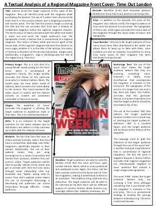
  • 1. A Textual Analysis of a Regional Magazine Front Cover- Time Out London Title- Informs (U+G) the target audience of the name of the magazine. They can identify (U+G) with the magazine while purchasing the product. The use of ‘London’ also informs (U+G) them that it is the London edition and is targeting Londoners and tourists areas. The fact that the primary image is covering the title and the city connotes that Time Out is already an established magazine within the regional magazine industry. The harsh colour of black contrasted with the white text makes it stand out and catch the target audience’s eye. The typography is bold, a feature that is conventional of a regional magazine. The colours of black, white and red are apart of the house style of this regional magazine because they feature on every page, whether it is in the title of the articles, the colour of the text or boarders of the primary/secondary images used. Additionally, a magazine’s logo is stereotypically the title of the magazine e.g. Time Out. Barcode- Identifies (U+G) each individual product. Distributors know how many products are being sold. Price- In addition to the barcode, the price of the magazine also informs (U+G) the target audience of how much the product is to purchase. The typography of this is red, which again connotes the house style of the magazine through the visual codes of colour and typography. Issue Number- Informs (U+G) target audience of how many issues have been distributed to the public and allows them to keep up to date with them. Issue numbers are also an indicator to publishers to know how many issues of their magazine has been distributed and purchased. Anchorage Text- The use of the word ‘plus’ makes the target audience believe that they are receiving something extra. However, in reality, every item/feature that accompanies the magazine is included in the end price. The typography of the word is of a larger font size and is big, bold and black. This further connotes that this particular feature is of great importance and that the target audience should be informed (U+G) of this. Primary Image- This is a mid shot of a young female model posing for the front cover, which is stereotypical of magazines. Clearly, this image directly connotes the theme of this particular issue which is London Fashion Week. The model does not have direct mode of address, which connotes her vulnerability to the camera. This could represent the wider issues in society and the fashion industry as models are sometimes vulnerable to fame and money. Slogan- The repetition of ‘more’ connotes the magazine is offering the target audience to experience more in their lives. This is an intertextual feature. The use of the number ‘100’ also attracts the target audience because numbers are a visual way of catching the target audience’s attention. ‘100’ is a rounded figure, and the target audience will be drawn to this feature of the magazine. Date- It is an indicator to the target audience for the latest releases and to distributors and editors so they can keep up to date with the releases of issues. Website- The fact that Time Out have an online website instantly means that they have a competitive advantage over other magazines, specifically regional, in their market. Additionally, the use of their website means they are using convergence as a means to promote and market their products, whether they are print or online. Target audiences will be able to socially interact (U+G) online and get in contact with Time Out very easily through social networking sites e.g. Facebook and Twitter. Being able to access Time Out’s website online means the use of convergent technology is developing and audiences can access information through different media platforms. Headline- Target audiences are able to instantly identify (U+G) that this issue will focus upon London Fashion Week, which is a very publicised and worldwide event. Again, the colour red has been used to conform to the house style of Time Out magazines, making it intertextual to them as an institution. The headline is big, bold and very distinctive. The target audience will be able to be informed (U+G) that there will be different aspects of London Fashion Week features e.g. coverage, fashion tips, celebrity interviews, etc. The language used to grab the attention of the target audience through the use of the word ‘win’ is another technical visual element that is conventional of regional magazines. The fact the prize is targeted towards a family further connotes that regional magazines are stereotypically targeted to mass audience that include a range of ages (demographics). The word ‘FREE’ makes the target audience believe they are receiving a ‘free’ item, although everything that is purchased with the magazine is included in the end price. This is a promotional strategy to develop the synergy between institutions e.g. Time Out and Covent Garden.
  • 2. This is a textual analysis that will be conducted based on the Time Out London front cover I have annotated. Time Out is the market leader in U.K regional magazines and this is primarily why I have decided to construct this textual analysis. Not only does Time Out publish regional magazines and websites in London, they also publish websites in sixty countries and in eleven different languages including New York, Dubai, Rome, Madrid, Toronto and many others. The layout of the front cover is stereotypical of regional magazines in terms of the features that are included. For example, the title of the magazine, ‘Time Out’, is positioned to the left of the page. This is generic and is intertexual to every issue of Time Out London. The use of the white typography against the black background is visually appealing because the title is clear and concise. The target audience will be able to instantly identify (uses and gratification) that this is an issue of Time Out because black and white are colours that visually work together. Stereotypically, a regional magazine’s logo is often the title of the magazine. Therefore this further emphasises the house style of the magazine and is consistent throughout every issue. The fact that the primary image is covering the title connotes that Time Out are an established market leader in the regional magazine because even though the title is slightly covered, from the layout and house style, the target audience are still able to identify (uses and gratification) this is an issue of Time Out magazine. The primary image dominates the front cover in terms of the rule of thirds. The model is spread out over two-thirds of the page, connoting her importance to this issue. The way in which she does not have direct mode of address with the audience connotes her vulnerability to the camera, and this assumption can delve into the idea that she is not only vulnerable to the camera, but she is vulnerable to the fashion industry. The model looks very young with a very slim figure, which is often generic through fashion and modelling. The importance of her on the front cover conveys the idea that she is further advertising and promoting, and therefore correlating with the headline of ‘Fashion Week’. This is a worldwide event is globally advertised. Time Out have decided to promote this event by headlining it in this issue, accompanied with the angelic model. Time Out is a regional magazine that focuses on events, activities and attractions in London. Therefore, when audiences decide to purchase Time Out, they will be informed (uses and gratification) of the event, and if they are able to access any coverage or events associated with Fashion Week. The people that purchased the magazine will then inform (uses and gratification) their family and friends, who will speak about fashion week and the exciting events that accompany it with other people(two step flow). This can be seen as synergy between Time Out and Fashion Week because they are working together to achieve something they could not of done alone. Time Out are benefitting hugely from this issue because new audiences could of picked up the magazine in the hope they could be informed (uses and gratification) on the sole purpose of where to be for Fashion week. However, once they read through the whole magazine, they would of seen that there is more to the magazine e.g. music, film, food, reviews and many more topics. They are then more inclined to purchase the magazine for more than one purpose at a later date and another issue. The language used in the text on the front cover is very important. Time Out have been very clever in using alliteration to attract a mass audience, for example, the text at the bottom of the page which reads ‘Your insiders’ guide to the shows, the stars, the frocks and the freebies…’. The use of alliteration allows the audience to remember the content because the words begin with the same letter. This is a language technique that is used to make audiences remember specific things. Time Out have used alliteration again, with the text reading ‘Cheap chic’. This has instantly captured the audience’s attention because Time Out’s target audience is primarily working class people who want to be informed (uses and gratification) of affordable events, activities and fashion styles. The use of ‘Cheap Chic’ has connotes that inside the magazine, the target audience can fine affordable, stylist and ‘in session’ fashion tips and be informed (uses and gratification) of where to purchase these items. Now in the twenty-first century, people, stereotypically young girls/women are very body and style conscious. It is important to note that in a social and historical context, women are conventionally seen as the inferior gender. They want to look the same as celebrities and often purchase these celebrities’ own brands/product lines so they feel a sense of security and comfort (dyer star) and can identify (uses and gratification) with them in their own personal way. The value of Time Out providing this information (uses and gratification) to the target audience is a very clever marketing strategy. This is because they are going to use this issue of the magazine to find out where they can purchase the latest, stylist but yet affordable fashion for Fashion Week, but will then later refer back to it and purchase it for other purposes e.g. new releases of films, music, activities, other events, after having essentially ‘flicked through’ the magazine to see what else it had to offer.
  • 3. Time Out’s slogan is simple yet effective – KNOW MORE. DO MORE’. Although the size of the text is quite small, the colour and style of the typography still makes it stand out and known to the audience. The fact that the slogan’s typography is bold, black and capitalised, this further connotes its importance to Time Out and what they stand for. The colour of black emphasises Time Out’s house style because it is clear that the colours of black, white , red and blue are dominant throughout the front cover. The simplicity of the choice of words, and the use of repetition connotes the purpose of Time Out – it is a regional magazine that informs (uses and gratification) the people of London of the latest activities, events, restaurants, new film releases, music reviews and many more. The slogan clearly connotes that by knowing more, people can clearly experience and do more in their lives. The use of repetition with the word ’more’ further emphasises the concept that more is better. It is far better to know more about the city of London and where to find certain aspects, e.g. the night life , then to not know anything and be completely oblivious. Time Out’s slogan is intertexual to the magazine because it is a feature that is present within every issue. Apart from the title of the magazine, it is the only text that is consistent throughout. Time Out’s slogan really does correlate with the purpose of the magazine because it is a simplified way of informing (uses and gratification) the target audience that by reading this magazine, you can instantly go out and experience new things that you might not have known even existed (hypodermic needle). The date of this issue is September 15-21 2011. Time Out have again been very clever in distributing this issue within these dates because the month of September completely focuses upon London Fashion Week, and the upcoming events/shows that are on offer. The target audience are informed (uses and gratification) of when London Fashion Week is from the date and the anchorage text, to the primary image and headline. Distributing Certain issues at specific times of the year is an excellent marketing and promotional strategy because it allows a mass audience to purchase the magazine for different purposes. For example, females could purchase Time Out in the months from June-September because they want to be informed (uses and gratification) of the latest Summer fashion styles and where to purchase affordable, yet stylish attire; a prime example is this issue as it centres around the event of London Fashion Week. On the other hand males could purchase Time Out just before Christmas because they might want to get ideas about special gifts for their other halves and loved ones. They could also want to be informed (uses and gratification) of tasteful, refined and sophisticated bars and restaurants if they want to take their partners out for a romantic evening. Time Out target their regional magazine to a mass audience because at the end of the day, everybody enjoys doing something, whether it is listening to music or watching films, to going out to bars and restaurants or searching for the latest fashion styles; Time Out is a regional magazine that offers careful insight and information (uses and gratification) on all of these topics to the people of London and visitors/tourists who are looking for something to do or experience with the time they have in London. In addition, the date of this issue not only informs (uses and gratification)the target audience of which issue it is, but it is a way for distributors and Time Out to monitor how many issues of the magazine there are, and when and what period of the year they are being sold to the public. Providing the target audience with a website on the front cover of the magazine automatically connotes that there has been technological development in the magazine industry; convergent media. The website allows the target audience to access even more information through their smart phones, e.g. Apple’s most priceless product; the iPhone. Due to the technological advances in the media and updated software's and applications, the target audience can download Time Out’s application on to their smart phones and have access to the information (uses and gratification) it provides at anytime. They can visually read an electronic copy of the print version of the magazine on their smart phones too. Moreover, due to the rise in communicating through social networking sites, Time Out have their own Facebook, Twitter, Spotify and Pinterest pages where they can communicate and socially interact (uses and gratification)with their target audience. Being able to simply ‘follow’ Time Out on any of these social networking sites allows the target audience to feel as though they can identify (uses and gratification) with the magazine and the people who are behind the pre-production, production and post-production on a technological and personal level of understanding and communication. Within the website, there are different features e.g. tabs at the top of the page that allow the target audience to minimise their search through the different categories e.g. things to do, food and drink, theatre and the arts, film and TV, music and nightlife, shopping and lifestyle, tickets and offers, etc. They also have their own blog where they post relevant and new information for their target audience to be informed (uses and gratification ) on the latest topics surrounding the magazine. The use of having an online website featured on the front cover allows technological convergence to occur because the target audience can access information (uses and gratification) through different media platforms e.g. print, an online website and a phone application.
  • 4. The headline is a feature that is dominant in this issue of the magazine. It is big, bold, capitalised and the colour red connotes importance and is a colour that is apart of Time Out’s house style. The headline reads ‘FASHION WEEK’. It is clear that the headline correlates with the primary image because the mid shot of the model is a stereotypical camera shot that is used in fashion photography. The headline is very simple in terms of informing (uses and gratification) the target audience that the focus of the issue is clearly Fashion week. It gets straight to the point and is clear and concise. The headline can be seen as a ‘stamp’ to mark what the focus of the issue is. The size of the headline is bigger than the rest of the text on the front cover, including the title of the magazine. This further emphasises that it is the most important feature on the front cover and that the target audience should pay close attention to it. The headline allows the magazine to have a ‘special focus’. This gives each and every individual issue a unique selling point in terms of differentiating themselves from each other. Although each issue belongs to Time Out , they still have their own unique selling point, which is primarily the headline, that focuses on a particular event/topic. The anchorage text that is place throughout the front cover entices the target audience to want to purchase the magazine. For example, the typography of the capitalised work of ‘PLUS’ is big, bold and black. Black is a colour that is apart of Time Out’s house style and runs throughout each issue. The use of the word ‘plus’ lures the target audience into a false sense of security because it makes them believe that they are receiving something extra. However, every item/feature that is included in the magazine is included in the end price when the magazine is purchased. The purpose of using the number ‘100’ attracts the target audience because numbers are a visual strategy of catching the target audience’s attention. The number ‘100’ is a rounded figure, and they will be drawn to this feature of the magazine. The text reads‘100 funniest films revealed’. Along with the alliteration of ‘funniest films’, the target audience will see it as a combined phrase that will attract them to know what these films are and what order they are ranked. People often like things to be ordered, so the use of the number ‘100’ works well with this concept. The language used to grab the attention of the target audience through using the word ‘win’ is another technical visual element that is conventional of regional magazines. The fact that the prize reads ‘WIN a fantastic family adventure in Egypt’ this further connotes that regional magazines are stereotypically targeted towards mass audiences that include a range of ages. ‘FREE’ is a word that most definitely instantly makes the target audience believe that they are receiving a ‘free’ item, although everything that is purchased with the magazine is included in the end price. Time Out have decided to partner with Covent Garden to include this offer in their magazine for their target audiences' benefit. This is a promotional strategy that develops the synergy between different institutions e.g. Time Out and Covent Garden. This benefits both institutions because firstly, Time Out are probably receiving some sort of financial reward for advertising Covent Garden on their front cover. Covent Garden are then benefitting because their name and brand is being advertised on the front cover of London's’ biggest and well known regional magazine. In addition, the synergy between Time Out and Covent Garden is relevant because Time Out offers information (uses and gratification) to their target audience about restaurants and events that are in Covent Garden. For example, if someone was to spontaneously purchase this issue of Time Out in the hope that they would find something to do, they would instantly see the ‘FREE’ Convent Garden discount shopping card. Instantly they would be more inclined to flick through the magazine and find something to do in Covent Garden because they are receiving a ‘FREE’ shopping discount card(hypodermic needle). It is examples like this one that connote the importance of synergy between different institutions; they are both creating and benefitting from something that could not have been done individually. The issue number of this issue of Time Out is No.2143. Not only does this inform (uses and gratification) the target audience of how many issues of Time Out have been distributed to the public, it also tells them what the latest issue is. For example, if there were two issues of Time Out on the shelve in the shop, a member of the public would be able to instantly identify (uses and gratification) which one is the latest issue simply by the issue number. Not only is it beneficial for the target audience, it is an indicator that helps Time Out and other distributors to identify (uses and gratification) the circulation of the magazine.
  • 5. The price of the magazine is one of the most important features of a front cover. Sometimes, magazines and their publishers often price magazines too high, and this can sometimes be off-putting for audiences. The price of this issue of Time Out is £3.25. This seems to be a reasonable priced magazine for the amount of content that it provides on different areas of social interaction (uses and gratification). The target audience are informed (uses and gratification)of how much the magazine will cost them, so they are not surprised when they pay for it. The price is also an indicator that informs (uses and gratification competitors within the magazine industry, specifically regional magazines, of how much Time Out are charging for their magazine. Sometimes, competitors work around other magazines’ prices to price their own magazine at a price that will make sure they can generate a substantial profit, but also make it affordable, thus giving them a competitor’s advantage in the magazine market. In addition to the price, the barcode also informs (uses and gratification) the target audience of the price of the magazine. What the barcode further does is that it calculates and generates the amount of purchases that are made of each issue of the magazine, and also a total of Time Out regional magazines as a whole. The use of a barcode allows Time Out to collect and organise large amounts of data in an efficient way. Moreover, the barcodes sometimes have imbedded online website links where target audiences can compare different prices of regional magazines.